Search the Community
Showing results for tags 'typography'.
-
I will use this thread to gather references to typefaces or other type-related projects of interest with shared features. When enough similar items will be amassed, I intend to construct a proper list. Additions and suggestions are, of course, encouraged.
-
ATypI Tech Talks is an event devoted to advances and innovation in technology, engineering, standards, formats, experimentation, tools, and other essential subjects related to type design, typography, font production, font formats, browsers, apps, web development, multiscript design, type education, type business, and more. ATypI Tech Talks will feature three days filled with presentations, panel discussions, workshops, and conversation.
-
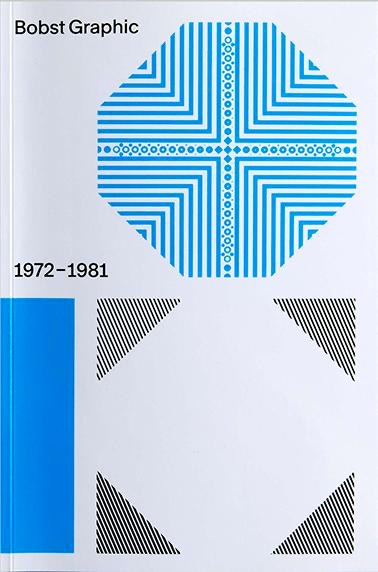 In the early 1970s, the Swiss packaging company Bobst S.A. began to wonder whether it would be ready for the future with only one product type. The Lausanne-based company, already far advanced in terms of packaging manufacturing technology, decided to launch phototypesetting machines. Thanks to the participation of some of the best font designers in the country, e.g. Team 77, different font families were developed for the new technique. The history of Bobst Graphic – a pioneering feat in the development of the phototypesetting at the time – has never been included in the rich history of Swiss graphic and font design.
 -
 “Type design must consider not only the shape of the letters, but also the white space around them, which is essential for the ease of reading.”
-
- 1
-

-
- spacing
- type design
- (and 1 more)
-
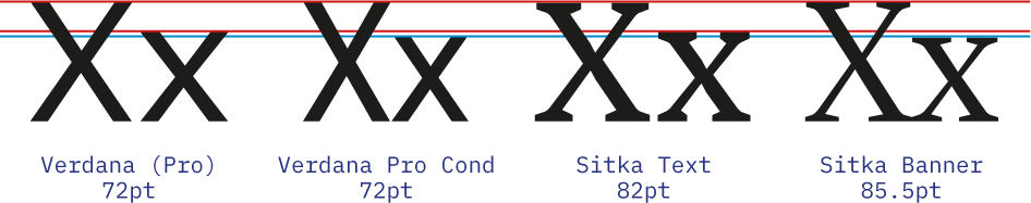
Recently I was looking for a complementary typeface to pair with Sitka, the somewhat obscure serif designed by Matthew Carter for Microsoft. It is a lovely typeface, designed with an emphasis on legibility that offers many optical sizes to boot. Searching for a complementary contrasting sans, I started to look for typefaces from the same designer, as I most often do. It turns out, there are not many Matthew Carter designed sans serifs. However, his most famous one, Verdana, seems to accompany well with Sitka (in fact, the eponymous Carter Sans could almost be seen as an interpolation between Sitka and Verdana). So I start looking for ways to make Verdana work despite its general overuse and avoiding web y2k vibes. First, I discover that at least the latest versions of non-Pro Verdana bundled with Windows include a stylistic set with a non-seriffed |I| (that is what I call a good start). Second, even better, I find out that Verdana Pro is available, together with several other typefaces, as an optional download for Windows (nothing comparable with what is available on mac OS, but still). This give me access to several additional weights and a condensed width, right? Not exactly. You see, Verdana already had a semi-condensed and condensed styles, they are called Tahoma and Nina, respectively. It is right in the promotional material! So, while, for example, Georgia Pro Condensed, as the name implies, is just a condensed version of Georgia, Verdana Pro Condensed is not (just) a condensed Verdana. Let me illustrate: What is going on? It took me a bit to find an explanation, then I think I figured it out. Verdana has the same ratio between caps-height and x-height as Sitka Text has. While that ratio in Verdana Pro Condensed is inbetween those of Sitka Display and Sitka Banner. So, in conclusion, speaking of standardising font names, I think that Verdana Pro Condensed should really be called Verdana Pro Display, because it is not so much a width variation, but rather an oprical size. Oh, I also would not mind seeing all the aforementioned typefaces (Verdana, Tahoma, Nina, Carter Sans, and Sitka) all grouped together as a big “Carter Superfamily”.

- 1 reply
-
- 2
-
-
- typography
- optical sizes
- (and 4 more)
-
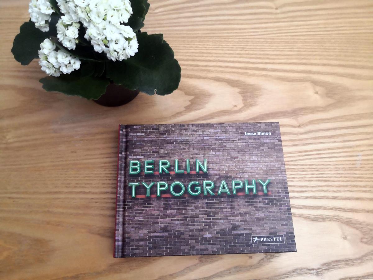
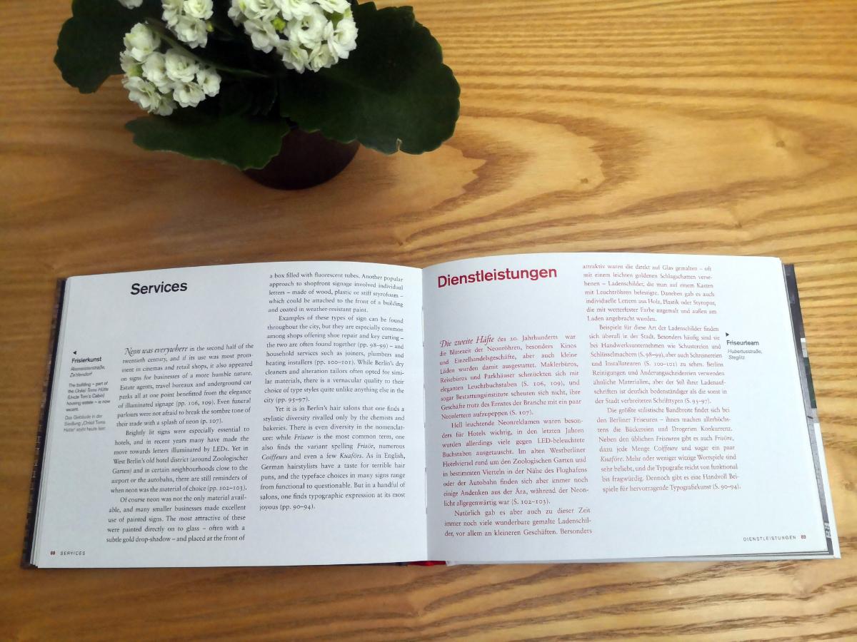
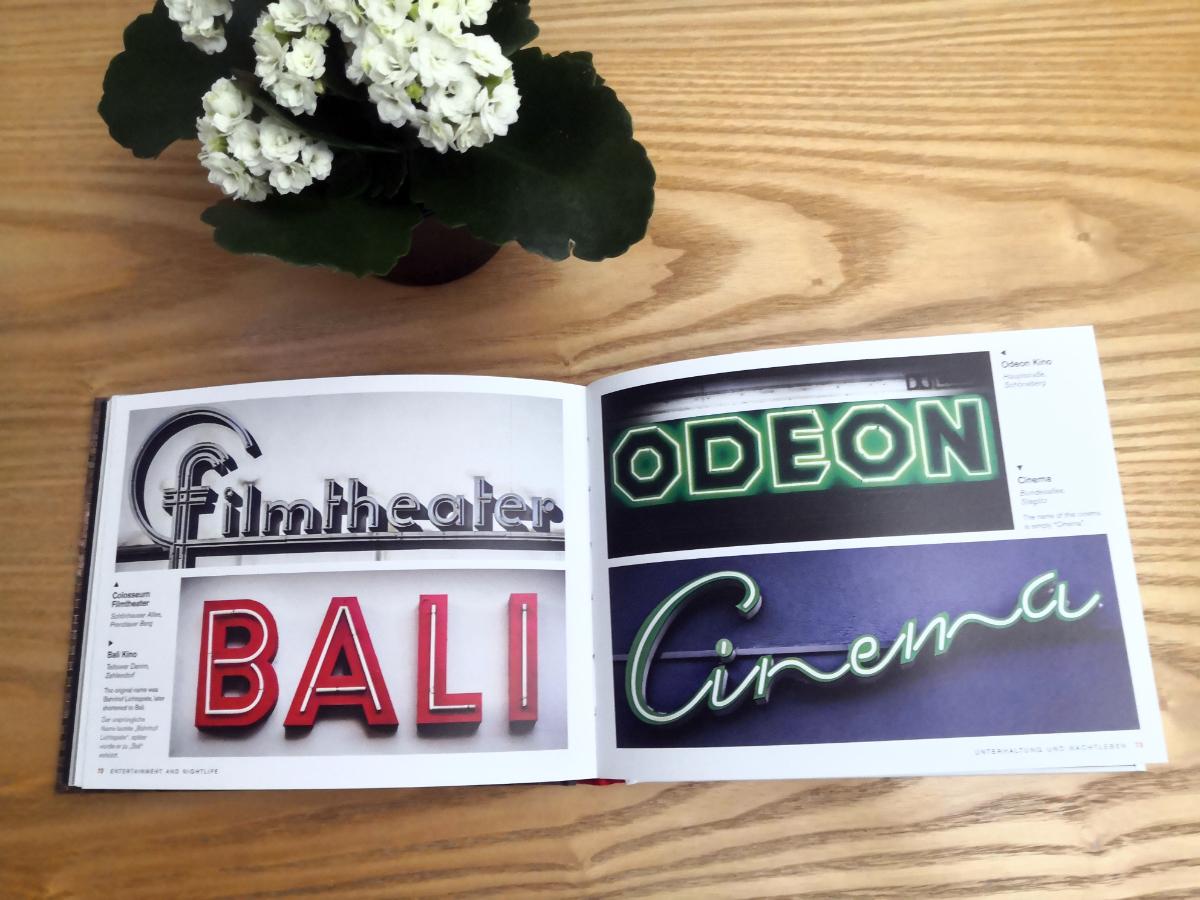
One of reasons I love Berlin is typography. From its neon shopfronts to its distinctive U-Bahn signs, Berlin is filled with stunning typography and letterforms. I just received a book by Jesse Simon “Berlin typography”. Lovely published, with hundreds of photos, and text in both English and German. I pre-ordered it a year ago and completely forgot, so it is a really nice surprise. Publisher: https://www.penguinrandomhouse.de/Buch/Berlin-Typography-dt-engl-/Jesse-Simon/Prestel/e575253.rhd Twitter: https://twitter.com/Berlin_Type It’s available on Amazon
-

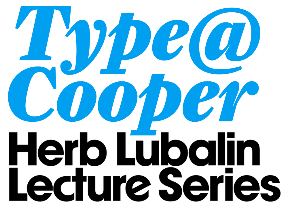 All lectures are free to attend and will be presented as Zoom webinars and live-streamed on The Cooper Union YouTube channel. The series is sponsored by Herb Lubalin Study Center of Design and Typography at the Cooper Union College, New York City.
-
- 1
-
-
- type@cooper
- lecture
- (and 2 more)
-

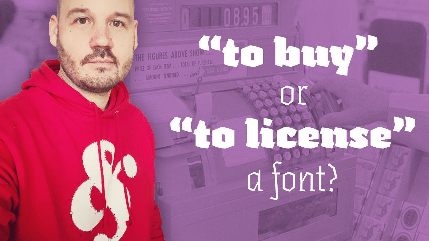 Is it wrong to say “I bought a font”? Watch this short video and find out.
 -

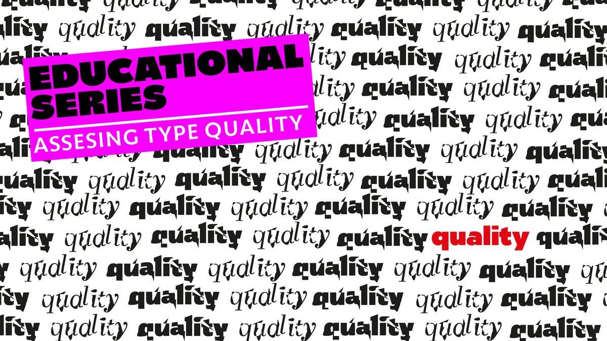
Quality type: how to spot fonts worth your money
Riccardo Sartori posted a news entry in Typography Weekly #104
 “Graphic designers play a fundamental role in visual communication, whether in print or digital format. They sit between content and reader and, for better or worse, they shape the way the public interacts with information. So when graphic designers choose typefaces they have a responsibility to the reader that should be taken seriously.”
-
- 1
-
-
- type
- typography
- (and 3 more)
-
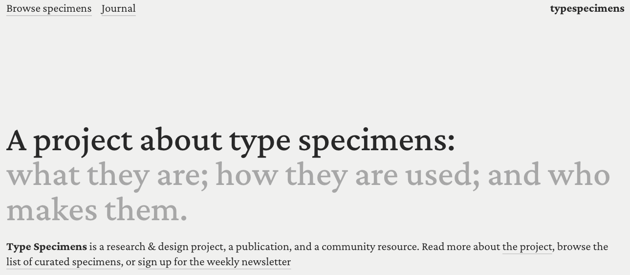 A curated list of digital specimens.
 -
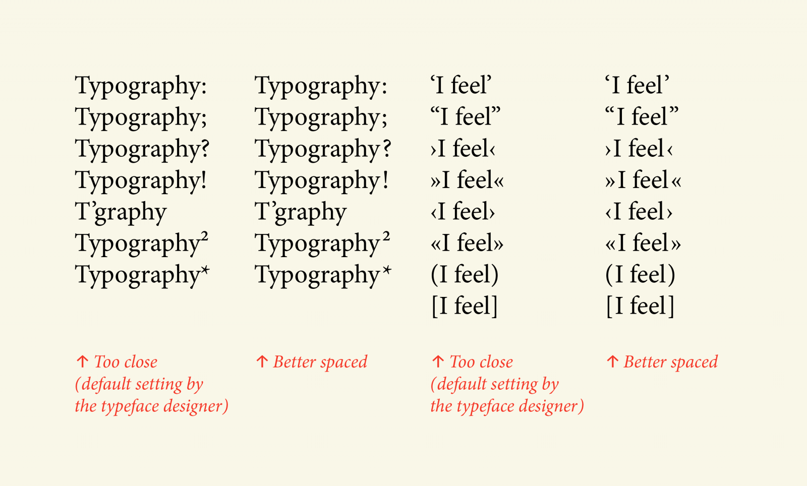 Thomas Bohm: “This article is for anyone who works with typography, in any medium, and it is especially for those designers who are keen to give users the best reading experience possible.”
-
- 2
-
-
- typography
- punctuation
- (and 1 more)
-

The Fonts in Popular Things Identified Vol. 1
jeremiahshoaf posted a news entry in Typography Weekly #101
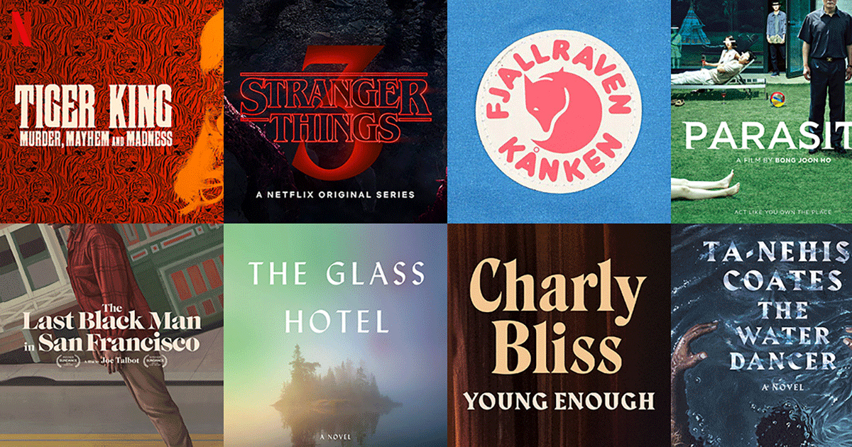 See the fonts used in popular culture—featuring Tiger King, Stranger Things, Parasite, Fjallraven and more.
 -
Collection of Research on Chinese Typography
Riccardo Sartori posted a directory entry in Typography Books
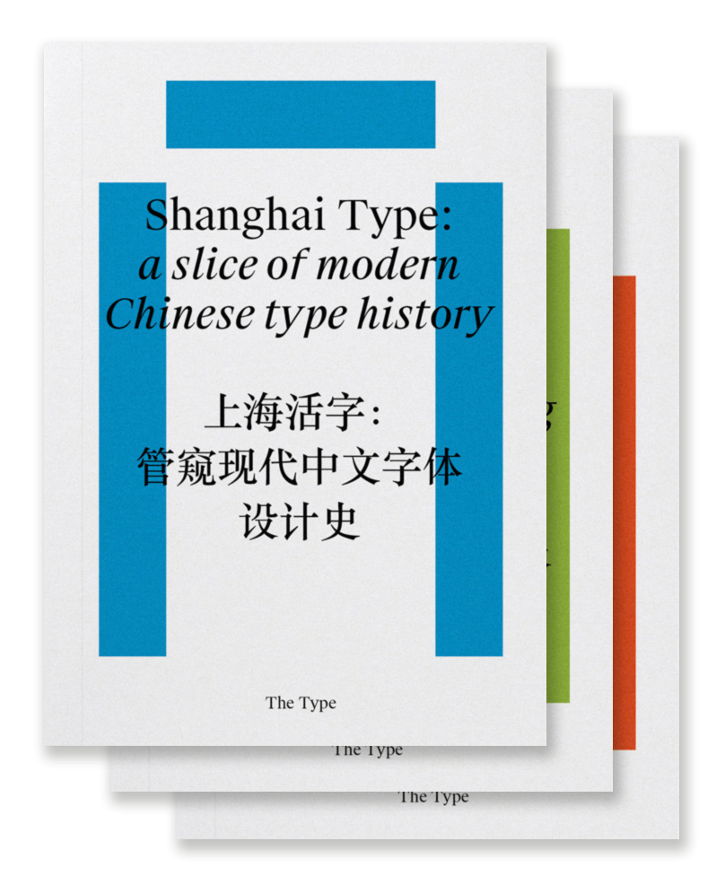 “Chinese typography is not easy to tackle, but we believe that, by more self-initiated and open research, we are able to address our challenges under a global perspective and invite more discussions and breakthroughs to the field. So here is a three-volume collection of our on-going research and dialogues about typography and design in China, including its history and development, conventions and contemporary practice, and working in transcultural contexts.” Shanghai Type: a slice of modern Chinese type history Transcultural Type Design: a dialogue from China Kǒngquè: restoring the mindset of Chinese typesetting
 -

Variable font experiment: Your Typeface
RasmusTypeDesigner posted a news entry in Typography Weekly #100
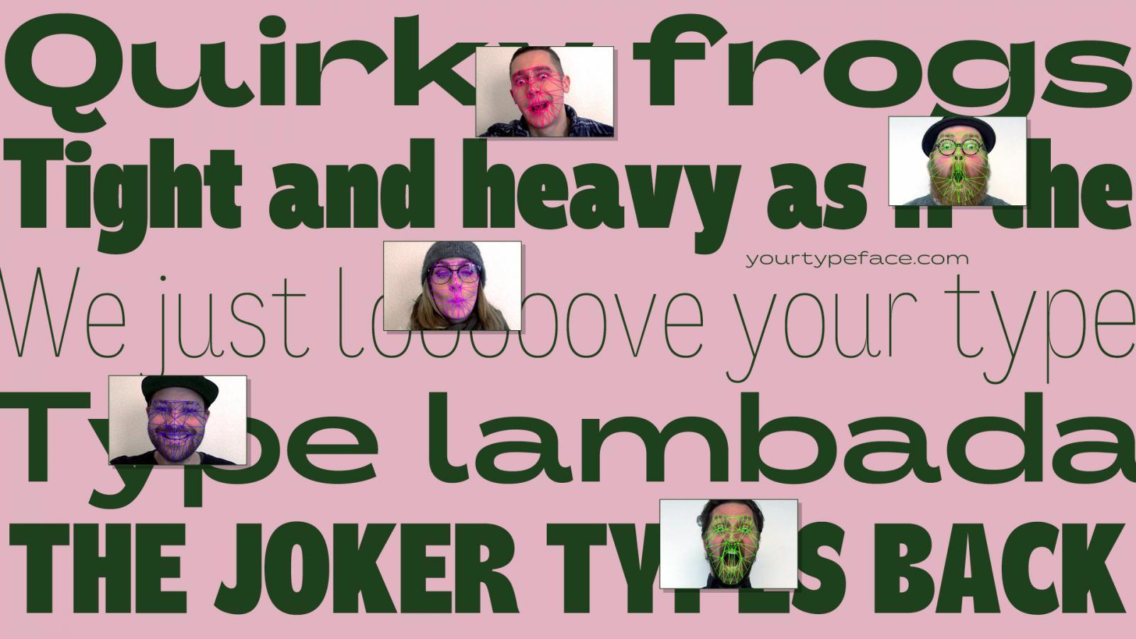 yourtypeface.com is a variable typeface experiment that enables you to design a typeface from the proportions and forced emotion of your face. Look surprised or uptight, yawn or smile, and let your face design your own typeface. Download it and use it freely for any project you’d like.
- 2 comments
-
- 1
-

-
- typeface
- typeface design
- (and 6 more)
-
Some mind blowing reference to typography here, enjoy folks. https://archive.org/details/letterformarchive
-
- 1
-
-
- type
- typography
- (and 3 more)
-
There are diagrams on the web giving technical names for the parts of letter forms, such as "counter," "ascender," "bulbous terminal," etc. Are there any similar diagrams for the parts of numbers? I'm specifically interested in 19th century type, but I assume the same names would apply. Thanks!
-
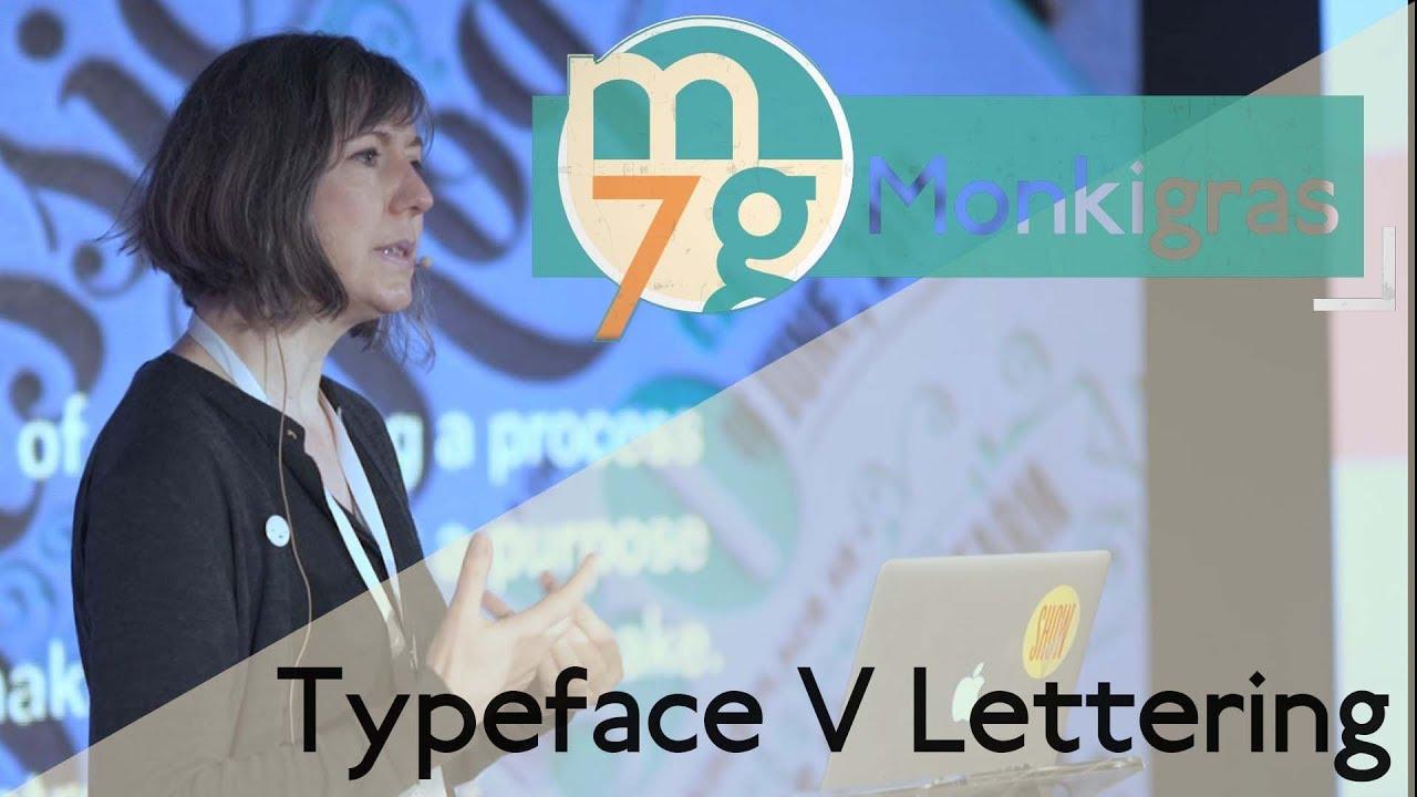 “Typography is remarkably complex. Catherine Dixon stopped by Monki Gras to clear up some of the issues facing the modern designer and to discuss some of the finer details of typography. explaining the way design is taught and how skills can be maintained.”
 -
 Robert Walker is a sign-writer, graphic designer and reverse glass sign maker based in West Yorkshire, UK. Umberto has been working in the field for 15 years, and has been teaching custom lettering and broader principles of graphic design for 6 years in design schools across West Yorkshire. Umberto specialises in hand crafted sign making known as Verre Églomisé, a process of applying both a design and gilding onto the rear face of glass.
 -
-
We’re heading for Rotterdam this weekend. I’m looking for interesting places to visit, besides the touristic scenes. Any antiquariats, shops with a proper graphic design book collection or other places for a letter and type aficianado to go bananas? Thanks Andy
-
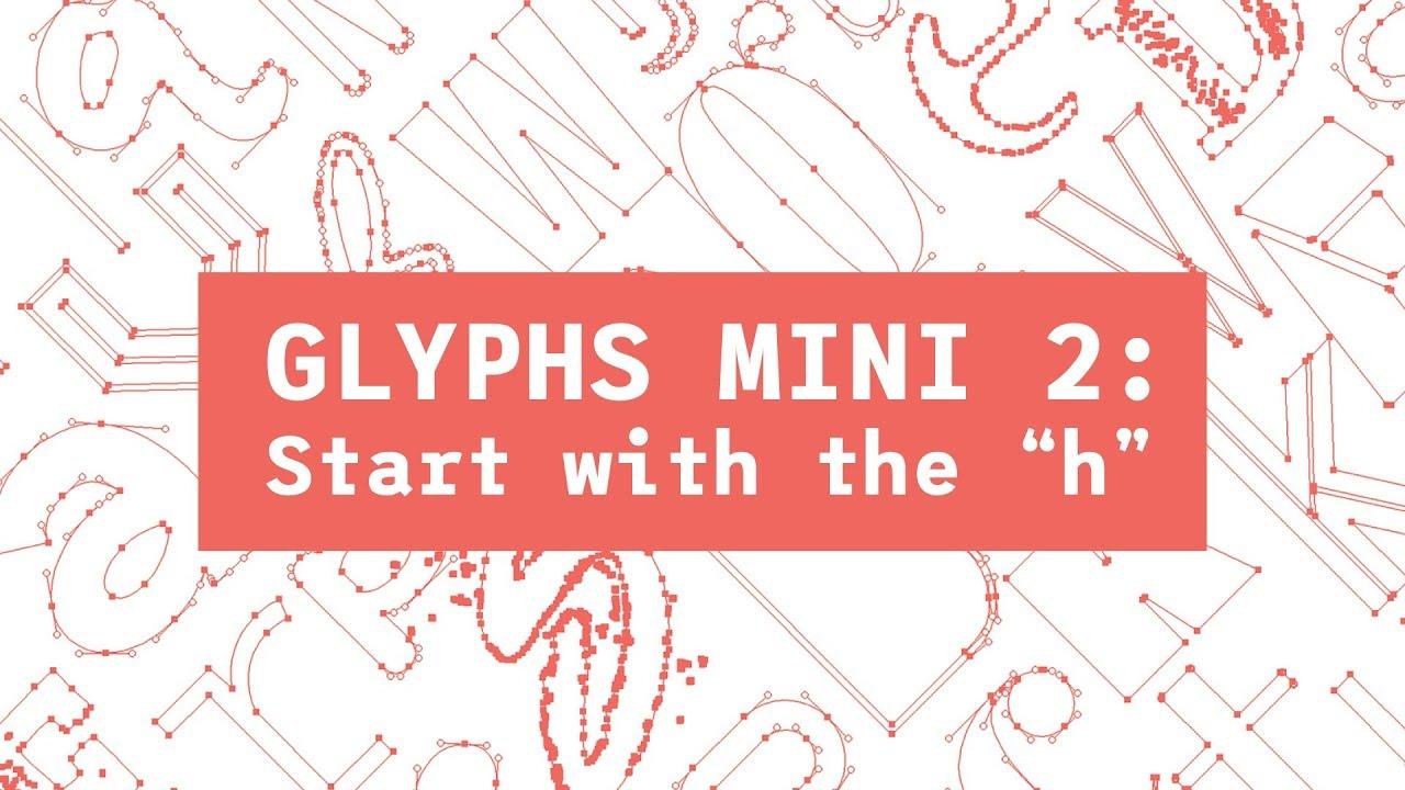 Font Tutorial - Glyphs Mini 2
- 1 comment
-
- 1
-

-
- typography
- font design
- (and 2 more)
-
 Design School: Type is an instructive guide for students, recent graduates, and self-taught designers. You'll get a comprehensive introduction to typography, a crucially important skill that underpins practically every aspect of graphic design. These guided lessons offer in-depth analysis of all the major areas of theory and practice used by experienced professional designers. Each section is interspersed with tests designed to help you retain the information they've covered, and a selection of relevant support files in popular design software formats so you can test yourself with provided demos. This guide to the rules and practices of typography avoids the temptation to stray into other areas of design technique, preferring to cover the essential skills of the professional typographer in the detail required to arm students and graduates with the knowledge needed for a successful start to their chosen career. The author Richard Poulin is cofounder, design director, and a principal of Poulin + Morris Inc., an internationally recognised, multidisciplinary design consultancy located in New York City. His work has been recognized by major design organisations, competitions, and publications including the American Institute of Graphic Arts (AIGA), Communication Arts, Graphis, Library of Congress, Type Director Club, and the New York Art Directors Club.
 -
Anyone know of a place to get good typography advice? I've watched all the Lynda.com, Skillshare, YouTube videos out there, basically, and seen all the "Beginner's Guide to ..." videos that I care to watch. Specifically looking for a good typeface for headlines for a newspaper that uses Chapparal Pro as the body typeface.
-
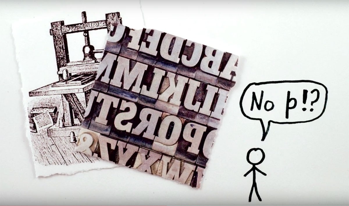 Have you ever wondered where "Ye Olde" spelling comes from? Today we unravel this thorny linguistic issue.
 -
Hopefully not too spammy, but maybe some of you would enjoy our instagram account '70s Movie Poster Typography'. We look at a different movie poster from the 70s every day, identify and discuss the typefaces (when possible), with a general emphasis on 70s ITC fonts, and a slight slant towards classic horror. http://www.instagram.com/70smoviepostertypography/