Search the Community
Showing results for tags 'san francisco'.
-
Apparently, San Francisco, in it’s several incarnations, offers various advanced typography features, and supposedly, the OS will automagically handle them in the most appropriate way (yay for tabular figures in clocks, we only waited for decades). Speaking of figures, one such feature is the inclusion of alternative numerals with open counters: The problem is, they seem to be used only on Watch’s faces. I would love to see them used on my Mac or iPhone when the numbers get very small. Better yet, wouldn’t it be nice to be able to set a preference, akin of that for font smoothing, to always use them under a given point size?
- 1 reply
-
- san francisco
- macos
-
(and 2 more)
Tagged with:
-
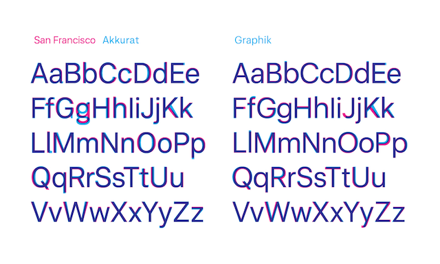
Hi everyone, I'm sure some of you already faced the challenge of finding a close alternative to Apple's new default system font to build a consistent cross-platform experience. My goal is to use San Francisco Display on iOS and Mac as primary platforms for our app and find something similar on other platforms (eg Windows, Android etc). I would really appreciate any suggestions. The closest one I could find is Graphik (Commercial Type). It does support Extended Latin, Cyrillic and Greek alphabets, proportional and tabular lining for figures, it has hinting and most importantly it looks... well, not similar, but close to SF UI. I still have to set text tracking tighter than default (about –20) but the main problem now is that the weight is distributed differently: Graphik Light is thiner than SF UI Light, Graphik Medium is bolder than SF UI Medium and so on. The only other suggestion I found was Akkurat here, but I'm still not satisfied. Graphik-family.pdf
- 3 replies
-
- san francisco
- sf ui
-
(and 1 more)
Tagged with:
-
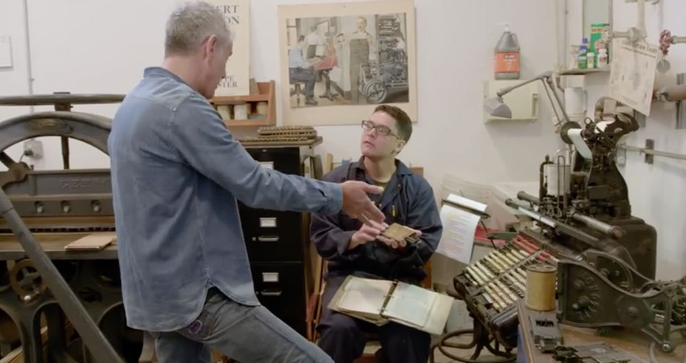
“Anthony Bourdain & The Balvenie head to San Francisco, California to meet with Andrew Hoyem, master typographer and printer of Arion Press. One of the last of its kind, Arion Press has only a handful of members on its staff, all fellow craftsmen dedicated to this age old process. Each works meticulously to create the books in multiple parts, from the typecasters, to the proofreaders, to the printers and the bookbinders. All of these hands build a work of art through a process that must be seen to be believed, and can only, truly, be described as magic.”
-
- letterpress
- printing
-
(and 3 more)
Tagged with:
-
Founded by Andrew Hoyem in 1974, the Arion Press publishes deluxe, limited-edition books, many of them printed by letterpress, illustrated by prominent artists, and some accompanied by separate editions of original prints. Arion Press is a cultural tenant at the Presidio, the new National Park in San Francisco, where it shares a handsome industrial building with its second division, M & H Type—the oldest and largest type foundry in the United States, serving the needs of designers and letterpress printers around the world—as well as its nonprofit adjunct, the Grabhorn Institute.
-
- usa
- letterpress
-
(and 2 more)
Tagged with:
-
-
- apple
- system font
-
(and 1 more)
Tagged with:
-

Apple explains the extended San Francisco Type Family
Ralf Herrmann posted a journal article in Journal
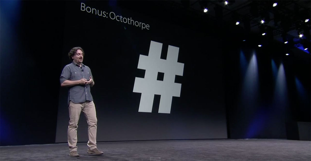
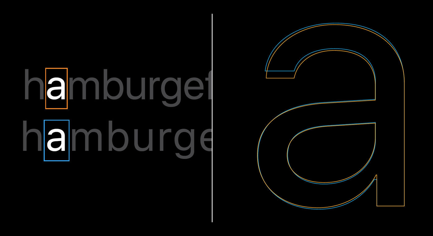
Apples search for a fitting and consistent typography is an ongoing quest. Lucida Grande defined the look of Mac OS X since 2001, while the iPhone uses Helvetica. But Apple’s corporate typeface used in ads, on the web or on packaging is a version of Myriad. Lately, Mac OS X took over Helvetica from iOS, while a completely new typeface appeared for the Apple Watch: San Francisco. With the upcoming releases of Mac OS X and iOS yet another change was announced. The watch font is now renamed to “SF Compact” and iOS and Mac OS will use a new branch of the San Francisco type family called “SF”. The SF branch is a compromise between the current use of Helvetica and Apples own watch font design. SF uses the same metrics and proportions as Helvetica, but borrows design features from the watch font. The main difference between SF and SF Compact is the treatment of the curves. While they are rounded in the SF branch, they are rather flat in the SF Compact branch. This gives the latter a more legible appearance on smaller screens, such as on the Apple Watch. The fonts currently cover extended Latin, Cyrillic and Greek. Both branches of the San Francisco type family come with optical sizes. There are 6 weights (including italics) for the text sub-family and 11 weights for the display sub-family (without italics). The correct choice for the optical sizes and the tracking values can be made automatically by the operating system. The fonts are also equipped with smart font replacement options like subscript/superscript figures, different figure sets (including variations for the figures 6 and 9), as well as special versions of punctuation and math characters which better suit all-caps or number settings. Numbers with a centered colon Conclusion: It’s good to see that Apple now has in-house type designers who create this extensive family and pay great attention to details. I also like that advanced features such as optical sizes are not only available in the font family, but can be automatically applied throughout the system. The look of the typeface itself is unfortunately rather bland. Apple is known for creating trends rather than following them. This design mix of typefaces such as Helvetica or Akkurat can’t really achieve this. It doesn’t have its own clear voice and doesn’t separate Apple’s UI from that of competitors such as Google who use a pretty similar font. An open question is the use of Myriad as a corporate font. Mixing Myriad and San Francisco doesn’t seem like a good idea. The fonts are different, but not different enough to be a good mix. So will San Francisco become the corporate font as well someday? The great variety of styles would certainly allow it. The full presentation (around 30 minutes) from the developer conferenced can be watched here. The fonts are available free of charge for Apple developers. But I would like to point out, that the fonts are currently only licensed for the development of apps for Apple devices. The fact that you might find these fonts for free on certain websites does not mean that you can use them like regular freeware or Open Source fonts. -
-
- san francisco
- dwiggins
-
(and 1 more)
Tagged with:
-
Letterform Archive in San Francisco is a nonprofit center for inspiration, education, and collaboration in the letter arts. It serves existing & potential practitioners, students, and admirers of typography, calligraphy, graphic design, the history of written communication, and adjacent fields. It is open to all, free of charge. Letterform Archive shares its world-class collection with a global audience through visits; public events; courses, workshops, and lectures by visiting artists and designers; publications; exhibitions; and state-of-the-art photography.
-
- san francisco
- archive
-
(and 3 more)
Tagged with:


