Search the Community
Showing results for tags 'spiekermann'.
Found 6 results
-
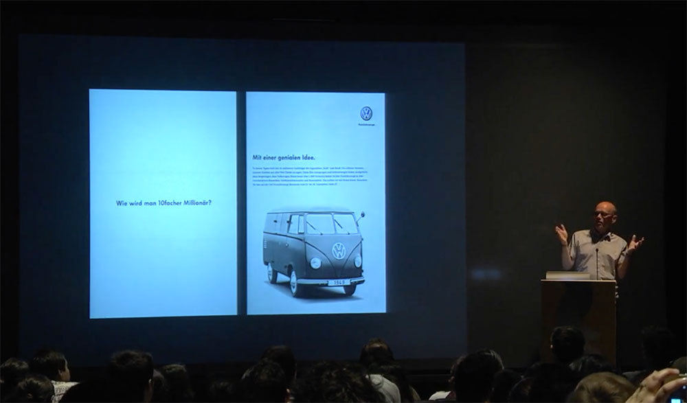 Grotesque – A wrong name for the right typefaces at the right time. In this ISType talk, Erik Spiekermann looks at the state of sans serif typefaces — who makes them, who uses them and why there is a never-ending supply of new designs for an old idea.
 -
Erik Spiekermann and Ralph du Carrois released a brand new neo-gotesque sans entitled FF Real. https://www.fontshop.com/superfamilies/ff-real What do you think of it? Thanks for your insight. • Read the official FF announcement • FF Real was originally conceived by Erik Spiekermann as one text weight and one headline weight to be used as the only faces in his biography ‘Hello I am Erik’, edited by Johannes Erler, published in 2014. While Spiekermann drew the alphabets, he passed on the font data to Ralph du Carrois who cleaned it up and completed it. In the meantime FF Real has been extended to a family of two styles and 13 weights each. The design of FF Real is rooted in early static grotesques from the turn of the century. Several German type foundries – among them the Berlin-based foundries Theinhardt and H. Berthold AG – released such designs between 1898 and 1908. The semi-bold weight of a poster-size typeface that was lighter than most of the according semi-bolds in metal type at the time, gave the impetus to FF Real’s regular weight. In the words of Spiekermann, the historical example is “the real, non-fake version, as it were, the royal sans serif face“, thus giving his new typeface the name “Real” (which is also in keeping with his four-letter names, i.e. FF Meta, FF Unit). FF Real is a convincing re-interpretation of the German grotesque style, but with much more warmth and improved legibility. With a hint towards the warmer American grotesques, Spiekermann added those typical Anglo-American features such as a three-story ‘g’ and an ‘8’ with a more defined loop. To better distinguish characters in small text sizes, FF Real Text comes in old style figures, ‘f’ and ‘t’ are wider, the capital ‘I’ is equipped with serifs, as is the lowercase ‘l’. What’s more, i-dots and all punctuation are round. In Spiekermann’s biography FF Real Text has proven to endure all challenges of a proper text face without an italic, while FF Real Headcuts a fine figure in larger sizes with a more reduced look.
-
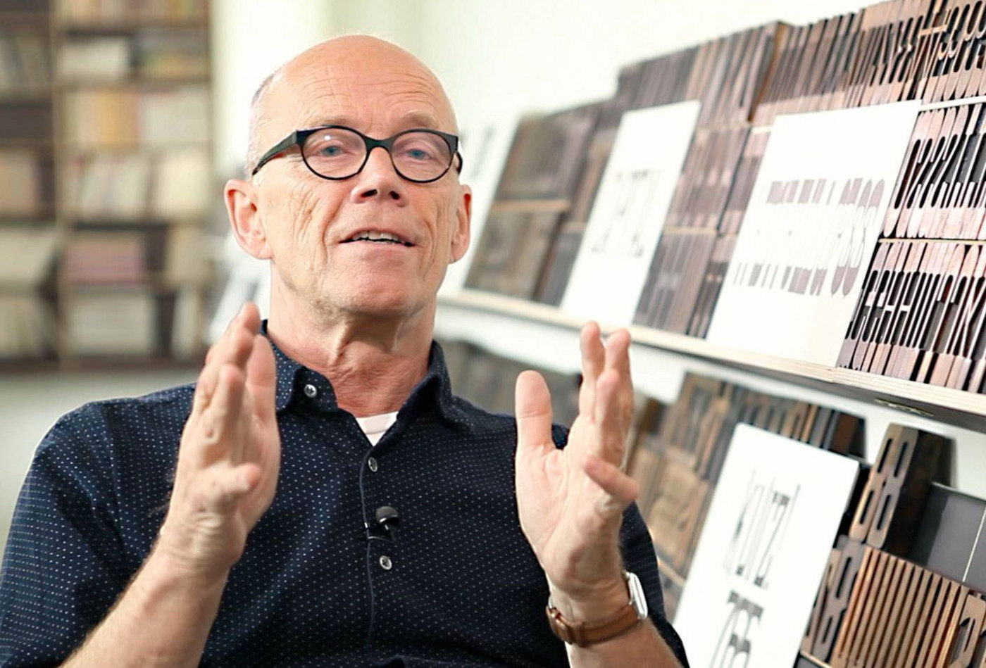
 p98a is an experimental letterpress workshop in Berlin dedicated to letters, printing and paper. A group of multi-disciplined designers is exploring how letterpress can be redefined in the 21st century through research, printing, collecting, publishing and making things. They work with hot metal- and wood-type, several proof presses, a Heidelberg “Windmill” platen and other traditional analogue equipment, and combine those with digital technologies.
 -
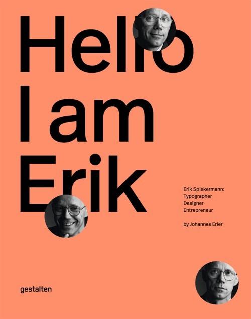 Erik Spiekermann is the epitome of a typographer. With his typefaces, commercial projects, and enterprises, he has shaped the world of graphic design like no other. This comprehensive book is the first to showcase his body of work and tell the story of his life. Hello, I am Erik is the first-ever visual biography of Erik Spiekermann s work. The book documents his projects, traces milestones in his life, and offers his personal perspectives on design. Essays by notable designers and authors provide a framework and further context for this vivid presentation of his body of work.
 -
-
- 1
-

-
- spiekermann
- berlin
- (and 3 more)
-
This topic was imported from the Typophile platform We were disappointed, but not surprised, that Erik Spiekermann, a noted and respected type designer and author, would knowingly make false and misleading statements regarding Berthold in a public forum. As such statements affect the reputation of Berthold Types, I am responding with this posting. I attach a letter dated June 3, 2004, to Mr. Spiekermann explaining the actual facts behind the continuation of H. Berthold's type business by Berthold Types. This letter is from Berthold Types Limited's German attorneys because the subject matter involves German law. We arranged for the attached English translation. Although the letter to Mr. Spiekermann addresses the myths and misconceptions perpetuated by Mr. Spiekermann's comments, I would like to make a few points: 1. Berthold Designers Mr. Spiekermann states that Berthold Types has no contracts with any of the original Berthold designers even though he is well aware of the agreement with Guenter Gerhard Lange. Mr. Spiekermann, a friend of Mr. Lange, tried to persuade Mr. Lange against working with Berthold Types but failed. Contrary to Mr. Spiekermann's statement, Berthold Types has agreements with Guenter Gerhard Lange, Bernd Moellenstaedt, Dieter Hofrichter, Orjan Nordling and Prof. Werner Schneider. --Mr. Lange (at 83) is working on new typefaces for Berthold Types; having completed Whittingham in 2001 and additions to his other typefaces (Bodoni Old Face and Imago). He also has a new typeface yet to be released and has embarked on another large typeface project for Berthold Types. Mr. Lange as artistic consultant is actively involved in future type releases by Berthold. --Mr. Moellenstaedt has created a new, large typeface family for Berthold Types (yet to be released) as well as preparing additional offerings of Formata. --Prof. Schneider recently completed and Berthold Types released his Senatus typeface. --Mr. Hofrichter works on many projects for Berthold's type program and works closely with Berthold Types to insure the continued quality of the Berthold type program. He works directly with GGL on all his new releases. All of the contracts between H. Berthold AG and the designers specifically stated that when a typeface design falls into the public domain the obligation by Berthold to pay royalities ceases. Berthold Types offered to pay designers nonetheless. Notwithstanding, Hans Reichel chose to release a reworking of Barmeno. Interestingly, according to H. Berthold's royalty worksheet, Mr. Spiekermann was never paid royalties on an ongoing basis for Berliner Grotesk and LoType. 2. Registration of Berthold's Trademarks Mr. Spiekermann also implies that any company could simply register H. Berthold's trademarks. This is simply not true. The Type division of H. Berthold was a separated in October 1991 and the Type assets were "leased" back to H. Berthold by a consortium of banks. The Type division was not a part of the H. Berthold AG bankruptcy in 1993 and was separate from Berthold's other businesses. Berthold Types acquired the type assests (e.g. the trademarks as well as other IP rights -- see the attached letter) through the chain of title through these banks, not through bankruptcy. Accordingly, contrary to Mr. Spiekermann's statements, over 80 German trademark registrations, and numerous UK and US registrations, were assigned through the "chain of title" from H. Berthold AG to Berthold Types, including the "Berthold in a red square logo" and the "H. Berthold" trademarks. 3. Protection of Berthold's IP Rights Mr. Spiekermann states that Berthold Types has been "suing dozens of people with frivolous cases which have cost me and other designers and foundries millions of dollars (and I am not exaggerating)." It's a myth. In fact, Berthold Types has filed only twelve lawsuits two of which were against FSI/FontShop (both for trademark infringement). Mr. Spiekermann cannot provide any basis supporting losses of "millions of dollars." Type is just not that large of a business. If Mr. Spiekermann wants to debate: Stick to the facts, please. Respectfully, Harvey Hunt President Berthold Types Limited Spiekermann_Translation.pdf (91.9 k)