Search the Community
Showing results for tags 'switzerland'.
-

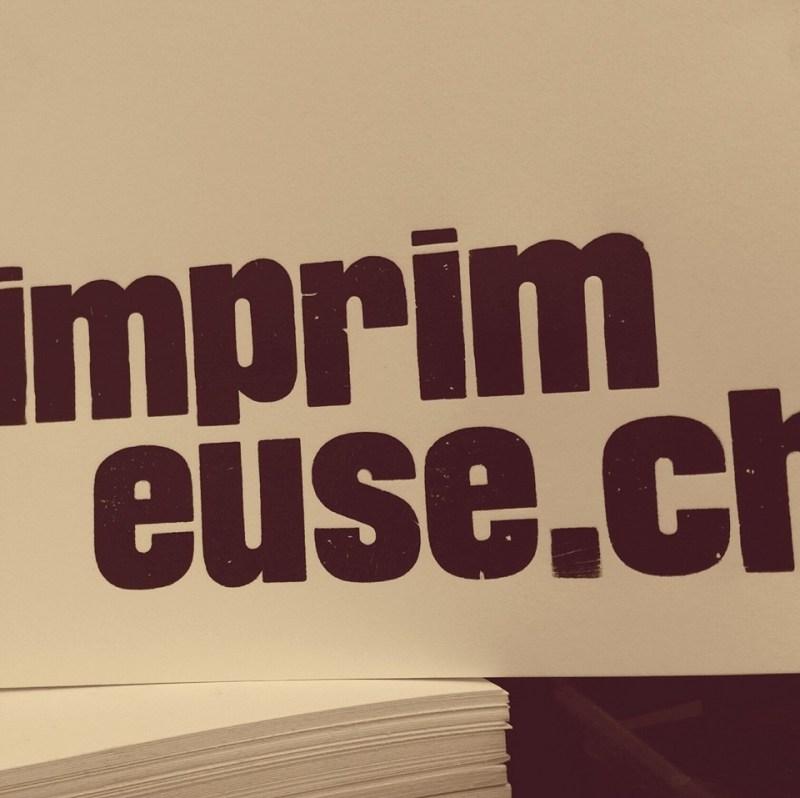
L'imprimeuse Letterpress Studio
Ralf Herrmann posted a directory entry in Artisanal workshops & studios
-
- letterpress
- printing
-
(and 1 more)
Tagged with:
-
-
- type design
- education
-
(and 2 more)
Tagged with:
-
-
- book binding
- monotype
-
(and 2 more)
Tagged with:
-
Lars Müller Publishers is an internationally active publishing house based in Zurich, Switzerland. It came into being in 1983, as a result of the bibliophile passion of designer Lars Müller. The press has made a worldwide name for itself – and not just in specialist fields – with carefully edited and designed publications on architecture, design, photography, contemporary art and society. Lars Müller works closely with his authors to produce significant publications of great independence, to the highest possible standards. Lars Müller Publishers presents its program as a “school of seeing.” It offers a precise selection from the unmanageable flood of visual events, and brings together authors, designers, and artists who stand for quality and tenacity in their own right.
-
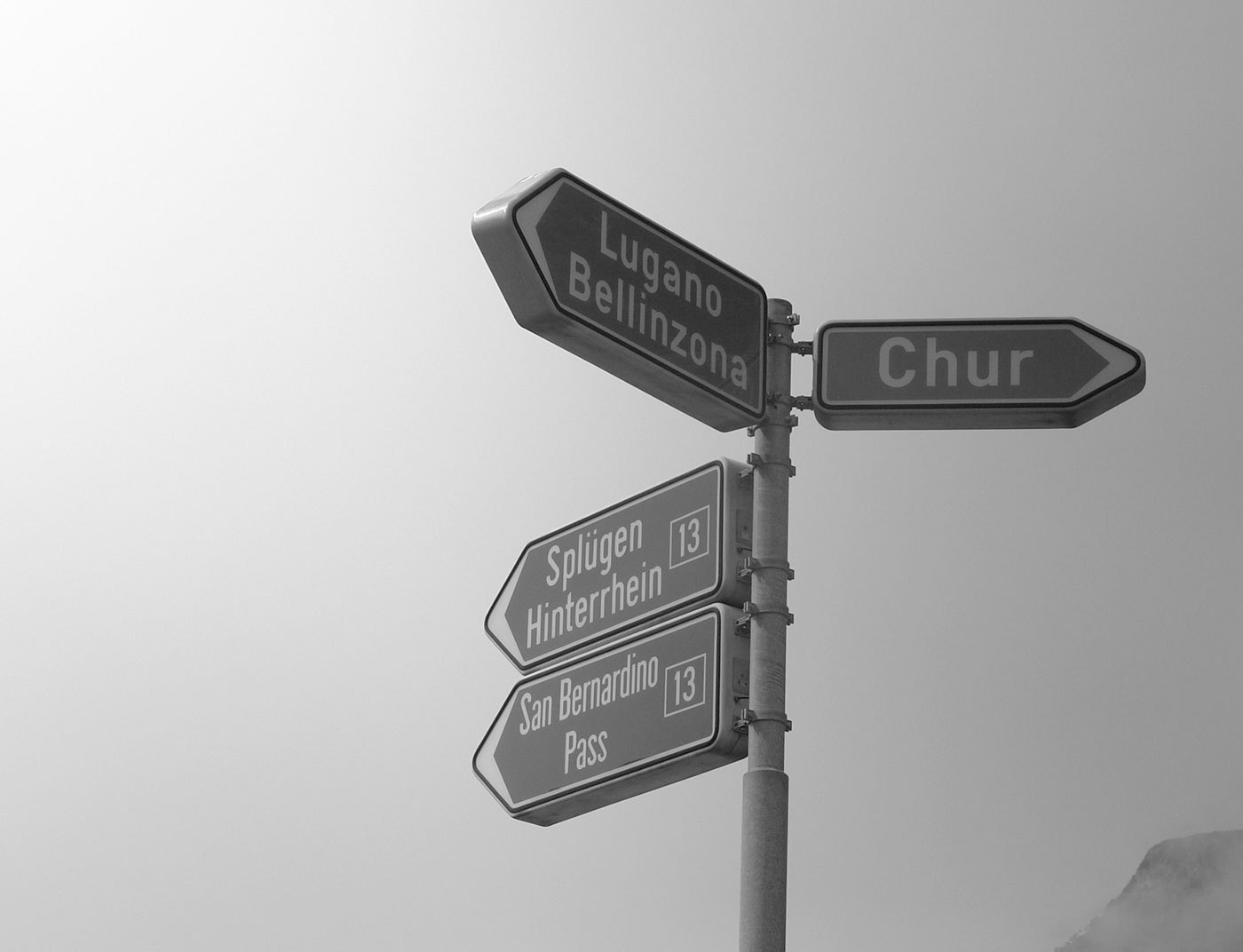
The old Swiss traffic sign font is called SNV (“Schweizerische Normen-Vereinigung”). It is a very geometric typeface with obvious legibility problems. The SNV fonts can still be found on older Swiss traffic signs and also in Belgium where it is still the main font on road signs. Since 2003 a new font called ASTRA Frutiger is used. It is based on Frutiger 57 Condensed with slight changes. ASTRA Frutiger is used in two styles: “Standard” for normal roads and “Autobahn” for motorways. The latter uses a slightly wider spacing. Frutiger is of course a perfect choice for traffic signs. It was derived from a design by Adrian Frutiger for the signage of the Roissy Airport in France. The clean and open design of the letters make the typeface very legible and it became one of the most popular sans-serif designs in the 20th century. Nevertheless there is some room for critique. The Frutiger typeface is already available in many different widths and weights, so it would have been no problem to obtain different versions for positive and negative contrast as well as styles with different widths. Choosing a condensed style as the main font could be problematic since a condensed style will always be slightly less legible than the corresponding style in the normal width. The official norm even allows the already condensed font to be further reduced in width. This is done without any typographic correction and decreases the legibility.


