Search the Community
Showing results for tags 'type design'.
-
 The website offers several tools and games to help familiarising with some aspects of typography and type design.
 -
ATypI Tech Talks is an event devoted to advances and innovation in technology, engineering, standards, formats, experimentation, tools, and other essential subjects related to type design, typography, font production, font formats, browsers, apps, web development, multiscript design, type education, type business, and more. ATypI Tech Talks will feature three days filled with presentations, panel discussions, workshops, and conversation.
-
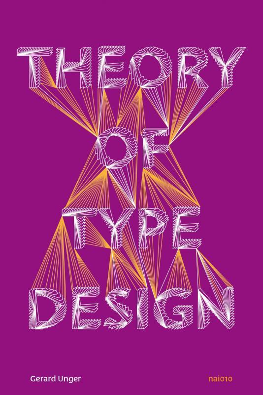 Theory of Type Design by type designer Gerard Unger is a comprehensive theory of typeface design. This volume consists of 24 chapters, each describing a different aspect of type design, from the influence of language to today’s digital developments, from how our eyes and brain process letterforms to their power of expression. This book includes more than 200 illustrations and practical examples that illuminate the theoretical material. The terminology is explained in the volume’s extensive glossary. The theory is internationally orientated and relevant for typography courses, professionals and those with a general interest in text and reading all over the world.
 -
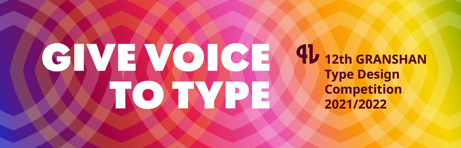 Submissions are open for the 2021/2022 edition of the GRANSHAN Competition, that seeks to recognise the most notable typefaces for individual scripts other than Latin as well as multiscript families.
 -
 “Type design must consider not only the shape of the letters, but also the white space around them, which is essential for the ease of reading.”
-
- 1
-

-
- spacing
- type design
- (and 1 more)
-

Design Regression, a journalette by Rosetta
Member Ric… posted a news entry in Typography Weekly #112
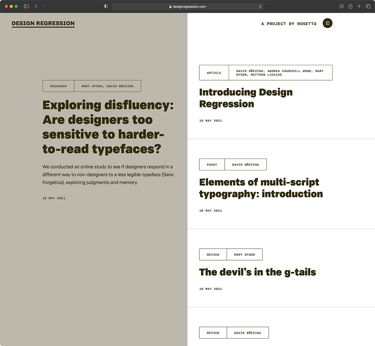 “Design Regression is a journalette (mini journal) publishing texts that are about design for reading and reading-related research. It aims for the hard-to-get blend of approachability with seriousness and relevance to practice.”
 -
 “TypeTogether cofounder Veronika Burian discusses the major Latin-based information you should know about diacritics: those accented characters we include in all our font families.”
-
- 1
-
-
- typograhy
- type design
- (and 1 more)
-

The Multifaceted Design of the Lowercase Sharp S (ß)
Ralf Herrmann posted a journal article in Journal
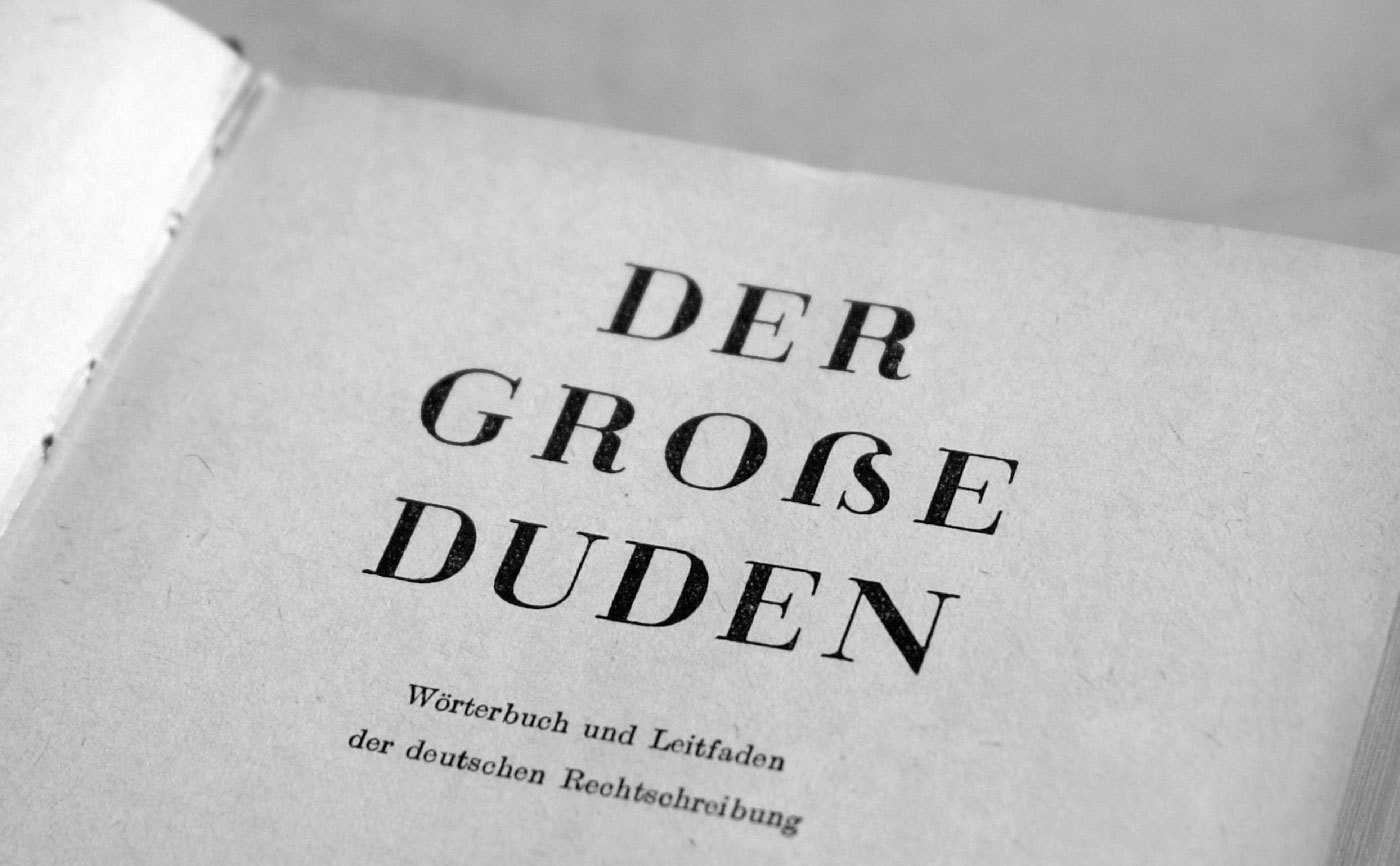
 The sharp s (or “Eszett” as it is called in German) is a letter of the alphabet in Germany and Austria. The Unicode casing rules state: “The German es-zed is special”. Indeed it is! Its (still not fully explained) history is full of twists and today’s understanding of this history is often full of misunderstandings. The origins of this character won’t be the discussed in detail in this article. Instead I will focus on the stylistic options which have resulted from the recent history. Sharp s variations for an alphabet in a lettering/calligraphy book from the 1930s by Willy Schumann Today there are two standard models for the design of the ß character. They are explained at first and are recommendable for most of today’s typefaces. 1. The ſs Ligature Design This design is both very old and rather new at the same time. It was used for centuries across Europe, especially in cursive writing, either as a purely stylistic choice or in accordance with a typesetting practice which avoided a long s as the end of words and therefore displayed a double s (ſſ) as ſs, either visually connected or not. ſs ligatures from Giovanbattista Palatino, from a 1578 compendium Since this design in its connected form is so visually similar to the typical modern German ß, it is often mistaken as the actual origin of the German character. But using this design for German texts is a rather new practice, which only became typical since around the middle of the 20th century. At that time, the roman and italic type styles of the Latin script replaced blackletter and Kurrent for German texts and with that, the influence of blackletter on the design of German typefaces started to vanish. Typical German blackletter ligatures (such as ch, ck, tz) came out of use and the understanding of the ß character shifted slowly. In caps-only typesetting the ß would be set as SZ in the beginning of the 20th century, but later SS became more common and finally the only correct spelling—until the introduction of the capital sharp s. Without the influence of blackletter, a German alphabet in the roman type style was now again more clearly based on designs from the time of Classicism and Renaissance and the historic ſs ligature became a perfect fit for the German ß—both in its design and the understanding of the character. Using this ligature design is the typical choice for so-called humanistic typefaces, i.e. designs which have their roots in the traditional book typefaces of the Renaissance. Both serif and sans serif typefaces can use this design model of the sharp s character. The ſs ligature design in Optima and Syntax Designing the ß in this style is rather simple, since it really is just ſ and s connected with an arc. The connection however is mandatory today. While an unconnected design is a historic variation, it won’t be accepted by today’s readers. The upper counter area is ofter narrower than the lower counter area, as it can be seen in the examples above. But there are also typefaces with a more prominent upper counter area, especially in italic styles. The sharp s in Sabon The arc and the s shape usually connect as one continuous curve, but there are a few typefaces which stress the different letter parts more clearly by making an abrupt change of direction. This can also work fine. But just to be clear: German readers without a background in typography see the ß as one character. Stressing ſ and s as individual parts of that design is neither expected nor necessarily helpful. Just as a W exposing its origin as ligature of two V is a possibility, but not necessarily helpful. The sharp s in Utopia and Calibri The ſ in its upright version might have a horizontal stroke on the left side and the ß then gets this stroke as well. This is a traditional design feature, but not really required. In my opinion, it only supports the confusion of ſ and f and therefore the horizontal stroke might also be omitted for ſ and ß in modern typefaces. Either way, ſ and ß should always follow the same principles. And speaking of the long s: It will usually have a descender in the italic design, but not in the roman version. The same is true for the sharp s. Upright and cursive styles of Tierra Nueva. 2. The Sulzbach Design As already mentioned, German was mostly set in blackletter (or written in Kurrent) until the middle of the 20th century and the sharp s as German character was established and mandatory in these type and writing styles. When German was written or set in the roman type style, a counterpart for the blackletter ß wasn’t available for a long time. As a result we can find different alternative spellings until the end of the 19th century. For example: a word like “groß” (big) in blackletter could appear as gross, groſs or grosz in roman typefaces. German book from 1795 in a roman typeface (Prillwitz Antiqua) using ſs where a blackletter text would always use ß. Around 1900 an official German orthography was established and a committee of type founders and printers met to define rules regarding the design and use of German characters like ß, ö, ä, ü in upper and lower case. At that time, typesetting and writing German in the roman style had already gained popularity and there was a need to find solutions and regulations regarding the different practices used for blackletter and non-blackletter typesetting. Some differences were kept, some things were unified. The ſ character was kept for blackletter, but dropped for setting German in roman and italic typefaces. The ß on the other was understood as a character of its own, which had become so important, that it was decided to add it to all typefaces, not just blackletter ones as before. All German type foundries should add it to their roman and italic designs. The design proposal that was chosen had similarities with an unusual letter used in the 17th century by the printer Abraham Lichtenthaler in the city of Sulzbach and is therefore now known as “Sulzbacher Form” (Sulzbach design). Sharp s in the Sulzbach design added to Walbaum Antiqua in the 20th century. In the time of Justus Erich Walbaum such a roman typeface had no sharp s. The new design doesn’t include a clear s or z shape, but consists of a long s at the left side and two connected arcs on the right side. As a result, the letter often looks like an uppercase B to people not familiar with German. This design was applied to many German non-blackletter typefaces after 1903, including the traditional old-style and modern typefaces. It remains in use until today, but mostly for more geometric/constructed typefaces, where the simplicity of the two arcs works better than the flowing connection of the upper arc of the long s with a lowercase s. Sharp s in Futura The Sulzbach design can more easily use an upper counter area that is similar in size and as width as the lower counter area. A tear-shaped or ball-shaped terminal can be used for serif designs. The connection of the two arcs in the middle should reach to the left as far as necessary, to make the character legible, but not so far as to suggest a connection with the stem – after all, it is not a B. And of course the aperture at the bottom should not be closed. Sharp S with teardrop terminal in this version of Bodoni The Sulzbach design is also the standard model for German handwriting. It will usually be written with a descender and fonts might replicate this. Sharp s in German in the historic Kurrent handwriting Handwritten sharp s FF Schulschrift The Schulbuch typeface is aimed at children learning to read and uses the descender of the handwritten sharp s. The two models explained above should suffice to design a proper ß for almost all roman and italic typefaces, but there are more variations in existence. For the sake of completeness they are shown below. They should only be used where appropriate. An unusual design of the ß character can make a typeface unsuitable for setting German, especially when it is supposed to be used for copy texts. It’s often better to include uncommon/historic designs as stylistic alternates and put a standard ß in the default slot for this character (U+00DF). The beautiful sharp s in the metal version of Bernhard Schönschrift (1925) The unusual sharp s in Ratio-Latein (1923) Historic Variation: The “Blackletter ß” With German blackletter and non-blackletter typefaces being used side by side since the end of the 19th century, type designers also started to mix elements of the two. The sharp s in blackletter Blackletter fonts became more simplified and the letter skeletons of the early blackletter fonts became more popular, which were still closer to the design of the roman letter style. And roman typefaces from German foundries started to “look more German” in the first half of the 20th century. The mandatory ligatures of blackletter typesetting were often added to the character set of the roman typefaces and the design of individual letters was also borrowed from blackletter typefaces. A typical case for that is the sharp s character. Many, but not all typefaces used the recommended Sulzbach design. A design as a ligature of a long s with something like a 3 with a flat top resembled the typical look of a blackletter ß and also became a popular choice until the middle of the 20th century. The blackletter-inspired sharp s in Erbar Meister-Kursiv by Herbert Thannhaeuser, 1952 Technotyp by Herbert Thannhaeuser, 1948 Not using a descender is also possible for this kind of sharp s Because the “blackletter sharp s” in roman typefaces is typical for the first half of the 20th century, its use can still evoke a connection with that time. It appears—as default or stylistic alternative—in a few modern typefaces as well (e.g. FF Kava, Verlag, Metric, DIN Next Slab) and is legible within a word context, but it is not something that works for every font or use case. The examples shown above represent the most typical design of this “blackletter sharp s” approach. But as a variation, some typefaces also use a design that looks like a 3 with two arcs or a z design on the right side of the ligature. These designs might not work so well for today’s readers. The sharp s in Ehmcke Antiqua (1909), which is also in the digital versions named Carlton. The URW++ version of Bodoni While used occasionally in the 20th century—a literal Eszett (“sz”) ligature is not recommendable today. Historic Variation: The Connected Script ſs Ligature I already explained the ligature of a long s and a round s where the top part of the long s is used to make the connection to the round s. But in connected cursive writing there is also a way of writing a regular long s and then making a connection from the bottom, usually as extension of a descender loop in the long s. This style can also be found across Europe and across different languages over several centuries. It usually just represents a double s, but in a German text that isn’t written with a long s as individual character, this design represents the sharp s, as seen in the following examples. From an original type specimen booklet of Justus Erich Walbaum from the early 19th century. “daß” and “bloß” are typeset as “daſs” and “bloſs”. This design can be found in use until the 20th century, but it not common anymore and will probably confuse many of today’s readers of German. An undated German school poster shows the connected script ſs ligature as alternative to the regular ß in the Sulzbach design.
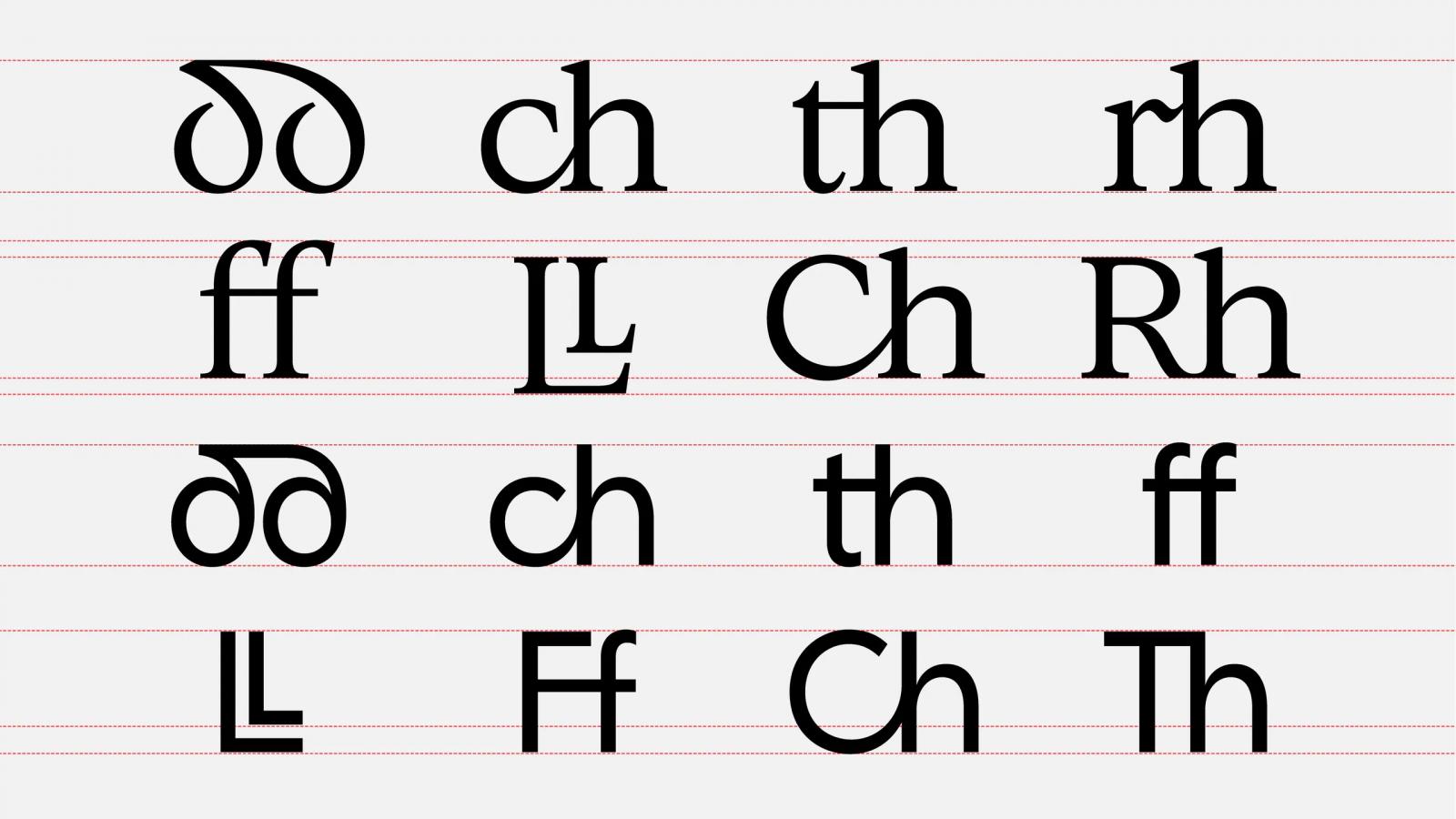
 -
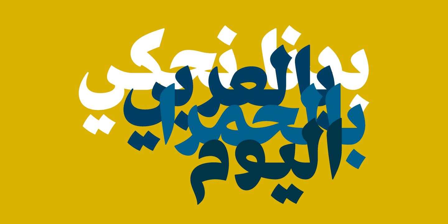 A new collection of 7 Arabic typefaces from Nadine Chahine’s ArabicType, accompanied by a virtual exhibition.
-
- 1
-
-
- arabic
- type design
- (and 4 more)
-

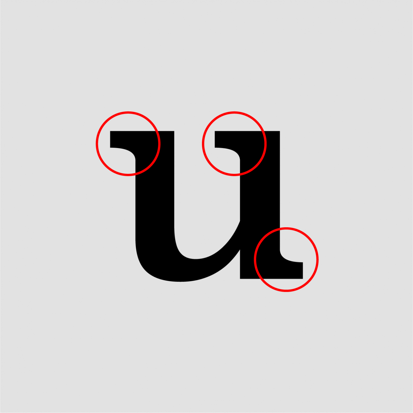
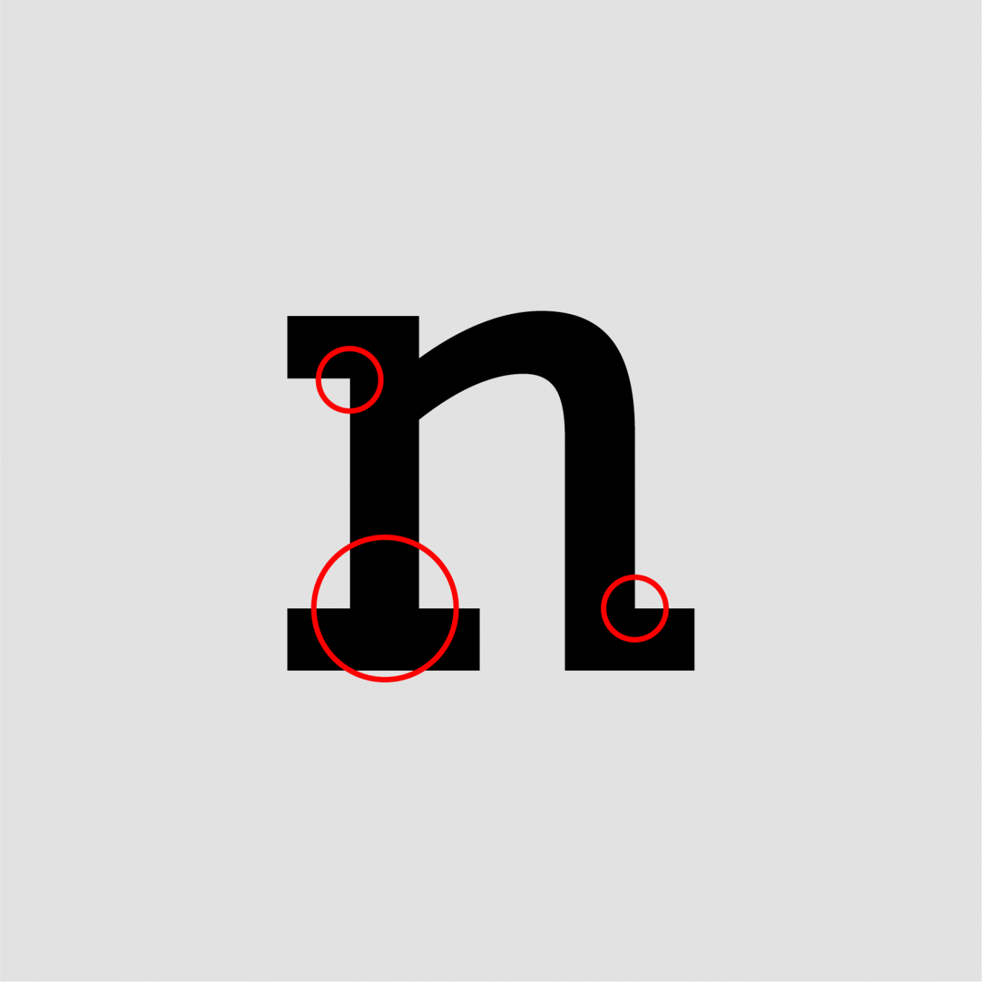
Type Anatomy: Correct Term for Small Serif-Like Hairlines in Incised Lettering
Member rke… posted a topic in Talk
Hi Typefaces that have their roots in incised or engraved lettering often have small thin serif like strokes at the end of the terminal. For example Copperplate by Frederic Goudy (see image) and Sophia by Matthew Carter have such hairline terminals. What is the correct term in English language for these terminals? Thanks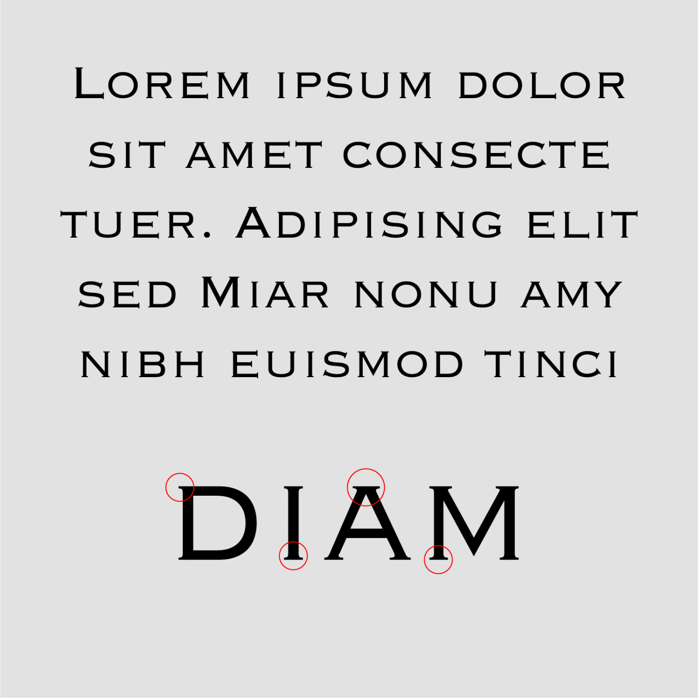
-
Hi I'm reading about serifs and how they are connected to the stem. I come across the term pairs bracketed / unbracketed and adnate / abrupt. Are bracketed serifs the same as adnate serifs, or vice versa, are unbracketed serifs the same as an abrupt ones? Are these term pairs interchangeable? Thanks Bracketed / Adnate Unbracketed / Abrupt
-
 “Typeland is an independent type design studio based in London. We offer retail fonts exclusively through our own website. We also develop custom fonts, and specialise in multi-script design and production.”
-
- 1
-
-
- type design
- typefaces
- (and 3 more)
-
 The art of designing typefaces.
 -
 “With a storied career spanning over 60 years and hundreds of original fonts that speak to the aesthetics of an era, type designer Georg Salden is one of the most significant and diverse type designers of our time. Despite much of his work having a lasting influence on type culture, Salden remains relatively unknown internationally – a fact which may be due to his independence as a designer, never having worked for large font foundries.” Now available on LudwigType.
-
- 1
-
-
- typefaces
- type design
- (and 1 more)
-
Quality type: how to spot fonts worth your money
Member Ric… posted a news entry in Typography Weekly #104
 “Graphic designers play a fundamental role in visual communication, whether in print or digital format. They sit between content and reader and, for better or worse, they shape the way the public interacts with information. So when graphic designers choose typefaces they have a responsibility to the reader that should be taken seriously.”
-
- 1
-
-
- type
- typography
- (and 3 more)
-
 On the design of MM Sans and MM Serif. “About typography, paleontology, evolutionism, fixism, interpolation and miscegenation. With Georges Cuvier, Jean-Baptiste de Lamarck, Charles Darwin, and FontLab Studio.” Thomas Huot-Marchand, 7 May 2020
 -
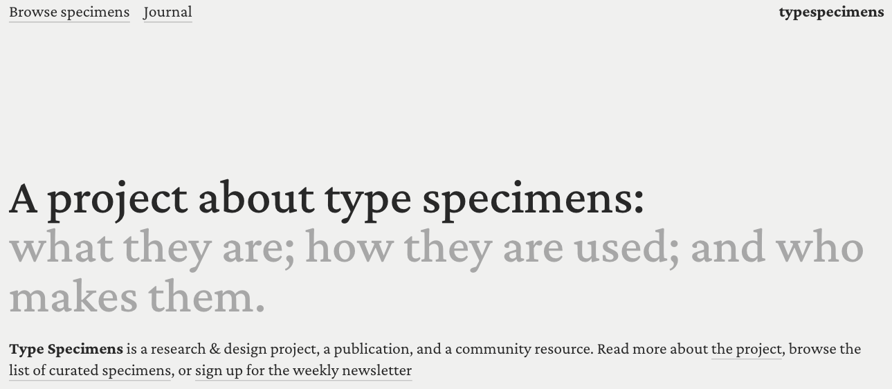 A curated list of digital specimens.
 -
 “A contemporary font family designed to represent Wales to the world [...]. Whilst the bespoke typefaces take cues from the Welsh typographical heritage, special care was taken not to wander into the territory of pastiche or parody. All three commissions were developed in close collaboration with the Colophon Foundry with additional consultancy from Joseph Burrin.”
 -
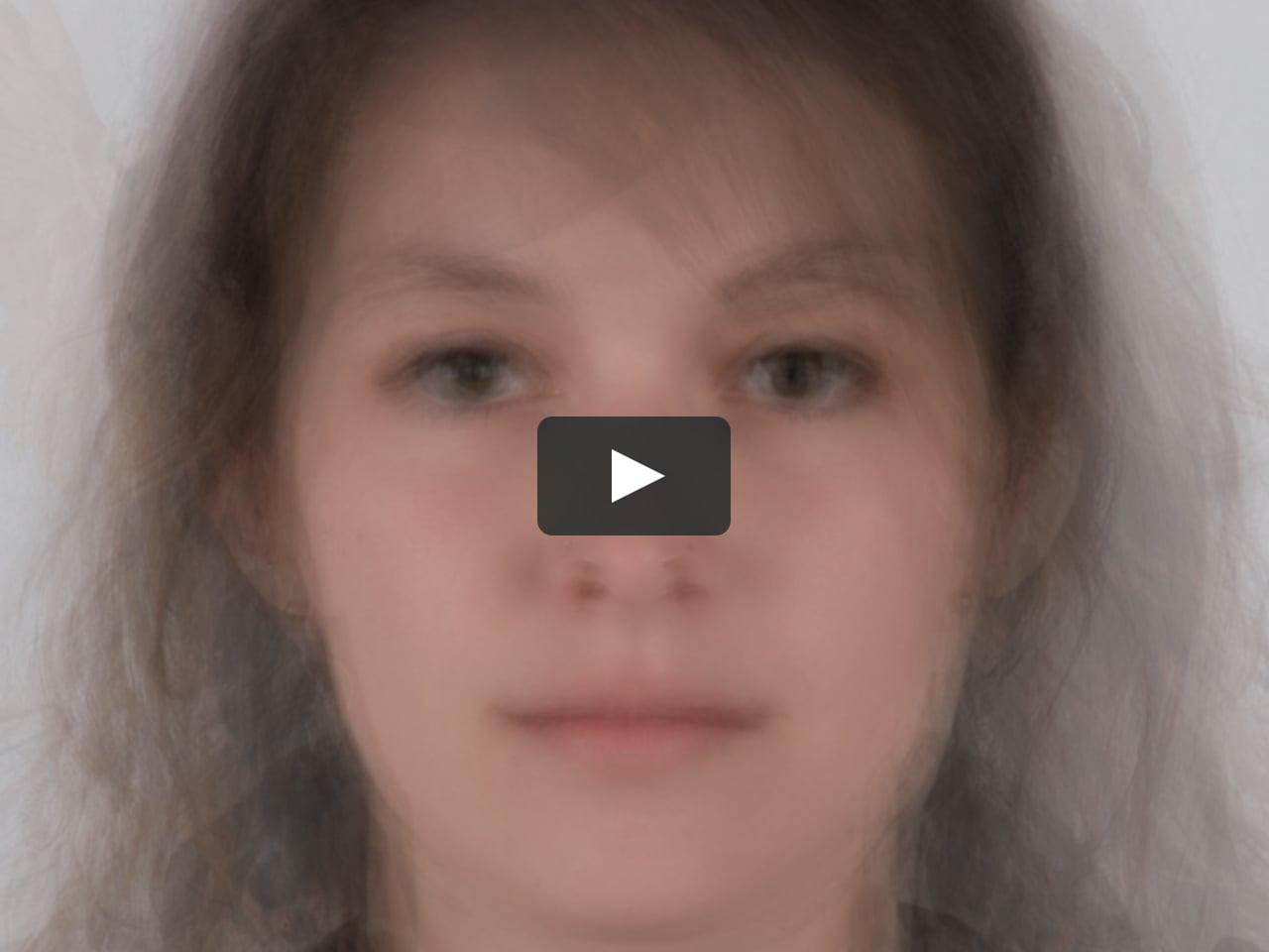
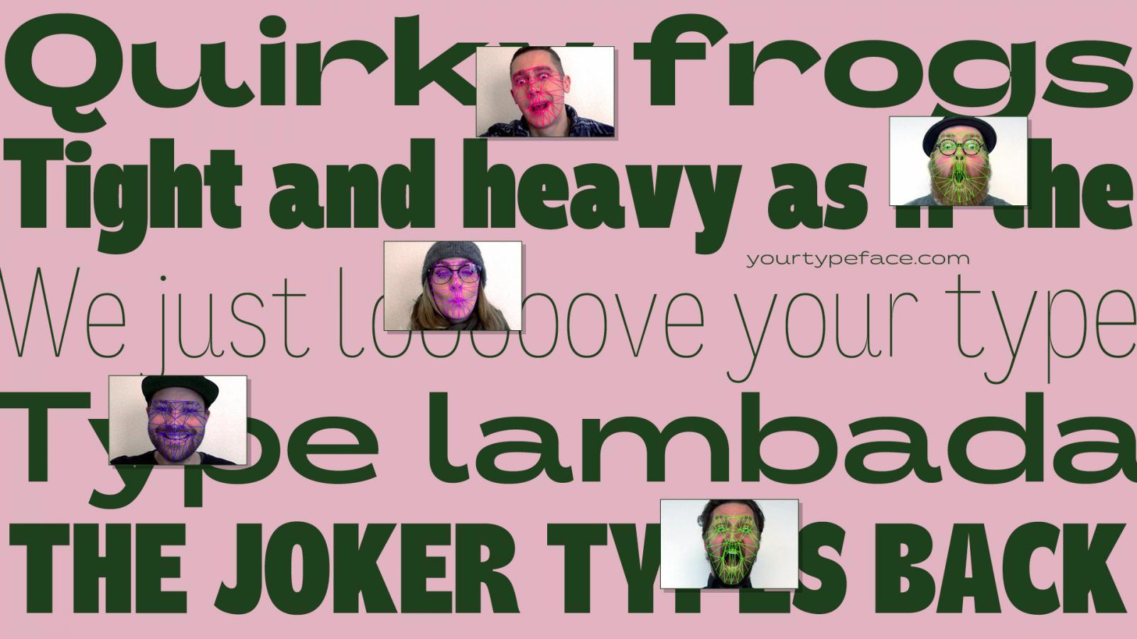 yourtypeface.com is a variable typeface experiment that enables you to design a typeface from the proportions and forced emotion of your face. Look surprised or uptight, yawn or smile, and let your face design your own typeface. Download it and use it freely for any project you’d like.
- 2 comments
-
- 1
-

-
- typeface
- typeface design
- (and 6 more)
-
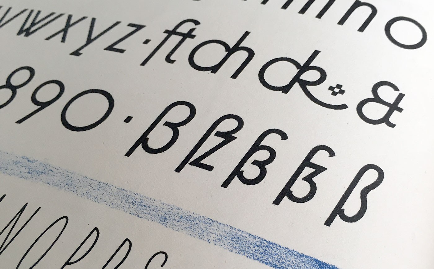
There's a lot of info online on how the long s (ſ) was used in past spelling, but not a lot about why it appears in the alternate forms it does, and what the expectations are today in modern type design if and when (rarely ever) its included or used. I've linked a few samples below, including ligatures ( long s+small roman s, which is often mistaken for the Esszett) for reference (nb. the normal ff ligature is included in comparison to the ſſ ligature). The alternation between Regular & Italic is of course the descender, which follows the same change as the lowercase 'f' between Regular & Italic. The inconsistent aspect which I'm highly curious about, and for which no apparent explanation is available to me, is the left-hand bar which appears on some typefaces, and not on others, or features only in either the Italic or Regular of the given type. What are your thoughts on these reasons? And on good design for the long s?
-
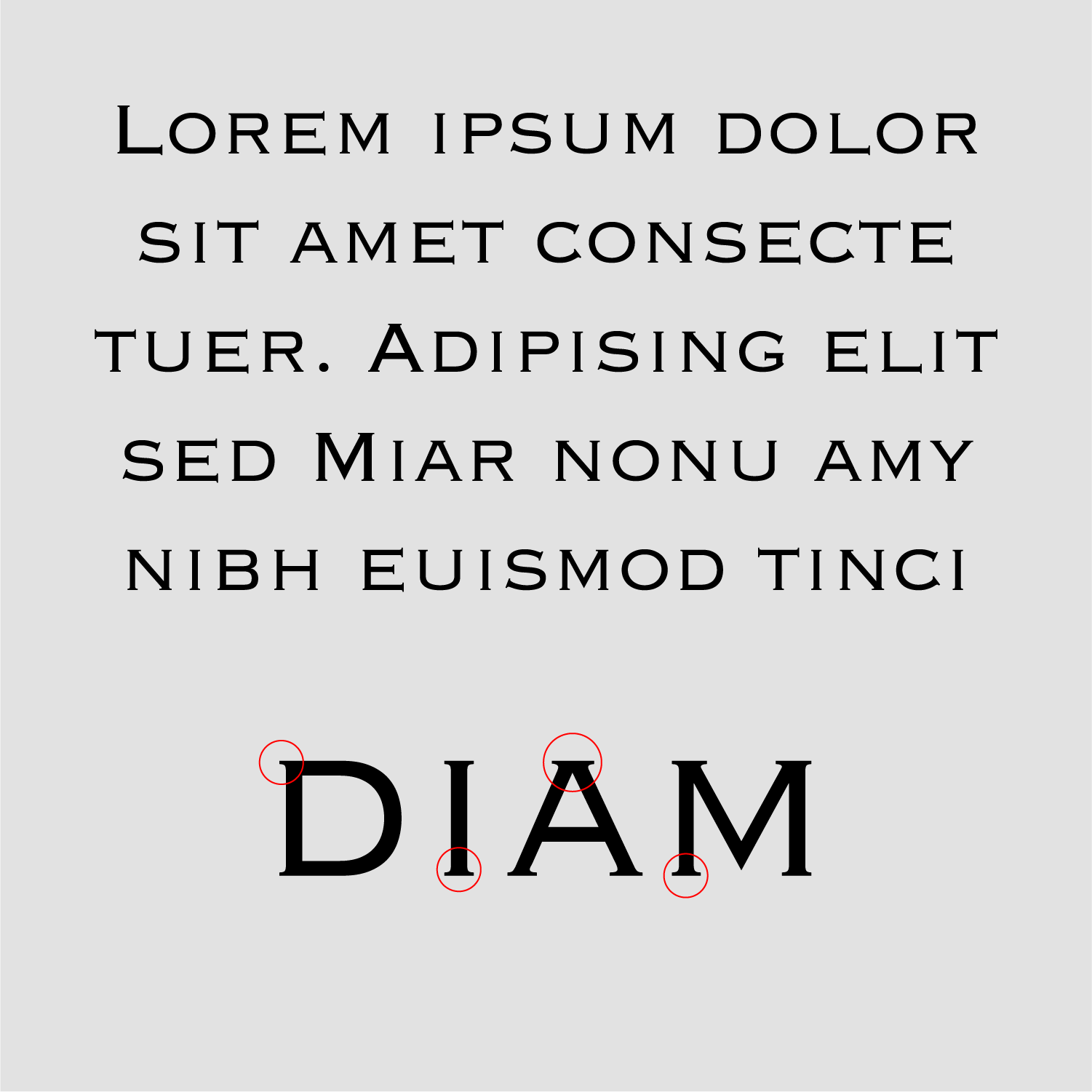
Capital Sharp S designs. The good, the bad and the ugly.
Ralf Herrmann posted a journal article in Journal
 Two years ago I wrote an article with suggestions on how to design a Capital Sharp S (ẞ). Now that over 600 new type families with support for this new character have been released, I thought it would be a good time to review, how the type designers have drawn their Capital Sharp S. At first, I present the designs I consider most successful, grouped by their design principle. There is a convention in German of naming different designs of the uppercase and lowercase Sharp S by certain cities and I am following this convention. Design “Dresden” with a an arc at the top left This is the design most typefaces use. It works like a capitalized form of the lowercase character (ß). But in contrast to the lowercase design it has a diagonal stroke at the top right in order to differentiate it from the letter B. Note how wide the character is in those examples. Designs that start from the lowercase ß can easily be too narrow, which might not be ideal among the other uppercase characters. Typeface shown above: Espinoza Nova, Henriette, Ernestine, Scotch Modern, Andron, Museo Slab Design “Dresden” with a corner at the top left In the sample shown above, the arc on the top left is derived from the lowercase letter ß. Some designers think, that such an arc doesn’t work well within the Latin uppercase letters. So, to avoid this “lowercase look”, one could draw the top left of the Capital Sharp S as a corner. This works especially well with more geometric typefaces. Typefaces shown above: Iwan Reschniev, Backstein, Hypatia Sans, LiebeRuth, Rooney Design “Leipzig” This design uses a clearly visible S as the right part of the Capital Sharp S. It works especially well with typefaces with a more calligraphic look. Very few typefaces use it, even though it is an interesting design that doesn’t cause any ambiguity problems. Typefaces shown here: FF Oneleigh, Numina, FF Fontesque Design “Zehlendorf” This is a new approach that was introduced by Martin Wenzel and Jürgen Huber within their design for the corporate typeface of the German government. They named it “Zehlendorfer Form” after the district in Berlin where their office is located. Its design falls right between “Dresdner Form” and “Leipziger Form”. It doesn’t use a diagonal stroke in the top right part, but a narrow S-like arc. The white-space and width of the character makes it very distinct. Its very legible and cannot be mistaken for a B. Conclusion Up to this point in time, the design model “Dresden” is clearly the most popular one for designing the Capital Sharp S. But I would be happy to see more of the design model “Leipzig” (third letter) and “Zehlendorf” (fourth letter) in the future. What not to do: A rounded top right segment Not all Capital Sharp S designs are convincing yet. The problem I have seen most is to stick too close to the lowercase design of ß and give the Capital Sharp S a rounded top right part. This results in something like an “ugly B”, but cannot be read easily as sharp S (ẞ). I suggest this simple test: First, cover the left side of the letter. Now check: can the remaining right side be read as a B? Then the design should be improved. What not to do: Using a double S design I have seen several typefaces which just put SS in the slot for Capital Sharp S. This is like putting two independent V in the slot for W. Yes, there might be a historic, typographic or orthographic connection, but it’s still wrong. The Unicode slot U+1E9E was created for the character Capital Sharp S. A W is not the same as VV and ẞ is not the same as SS. If you don’t like the idea of a Capital Sharp S, you better not use U+1E9E at all. But don’t put a double S in it. In the same vein, don’t try to create an uppercase SS ligature as Capital Sharp S. The whole point of the Capital sharp S is, that ß and ss represent a different pronunciation nowadays and without ẞ this difference cannot be maintained in uppercase-only typesetting. So an SS ligature doesn’t solve anything. It is just read as SS and not as a representation of the sharp S character.
- 4 comments
-
- 1
-
-
- type design
- capital sharp s
- (and 3 more)
-
 The letter ß came into existence in German blackletter writing, where it didn’t require an uppercase counterpart, because it stood never at the beginning of words and blackletter was never set in uppercase only. But since German is set in Roman script, there is an obvious gap in the German alphabet. Proposals to fill this gap were made since the 19th century. Here are designs that were discussed at the beginning of the 20th century: A commission of German publishers, printers and type foundries introduced the lowercase ß when German was set in Roman script, but the introduction of a capital ß was postponed because the commission could not agree on a design at this point. This comes as no surprise, because it had to be created from scratch and there was nothing to base the design on and the German readers where not used to see such a new character in their alphabet. New proposals appeared in the 1950s in the German magazine Papier und Druck: Even though the capital ß never became an official part of the German orthography during the 20th century some type foundries included it in their alphabets and it appeared occasionally in print. The Capital Sharp S today Since 2008 the capital ß is an official part of Unicode and it is now included in more and more typefaces. But type designers are unsure about how to draw this character. Here are some thoughts from a German type designer and reader on the different approaches … The Ligature Approach Not true! In German blackletter writing ß was understood as combination of long s (ſ) and z. We still call this character “Eszett” in German which just means “SZ”. So that’s the reason why many of the proposal shown above are drawn as an uppercase SZ ligature. And SZ was also the recommended replacement for ß in uppercase writing in the beginning of the 20th century. The dictionaries called this an interims solution to be used until a proper capital sharp S has been introduced. Over time, SS also became another replacement for ß in uppercase and by the end of the 20th century the original replacement with SZ was dropped and SS remained the only official writing according to the German orthography. Type designers are drawn to this ligature approach for the design of the uppercase ß, because it sounds like the most logical thing to do in terms of the history of the lowercase character. But I don’t think so. First of all: the history of the letter ß has yet to be fully explained. At this point we cannot be sure that it has definitely derived from a ſs or ſz ligature. And creating a new character based on assumptions alone, would not be a good idea. Secondly, the knowledge that ß has probably derived from a ligature is purely limited to typographers and graphic designers. Young German readers today don’t know a long s anymore and they don’t see the character ß as a ligature either. To them, it’s just a letter of the alphabet, just like any other letter. So they don’t expect an uppercase ß to look like a ligature. Letters are just conventions among the people who use them. They are “correct” when they are accepted by the users of this language—not because they are correct in a certain historical sense. And this is true for all Latin letters. We don’t draw an A so it looks like a Mediterranean ox head—we draw it the way, people are used to. In the same way, a capital ß should be designed according to the user’s expectations and not according to a possible, but still unclear history of the letter ß. It needs to work as a tool of communication and that is all that matters. A ligature approach using S and Z would certainly be possible, just like Æ and Œ are part of the Latin script. But I don’t think it would be desirable. It’s a forced design that doesn’t develop naturally. Even though some of the SZ ligature designs presented above look pretty nice, they feel more like stylistic ligatures for display use and I don’t see them as something Germans would want to use on a regular basis or for example in fine print or handwriting. Another popular idea among type designers is a design based on two S (see image above). But this is not an option at all! The whole point of having ß in the German alphabet today, is that it represents a different pronunciation than ss. An uppercase SS ligature will be understood as a stylistic ligature as you can see in this example: It represents “Professor” with a short vowel in front of the SS. So we can’t use a SS ligature as an uppercase representation of ß. The diacritical mark approach Diacritical marks are used frequently in languages which are written in the Latin script and in the old proposals for the capital ß several solutions are presented that use an S as the base glyph and added diacritical marks above, below or inside the letter. But a diacritical mark that is just used in the uppercase version and has a totally different counterpart in lowercase writing would be a very strange thing. German readers would only see it as a strange S, not as a capital ß and such a solution has little chance of getting accepted. The arbitrary shape approach Instead of using ligatures or diacritical marks the uppercase ß could also be based on arbitrary shapes. We could create a totally new character that would be in harmony with the design principles of the Latin script or we could borrow a design from a different language that isn’t used in German. But again: such solutions have little chance of getting accepted. The uppercase ß will hopefully be used more and more over the next couple of years and maybe even become an official norm. But if someone just uses an arbitrary shape today, it is very unlikely that Germans would agree to this design. The capitalized Eszett If you look at the capital sharp S designs that were introduced in the last couple of years, it is pretty obvious which approach is the most promising one. It is to start from the shape of the lowercase ß and turn it into a design that fits the uppercase letter. And that’s not a surprise: people in Germany and Austria often deal with the gap in their alphabet by simply using the lowercase ß inside uppercase writing. You can see that in Germany every day—from handwritten notes to TV ads. But the lowercase ß doesn’t belong into uppercase writing and the simple and obvious solution is to equip the German users with an uppercase Eszett that can easily be used and read, but looks also typographically correct in uppercase writing. And this is the solution I am also suggesting. The German readers don’t need to learn something new. They understand this letter instantly and the use of it solves all the common problems that result from the gap in the German alphabet. So how should this capitalized ß look like? There are now over a 100 designs done in this fashion and some work better than others. Here are a the two basic principles to design a capitalized ß: The left one is the most common design. The defining characteristics are the aperture on the bottom and the diagonal stroke on the top right side. The top left is usually done as a curve, but there are also designs where this part has been drawn as a corner or even with a serif. It also doesn’t hurt to make the capital ß wider than letters like B, but that is not a real requirement. The version on the right might fit in better with more calligraphic typefaces. The stem can even get a descender in italic version. Here are some examples of this approach which I consider successful: Note: The top right part is what makes this character unique! So make sure, you design this part in a unique way. The following example does not work for me … I just read it as a B, even though it has an aperture at the bottom. The top right part is what matters and it should never be rounded like a B. Make sure this curve is clearly broken by a diagonal stroke or even an inward S-like shape. So draw it either like this … or like this …
- 1 comment
-
- 1
-
-
- type design
- capital sharp s
- (and 3 more)
-
Hello everyone, I have been designing a custom typeface that I intend to use for a branding. The typeface would be used only internally and would not be sold or distributed in any way. The goal is to have letters (that are not too obvious) from solid filled basic geometric shapes like circles, triangles, rectangles etc. I only need capital letters but then I thought numbers might come handy. Overall I am happy with the look of the letters but the numbers can be improved as some look out of place. Some feedback would be really appreciated. I have attached Illustrator screen grab. I intend to import the letters in Glyphs and tweak them there. This is my first attempt to create type in some form... In the past, I have created custom letters for branding but never full alphabet. P.S. I am not sure why I am not allowed to create posts in the type design forum even though I am a member. Therefore I will post here and the admins can move it in the right section.
-
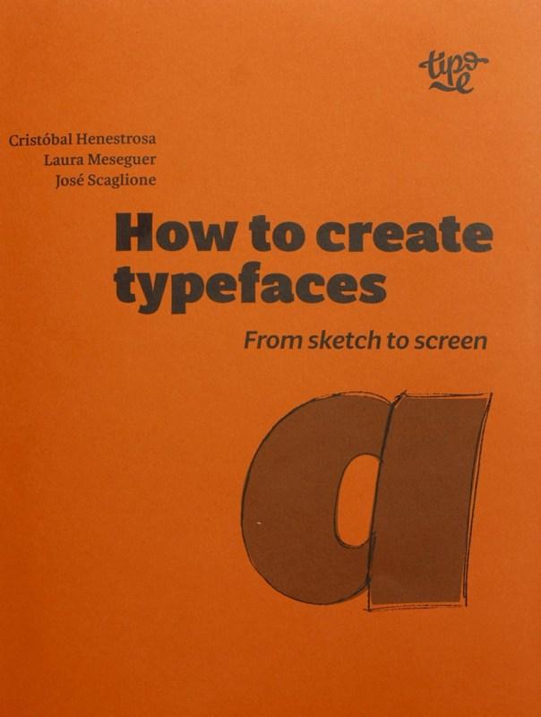 How are typefaces designed? What is the process? Which characters are essential? What is the difference between roman, italic and cursive? What is OpenType? In How to create typefaces Cristóbal Henestrosa, Laura Meseguer and José Scaglione answer these and many other questions in a straightforward and direct way. This publication, aimed at new and novice type designers as well as those trained in the field, unravels the fascinating task of creating a font, from sketch to screen. Content Foreword by Gerry Leonidas Motives The thinking that happens before even starting the process of creating a new typeface. Writing, calligraphy, drawing and type designs On the similarities and differences between methods of writing, calligraphy, drawing, and type design; shared characteristics, common elements and considerations when sketching typographical characters. Processes and methods On approaches to sketching, proportion and structure, consistency, optical correction, planning and workflow. Digitisation On digitising the sketches, principles of drawing with digital outlines, fundamental and complementary characters, sequences and derivations. Spacing On basic methods to control and adjust spacing: sidebearings and kerning, the importance of counterform, numerals and vertical spaces. Typographic programme On series design and family variations – italics, weight and proportional variants, optical sizing, superfamilies and other ways of extending a typeface family. Typography as software On the role of digital technology in typeface design, from the basics of formatting to the possibilities of Open Type features and Unicode. Distribution On legal issues and marketing, plagiarism and piracy, distribution models, custom typeface design and costings. 9 Perspective Reflections of each author on their personal experiences of the process of type design. Glossary and Bibliography Technical data Title: How to create typefaces. From sketch to screen Authors: Cristóbal Henestrosa, Laura Meseguer y José Scaglione Translation: Christopher Burke and Patricia Córdoba Publisher: Tipo e 152 pages 123 illustrations ISBN 978-84-938654-3-6 170 mm × 210 mm Available here
 -
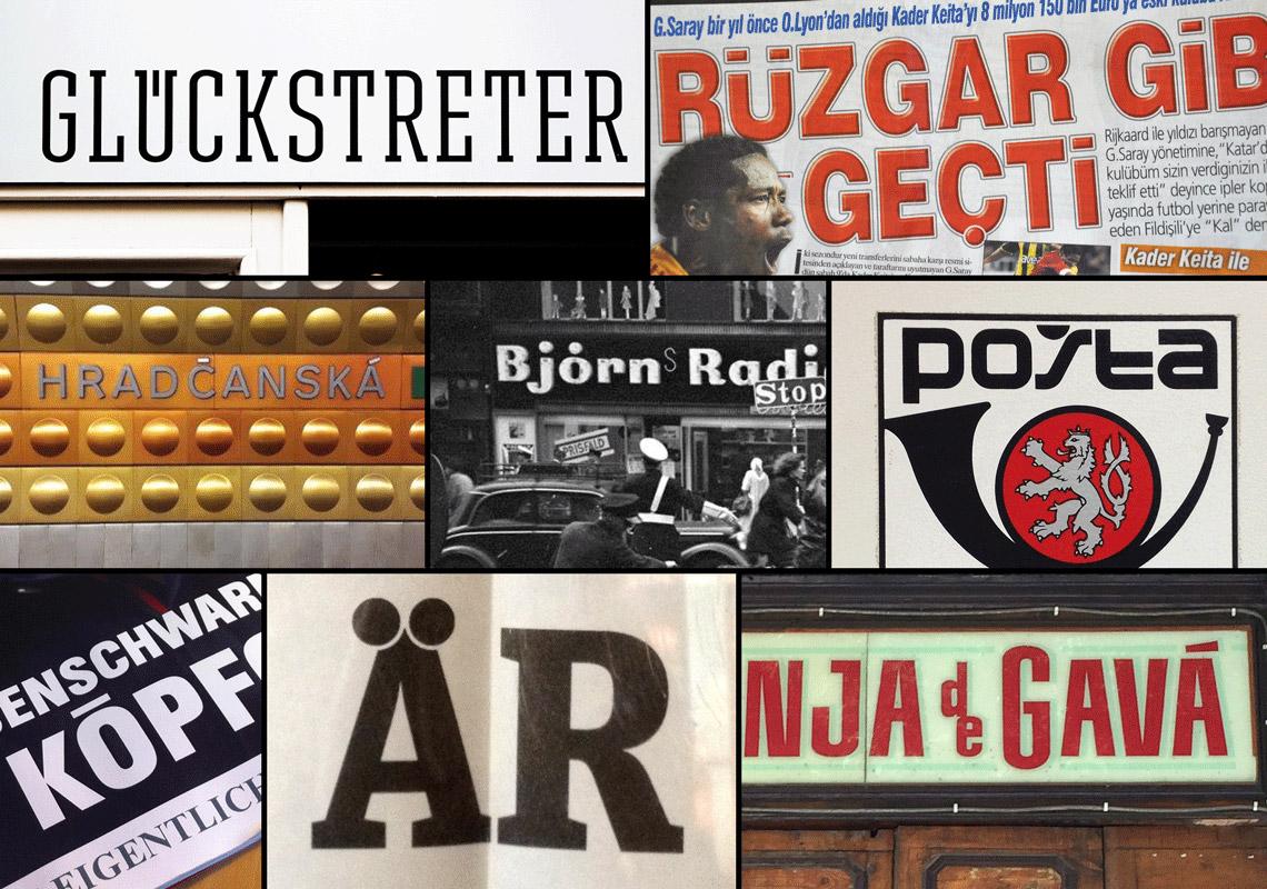
 The Insects Project is a product of a collaborative research aimed at sharing knowledge about Central European typography and promoting design that is sensitive to the needs of all those who are unlucky enough to be native users of Czech, Hungarian, Polish and Slovak. Perhaps few users of “diacriticless” languages (such as e.g. English) realise how lucky they are to be able to choose from literally thousands of typefaces. Central Europeans, on the other hand, are nowhere near as spoiled for choice, because many fonts available on the market still seem to overlook the specific needs of their knotty languages. This book contains four articles by invited experts. Each of them presents a historical overview and a guide to good diacritic design practices in particular languages including examples of the most common design problems that were prepared using font samples from young Czech, Polish and Slovak typedesigners. The book can be downloaded for free at: http://theinsectsproject.eu