Search the Community
Showing results for tags 'talk'.
-
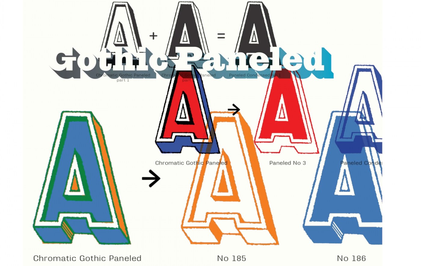
The proliferation of 19th (and 20th) century wood type and its impact on typographic norms, with David Shields Throughout the nineteenth (and early twentieth) century the proliferation of wood type played an integral role in the creation of American visual culture. With the introduction in 1827 of innovative production techniques, affording low cost and the proliferation of a wide range of styles and sizes, wood type gave tremendous impetus to job printing and mass advertising. David Shields is an Associate Professor and Chair of the Department of Graphic Design at Virginia Commonwealth University in Richmond. David is currently focusing his research on 19th century typographic form and visual culture arising from investigations of Rob Roy Kelly’s American Wood Type Collection. He keeps a slow blog of his research at Wood Type Research.
-
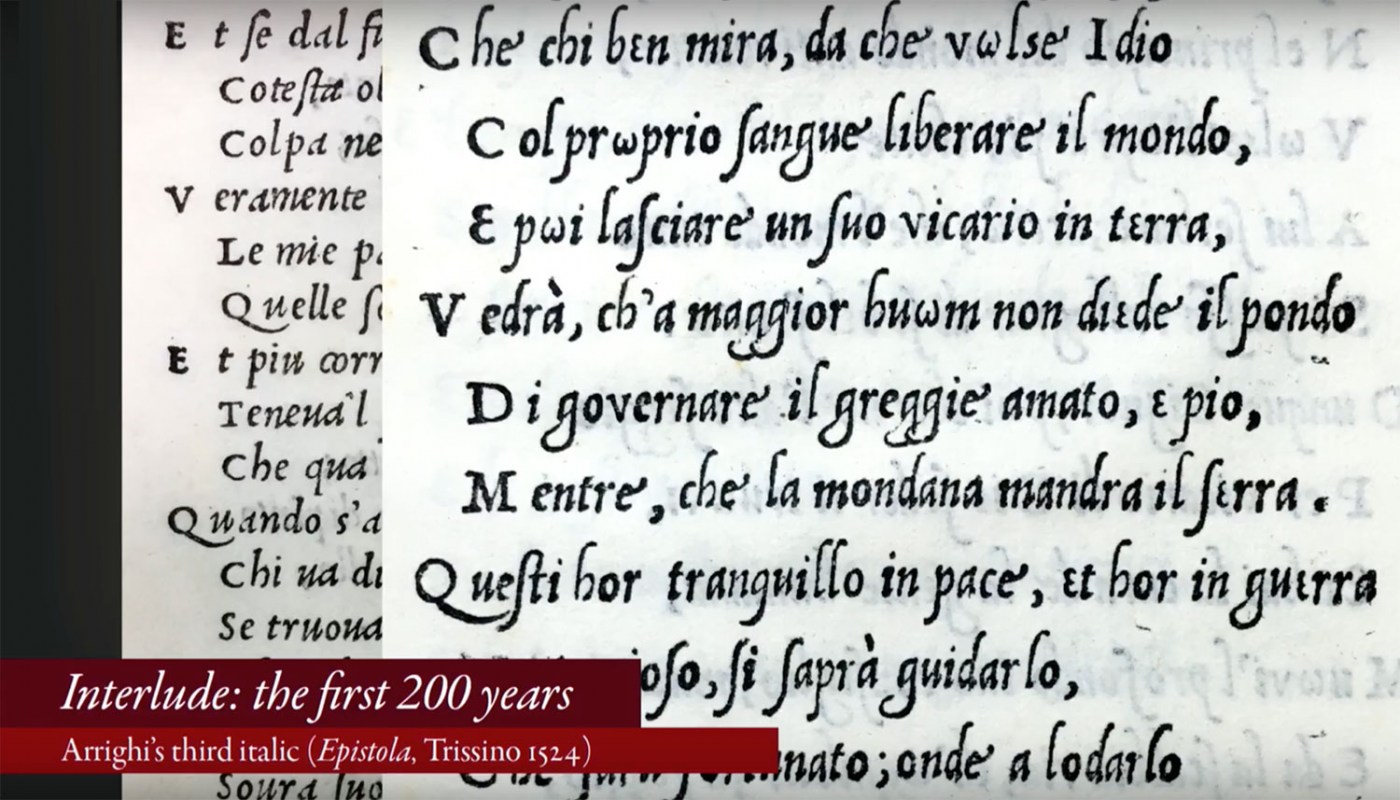
Soon after the invention of upright roman type, an interloper entered the arena—italic. Rather than displacing roman, it wound its way into our typographic culture, becoming an essential part of languages that use the Latin script. Our written communication depends on it, yet in all the books that have been written about type design there are often only a handful of pages about this essential style. This talk will explore the roles italic plays in our typographic culture: as a language feature, a typographic element, a historical marker, a design object, and a business product. These roles have shaped the design of italic and inspired innovation and creativity. But they have also often forced italic into a subservient position. What is the essence of italic? Has that identity survived its use as a secondary complement to roman? Is it possible that this servitude has given italic the freedom to flourish? This is the story of how italic established itself as part of our typographic language, was transformed as it was relegated to secondary roles, and yet remains a strong and essential part of typeface design.
-
Johannes Bergerhausen at TEDxVienna Prof. Johannes Bergerhausen born 1965 in Bonn, Germany, studied Communication Design at the University of Applied Sciences in Düsseldorf. From 1993 to 2000, he lived and worked as a designer in Paris. First he collaborated with the Founders of Grapus, Gérard Paris-Clavel and Pierre Bernard, then he founded his own office. In 1998 he was awarded a grant from the French Centre National des Arts Plastiques for a typographic research project on the ASCII-Code. He returned to Germany in 2000 and, since 2002, is Professor of Typography and Book Design at the University of Applied Sciences in Mainz. Lectures in Amiens, Beirut, Berlin, Brussels, Dubai, Frankfurt, London, Malta, Paris, Prague, Rotterdam, San Francisco, Sofia, Weimar. Since 2004, he is working on the decodeunicode.org project, supported by the German Federal Ministry of Education and Research, which went online in 2005. Semester of research 2007 in Paris. He received many design awards like RedDot, Type Directors Club of New York, ADC, iF, Best German Books and more. In 2011, together with Siri Poarangan, he published »decodeunicode — Die Schriftzeichen der Welt«, a repertoire of the world's 109,242 digital characters. In 2012, he was awarded with the Designpreis in Gold of the Federal Republic of Germany. He is currently working on a digital cuneiform font.
-
- unicode
- decodeunicode
-
(and 2 more)
Tagged with:
-
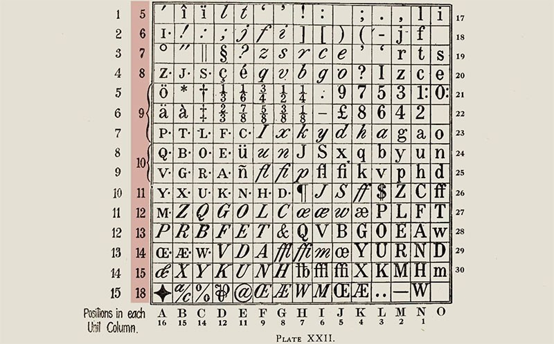
Many typefaces available to us today are not stand-alone designs, but were introduced as inventive solutions to very specific problems of type manufacture, typesetting restrictions, or printing issues. As those designs become part of the overall typographic landscape, it’s easy to forget how closely connected they are to the original problem, or how much potential there may be to explore solutions to a new problem. Looking at some now-classic typefaces, we’ll see how they turned out the way they did, and hopefully encourage some fresh responses to newer challenges. Dan Rhatigan worked as a designer and typographer for 15 years in Boston and New York before moving to England in 2006 for graduate school at the University of Reading. After receiving his MA in Typeface Design, he spent 7 seven years working with Monotype as researcher, type designer, and eventually Type Director. He now lives in New York City again, where he works as an independent type designer and consultant.
-
- talk
- type design
-
(and 5 more)
Tagged with:
-
-
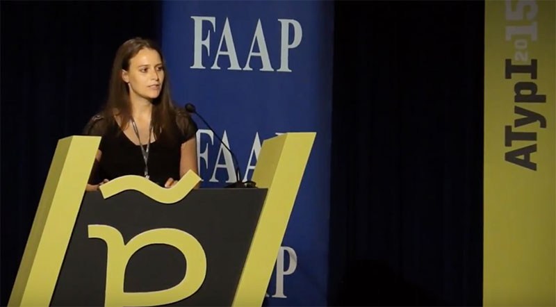
Ann Bessemans’ talk from ATypI 2015 in São Paulo These days rhythm within typefaces is treated very homogenously. The perfect example is the currently dominant early 21th century letter model where all the letters within a typeface get roughly the same width. But how does this development affect reading comfort? Currently, there is no closed definition of reading comfort and how to test it (quantitatively) in the best possible way. Tracy (1986) describes readability in terms of quality of visual comfort, as an important requirement in the comprehension of long stretches of text without experiencing physical complaints. There is strong evidence that visual comfort has to do with the rhythm of the typeface. Studies show that stripe patterns impede the reading process due to visual discomfort. Visual discomfort refers to the adverse effects of viewing certain kind of visual patterns, like text. This lecture will offer new insights into the way how to define reading comfort and why measuring visual comfort, independent from reading performance, seems to be innovative.
-
- 1
-

-
- legibility
- reading
-
(and 3 more)
Tagged with:


