Search the Community
Showing results for tags 'typesetting'.
-
The Printing Trade section of the “Museum der Arbeit” is located on the first floor; this section looks at letterpress printing , the gradual mechanisation of the industry and its end. The exhibition focuses on the evolution of printing with movable type, a process that is over five hundred years old. To illustrate these complex processes and make them understandable, the museum has chosen three different approaches, which are presented here in three different rooms: workshops where various methods of typesetting and printing are presented; an educational room where visitors can try printing themselves; and, in the central aisle of the factory building, an exhibition of documents and artifacts that provide insight into the trade. The starting point for this section is a montage of images and texts which shows what printing with movable type involves: the production of individual letters, typesetting, printing, and, finally, book binding. The display also provides an overview of the history of book printing since 1440, with the gradual mechanisation stages that took place. The era of manual work in book printing from 1440 to 1800 is shown with a casting instrument used for making type, a type shelf with a type case and a very special and rare item: a wooden screw press dating back to around 1780. These are items that dominated the printing industry for almost 350 years. The first decisive change in printing took place in 1814 with the introduction of the high-speed press, a device that gradually took on in Germany around 1840. In the museum, it is represented by a machine made by Bohn & Herber in 1890, which demonstrates which tasks the press performed automatically, and those which still had to be performed by hand. Setting up the forme, inserting and removing the paper, and monitoring the machine all remained tasks that were performed manually by workers. The incredible speed at which they had to work is specifically illustrated by the job of feeding the paper into the press, with up to 2,200 sheets needed per hour; this can be fully appreciated when seeing the Autodux press (built in 1962), which has a folding sheet-feeder, in operation. Feeding the paper into the press was traditionally a woman’s job in the printing trade, illustrating the clear gender divide that dominated in the workplace. The centrepiece in this section is a Columbia press, a cast-iron, hand press where the handle and the counterweights helped to increase the printing pressure. It was built around the same time as the first high-speed presses and is therefore more of a niche product. It was probably preserved on account of its magnificent appearance: it is lavishly decorated with eagles, cornucopias, figures of Minerva, dolphins and caducei, i.e. all motifs from classic literature that symbolised the rich tradition of the book printer which flourished at the same time as high-speed presses appeared on the market and started posing a threat to their very existence. This, and other responses to change, can be traced in the documentation display. The museum also has a separate pressroom which is equipped with a Heidelberg rotary press and a Heidelberg platen press. As printing became increasingly mechanised, engineers started looking at ways to automate typesetting, and the first successful mechanical compositors were introduced around 1890. The museum has three different types: a typograph which sets an entire line of type in one go; a monotype, which set individual letters; and the most widely used version, the linotype machine. All of these typesetting machines are in working order. The response of the manual typesetters to these new machines, which presented a serious and ultimately fatal blow to their profession, is documented in a collective wage agreement from 1900 which specifies that only skilled manual typesetters are to be allowed to operate these machines. The crowning glory in this part of the exhibition is a true rarity: a cylinder press from 1896 which was developed specifically for printing newspapers.
-
Hello everyone, in my current book design contract, I've come across an issue and I'm curious if any designers out there have any suggestions: I have come across the term "AL East" (as in the American League East, one of the divisions in Major League Baseball) within normal text. Throughout this book (and generally throughout my work) I follow Robert Bringhurst's guidelines of using small caps for acronyms/abbreviations, except for two-letter geographic acronyms (such as DC in Washingon DC) and acronyms that refer to someone's name (such as E.B. White). I admit it looks odd to set "AL" in small caps, followed by the word "East" set in regular upper/lowercase. But it also seems a bit odd to have small caps during pretty much all other instances of abbreviations/acronyms (ex. "WWI aviation", "5:00 AM") except this one. I'm leaning towards making MLB divisions (AL East, NL Central, etc.) an exception to the abbreviation/acronym rule, but I'm also curious to know if anyone else has come across this issue before, and what solutions other people would suggest. Thanks!
- 2 replies
-
- typesetting
- robert bringhurst
-
(and 3 more)
Tagged with:
-
-
- linotype
- typesetting
-
(and 1 more)
Tagged with:
-
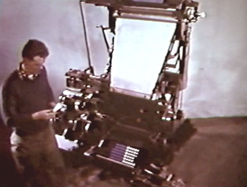
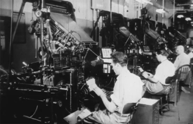
This film features the Model 31 (with up to four magazines) and the Model 32 (with up to 8 magazines with the auxiliary magazines). Many new safety features and speed improvements are displayed. Originally produced for the Mergenthaler Linotype Company by Caravel Films, Inc., New York. Digitized by printingfilms.com
-
- linotype
- typesetting
-
(and 1 more)
Tagged with:
-
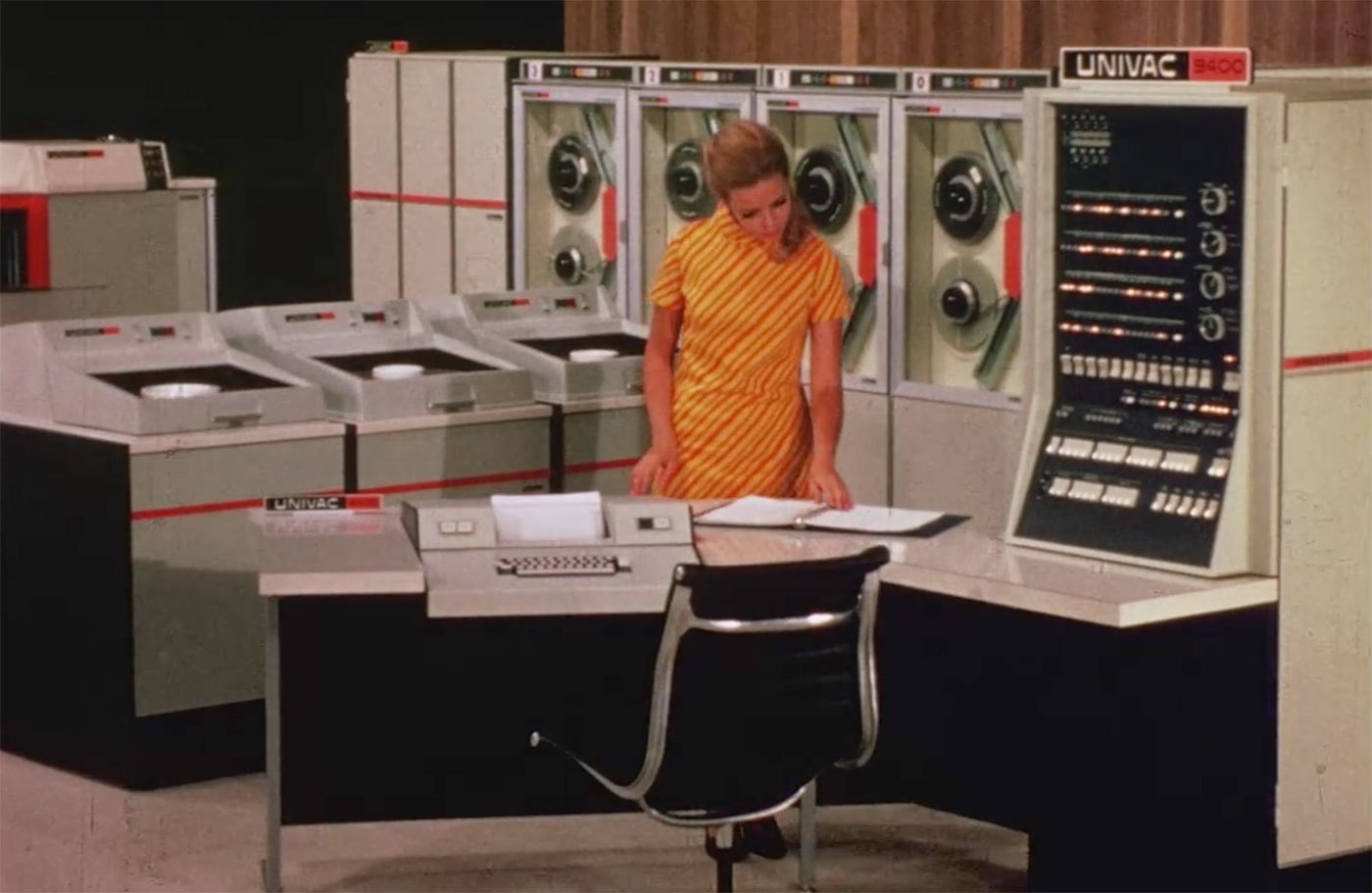
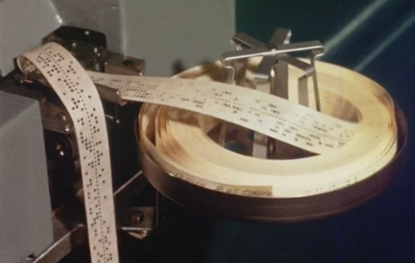
Featuring the cathode-ray tube Linotron 505 for high-speed film typesetting. Although this is a film machine, the input is still controlled by perforated tape. The film features many interesting line diagrams on how the CRT machine works and exposes the characters onto paper or film. It goes into great depth about the optical grid system of characters on glass plates. Originally produced for the Mergenthaler Linotype Company by Franz Edson, Inc. Digitized by printingfilms.com
-
- linotype
- typesetting
-
(and 2 more)
Tagged with:
-
-
-
- typesetting
- printing
-
(and 2 more)
Tagged with:
-
-
- 1
-

-
- typesetting
- 1950s
-
(and 1 more)
Tagged with:


