Jump to content
Nova Caps is a striking and globe-trotting editorial typeface that steals inspiration from Roman inscriptions and Art-Deco architectural lettering.
  • The Anatomy of a Thousand Typefaces

    Riccardo Sartori

    Open the Link

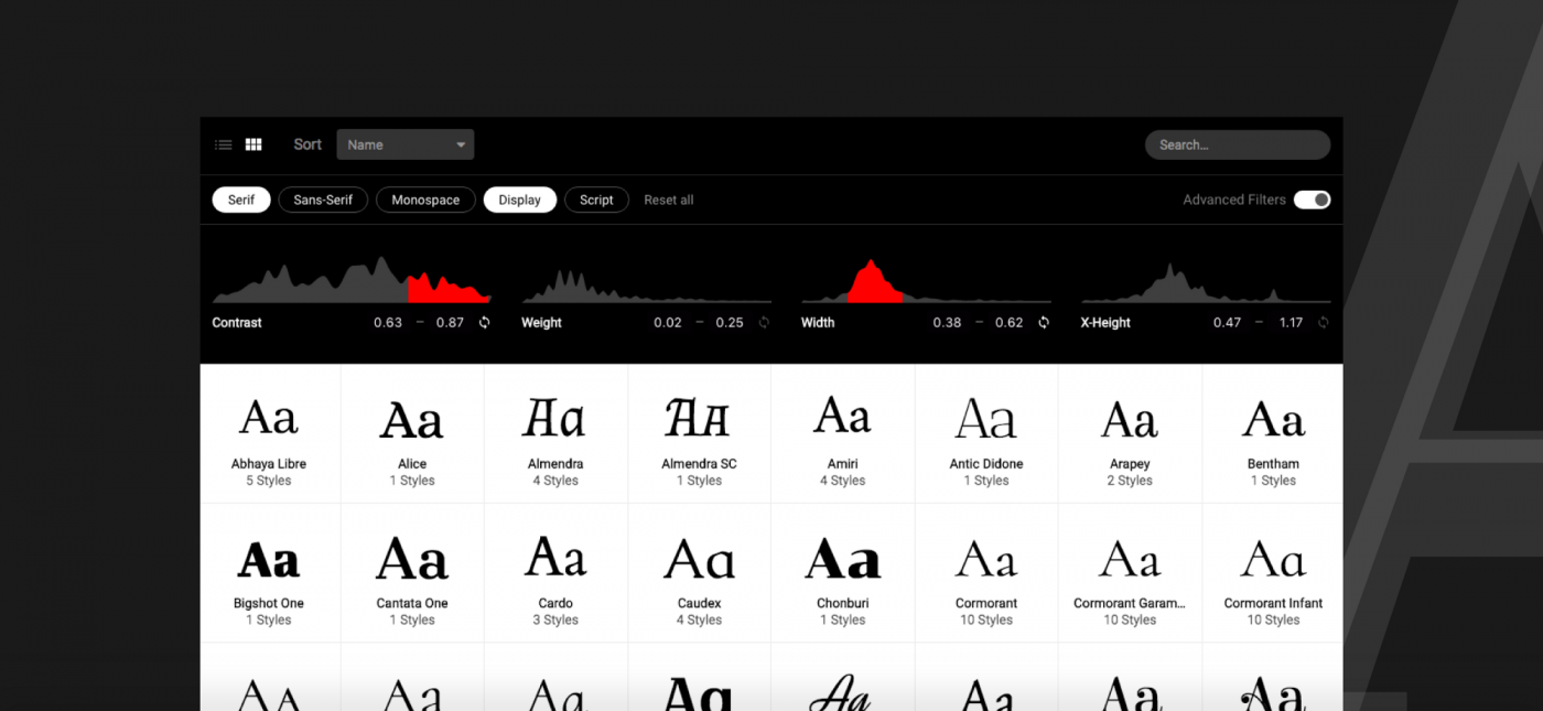
    Florian Schulz: “The seemingly mindless choice of a font is a general problem with font menus: there are either too few or too many options.
    On one hand, a limitation to system fonts, as seen in the video, can lead to a bad choice because there simply isn’t something better installed.
    On the other hand, web font libraries with hundreds or thousands of fonts can be quite overwhelming and lead to a paradox of choice.”

    medium.com


    User Feedback

    Recommended Comments

    There are no comments to display.


    Create an account or sign in to comment

    You need to be a member in order to leave a comment

    Create an account

    Sign up for a new account in our community. It's easy!

    Register a new account

    Sign in

    Already have an account? Sign in here.

    Sign In Now

Our typography network

Typografie.info – The German typography community
The best typography links of the week.
Discover the fonts from the Germany foundry FDI Type. A brand of Schriftkontor Ralf Herrmann.
The type specimens of the world.
  • Add your content!

    We spread your news free of charge among a growing list of subscribers and tens of thousands of followers of our social media channels.
    Learn more about this
Watch our video course about font licensing.
×
×
  • Create New...

Important Information

We are placing functional cookies on your device to help make this website better.