

-
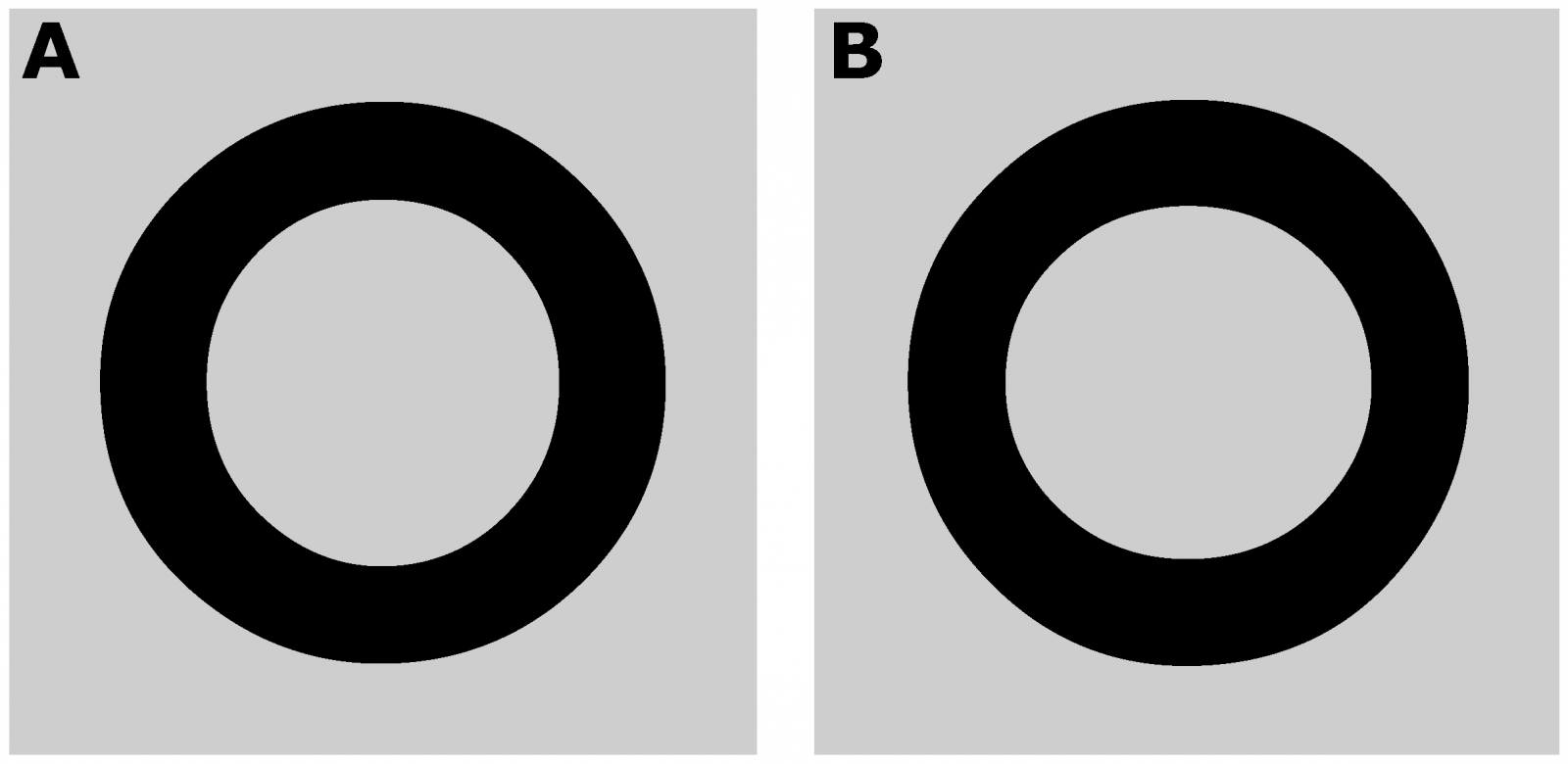
Type design science: Horizontal Is Perceived as Thicker than Vertical
“We report two psychophysical experiments that investigate a visual illusion that is considered common knowledge among type designers, but has never been studied scientifically. Specifically, the thickness of a horizontal line is overestimated in relation to that of a vertical line.”
www.mdpi.com
-
 1
1
User Feedback
-
Our typography network


-
Add your content!
We spread your news free of charge among a growing list of subscribers and tens of thousands of followers of our social media channels.
Learn more about this


Recommended Comments
There are no comments to display.
Create an account or sign in to comment
You need to be a member in order to leave a comment
Create an account
Sign up for a new account in our community. It's easy!
Register a new accountSign in
Already have an account? Sign in here.
Sign In Now