Jump to content
Education typography videos. Check out our YouTube channel …
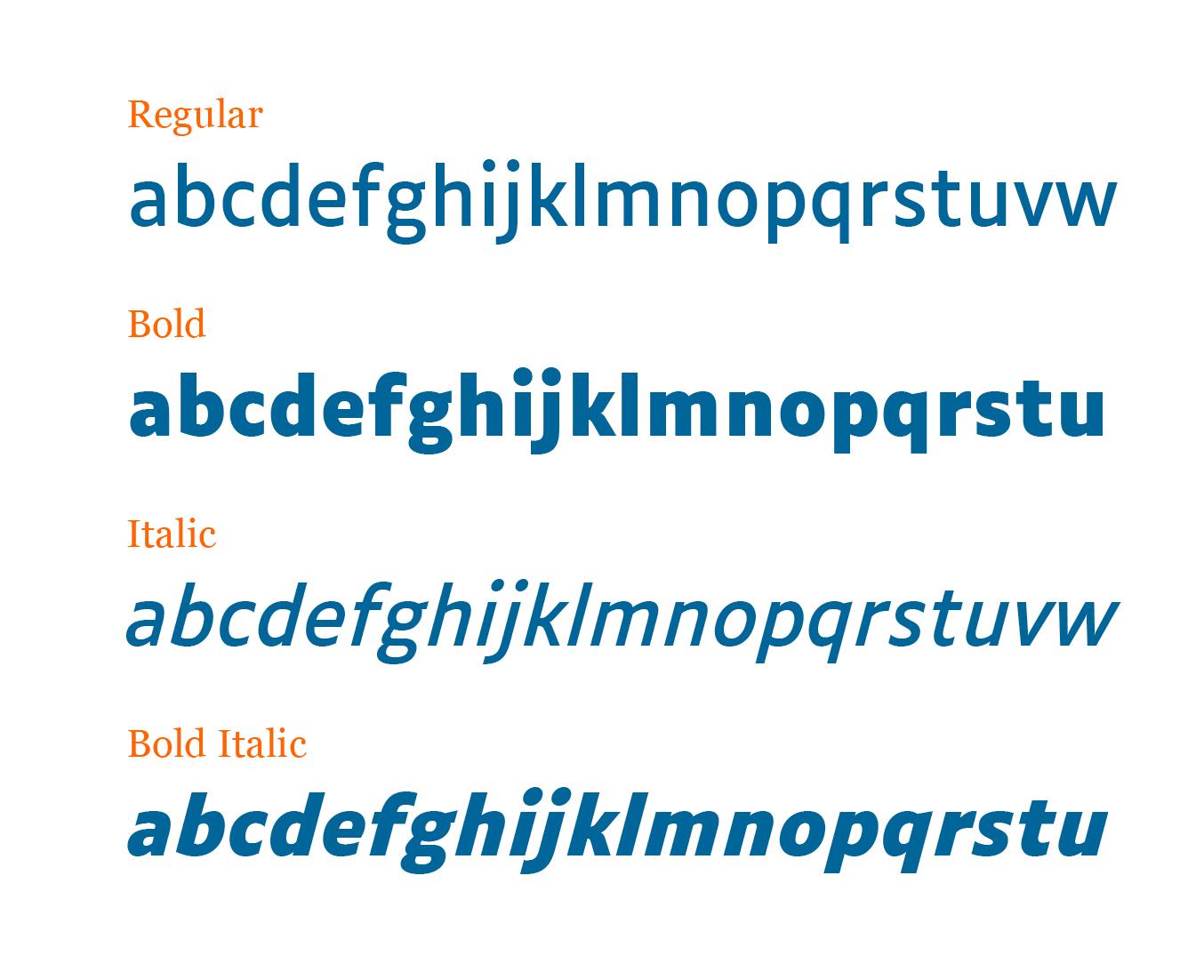
  • A typeface for visual impairment

    Riccardo Sartori

    Open the Link

    “Word massing, spacing, the structure of the letters: the concept for Luciole adheres to a dozen specific design criteria to provide the best possible reading experience for the visually impaired. Particular care has been taken in drawing the figures, mathematical signs, and punctuation.”
    Available under a Creative Commons Attribution license.

    www.luciole-vision.com

    • very interesting! 1


    User Feedback

    Recommended Comments

    52 minutes ago, Greg Yerbury said:

    It is surprising that the lower case l doesn't have a little serif on it.. 

    The uppercase |I| has very prominent serifs, so there is no risk of confusion between the two. Of course, a |l| with a curved bottom remains identifiable even without (or with limited) context.

    Link to comment
    Share on other sites


    Create an account or sign in to comment

    You need to be a member in order to leave a comment

    Create an account

    Sign up for a new account in our community. It's easy!

    Register a new account

    Sign in

    Already have an account? Sign in here.

    Sign In Now

Our typography network

Typografie.info – The German typography community
The best typography links of the week.
Discover the fonts from the Germany foundry FDI Type. A brand of Schriftkontor Ralf Herrmann.
The type specimens of the world.
  • Upcoming Events

  • Add your content!

    We spread your news free of charge among a growing list of subscribers and tens of thousands of followers of our social media channels.
    Learn more about this
Watch our video course about font licensing.
×
×
  • Create New...

Important Information

We are placing functional cookies on your device to help make this website better.