Typography Books
74 directory entries in this category
-
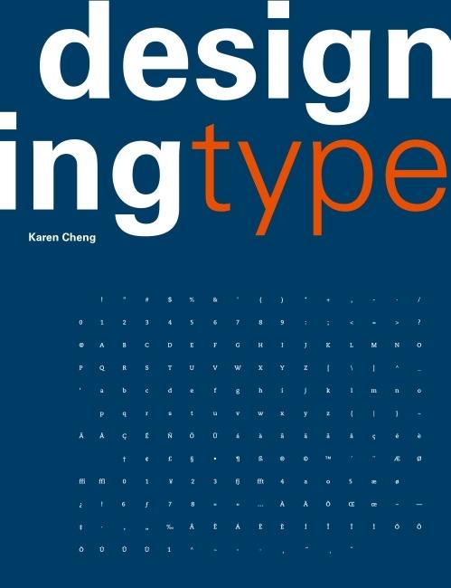
“One of the most essential tools of graphic design, typography influences the appearance of visual print materials perhaps more than any other component. This essential book explains the processes behind creating and designing type. Author Karen Cheng discusses issues of structure, optical compensation, and legibility, with special emphasis given to the often overlooked relationships between letters and shapes in font design. The book is illustrated with numerous diagrams that demonstrate visual
-
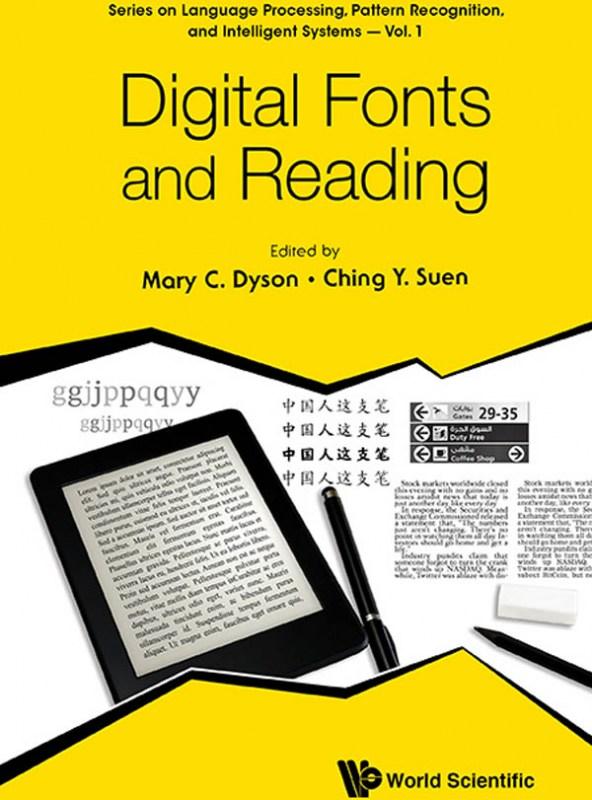
The book is a collection of invited chapters by renowned experts and is part of a series on Language Processing, Pattern Recognition, and Intelligent Systems. The content is wide-ranging, encompassing perspectives from computer science to social science to design and reflecting the considerable experience of researchers, teachers and practitioners. This diversity offers rigorous approaches to the topic of Digital fonts and reading, organised in four sections: vision and reading; scientific appro
-
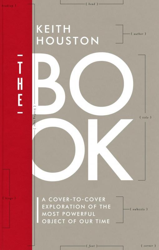
Second book of Keith Houston after „Shady Characters”. „The Book” is about the paper, ink, thread, glue and board from which a book is made. It’s an amazing travel through history of this 2,000 year-old medium: from tablets and papyrus scrolls to hard covers and paperbacks we have today. It’s a must-have for anyone interested in history of book making, but also for editorial designers and printers.
- The book
-
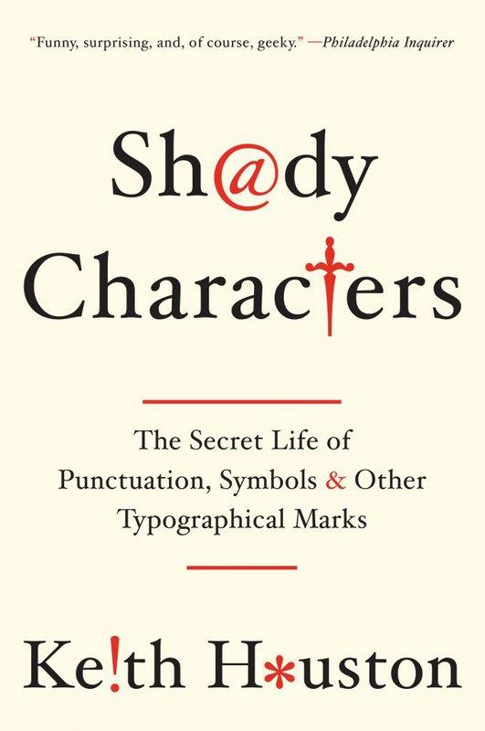
Shady Characters: The Secret Life of Punctuation, Symbols, & Other Typographical Marks (USA), or Shady Characters: Ampersands, Interrobangs and Other Typographical Curiosities (UK), is an illustrated companion book of the website Shady Characters: The secret life of punctuation. “Shady Characters weaves a fascinating trail across the parallel histories of language and typography. Whether investigating the asterisk (*) and dagger (†)—which alternately illuminated and skewered heretical v
-
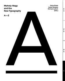
In 1929, ten years after the Bauhaus was founded, Berlin’s Martin-Gropius-Bau launched the exhibition “New Typography.” László Moholy-Nagy, who had left Dessau the previous year and had earned a reputation as a designer in Berlin, was invited to exhibit his work together with other artists. He designed a room—entitled “Wohin geht die typografische Entwicklung?” (“Where is typography headed?”)—where he presented 78 wall charts illustrating the development of the “New Typography” since the turn of
- An A-Z
-
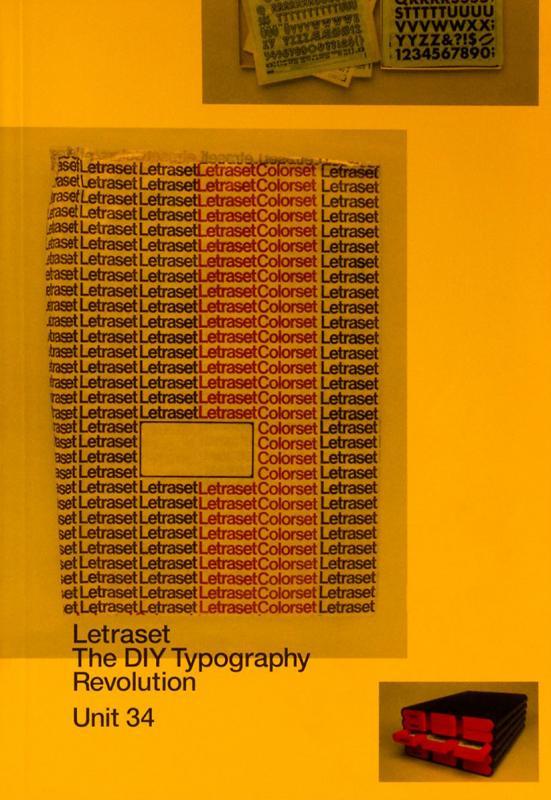
Letraset: The DIY Typography Revolution is the first comprehensive history of Letraset, the rubdown lettering system that revolutionised typographic expression. The book tells the Letraset story from its early days as a difficult-to-use wet system, to its glory years as the first truly democratic alternative to professional typesetting. The book also looks at Letraset’s present-day revival amongst a new set of admirers who recognise the typographic excellence of the system’s typefaces.
-
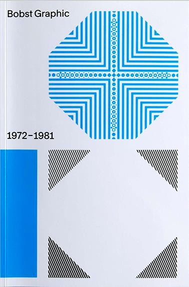
In the early 1970s, the Swiss packaging company Bobst S.A. began to wonder whether it would be ready for the future with only one product type. The Lausanne-based company, already far advanced in terms of packaging manufacturing technology, decided to launch phototypesetting machines. Thanks to the participation of some of the best font designers in the country, e.g. Team 77, different font families were developed for the new technique. The history of Bobst Graphic – a pioneering feat
-
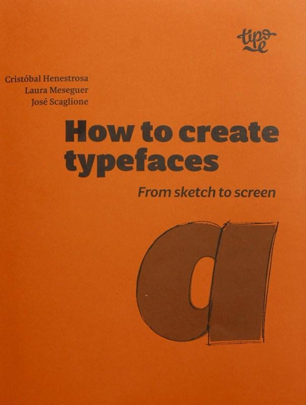
How are typefaces designed? What is the process? Which characters are essential? What is the difference between roman, italic and cursive? What is OpenType? In How to create typefaces Cristóbal Henestrosa, Laura Meseguer and José Scaglione answer these and many other questions in a straightforward and direct way. This publication, aimed at new and novice type designers as well as those trained in the field, unravels the fascinating task of creating a font, from sketch to screen. Content
- From sketch to screen
-
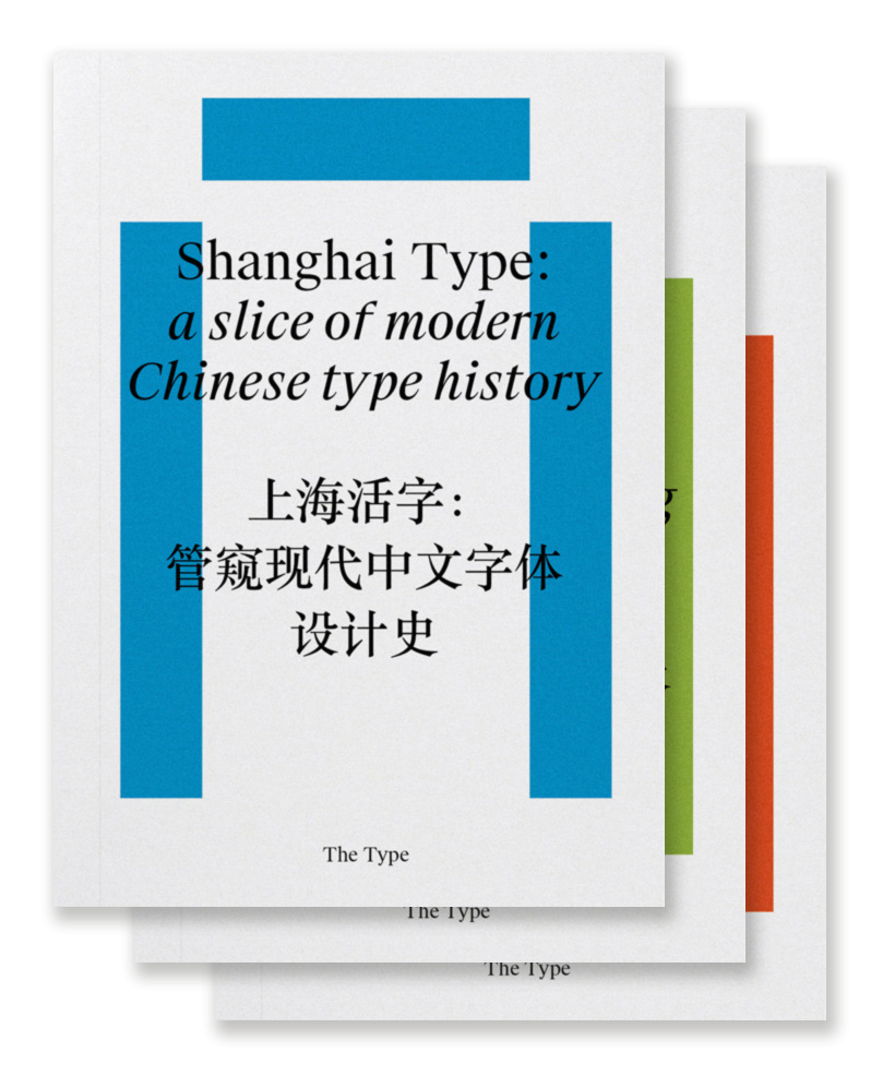
“Chinese typography is not easy to tackle, but we believe that, by more self-initiated and open research, we are able to address our challenges under a global perspective and invite more discussions and breakthroughs to the field. So here is a three-volume collection of our on-going research and dialogues about typography and design in China, including its history and development, conventions and contemporary practice, and working in transcultural contexts.” Shanghai Type: a slice of
- 中文文字设计研究选集
-
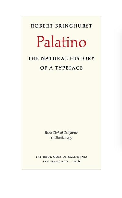
Written and designed by poet, linguist, and typographer Robert Bringhurst, Palatino is a definitive account of Hermann Zapf’s most ambitious and enduring design project. This book provides a detailed and sumptuously illustrated history of the evolution of all members of the Palatino tribe: foundry Palatino, Linotype Palatino, Michelangelo, Sistina, Aldus, Heraklit, Phidias, American Palatino, Enge Aldus, Linofilm Palatino, Zapf Renaissance, PostScript Palatino, Palatino Nova, Aldus Nova, an
- The Natural History of a Typeface
-
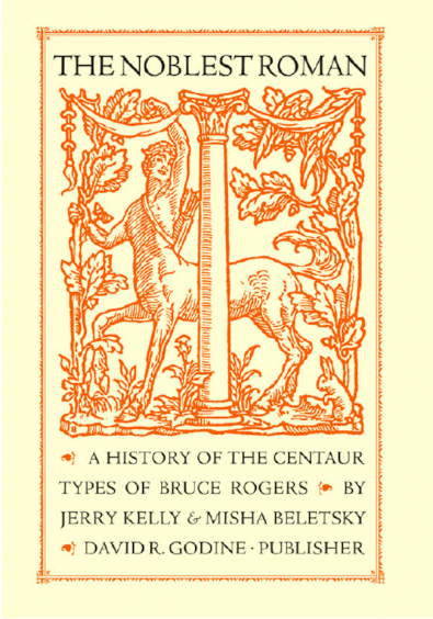
Bruce Rogers was a towering figure in the history of graphic arts, and remains one of the most important American book designers of the twentieth century. The unrivaled subtlety of his style also sets apart Rogers’s most widespread accomplishment, the Centaur type. This type was born of the late-nineteenth-century quest to create a modern revival of Nicolas Jenson’s humanist roman of 1470, long held by scholars to be both the origin and the apogee of the Venetian roman, and which has inspired de
- A History of the Centaur Types of Bruce Rogers
-
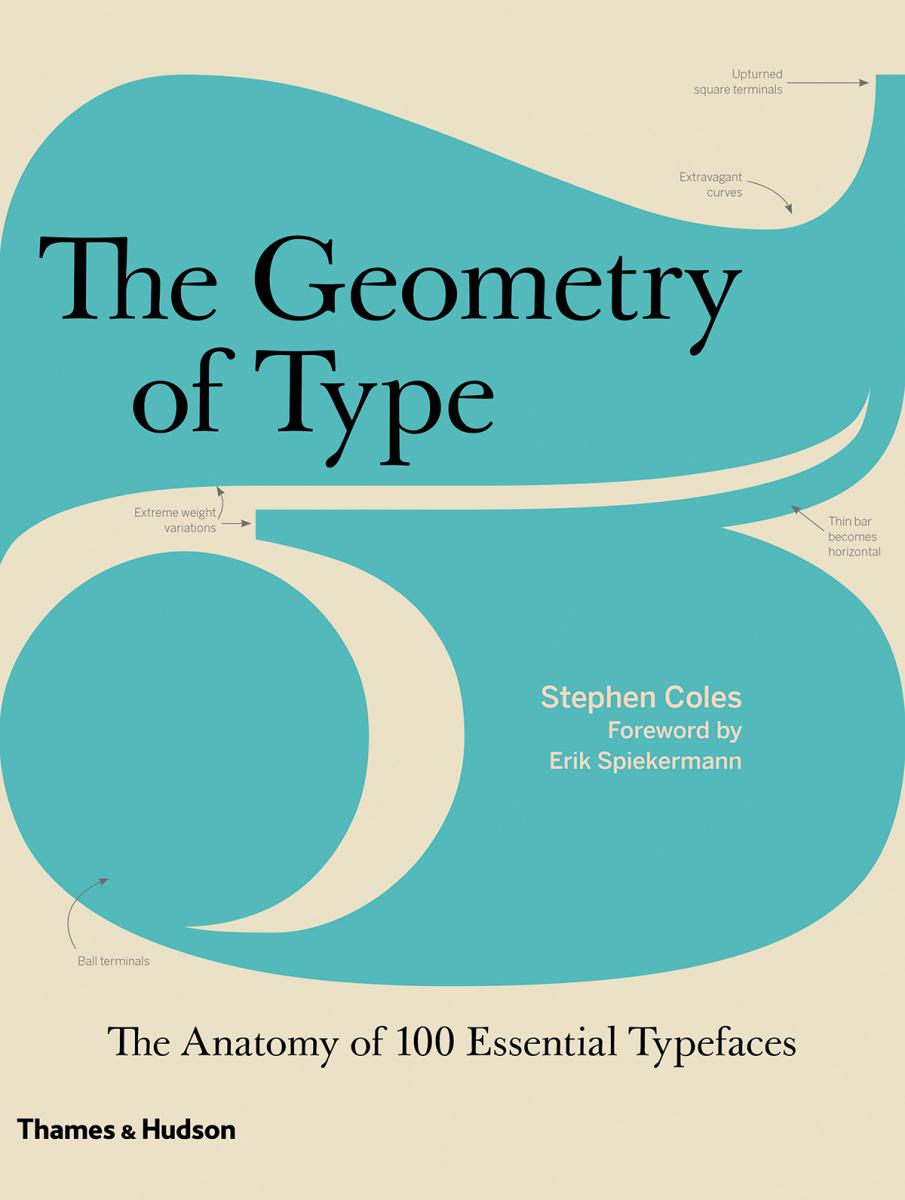
The Geometry of Type explores 100 traditional and modern typefaces in loving detail, with a full spread devoted to each entry. Characters from each typeface are enlarged and annotated to reveal key features, anatomical details, and the finer, often-overlooked elements of type design, which shows how these attributes affect mood and readability. Sidebar information lists the designer and foundry, the year of release and the different weights and styles available, while feature boxes explain the o
- A Graphic Guide to 100 Typefaces
-
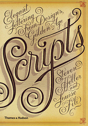
Seen in everything from wedding invitations and birth announcements to IOUs, menus, and diplomas, script typefaces impart elegance and sophistication to a broad variety of texts. Scripts never go out of style, and the hundreds of inventive examples here are sure to inspire today’s designers. Derived from handwriting, these are typefaces that are stylized to suggest, imply, or symbolize certain traits linked to writing. Their fundamental characteristic is that all the letters, more or less, touch
-
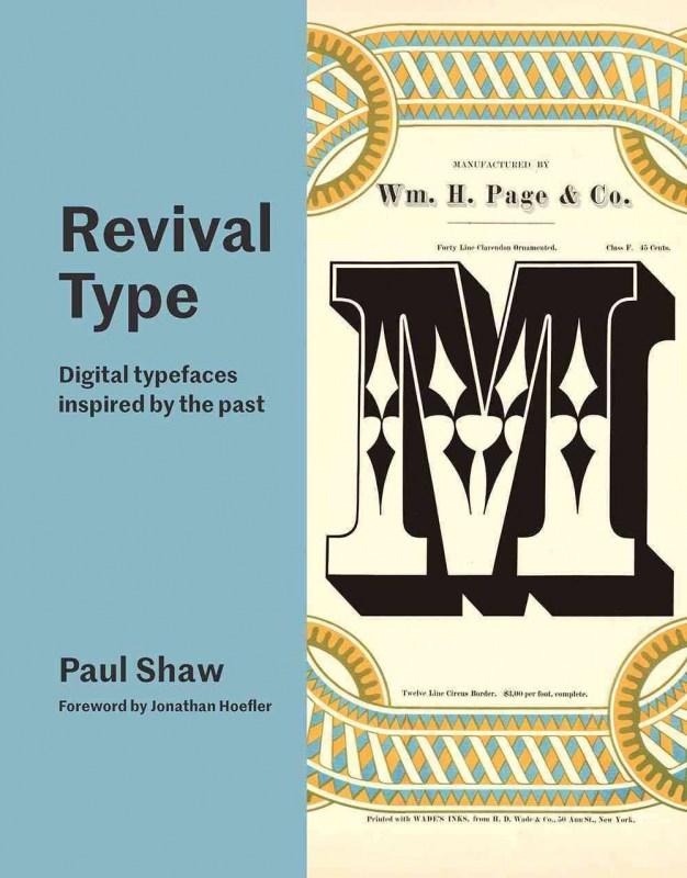
A wide-ranging survey of revival typefaces focusing on digital fonts with roots in the past Examples in 'Revival Type' include direct revivals of metal and wood typefaces, while others are looser interpretations of older typefaces. Among the fonts are interpretations of classic designs by Nicolas Jenson, Claude Garamont, Robert Granjon, William Caslon, John Baskerville, Giambattista Bodoni, Firmin Didot and other iconic names. Alongside them are typefaces rooted in the work of important, th
- Digital typefaces inspired by the past
-
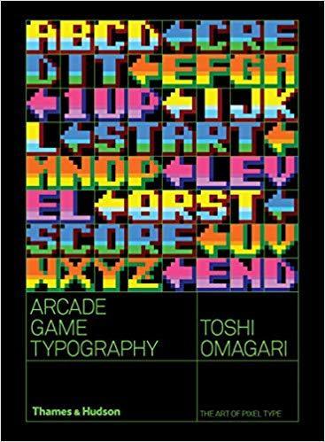
Arcade Game Typography presents readers with a fascinating new world of typography: the pixel typeface. Video game designers of the ’70s, ’80s, and ’90s faced color and resolution limitations that stimulated incredible creativity. With each letter having to exist in a small pixel grid, artists began to use clever techniques to create elegant character sets within a tiny canvas. This book presents typefaces on a dynamic and decorative grid, taking reference from high-end type specimens while addi
- The Art of Pixel Type
-
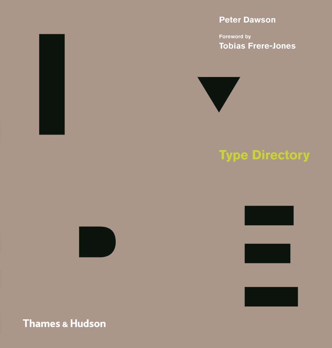
Type Directory shows 1,500 typefaces are organized by category – Serif, Sans Serif, Display, Script and Symbols & Dingbats – and subsequently arranged by recognized sub-categories. This allows the reader to make a direct comparison of typefaces with a similar appearance, thus facilitating a deeper understanding of the design and selection process. A visual celebration of the craft, innovation and beauty of these letterforms is presented throughout, from classic typefaces like Garamond, Bodon
-
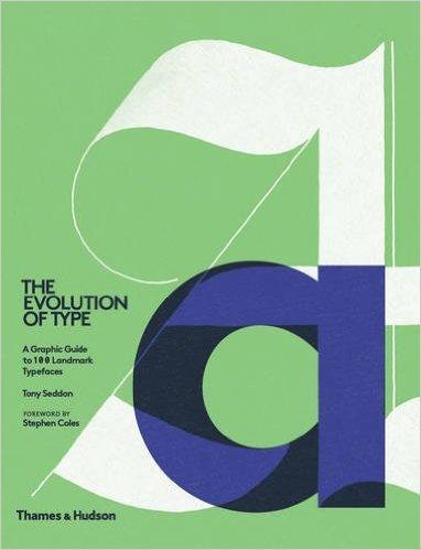
The Evolution of Type takes the reader on a journey through the development of type design and typographic style from the mid-15th century to the present day, by way of 100 typefaces. Chosen to represent the key elements of style and form used by the punch cutters, calligraphers and designers of their day, and presented in chronological order according to release date, each typeface is discussed in terms of its origins and its impact on the design and print industry, and latterly the additional
- A Graphic Guide to 100 Landmark Typefaces
-
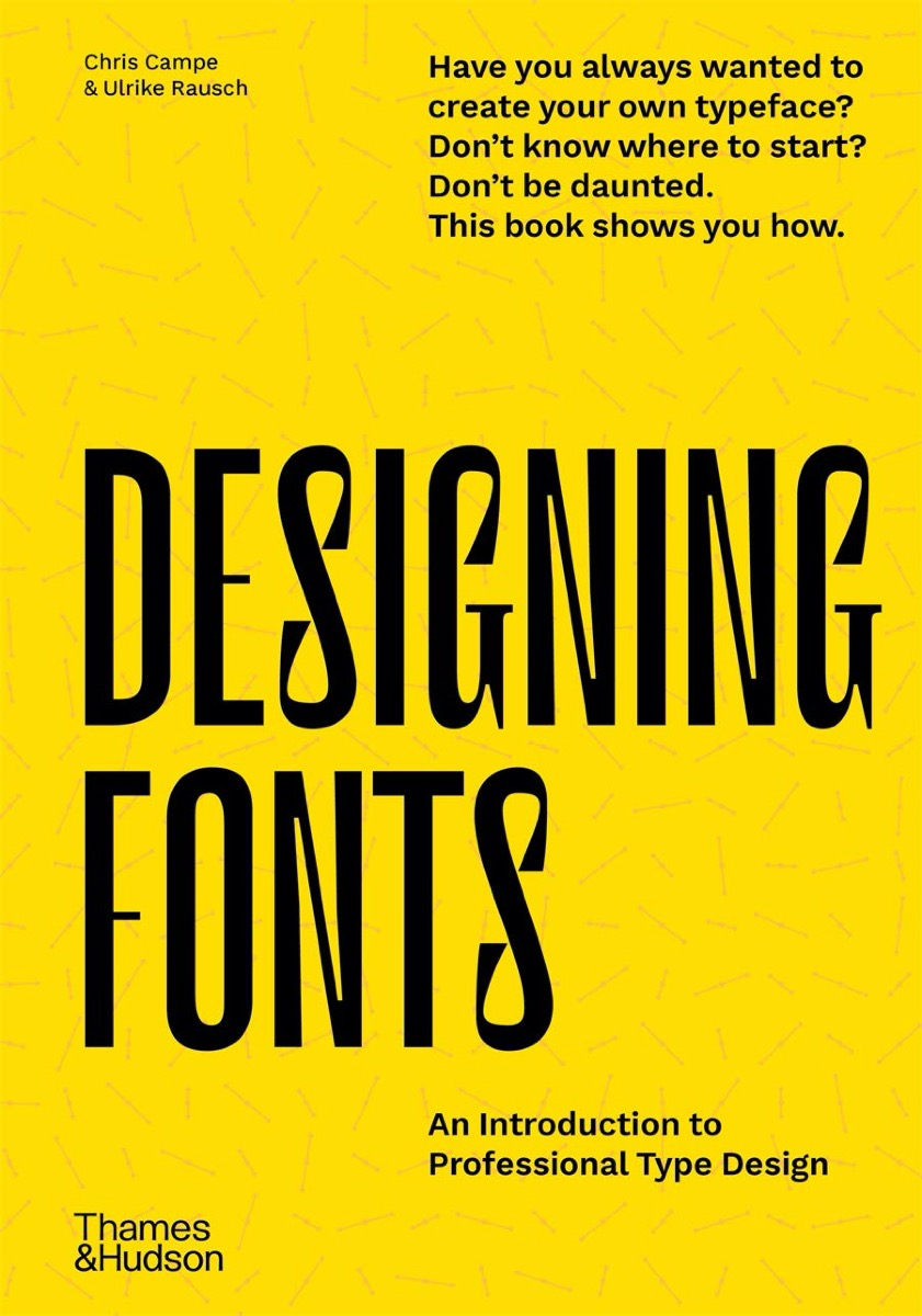
With easy-to-follow instructions, many examples and professional tips, the book teaches you how to design unique typefaces tailor-made for your own projects or customer orders. Designing Fonts has two parts. Part 1 explains the theoretical, creative and technical basics of type design and font production. Six chapters then cover everything from alphabet to font, showing you how to find and develop typeface ideas, design matching letters, produce fonts and expand them with special functions
- An Introduction to Professional Type Design
-
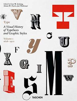
Know your type: A visual history of fonts and graphic styles: 1628–1938 This book offers a connoisseur’s overview of typeface design, exploring the most elegant fonts from the history of publishing. Taken from a distinguished Dutch collection, this exuberant two-volume edition traces the evolution of the printed letter via exquisitely designed catalogs, showing type specimens in roman, italic, bold, semi-bold, narrow, and broad fonts. Borders, ornaments, initial letters, and decorations are
-
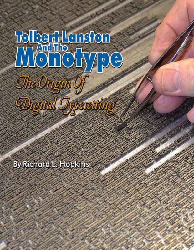
This special hardback edition is limited to 300 copies. It includes a 24-page Monotype letterpress keepsake booklet, Going with Goudy to Philadelphia, composed, printed in several colors, and signed by Richard Hopkins. Tolbert Lanston and the Monotype is printed in full color, with more than three hundred photos and illustrations, 232 pages, plus several appendices and index. Tolbert Lanston, at the end of the nineteenth century, was a man obsessed with the idea of creating a machine which wo
- The Origin of Digital Typesetting
-
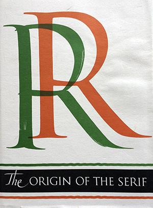
The Serif is the short cross stroke at the beginning and end of letter parts. Its origin in Roman inscription letters is one of the uncharted areas of paleography. In this book the author questions accepted theories as to the serif’s origin, and his own theory with skillful reasoning, detailed illustration, and epigraphic proof. Demand for copies of The Origin of the Serif has been constant since Fr. Catich published it in 1968. The information found there is not available elsewhere, and Ca
- Brush Writing & Roman Letters
-
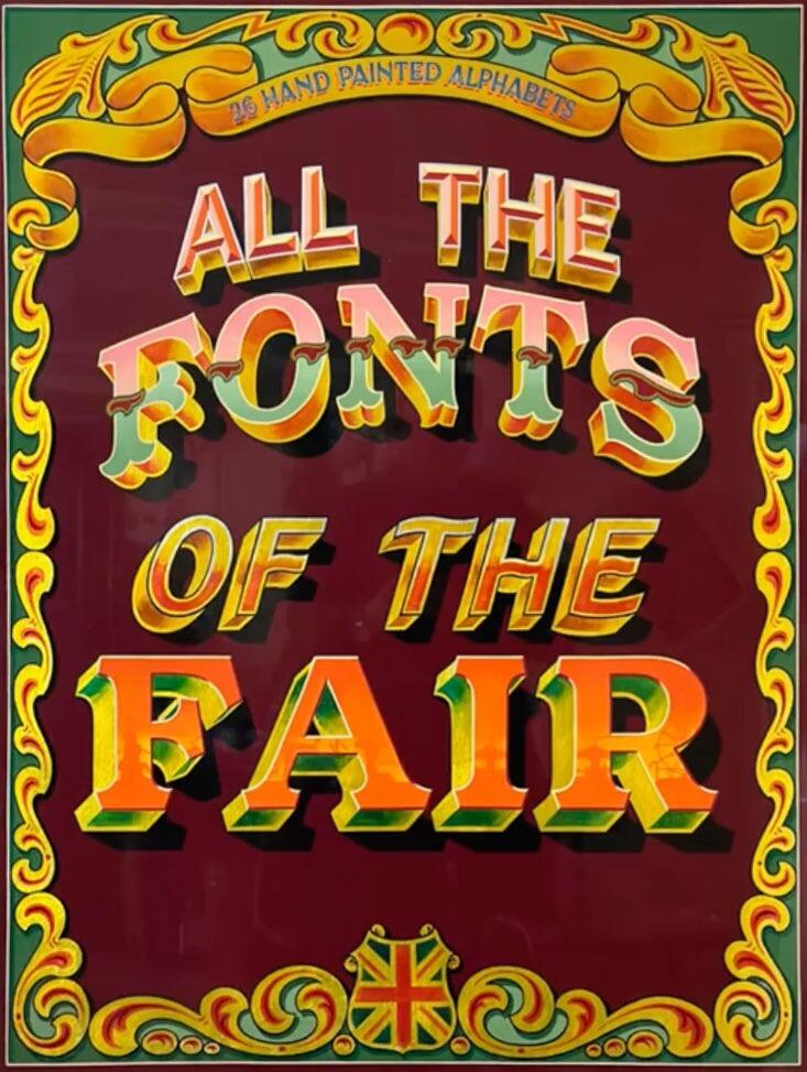
All the Fonts of the Fair, Joby Carter’s second book, takes a deep dive into fancy lettering styles found at traditional British fairgrounds up until the 1960s. Many of these vibrant, whimsical designs are missing from graphic design manuals and typography archives. This book helps continue their legacy and give them a new lease of life. This full colour book includes 26 hand drawn fairground inspired alphabets. Each alphabet has a reference guide with tips on how to accurately recreate the
-
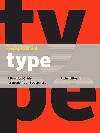
Design School: Type is an instructive guide for students, recent graduates, and self-taught designers. You'll get a comprehensive introduction to typography, a crucially important skill that underpins practically every aspect of graphic design. These guided lessons offer in-depth analysis of all the major areas of theory and practice used by experienced professional designers. Each section is interspersed with tests designed to help you retain the information they've covered, and a selection of
- A Practical Guide for Students and Designers
-
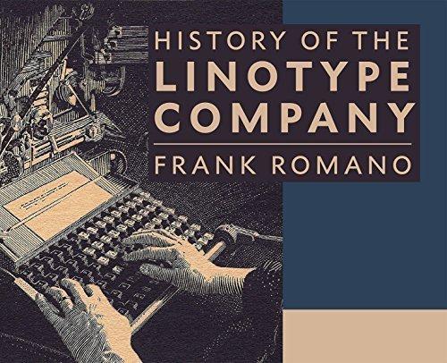
The book contains 464 pages of in-depth history of the people, places, and products manufactured by the Mergenthaler Linotype Company. Frank Romano traces the history of corporate acquisitions, product development, and competing machines all with his usual wit and experience. He also writes about his own personal history working at Linotype starting in 1959. There are hundreds of color reproductions of advertisements, publications, photographs, and typeface specimens. It also includes 120 pages
-
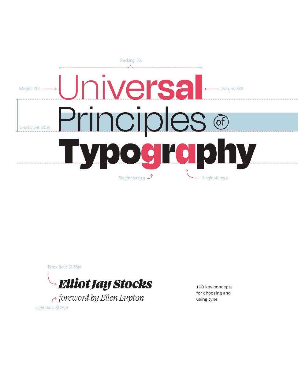
Explore 100 key concepts, theories, and guidelines that are critical for choosing and using type. We communicate with text every single day, but what does it mean to really understandtype—to use it with clear intent and purpose? The art and science of typography combines subtle tweaks to line lengths with harmonious combinations of weights and styles; considered typeface pairings with a robust set of alternate characters; exciting technological advances with the realities of font licensing.
- 100 Key Concepts for Choosing and Using Type
-
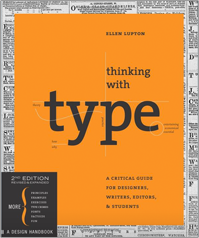
Thinking with Type is the definitive guide to using typography in visual communication, from the printed page to the computer screen. This revised edition includes forty-eight pages of new content, including the latest information on style sheets for print and the web, the use of ornaments and captions, lining and non-lining numerals, the use of small caps and enlarged capitals, as well as information on captions, font licensing, mixing typefaces, and hand lettering. Throughout the book, visual
-
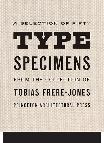
Fifty Type Specimens is a collection of postcards with typographic images, for inspiration, correspondence, or display. Cards feature classic letterforms, pages from specimen books, and crops of letters presented in a box with the feel of an old specimen book. Historic typefaces, selected by renowned designer Tobias Frere-Jones, are organized into four geographic categories by thumb tabs: Germany, France, United States, and the United Kingdom.
-
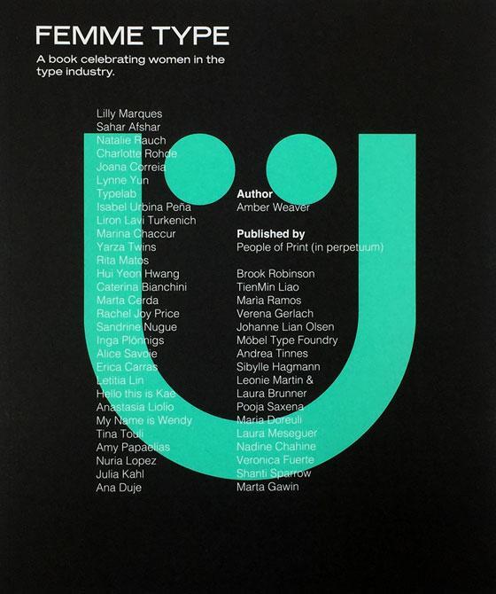
Femme Type is an all-female publication conceptualised by ex-University of Arts London Chelsea attendant Amber Weaver aiming to celebrate over 40 skilled, international women in the type industry. The mission is to create a valuable stage and platform for designers to showcase their typographic achievements wrapped up in a printed format. Includes contributions from over 40 international women Foreword by GoodType Founder Brooke Robinson 272 pages + 4pp Cover / 25cm x 21c
- A book celebrating women in the type industry
-
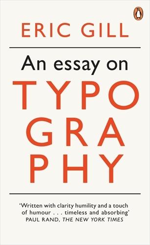
Eric Gill’s opinionated manifesto on typography argues that “a good piece of lettering is as beautiful a thing to see as any sculpture or painted picture”. This essay explores the place of typography in culture and is also a moral treatise celebrating the role of craftsmanship in an industrial age. Gill, a sculptor, engraver, printmaker and creator of many classic typefaces that can be seen around us today, fused art, history and polemic in a visionary work which has been hugely influential on m
-
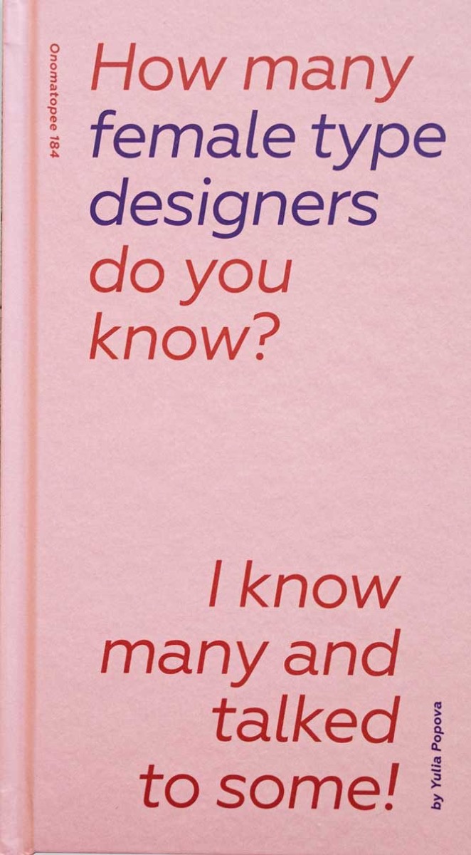
This book aims to shine light on work of women in type. The first part of the book offers research on the gender issue in type design field. It includes statistics, data and an overview of some works that address this issue. Further it contains some biographies of female type designers that worked in the 19th and in the beginning of 20th century. These women contributed to the industry, yet they are rarely mentioned in educational material. The second part is a series of the interviews with 14
- I know many and talked to some.
-
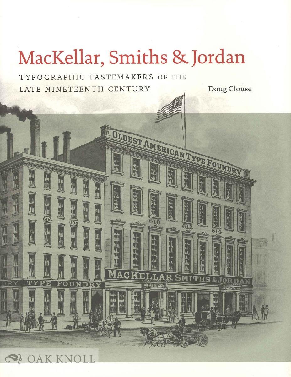
This study of America’s leading type foundry of the nineteenth century, MacKellar, Smiths & Jordan, emphasizes the design of the hundreds of typefaces that were produced by the foundry, from its inception in the 1860s until its merger with most other American foundries at the end of the century. The author describes how changing business conditions and technical improvements in type founding interacted with changes in public taste over the decades to modify the appearance of American typefac
- Typographic Tastemakers of the Late Nineteenth Century
-
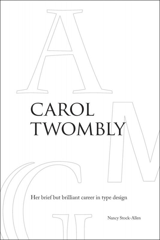
This study is a fascinating inside look at digital type design, the rather mysterious career of one of its most important practitioners, and the history and culture of Adobe Type, with additional insight into other type designers of the digital era. It is difficult to imagine a graphic designer in the last quarter century who is not familiar with at least some of Carol Twomblys typefaces. Yet many of those who use her fonts today would be hard pressed to name their designer. Twombly studied at t
- Her brief but brilliant career in type design
-
A reference guide of typographic terms and classification with definitions of form and usage for Latin based writing systems. The TDR is an encyclopedia, listing countless entries on the typographic arts. http://typedeskref.com/
-
Responsive web design helps your site maintain its design integrity on a variety of screen sizes, but how does it affect your typography? With this practical book, graphic designers, web designers, and front-end developers alike will learn the nuts and bolts of implementing web fonts well, especially how to get the best appearance from type without sacrificing performance on any device. After examining typography fundamentals and the evolution of type on the Web, author Jason Pamental provi
- Using Type Well on the Web
-
“We are surrounded by emoji. They appear in politics, movies, drug deals, our sex lives, and more. But emoji’s impact has never been explored in full. In this rollicking tech and pop culture history, Keith Houston follows emoji from its birth in 1990s Japan, traces its Western explosion in the 2000s, and considers emoji’s ever-expanding lexicon. Named for the world’s most popular pictogram, Face with Tears of Joy tells the whole story of emoji for the first time.” https://wwnorton.com/books/9781
- A Natural History of Emoji
-
Although Arabic is the third-most widely used script in the world, there is a lack of sound typographic literature. This publication is a multi-disciplinary reference work that combines the latest academic research with applied typography. The focus on elements that pertain specifically to Arabic typography prevents overlapping with the comprehensive literature on Latin script typography, making the book relevant and accessible to the widest possible audience. The first part provides an in-depth
- History and Practice
-
Cyrillic is a script used in numerous primarily eastern and southern Slavic languages in Europe and Asia. “Cyrillize it!” is an introductory work for graphic designers who are not native to the Cyrillic script, and cannot read Cyrillic-based languages. The book offers a method of dealing meaningfully and successfully with writing systems other than your own. The approach is based on constantly drawing parallels between Latin and Cyrillic, thus making a foreign script more familiar to non-native
- A guide on Cyrillic typography for graphic designers
-
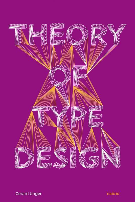
Theory of Type Design by type designer Gerard Unger is a comprehensive theory of typeface design. This volume consists of 24 chapters, each describing a different aspect of type design, from the influence of language to today’s digital developments, from how our eyes and brain process letterforms to their power of expression. This book includes more than 200 illustrations and practical examples that illuminate the theoretical material. The terminology is explained in the volume’s extensive gl
-
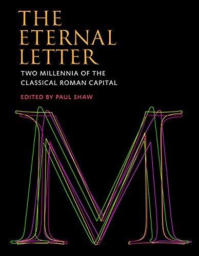
The fiftieth anniversary of Helvetica, the most famous of all sans serif typefaces, was celebrated with an excitement unusual in the staid world of typography and culminated in the release of the first movie ever made starring a typeface. Yet Helvetica’s fifty-year milestone pales in comparison with the two thousandth anniversary in 2014 of Trajan’s Column and its famous inscription — the preeminent illustration of the classical Roman capital letter. For, despite the modern ascendance of the san
-
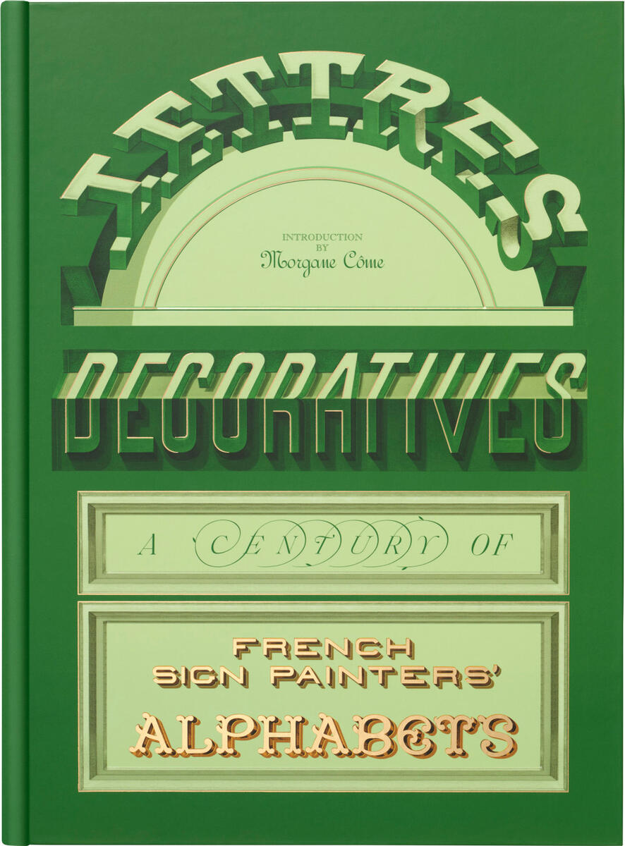
From the Age of La Peinture en Lettres — A kaleidoscopic survey of letterforms from nineteenth- and twentieth-century France, Lettres Décoratives includes more than 150 plates from grand lithographic albums printed at the height of the sign painter’s craft. Originally made to demonstrate styles and inspire artists to decorate cities with increasingly colorful, adventurous, and refined forms, these portfolios preserve a rich visual history of urban alphabets. An introduction by practitioner Morga
-
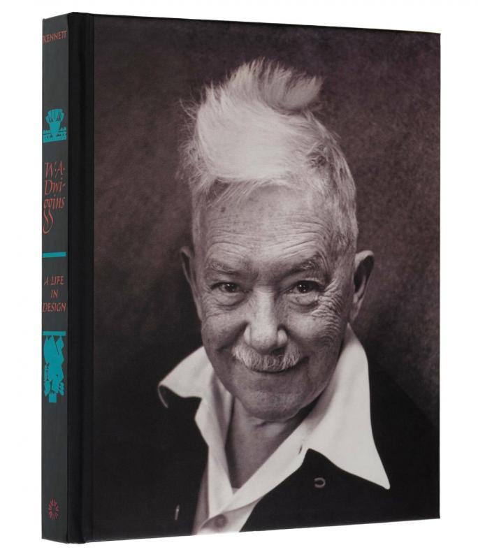
Often credited with inventing the term "graphic design," W. A. Dwiggins was a quintessential maker — fabricating his own tools, inventing techniques, and experimenting with design in areas as wide-ranging as modular ornament, stamps, currency, books, kites, marionettes, and theatrical sets and lighting. More than any of his contemporaries, he united the full range of applied arts into a single profession — designer. Despite this, a thorough study of Dwiggins has never been published. Until now.
-
For at least a dozen years, Luca Lattuga has been collecting and cataloguing metal and wooden movable type produced in Italy between the 1920s and 1940s. During his research, he rediscovered a recurring and consistent style, hitherto little considered, that characterized that period. Although widespread at the time, this style, which originated in the printing workshops, remained in the shadows for decades. These lesser-known typefaces coexisted alongside the famous types from historic foundries
-
Alfabeti Modernisti Type Specimens illustrates twenty-five digital revivals based on wooden and lead typefaces produced in Italy in the 1930s and 1940s, documenting a research and enhancement project that intertwines memory and design and gives new voice to a little-explored chapter of Italian graphic design. Very popular at the time but now forgotten, the typefaces have been recovered by Luca Lattuga over a period of more than ten years. Reissued by the CAST type foundry, available for purchase
-
The Visual History of Type is a comprehensive, detailed survey of the major typefaces produced since the advent of printing with movable type in the mid-fifteenth century to the present day. Arranged chronologically to provide context, more than 320 typefaces are displayed in the form of their original type specimens or earliest printing. Each entry is supported by a brief history and description of key characteristics of the typeface. This book will be the definitive publication in its field, a
-
Need to produce a flyer? Want to draw up a logo for a band? Does your local speed shop need a T-shirt design? Don’t want to use the same old computer fonts? Well, let graphic designer and typography teacher Ivan Castro show you The ABC of Custom Lettering. This practical workbook features easy-to-follow, step-by-step guidance on hand drawing a range of letterforms, from Modern Roman and Gothic to Latin, Script, and Interlocked. It uses traditional instruction methods with a modern twist, and inc
-
Learn FontLab Fast; A Simplified Guide to Creating Fonts with FontLab, TypeTool, ScanFont and AsiaFont Studio covers versions 4.6 and 5.0 of FontLab. It has been written to enable users to dramatically cut down the learning curve required to master FontLab and its sister programs, TypeTool and AsiaFont Studio. Author and designer Leslie Cabarga (who also wrote The Logo Font & Lettering Bible) packed Learn FontLab Fast with illustrations, diagrams and screenshots, and cut the text to a minimu
-
Counterpunch is both an explanation of the 16th-century method of cutting metal type and an impassioned plea for contemporary designers to incorporate the lessons of history as a means of creating typography in our digital age. Smeijers sees the counterpunch technique as essential for ensuring the regularity of form, repeatability, and speed of production necessary for rational design. Smeijers traces the history of letterform design to discover how technique influenced the shape of type, w
- Making Type in the 16th Century
-
This history of typography starts with the early years of the Enlightenment in Europe, around 1700. It was then that typography began to be distinct from printing. Instructional manuals were published, a record of the history of printing began to be constructed, and the direction of the printing processes was taken up by a new figure: the typographer. This starting point gives the discussion a special focus, missing from existing printing and design history. Modern typography is seen as more tha
- an essay in critical history
-
Renowned typographer and poet Robert Bringhurst brings clarity to the art of typography with this masterful style guide. Combining the practical, theoretical, and historical, this edition is completely updated, with a thorough revision and updating of the longest chapter, “Prowling the Specimen Books”, and many other small but important updates based on things that are continually changing in the field.
-
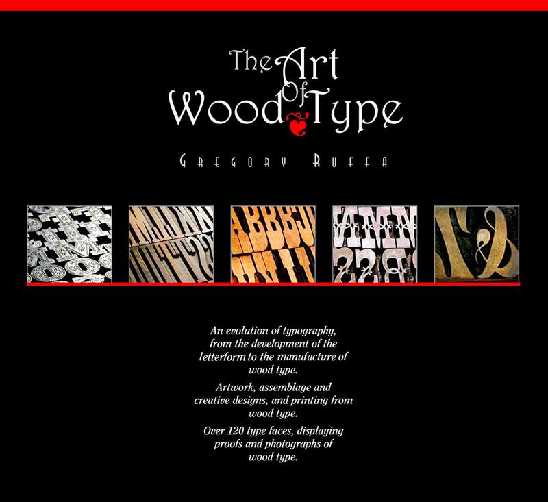
330 pages filled with the history of alphabet, the anatomy of the letterform, and how wood type was made. Personal stories from artists, typographic designers, the new uses of wood type in printing from two university professors, and the story of the world’s largest collector of wood type, Leo Kaplan, the Grandfather of the wood type collage and Dave Greer, the largest collector of rare wood and metal type. The book is not available in stores, but can be ordered via [email protected]