

Typography feed (default)
Showing topics, journal articles, directory entries, news entries, quotes, videos, font lists, terms, font releases, exclusive entries and events posted in for the last 14 days.
- Today
-

I need help finding this fancy font type from a bridal shower invitation
Member khi… replied to Member khi… 's topic in Font Identification
Thank you so much for the help!!! I really appreciate it! -
Remember that hier, at Typography.guru, under Fonts > Font Lists, you have lists of free fonts that can be really useful.
-

Looking for AUSTIN THEORY font from WWE NXT in 2019
Member Ken… posted a topic in Font Identification
Hi everyone. I am looking for this futuristic/space looking for for AUSTIN THEORY used back on the WWE Network in 2019. I used to have this font downloaded but somehow I must've misplaced it and I can no longer remember its name. If anyone happens to know what this font is, it would be much appreciated. Thanks!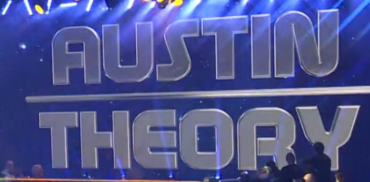
- Yesterday
-
.thumb.png.51dfb6cc71a655bbb607ec7a044b60c4.png)
Looking for the name of the font used for this Trading Post store in Custer, SD
Member Mis… replied to Member MDo… 's topic in Font Identification
I think it's Signmaker 2 from LHF. Mix of Regular and Fancy. -

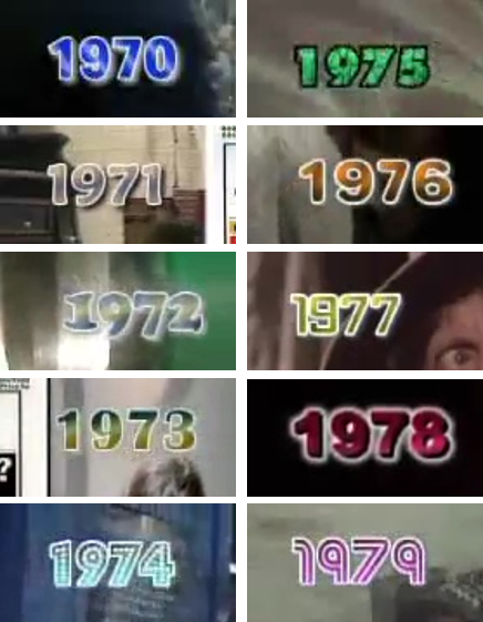
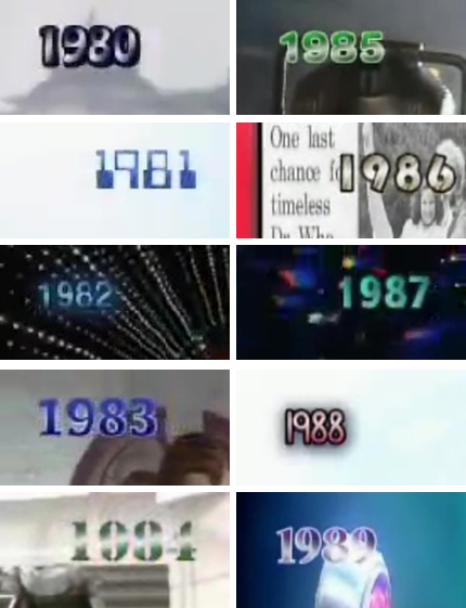
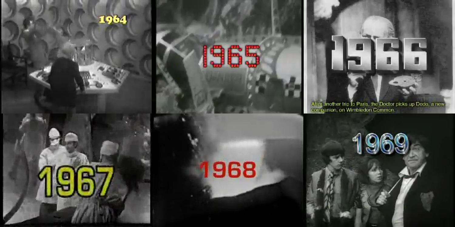
Help with fonts used in a web video published on the BBC website in 2005
Member Joh… posted a topic in Font Identification
Hi all, I would like some help with fonts used in a BBC web video from 2005. Here are screenshots from said video (sorry about the picture quality but it was 2005). I think I've managed to identify most of them, but would like to have a second opinion from the experts on here; and also have help to narrow down some to specific fonts within a family. 1964 > Cooper Black 1965 > ?? 1966 > ?? 1967 > in Eurostile family 1968 > in Eurostile family 1969 > Arial 1970 > ?? 1971 > Maiandra 1972 > Cooper Black 1973 > Britannic Bold 1974 > Budmo Jiggler 1975 > Futura Extra Bold 1976 > Arial Rounded or Helvetica Rounded 1977 > ?? 1978 > Arial Black 1979 > Street Cred 1980 > Hobo 1981 > Computer Regular 1982 > ?? 1983 > ?? (similar to Tahoma) 1984 > Stencil 1985 > Arial Rounded or Helvetica Rounded 1986 > Bauhaus 1987 > Segoe UI 1988 > ?? 1989 > ?? Thank you in advance 🙂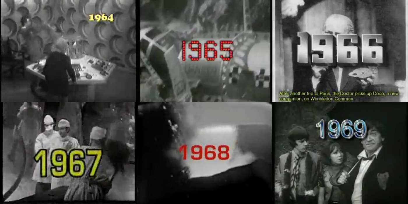
-
I am looking for the font used in this Kabi Kabi People logo.
Member Mis… replied to Member Dar… 's topic in Font Identification
Looks like Luna by Carolina Mejia Villegas.
-

Looking for the font used on RM's upcoming album Right Place, Wrong Person
Member mer… posted a topic in Font Identification
This font is used in graphics for RM's album Right Place, Wrong Person that's coming out in a few weeks. I've done some digging on my own including inspecting the website and it seems similar to Nanum Myeongjo but it doesn't match perfectly. I'm looking for a digital version and commercial fonts are fine.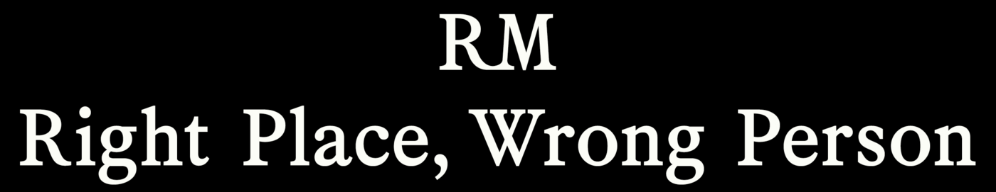

- Last week
-

80's logo signage identification Kosher Delight
Member Kev… replied to Member Naf… 's topic in Font Identification
Mellissa, which sadly has never been digitized.- 1 reply
-
- 1
-

-
 A professional and faithful revival of Berthold’s Signal type family originally published in the 1930s.
 -
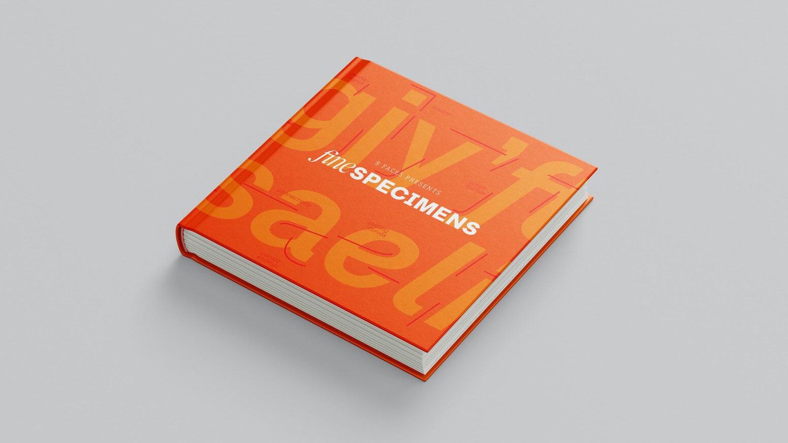 A collection of contemporary specimen graphics from indie type foundries around the world, created by the team behind 8 Faces.
 -
Need to ID 3 fonts from Changing Mission: Unchanging Faith
Member Mis… replied to Member Typ… 's topic in Font Identification
'CHANGING MISSION' looks like Teko (Bold 700). 'Episcopalians' indeed seems to be Minion (Minion Pro Bold Italic). 'LEE LITTLE' looks more like Faustina (Regular 400). -
It was designed by Geoffrey Lorenzen, but his website (www.omaticdesign.com) is no longer live and the typeface is “no longer available,” per the PDF attached. GLorenzen.pdf
-

Font identification: Jean Cocteau Handwriting/Signature
Member CN1… replied to Member CN1… 's topic in Font Identification
Thanks you David. We did look at Auteur but the majority of the letterforms just seem way off. Many thanks for looking. -
Looking for this Chinese font on the package
Member Bjø… replied to Member Yin… 's topic in Font Identification
Maybe you can try Merchant Copy? -

Sans Serif display font on record cover from 1958 (The Thompson Touch)
Member Chr… replied to Member Chr… 's topic in Font Identification
Many thanks - that's a great starting point. Cheers CM -
Need to ID Serif and Sans Serif (Getting Better book)
Member Kev… replied to Member Typ… 's topic in Font Identification
A DOCTOR’S STORY… is set in Neutraface No. 2 Text Demi . -
Looking for the font of this clothing brand’s hoodies and crewneck. (Happy Camp3r)
Member Kev… replied to Member est… 's topic in Font Identification
You shouldn’t be surprised that the brand never responded—if your goal is to create "matching designs," why should they help you infringe on their copyrighted identity? I wasn't inclined to help you either, for the same reason. There are actually two distinct, modified typefaces in your sample—Miss Nobody has already identified Happy Camp3r (stroke added and joints rounded), while Club is set in a similarly modified roman of another typeface that was released in 2008. I urge you, however, to find your own style for whatever you want to create—people often quote Oscar Wilde on this topic, but almost always leave off the end of the statement (italics mine): “Imitation is the sincerest form of flattery that mediocrity can pay to greatness.” -
Looking to identify this font from a t-shirt, Comic style?
Member Mis… replied to Member Sil… 's topic in Font Identification
I've tried to find '5', but I can't. It is possible it might be some older version of the font where '5' was a bit different, but that's just a wild guess. -

What’s this font (Signwritten Art book)
Member Sue… replied to Member Sue… 's topic in Font Identification
Thank you for your advice on this Ralf and Kevin. -
Awesome, thanks!
-
Looking for big love font on State of Elliot wedding welcome sign
Member Kev… replied to Member Geo… 's topic in Font Identification
The ampersand (and other cursive type on the other samples on the website) is Bourdos, and the smaller text appears to be Milk and Clay Regular. -
For anyone else who may have encountered this issue, I have determined that the Noto fonts are being installed along with new installations and updates of LibreOffice. There is no option in custom installation to NOT install these fonts. This means that on every computer I own, whenever I update LibreOffice I immediately have to go into Windows Fonts and delete the unwanted Noto fonts (which means all of them, since I have never used them and have no need for them).
- Earlier
-
Looking for the font used in the Touchstone 3rd edition of Viktor Frankl's Man's Search for Meaning
Member Kev… replied to Member Ell… 's topic in Font Identification
The ampersand and numerals (the latter in old style form on the original sample) seem to be a match to the sample I posted. Calling this Linotype Baskerville, likely a metal version given how much the baseline jumps. Unfortunately, none of the currently available digital versions of Baskerville or Bulmer are spot-on matches for the printed sample from 40 years ago. Some digital versions don’t even include old style figures (like Libre Baskerville, unfortunately). ITC New Baskerville or Baskerville Neo would be your best bets for approximating the look. -
Looking to identify the font used on the facade of this auctioneers business
Member Mis… replied to Member Ire… 's topic in Font Identification
Looks like ARS Novelty. -
Looking for the font of "Maëlynn" in picture attached
Member Mis… replied to Member eli… 's topic in Font Identification
Looks like Halana.- 1 reply
-
- 1
-


-
Newsletter
Sign UpSubscribe to our monthly newsletter, which highlights recent and noteworthy content from the community.
-
New in Typography Weekly
-
Tell a friend
-
Article | See more …
-
Latest Videos | see more…
-
Latest Lists | see more…
-
Random Quote
Trajan is the Arial of film posters.


