

Typography Feed (complete)
- Today
-
 Yes, Ralf. These pics are from another book but the same series of the same editorial.
-
 DesignEdinburgh joined the community
 -
 Any chance to see the lowercase characters in a good resolution?
 - Yesterday
-
Or Steelfish.
-
Alternate Gothic No. 2
-

Looking for the typeface used by a 2000s drift team called PRIDE
Drifto replied to Drifto's topic in Font Identification
Thank you very much!!!!! -
Thank you, it looks similar but it's not
-
Neither of those fonts strikes me as being especially narrow. The first, however, to me looks like the letters are crammed in too close together for easy reading. I rather like the second choice, and it seems to balance well with the visual weight of the body text.
-
My original post might be a bit vague, so here are a few examples of the kind of font that I have in mind (coolvetica top, bloomsburg bottom).
-
Thanks everyone for your suggestions. I mean narrow in the sense that you can fit more words into the header. An example would be Interstate.
-
Maybe Saira Extra Condensed licensed under SIL Open Font license
- Last week
-
That looks like a nice, classic body typeface. I don't suppose you'd want to pair it up with Copperplate? How about Alternate Gothic? https://fonts.adobe.com/fonts/atf-alternate-gothic Helvetica Narrow? https://fontsgeek.com/fonts/Helvetica--Narrow
-
 Bertham Regular? https://www.myfonts.com/products/regular-bertham-pro-345428?queryId=undefined&index=universal_search_data&objectIDs=5824160000
 -
Narrow as in condensed? or just not as wide than some other sans serif typfaces?
-
A distorted version of a Diddl mouse font clone like this one: https://www.dafont.com/de/branching-mouse.font?text=PRIDE
-
As the title suggests I an looking for þhe name of the typeface used by a drift team called PRIDE


-
 leoknee joined the community
 -
 Explore the latest updates to SF Symbols, Apple’s library of iconography designed to integrate seamlessly with San Francisco, the system font for all Apple platforms
 -
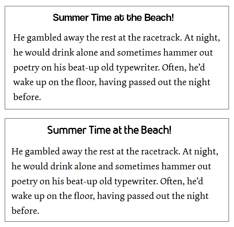
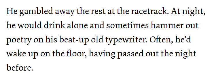
Hi everyone, I'd like to ask for some advice on ideas for a nice narrow san-serif font for headers (top of book page) that would compliment a Dolly body text (see image below), and would work well for a casual/fun/conversational book. Thanks in advance! Alan
-
 The one I'm looking for is the text of "Scarface" if anyone knows what it is or something similar I would appreciate it :)
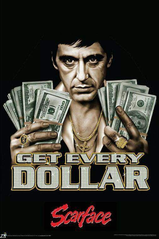

-
benjaktr joined the community
-
The most similar font I find is Freundschafts-Antiqua http://luc.devroye.org/fonts-53930.html
-
 hoathu joined the community
 -
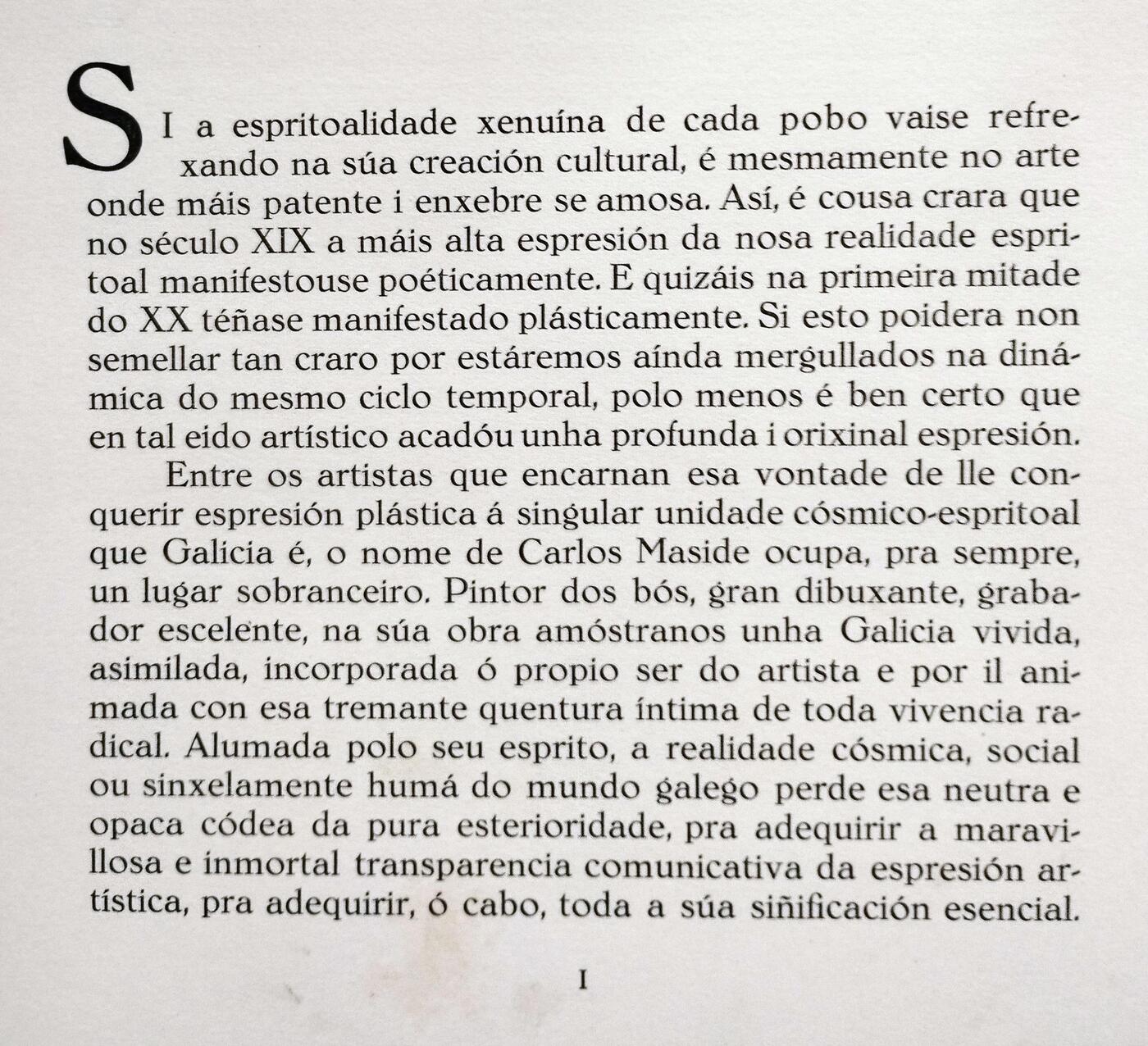
I found one big pic, uppercase

-
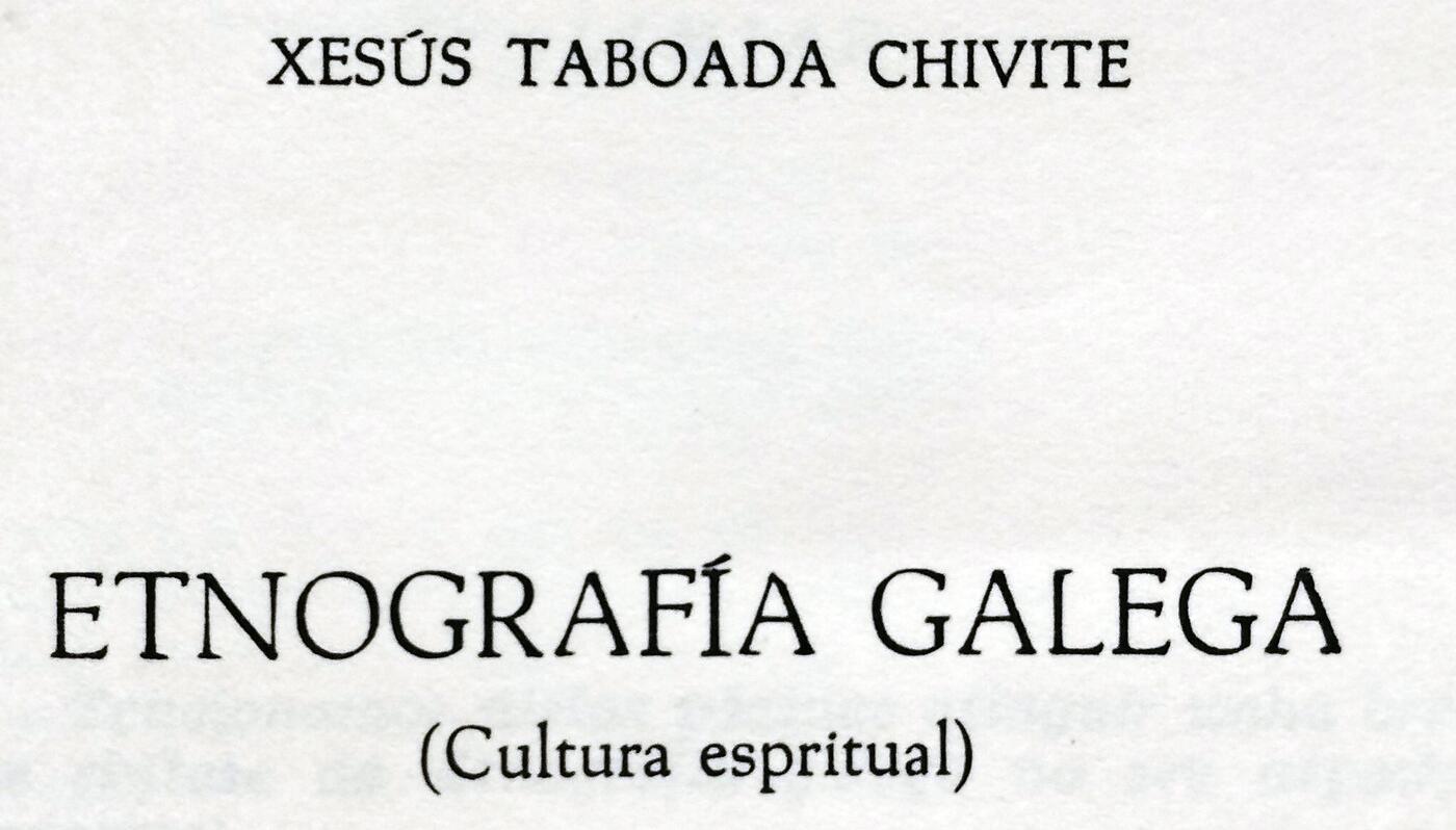
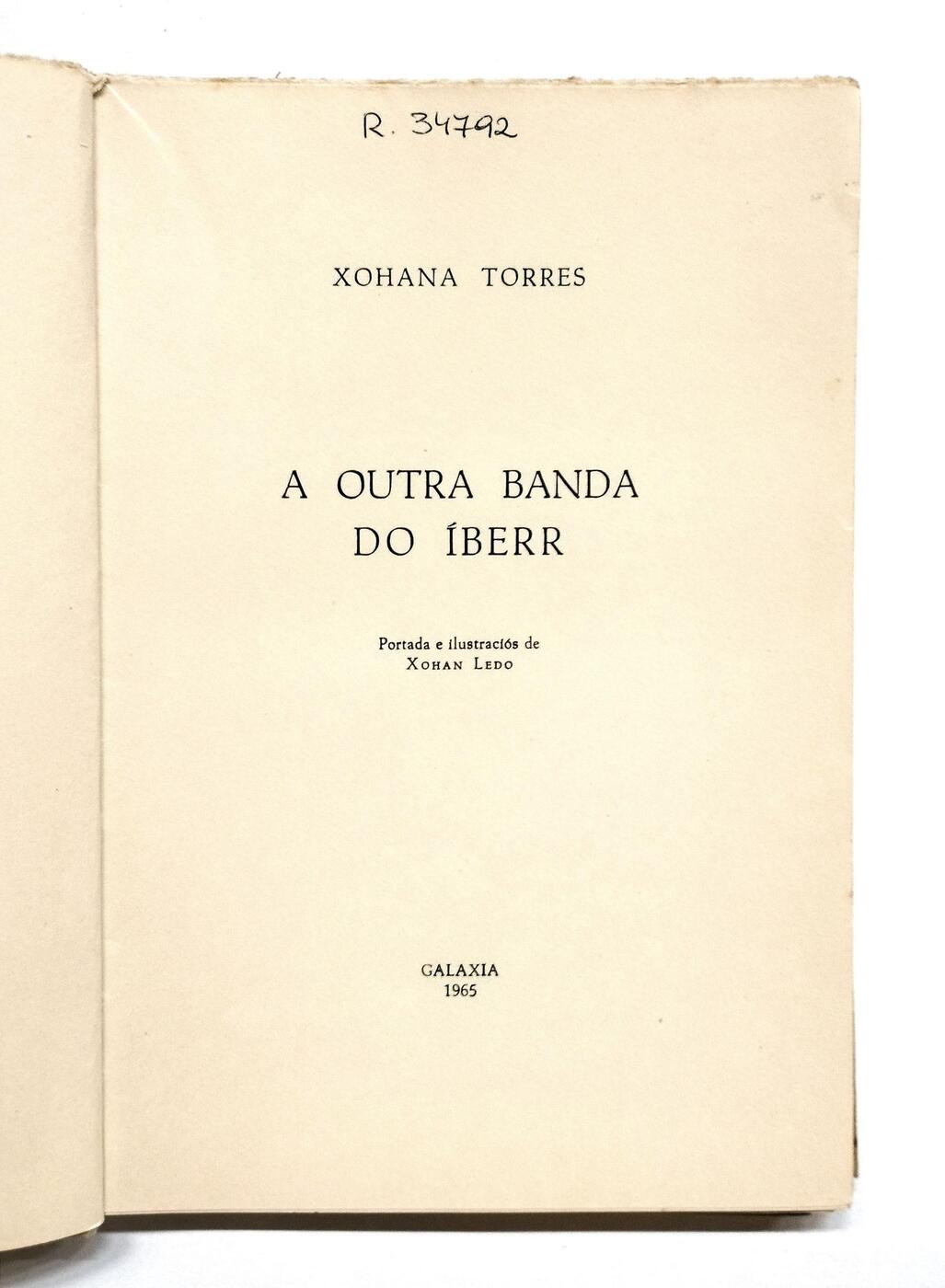
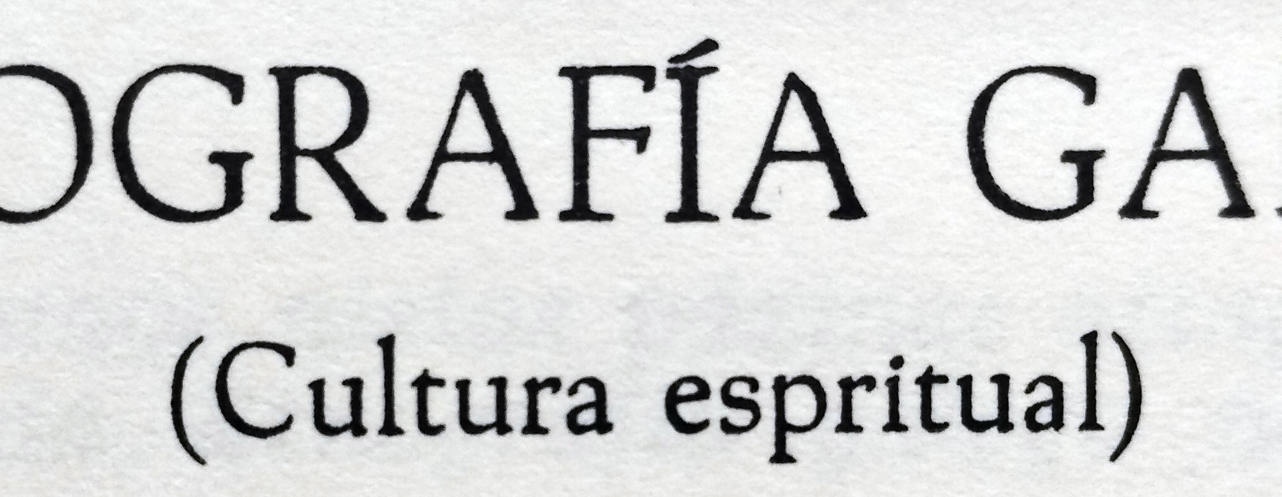
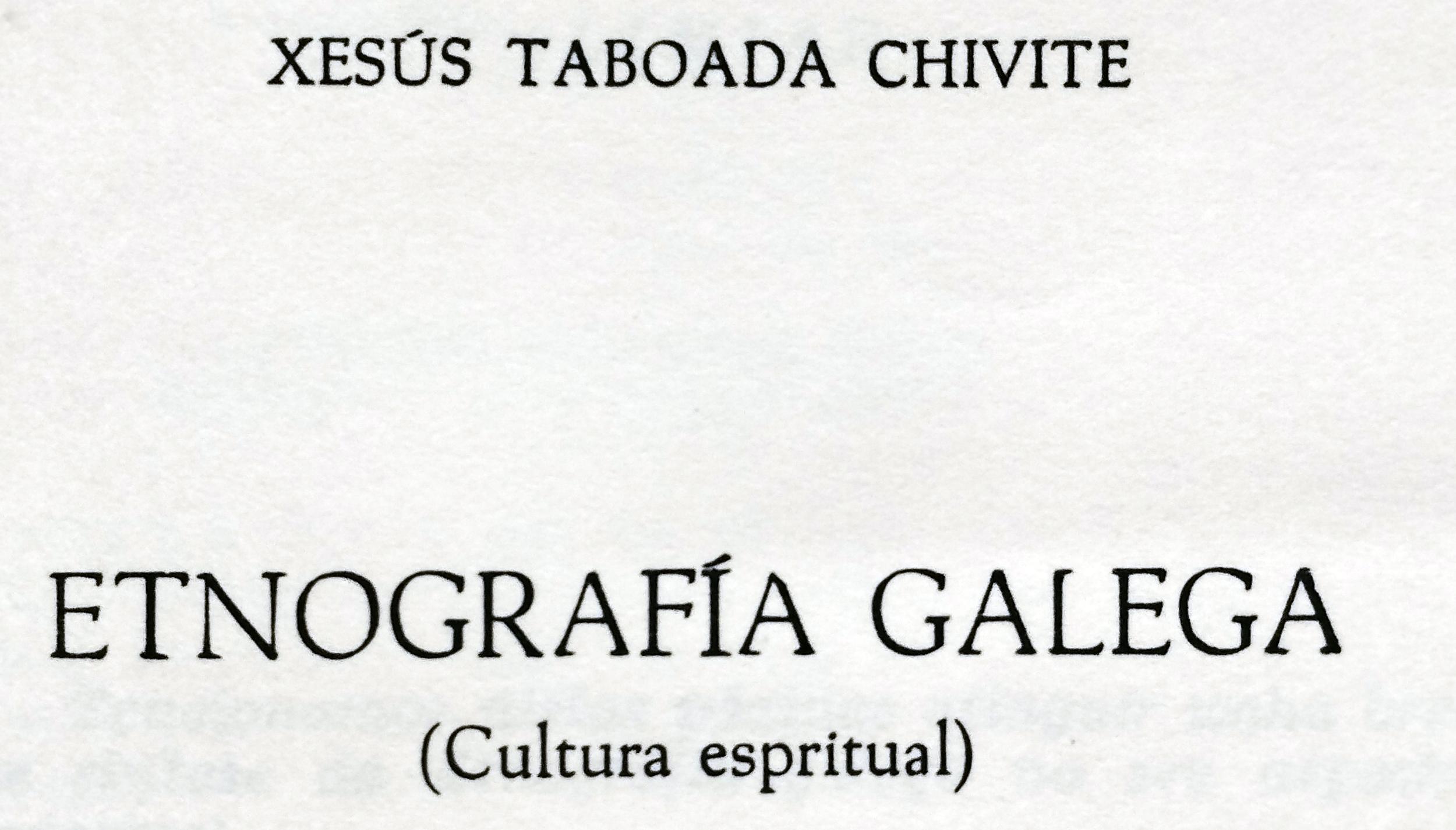
I wanna identify that font of this book, published by Galaxia Editorial in 1965 in Galicia. Thanks
-
Amazing, Ralf!
-
Probably Antigua Mercedes, the Spanish version of Tages-Antiqua.
-
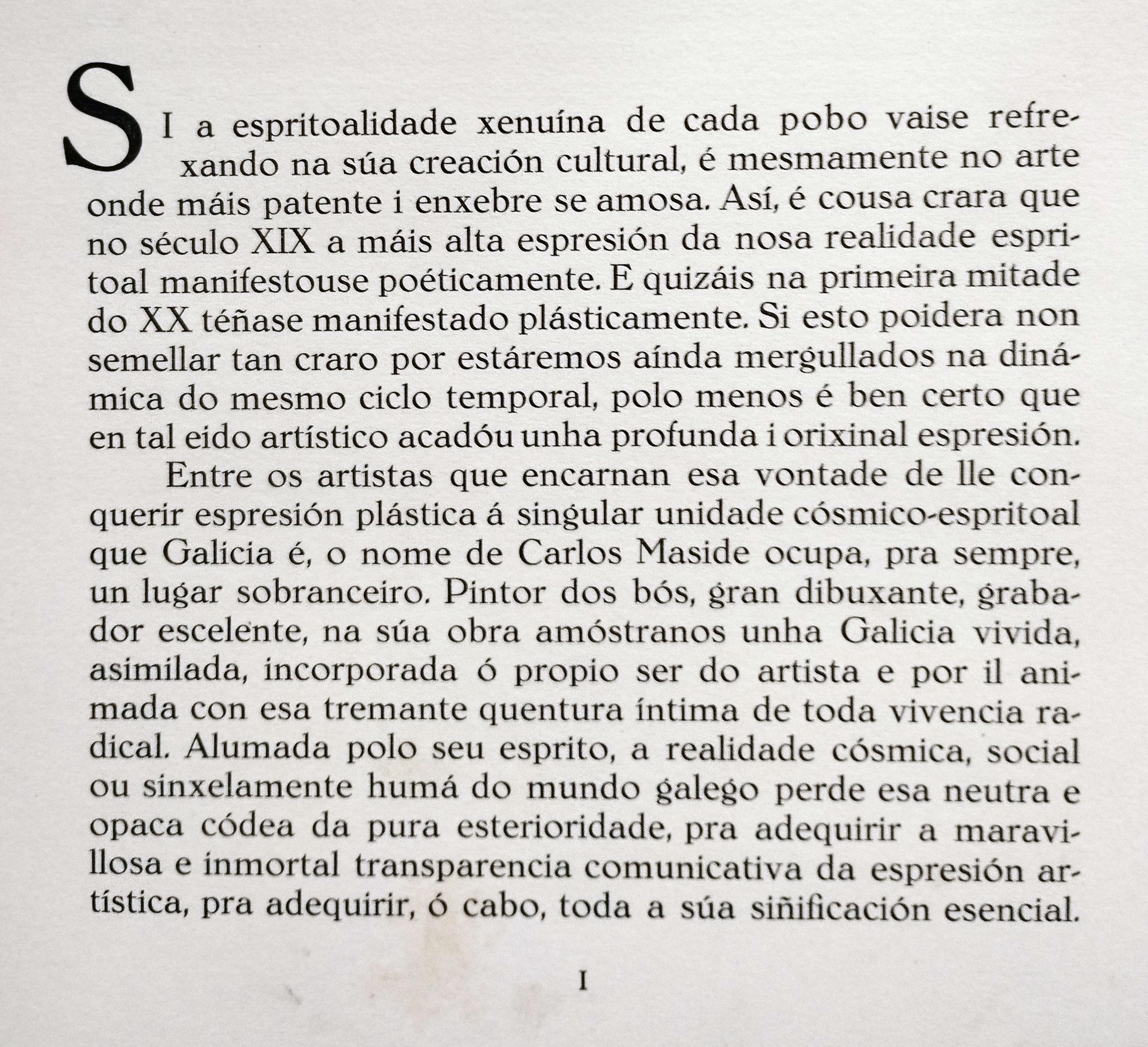
I wanna know if that font (I attached 2 jpgs of this: one —the title of the book— in uppercase and one —the body text– in lowercase. The book was published by Galaxia Editorial, in Galicia in 1959. Investigating (for my previous case, thanks) in Jakob Erbar, I find Candida font. It's similar but it's not her. Thanks


-
Newsletter
Sign UpSubscribe to our monthly newsletter, which highlights recent and noteworthy content from the community.
-
New in Typography Weekly
-
Tell a friend
-
Article | See more …
-
Latest Videos | see more…
-
Latest Lists | see more…
-
Random Quote
Legibility, in practice, amounts simply to what one is accustomed to. But this is not to say that because we have got used to something demonstrably less legible than something else would be if we could get used to it, we should make no effort to scrap the existing thing. This was done by the Florentines and Romans of the fifteenth century; it requires simply good sense in the originators & good will in the rest of us.


