


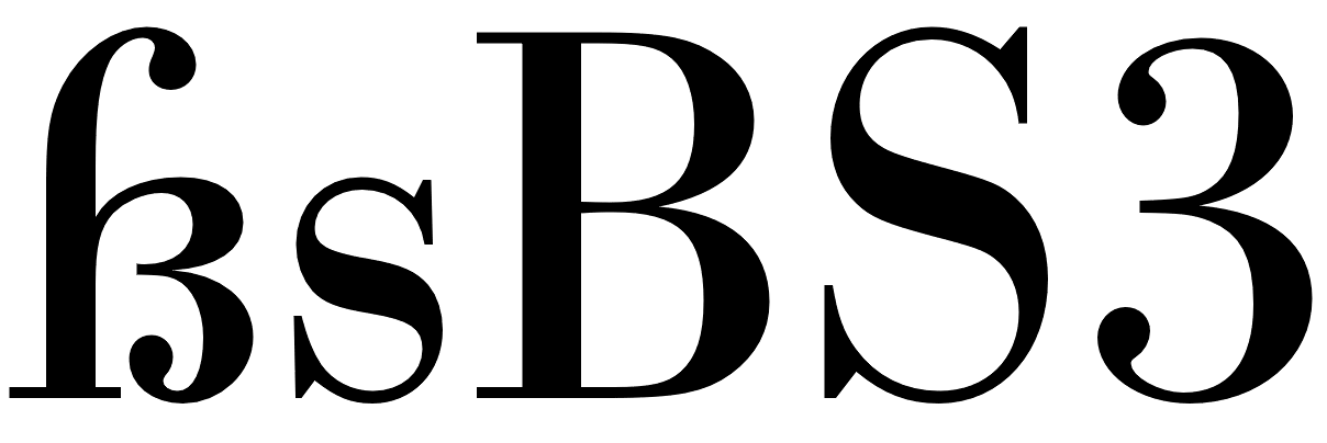
The sharp s (or “Eszett” as it is called in German) is a letter of the alphabet in Germany and Austria. The Unicode casing rules state: “The German es-zed is special”. Indeed it is! Its (still not fully explained) history is full of twists and today’s understanding of this history is often full of misunderstandings. The origins of this character won’t be the discussed in detail in this article. Instead I will focus on the stylistic options which have resulted from the recent history.
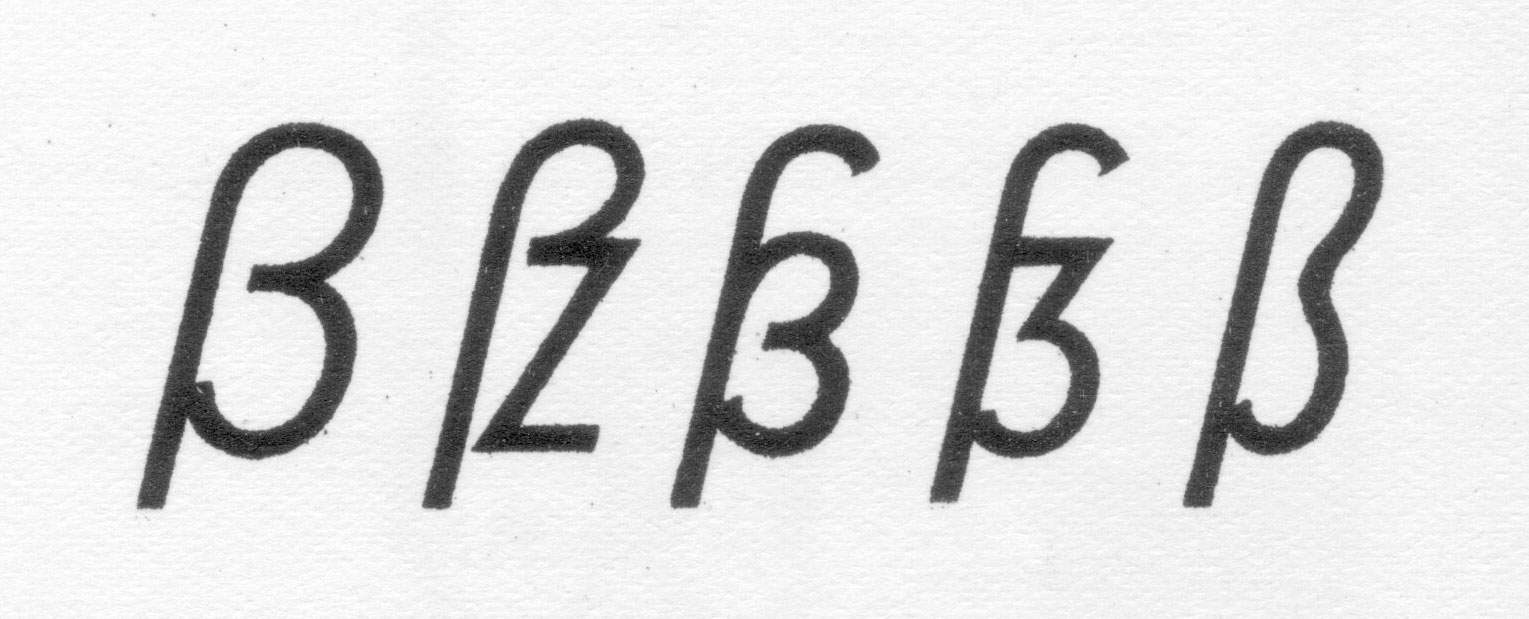
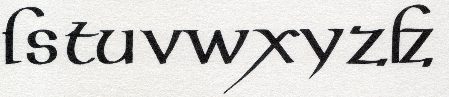
Sharp s variations for an alphabet in a lettering/calligraphy book from the 1930s by Willy Schumann
Today there are two standard models for the design of the ß character. They are explained at first and are recommendable for most of today’s typefaces.
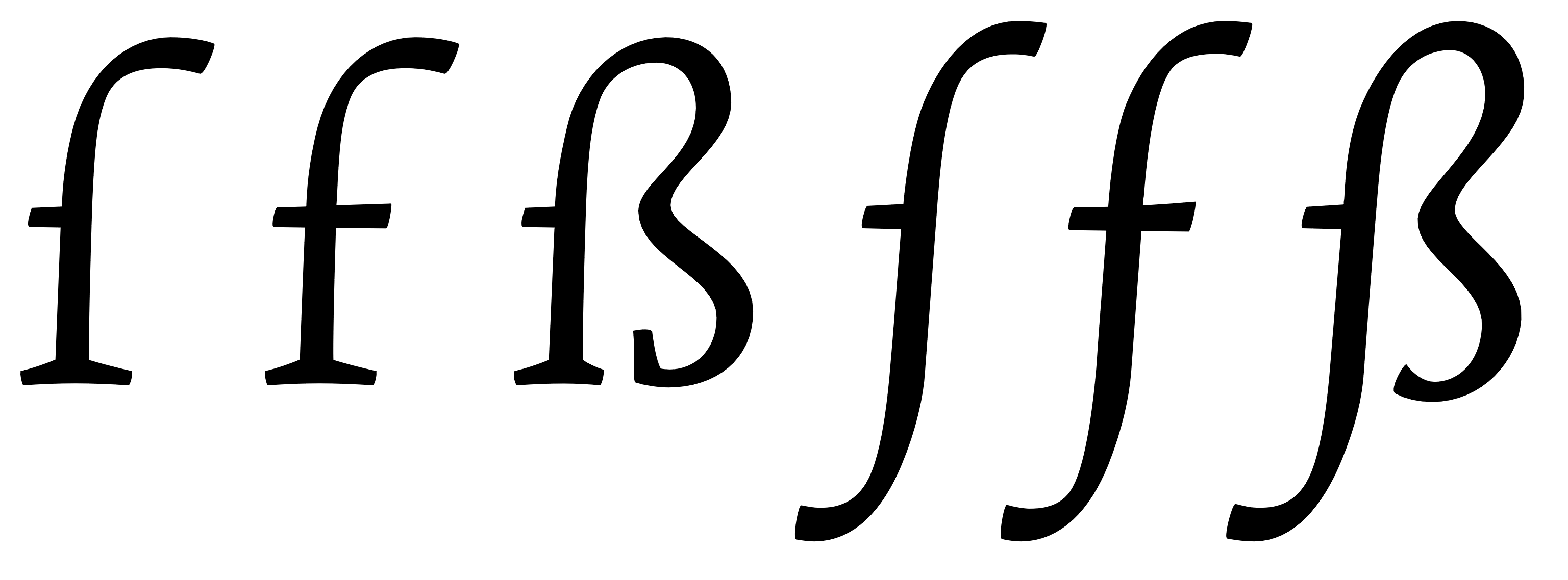
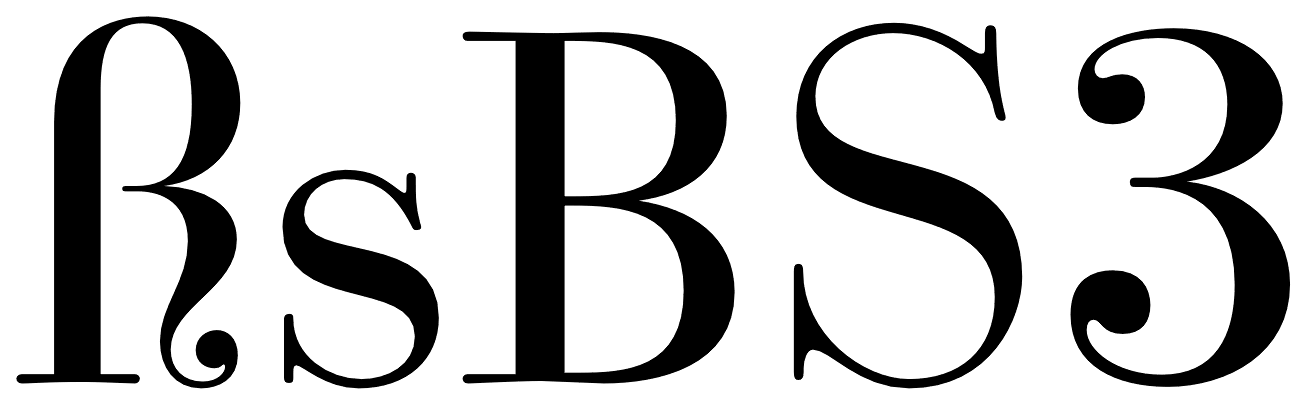
1. The ſs Ligature Design
This design is both very old and rather new at the same time. It was used for centuries across Europe, especially in cursive writing, either as a purely stylistic choice or in accordance with a typesetting practice which avoided a long s as the end of words and therefore displayed a double s (ſſ) as ſs, either visually connected or not.
ſs ligatures from Giovanbattista Palatino, from a 1578 compendium
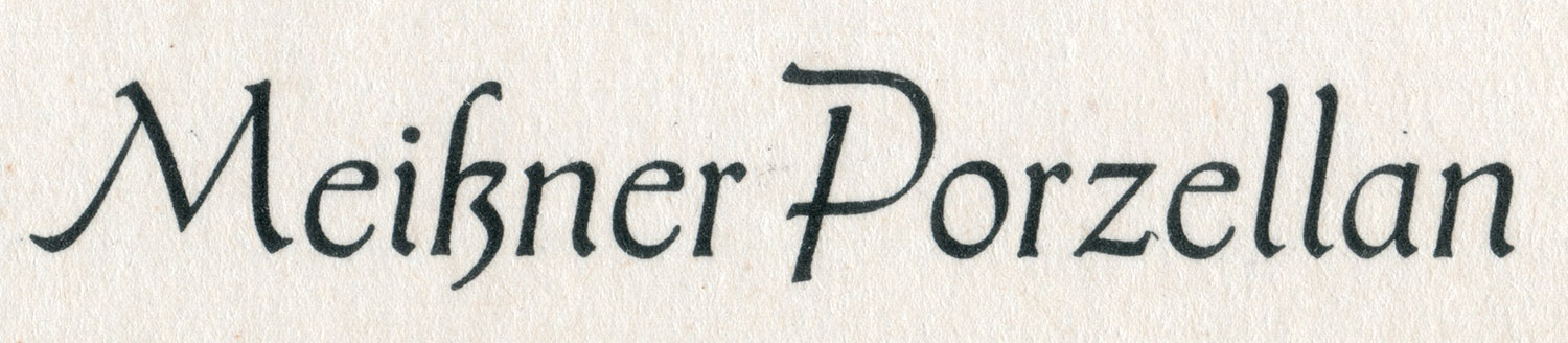
Since this design in its connected form is so visually similar to the typical modern German ß, it is often mistaken as the actual origin of the German character. But using this design for German texts is a rather new practice, which only became typical since around the middle of the 20th century. At that time, the roman and italic type styles of the Latin script replaced blackletter and Kurrent for German texts and with that, the influence of blackletter on the design of German typefaces started to vanish. Typical German blackletter ligatures (such as ch, ck, tz) came out of use and the understanding of the ß character shifted slowly. In caps-only typesetting the ß would be set as SZ in the beginning of the 20th century, but later SS became more common and finally the only correct spelling—until the introduction of the capital sharp s.
Without the influence of blackletter, a German alphabet in the roman type style was now again more clearly based on designs from the time of Classicism and Renaissance and the historic ſs ligature became a perfect fit for the German ß—both in its design and the understanding of the character.
Using this ligature design is the typical choice for so-called humanistic typefaces, i.e. designs which have their roots in the traditional book typefaces of the Renaissance. Both serif and sans serif typefaces can use this design model of the sharp s character.
The ſs ligature design in Optima and Syntax
Designing the ß in this style is rather simple, since it really is just ſ and s connected with an arc. The connection however is mandatory today. While an unconnected design is a historic variation, it won’t be accepted by today’s readers.
The upper counter area is ofter narrower than the lower counter area, as it can be seen in the examples above. But there are also typefaces with a more prominent upper counter area, especially in italic styles.
The sharp s in Sabon
The arc and the s shape usually connect as one continuous curve, but there are a few typefaces which stress the different letter parts more clearly by making an abrupt change of direction. This can also work fine. But just to be clear: German readers without a background in typography see the ß as one character. Stressing ſ and s as individual parts of that design is neither expected nor necessarily helpful. Just as a W exposing its origin as ligature of two V is a possibility, but not necessarily helpful.
The sharp s in Utopia and Calibri
The ſ in its upright version might have a horizontal stroke on the left side and the ß then gets this stroke as well. This is a traditional design feature, but not really required. In my opinion, it only supports the confusion of ſ and f and therefore the horizontal stroke might also be omitted for ſ and ß in modern typefaces. Either way, ſ and ß should always follow the same principles.
And speaking of the long s: It will usually have a descender in the italic design, but not in the roman version. The same is true for the sharp s.
Upright and cursive styles of Tierra Nueva.
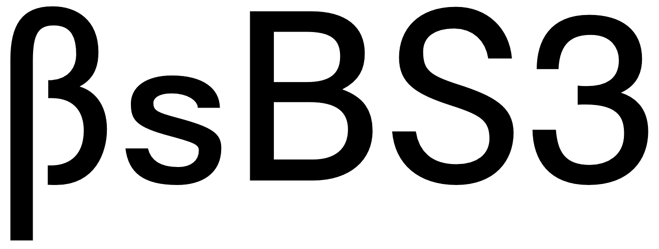
2. The Sulzbach Design
As already mentioned, German was mostly set in blackletter (or written in Kurrent) until the middle of the 20th century and the sharp s as German character was established and mandatory in these type and writing styles. When German was written or set in the roman type style, a counterpart for the blackletter ß wasn’t available for a long time. As a result we can find different alternative spellings until the end of the 19th century. For example: a word like “groß” (big) in blackletter could appear as gross, groſs or grosz in roman typefaces.
German book from 1795 in a roman typeface (Prillwitz Antiqua) using ſs where a blackletter text would always use ß.
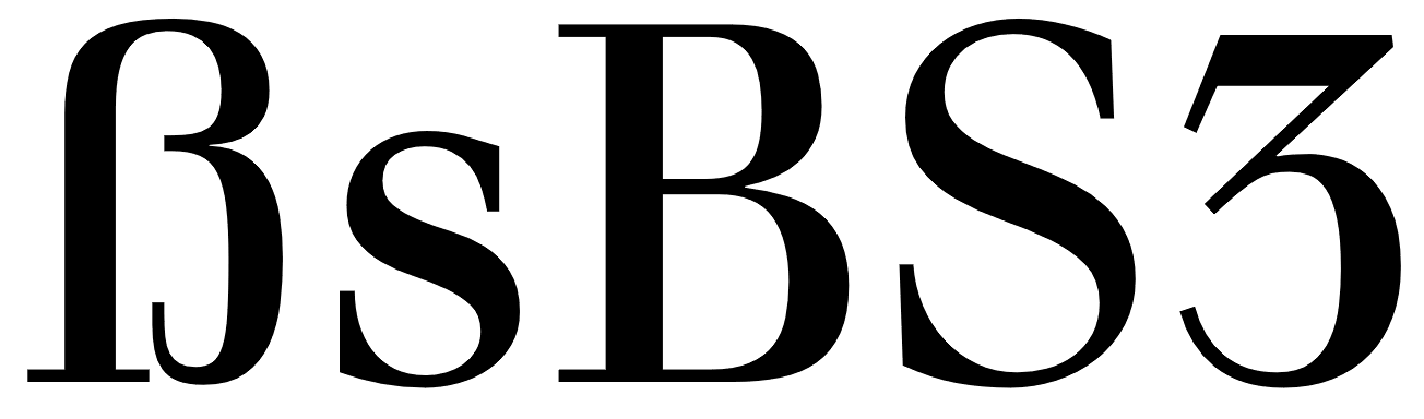
Around 1900 an official German orthography was established and a committee of type founders and printers met to define rules regarding the design and use of German characters like ß, ö, ä, ü in upper and lower case. At that time, typesetting and writing German in the roman style had already gained popularity and there was a need to find solutions and regulations regarding the different practices used for blackletter and non-blackletter typesetting. Some differences were kept, some things were unified. The ſ character was kept for blackletter, but dropped for setting German in roman and italic typefaces. The ß on the other was understood as a character of its own, which had become so important, that it was decided to add it to all typefaces, not just blackletter ones as before. All German type foundries should add it to their roman and italic designs. The design proposal that was chosen had similarities with an unusual letter used in the 17th century by the printer Abraham Lichtenthaler in the city of Sulzbach and is therefore now known as “Sulzbacher Form” (Sulzbach design).
Sharp s in the Sulzbach design added to Walbaum Antiqua in the 20th century. In the time of Justus Erich Walbaum such a roman typeface had no sharp s.
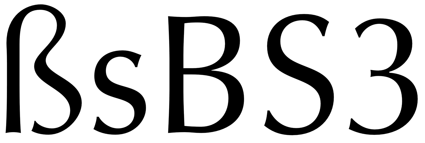
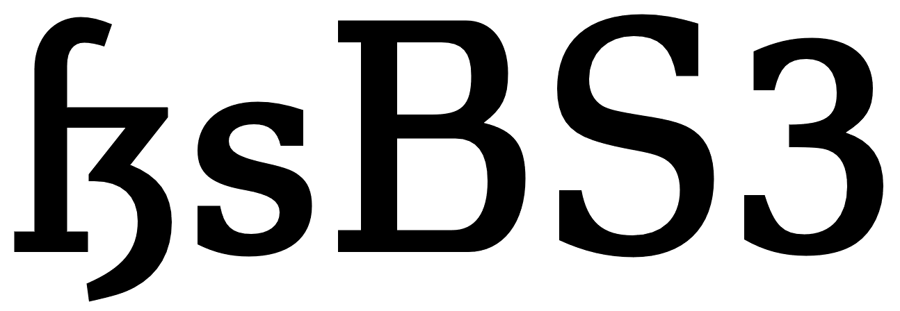
The new design doesn’t include a clear s or z shape, but consists of a long s at the left side and two connected arcs on the right side. As a result, the letter often looks like an uppercase B to people not familiar with German. This design was applied to many German non-blackletter typefaces after 1903, including the traditional old-style and modern typefaces. It remains in use until today, but mostly for more geometric/constructed typefaces, where the simplicity of the two arcs works better than the flowing connection of the upper arc of the long s with a lowercase s.
Sharp s in Futura
The Sulzbach design can more easily use an upper counter area that is similar in size and as width as the lower counter area. A tear-shaped or ball-shaped terminal can be used for serif designs. The connection of the two arcs in the middle should reach to the left as far as necessary, to make the character legible, but not so far as to suggest a connection with the stem – after all, it is not a B. And of course the aperture at the bottom should not be closed.
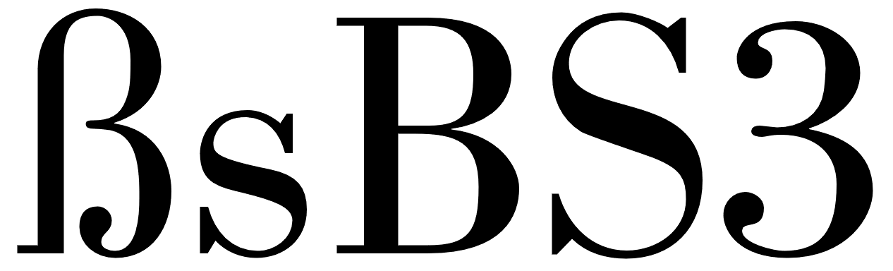
Sharp S with teardrop terminal in this version of Bodoni
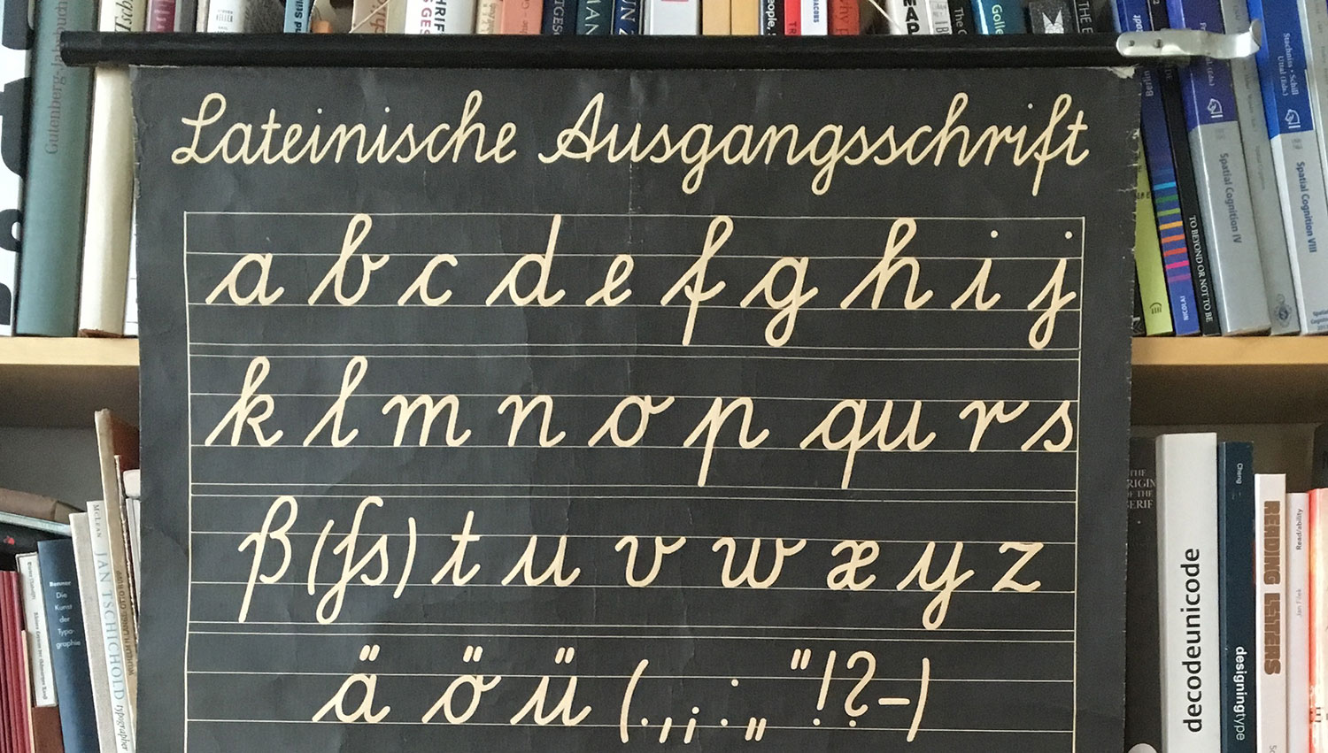
The Sulzbach design is also the standard model for German handwriting. It will usually be written with a descender and fonts might replicate this.
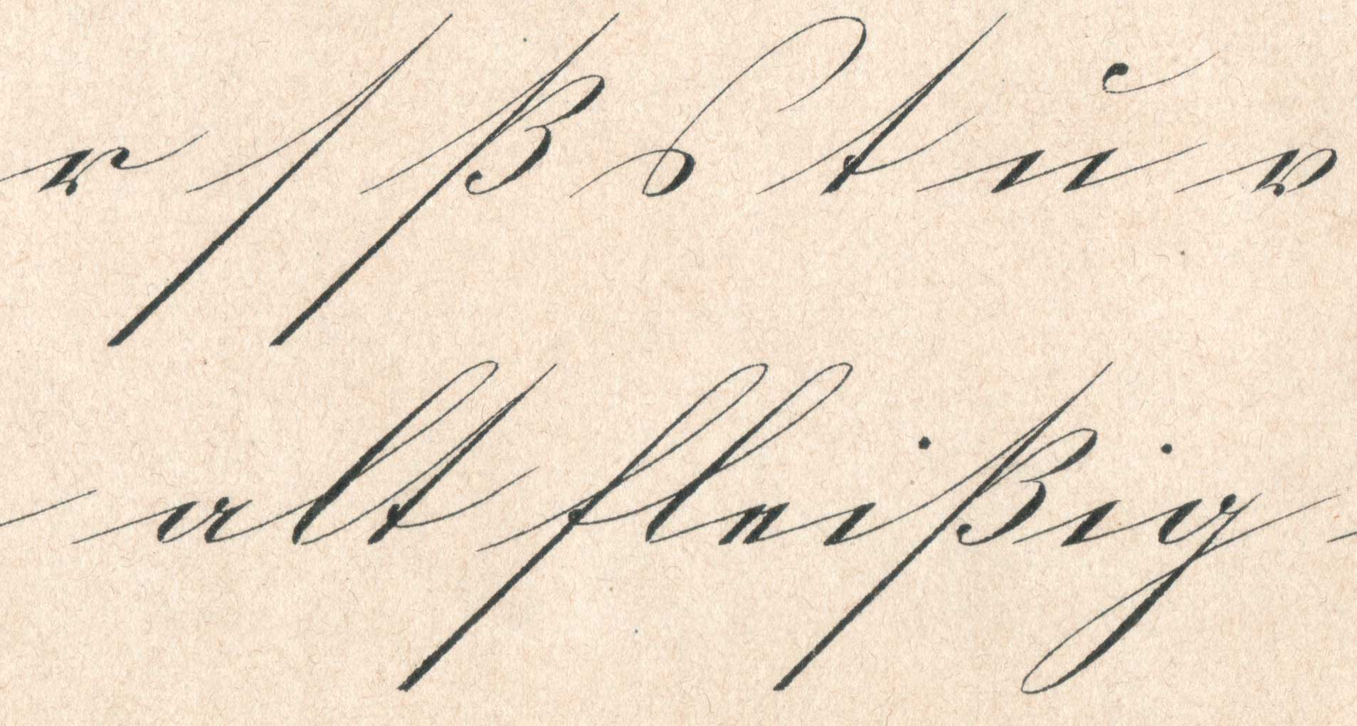
Sharp s in German in the historic Kurrent handwriting
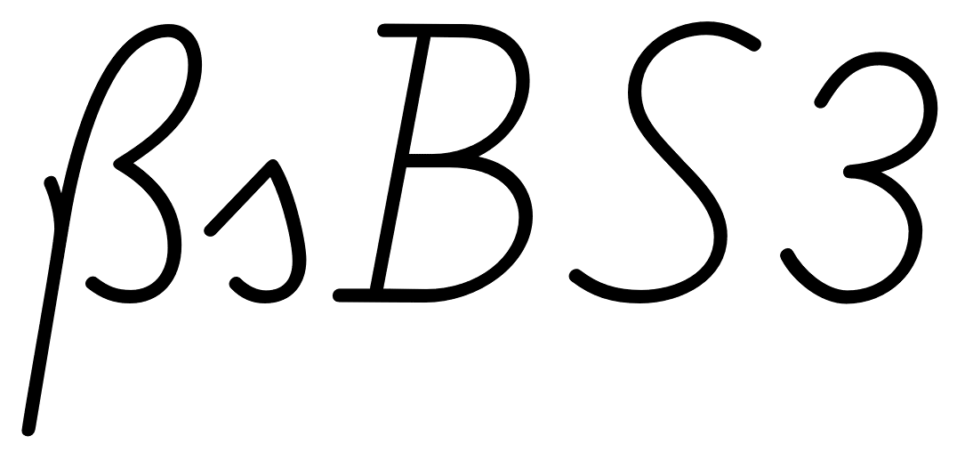
Handwritten sharp s FF Schulschrift
The Schulbuch typeface is aimed at children learning to read and uses the descender of the handwritten sharp s.
The two models explained above should suffice to design a proper ß for almost all roman and italic typefaces, but there are more variations in existence. For the sake of completeness they are shown below. They should only be used where appropriate. An unusual design of the ß character can make a typeface unsuitable for setting German, especially when it is supposed to be used for copy texts. It’s often better to include uncommon/historic designs as stylistic alternates and put a standard ß in the default slot for this character (U+00DF).
The beautiful sharp s in the metal version of Bernhard Schönschrift (1925)
The unusual sharp s in Ratio-Latein (1923)
Historic Variation: The “Blackletter ß”
With German blackletter and non-blackletter typefaces being used side by side since the end of the 19th century, type designers also started to mix elements of the two.
The sharp s in blackletter
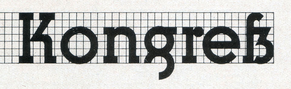
Blackletter fonts became more simplified and the letter skeletons of the early blackletter fonts became more popular, which were still closer to the design of the roman letter style. And roman typefaces from German foundries started to “look more German” in the first half of the 20th century. The mandatory ligatures of blackletter typesetting were often added to the character set of the roman typefaces and the design of individual letters was also borrowed from blackletter typefaces. A typical case for that is the sharp s character. Many, but not all typefaces used the recommended Sulzbach design. A design as a ligature of a long s with something like a 3 with a flat top resembled the typical look of a blackletter ß and also became a popular choice until the middle of the 20th century.
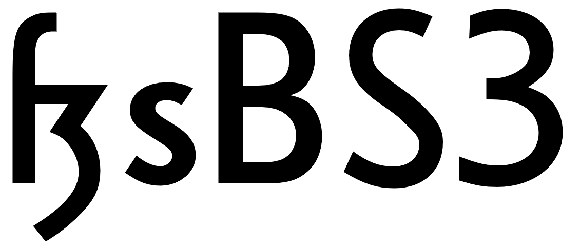
The blackletter-inspired sharp s in Erbar
Meister-Kursiv by Herbert Thannhaeuser, 1952
Technotyp by Herbert Thannhaeuser, 1948
Not using a descender is also possible for this kind of sharp s
Because the “blackletter sharp s” in roman typefaces is typical for the first half of the 20th century, its use can still evoke a connection with that time. It appears—as default or stylistic alternative—in a few modern typefaces as well (e.g. FF Kava, Verlag, Metric, DIN Next Slab) and is legible within a word context, but it is not something that works for every font or use case.
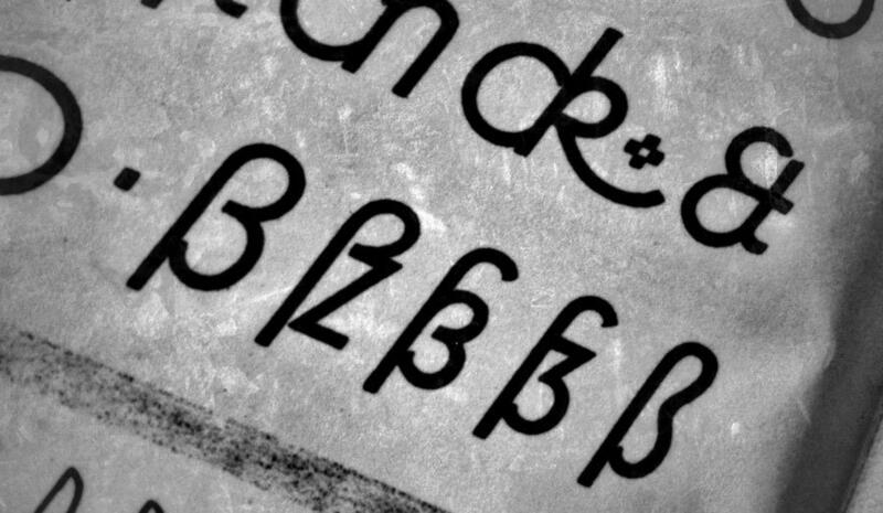
The examples shown above represent the most typical design of this “blackletter sharp s” approach. But as a variation, some typefaces also use a design that looks like a 3 with two arcs or a z design on the right side of the ligature. These designs might not work so well for today’s readers.
The sharp s in Ehmcke Antiqua (1909), which is also in the digital versions named Carlton.
The URW++ version of Bodoni
While used occasionally in the 20th century—a literal Eszett (“sz”) ligature is not recommendable today.
Historic Variation: The Connected Script ſs Ligature
I already explained the ligature of a long s and a round s where the top part of the long s is used to make the connection to the round s. But in connected cursive writing there is also a way of writing a regular long s and then making a connection from the bottom, usually as extension of a descender loop in the long s.
This style can also be found across Europe and across different languages over several centuries. It usually just represents a double s, but in a German text that isn’t written with a long s as individual character, this design represents the sharp s, as seen in the following examples.
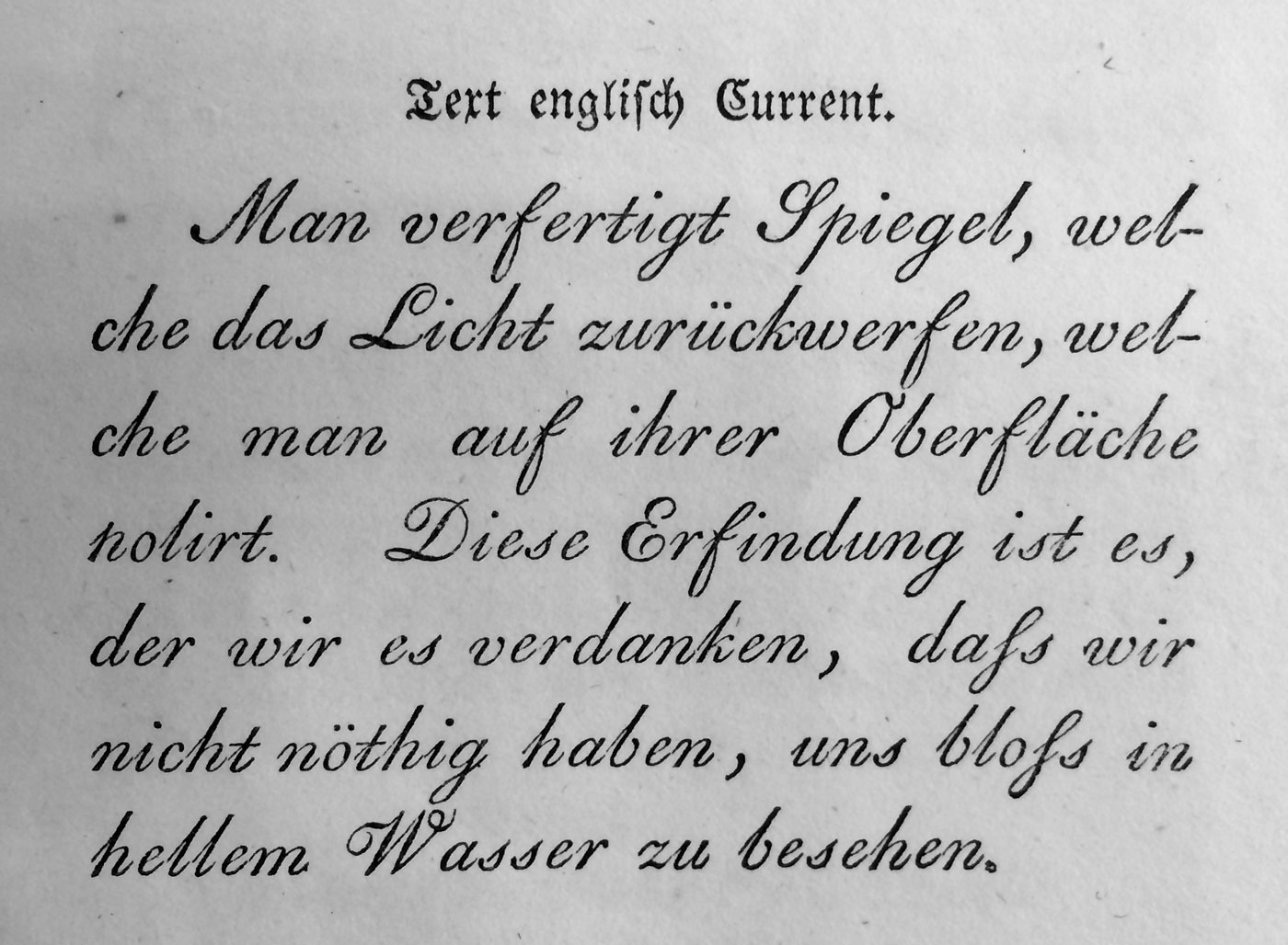
From an original type specimen booklet of Justus Erich Walbaum from the early 19th century. “daß” and “bloß” are typeset as “daſs” and “bloſs”.
This design can be found in use until the 20th century, but it not common anymore and will probably confuse many of today’s readers of German.
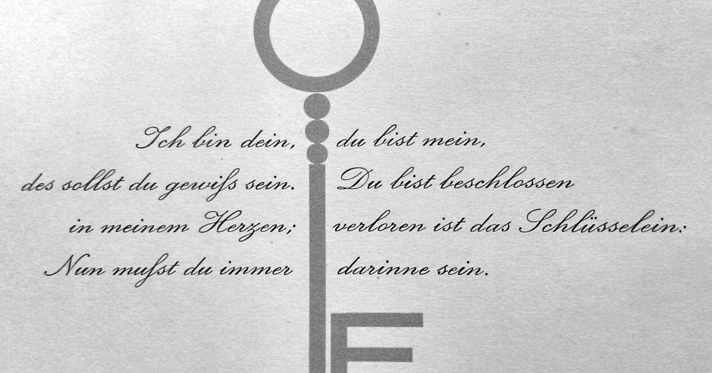
An undated German school poster shows the connected script ſs ligature as alternative to the regular ß in the Sulzbach design.
-
 5
5


Recommended Comments
Create an account or sign in to comment
You need to be a member in order to leave a comment
Create an account
Sign up for a new account in our community. It's easy!
Register a new accountSign in
Already have an account? Sign in here.
Sign In Now