Today’s demand for a capital ß (“sharp s”) character is a functional demand. And a very simple one at that. It logically follows from two points:
- How the lowercase ß character is used today in the German alphabet
- How the Latin script works today as double-story alphabet
Put these things together and it should be clear that the ß requires an uppercase counterpart like any other Latin character as well. So people still arguing against the capital ß will usually just ignore the functional aspects of it. They have to. Instead they typically argue in one of two ways:
- “because something in history …”
- or “because something is wrong with the design”
The history of the character ß is an interesting topic. It might be one of the most interesting ones of all the Latin characters which developed over the last couple of centuries and I discussed what we know about this history in previous articles. But whatever you know (or think to know) about the history of the character—it cannot be a proper argument against a capital ß, because it has no influence on the two bullet points listed above. So it’s by definition irrelevant. And very often people arguing this way actually know very little about the history of the character. They just go by simple claims they picked up many years or even decades ago, which might not even be true or it might just be a tiny piece of the puzzle.
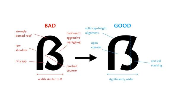
But what about the design arguments against the capital ß? Now that the character is part of the official German orthography, the design argument seems to be the last straw for the “grumpy holdouts” in our field still rejecting the character. And of course it’s the most tricky aspect, since whether or not all or specific capital ß designs are successful is subjective. If someone likes or dislikes all or specific capital ß designs, everyone else might just want to respect that. It’s just an opinion and probably an honest description of a personal perception. But people might also argue for their opinion. They might try to give objective reasons why something is supposedly intrinsically wrong with the typical capital ß designs or even the idea of the capital ß itself. And those reason can and should be checked. Normally, the burden of proof would be on the ones making such claims. But unfortunately, after all these years debating the capital sharp s, not a single article has been written trying to make a convincing case against its design or existence. All we get is short social media posts with opinions and bold assertions. So let’s look at the reasoning we can gather from these posts against the capital sharp s design.
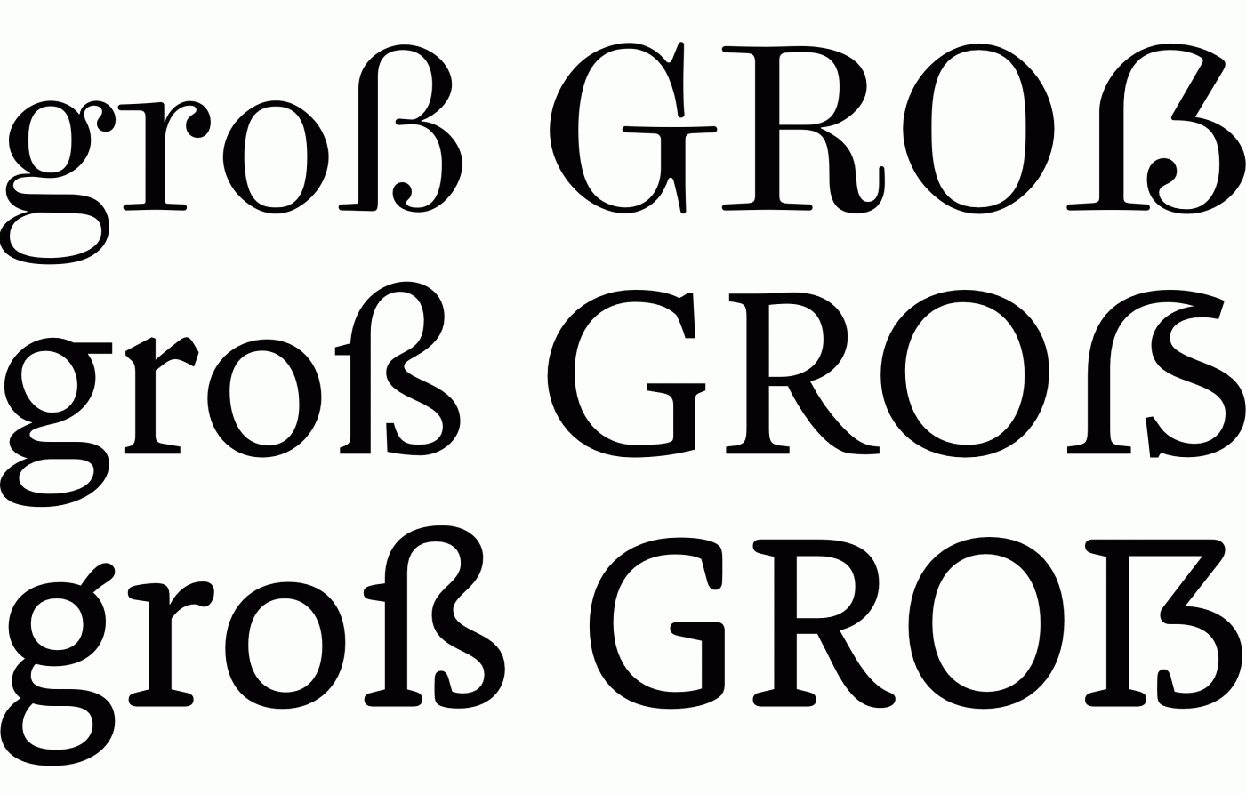
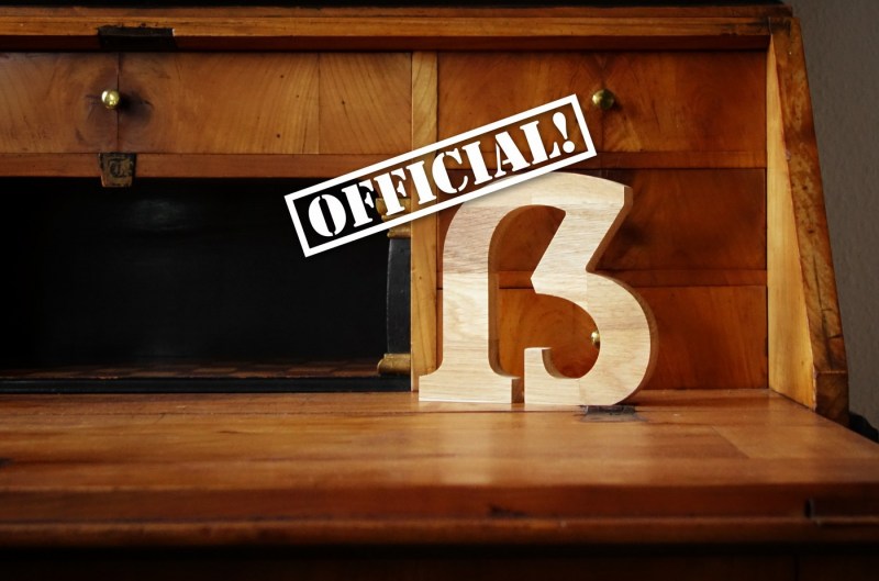
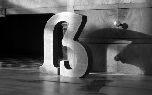
Examples of modern capital sharp s designs: Scotch Modern, Goodchild Pro, Rooney
Most capital sharp s designs today are based on a kind of “capitalized” ß, i.e. a design derived from the lowercase sharp s. That shouldn’t be a surprise. This design is instantly legible without requiring millions of readers to learn a completely new letter. At the same time it fixes the typographic problems one would create by putting the lowercase ß between capital letters as a work-around for the previously missing character. And this was and still is common practice. Even official documents like German passports did it this way to maintain the correct spelling of names in uppercase. But typographically, the ß character, like any lowercase character, isn’t meant to be put between uppercase characters. It might have a different height and it doesn’t use uppercase proportions. A capital sharp s based on a capitalized version of the ß can fix these problems. And so all functional and typographic problems are solved this way. Yet, some typographers, type or graphic designers insist, that this approach is somehow flawed and any capital sharp s created this way is intrinsically flawed because of it. In the most general way those people say:
- “You can’t create an uppercase character from a lowercase character.”
But most of the time it is actually phrased this way:
- “You can’t create an uppercase character from a lowercase ligature”.
Well, let’s look at those claims logically and one by one.
The first one is based on the knowledge, that the (basic) set of Latin uppercase letters existed first. The lowercase letters came later and the claim essentially suggests, that this is the “natural order”, which can’t be reversed. The claim can be understood in two ways: either it talks just about the order of the development or about the designs that follow from that order. The order itself can hardly be used against the capital ß, because the same argument could also be used against the German umlauts (ä/ö/ü), which also existed as lowercase first. But no one really questions their existence, do they?
But what about the design? Can we derive a proper uppercase shape from a lowercase character? Well, of course we can! Characters, not unlike words, are human-made cultural tools of communication. We create and shape them as we need them. And we have done this for thousands of years. If there is a functional demand for a word, we create it. If there is a functional demand for an uppercase letter, we can create it as well. The only reason this specific demand didn’t exist in the past was that German was mostly set in blackletter, which used mixed-case typesetting only. And since the ß never appears at the beginning of words, there simply was no demand for a capital version. Now this demand exists and and so now we create the letter. Plain and simple.
But can we “reverse-engineer” the design process so to speak? And do we have to do that? Because one could argue, that the perfect capital ß would be one that could have existed 1000 or 2000 years ago and then later turned into the lowercase letter ß we use today. And people then argue, that the typical capital ß designs today are intrinsically flawed, because they don’t do that and just jump from lowercase to uppercase by “capitalizing” the lowercase shape. They basically say, that as long we can recognize the lowercase ß in there, it remains a lowercase letter and as a capital letter design is therefore flawed. So what about this argument?
I fail to see any logic in it. It’s the reasoning you come up with while doing post-hoc rationalization. Because it just isn’t in line with reality. Again, we can look at the history of the German alphabet. German blackletter is full of (what we today consider) lowercase shapes turned into uppercase.
A blackletter H can be seen as the lowercase shape turned into an uppercase letter by changing the proportions and adjusting the design to fit the other uppercase letters. And that is exactly what is currently happening with the capital sharp s designs. But why do some consider this wrong for the capital ß, but they don’t complain about those blackletter shapes? If it happened in the past it is okay, if it happens today it is flawed?
And to fully drive this point home, just consider this thought experiment: A type designer would have been shielded his or her whole life from seeing the Latin letter s/S. And then one day we show him or her the lowercase letter and ask the designer to create a proper uppercase version. What would the designer do? Well, we can’t know for sure, but it wouldn’t be surprising if the designers takes the letter skeleton of the lowercase s and enlarges it regarding its size and proportions to fit the other uppercase letters. The result could look exactly like our S looks today. But would this shape now be flawed because the lowercase character came first? Of course not! That would obviously be an absurd claim in this case. But it is the same claim people keep using against today’s uppercase ß designs.
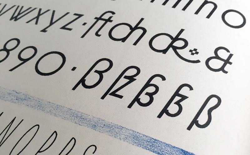
Today’s capital sharp s designs are nothing new by the way. As an example, this typeface from 1915 (“Koralle”) already used an uppercase design based on the lowercase design
Visual similarities between a Latin uppercase letter and its lowercase counterpart aren’t a flaw—they are perfectly normal. Some character pairs (like S/s, as well as ones based on ligatures such as W/w) are very similar, others less so. But either way—it’s not a criteria for good or bad letter designs. The design of the S isn’t wrong, because it can be seen as a capitalized s. The blackletter H isn’t wrong because it looks like a capitalized h. And the capital ß isn’t wrong, because it looks like a capitalized ß. This is a logic in line with the reality of the Latin script.
A good or bad letter design depends on the the skill of the type designer. Today’s Latin fonts need to work in both mixed-case and uppercase-only typesetting. That is the challenge for the type designer and with the capital sharp s being new, not all designs might be perfect yet. But logically, there is just no intrinsic flaw just because the lowercase letter came first. Simply knowing what came first, doesn’t affect how the readers perceive and read those letters.
Now let’s move on to the ubiquitous ligature myth. Some people in our field seem to be unable to to see the letter ß as anything else than a ligature. And starting with that as a premise, they come to typical conclusions like:
- if it’s a ligature (like fi/fl) it’s not really a regular letter and there is no need for an uppercase version.
We won’t address this in detail in this article. But the conclusion is wrong since the premise is factually wrong. Today, the sharp s cannot be grouped with typographic ligatures (like fi/fl). It anything, it would have to be grouped with character such as w and æ — regular characters historically probably derived from ligatures.
But when type designers understand the ß as a ligature of two lowercase letter, they might think that an uppercase version needs to follow the same logic and so the uppercase ß must be created from the uppercase counterparts of whatever lowercase parts the ß is made of. And since there is supposedly a long s (ſ) in the ß design, some might conclude that a capital version cannot be created at all, since there is no capital ſ.
Once more, I fail to see any good reasoning behind such claims. First of all, if you think the original lowercase parts of the ß matter and should be used for the uppercase version as well, which parts would those even be and how can you be sure to pick the right ones? Because at this point, there isn’t even scientific consensus about the origin of the ß. There is a single paper by Herbert E. Brekle, which can be considered scientific. But it mentions several possible sources. It might be one of those. It might be a combination. There might be other theories and sources that still need to be explored. Considering this status quo, it’s really surprising and disappointing how many designers and typographers claim to know what the ß was and therefore supposedly also “is”. (Which by the way is another logical fallacy.)
But even if we would know for sure what the original parts of the ß are and if we happened to have those available in the uppercase alphabet: Would we need to create a new ligature from those individual uppercase letters? No! Case in point: We didn’t do that with the umlaut characters either. A German ä has definitely developed from merging lowercase a and e. When the uppercase versions were created much later, they didn’t use an Æ design to recreate the merger of a and e in uppercase as A and E. The type designers and writers of the time adopted the common design of the lowercase umlauts for the uppercase versions as well. At that time, that usually meant to put a lowercase(!) e on top of the uppercase letter. Not a very logical thing to do in terms of type history, but an understandable solution nevertheless. And one that isn’t questioned at all in hindsight. So why shouldn’t we be able to do that with the uppercase ß as well?
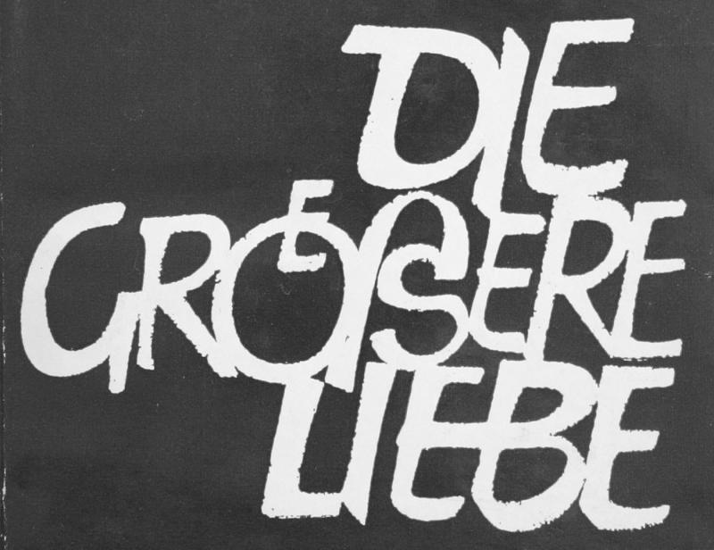
And last but not least, there is another problem with the typical ligature arguments against the capital sharp s designs: It ignores the two historic branches of the German alphabet: blackletter and roman (or “Antiqua” as it is called in German). The sharp s was established when blackletter was the dominant type style in Germany. There is no doubt about that. But if we talk about the design of today’s typefaces, we hardly ever mean blackletter typefaces. We mean the roman designs. But it is a fact that the roman ß hasn’t developed from a ligature. It hasn’t developed at all. It was introduced by a committee as a new character with a new design at the beginning of the 20th century.
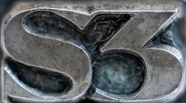
The ß design as introduced and used in the early 20th century.
The left part does indeed look like a long s (ſ), but that special character had already been removed from the roman orthography of the German language at that point. And the right part was neither a roman s, nor a roman z. So calling it a ligature actually makes little sense. If anything, it hints at a ligature design. It didn’t develop from a ligature, nor did the “parts” even exist individually in the orthography they were used in. What was created was a single roman letter with its own unique design. And that by the way is how the vast majority of people in Germany and Austria perceive it. They don’t see a ligature in the character w and they don’t see one in the character ß. It’s one design in both cases.
So if we talk about the design for the roman capital ß, what else should it be based on than the lowercase ß? Why go further back than its introduction at the beginning of the 20th century? Why go by our sketchy knowledge about blackletter predecessors? In today’s roman typefaces, we hardly ever draw any German character (ß, ä/Ä, ö/Ö, ü/Ü) the way they looked in blackletter. So why would the capital ß—as the only exception—have to be based on asserted historic lowercase parts in blackletter put together again as uppercase ligature? It’s just not conclusive and the logical fallacy of special pleading.
In conclusion: if some people don’t like an uppercase ß that reminds them of the lowercase ß, so be it. But I can’t see how you can make a case, that this would be an objective flaw of such designs. If the existing uppercase characters are allowed to have similarities to their lowercase counterparts, so does the capital ß. Insisting that a capital sharp s with similarities to the lowercase ß remains a lowercase letter or ligature because of those similarities—even though it was specifically drawn as uppercase letter with uppercase proportions—is frankly an absurd claim because it is not in line with the reality of the Latin script. And the assumption, that the ß character developed from a ligature also doesn’t change anything in that regard. If you accept German umlaut characters not to be drawn from their historic parts, then logically you should accept the same for the uppercase ß.
The Latin script has a history spanning over thousands of years and characters were added all the time. There is nothing special about the current change of adding a capital sharp s. In the future and in hindsight, neither this change nor the design will be questioned. Just because this single change out of the hundreds of changes happens in the present and is in conflict with the typesetting conventions one grew up with, doesn’t mean that it is flawed. Sure, a new character might briefly stand out because it is new. But that doesn’t mean there is something wrong with the design. In the end, it’s all in the hands of today’s type designers. We know they can draw a coherent set of over 100 Latin characters and all sorts of optional ligatures—nothing is stopping them to make their capital sharp s designs work just like any other Latin character.







Recommended Comments
There are no comments to display.
Create an account or sign in to comment
You need to be a member in order to leave a comment
Create an account
Sign up for a new account in our community. It's easy!
Register a new accountSign in
Already have an account? Sign in here.
Sign In Now