


Languages which use letters based on the latin alphabet are set in two separate alphabets: uppercase and lowercase. We set text usually either in mixed-case or in uppercase/small cap letters. At any time we can switch between the two without touching the content of the text. This however, is not possible in Germany and Austria where the lowercase alphabet consists of 30 letters (Basic latin + ä, ö, ü, ß), but the uppercase alphabet has just 29 letters (Basic latin + Ä, Ö, Ü). How did this happen? Well, Until the 1940s German was usually set in blackletter and such texts were never set in uppercase, because of the wide and decorated design of these uppercase letters. And since there is also not a single word that starts with an ß (Eszett), there was simply no need to have an uppercase version. But this has turned around. Today, we hardly set German text or names in blackletter and the use of uppercase/small caps is still popular for various reasons. So there is an obvious gap in the German alphabet.
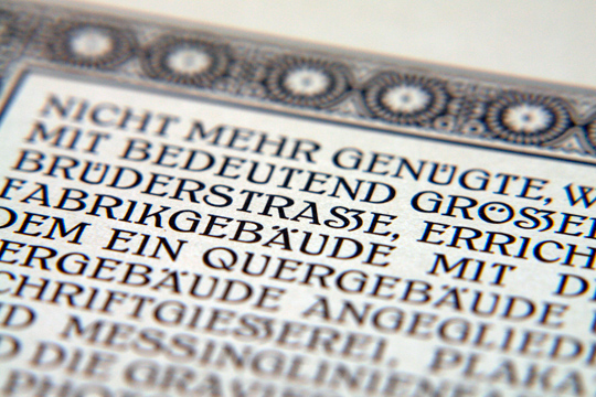
A design for a capital Eszett by the font foundry “Schelter & Giesecke” (Hauptprobe 1912)
The existence of this gap was acknowledged a long time ago. In 1903 a commission of German, Austrian and Swiss printers and font foundries announced that the letter ß should also be included in any non-blackletter typefaces. A capital version was also discussed but the commission could not agree on one design at this time. So it became common practice to replace the letter ß with SS or SZ in uppercase text. This however was never meant as a real solution to this problem. In 1919 the Duden (a German orthography book) explained:
“The use of two letters for one phoneme is just an interims solution, that must be stopped, once a proper letter for the capital ß has been designed.”
(Original quote: „Die Verwendung zweier Buchstaben für einen Laut ist nur ein Notbehelf, der aufhören muß, sobald ein geeigneter Druckbuchstabe für das große ß geschaffen ist.“)
During the 20. century a capital Eszett appeared occasionally as you can see in these examples here, but the topic couldn’t reach a broader audience.
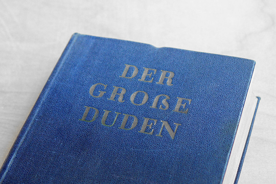
Capital Eszett on a German orthography book from 1965
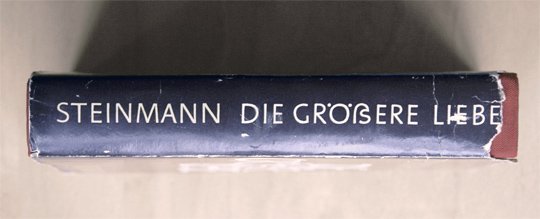
A novel using a Capital Eszett, printed in 1971
So the interim solution of replacing ß with SS is still in use today. Germans are used to this practise but it constantly causes trouble. Here are the two main problems:
Proper names
Depending on where you live in Germany or Austria the letter ß is quite frequent in the names of cities or families (see illustration).
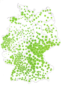
In Germany there are 444 cities that use an Eszett. According to a rough estimation around 2 million people have to use an Eszett when they should write down their address. But how do you do that, when the form of the postal service asks you to write in uppercase only? Sure, one can replace the Eszett with SS, but unfortunately this is a one-way street. Once the name has been converted to uppercase it cannot be converted back to mixed-case letters, because it is then unknown if the name WEISS actually stands for Weiß or Weiss. Both names exist and this is true for almost all names with an Eszett. This is a real problem in today’s electronic data processing. When people enter their address in web forms they might do it in mixed-case, uppercase and lowercase letters. This can be fixed with methods of case folding, but when SS is used as a replacement for an Eszett this will not work properly. And beside these technical problems, the spelling of proper names is something that you shouln’t toy with. My first name for example, exists as Ralf and Ralph in German. Of course, I accept only one spelling. Imagine, my name would be Ralf Herrmann in mixed-case texts and RALPH HERRMANN in uppercase! Sounds absurd? Well, this is exactly what we do to people who have an Eszett in their name. Both Mr. Meißner and Mr. Meissner will be set as MEISSNER in uppercase. And so far, almost everyone I have talked to, who has an Eszett in the family name, hates such a replacement.

Lowercase ß in uppercase text
The same is true for city names. I come from a small town called Pößneck. The Eszett is part of the identity of the inhabitants and the spelling PÖSSNECK always causes heated debates. They rather use the lowercase letter between the uppercase letters: PÖßNECK. But this is of course a typographic nightmare.
Pronunciation
In 1996 the German orthography was changed and this also affected the use of the Eszett. Now the use of Eszett vs. double-s clearly points out if the vowel in front of the s-like sound should be spoken short or long.
The ß in Fuß (foot) means long vowel – The ss in Kuss (kiss) means short vowel.
As nice and simple as this rules is, it will certainly cause problems when uppercase text is used and the Eszett will be replaced with SS. Now Fuß becomes FUSS and this would require a different pronunciation, just because it is set in uppercase text! And it gets worse: there are common words like Masse (weight) and Maße (measures) which both become MASSE in uppercase texts.

Conclusion
As one can clearly see: replacing one character with two other characters just because the case of the text changes, doesn’t make much sense and causes serious problems. The simple and logical solution is to complete the alphabet, so there is a counterpart for every letter in uppercase and lowercase text. Anyone who cares about type and language should agree to this simple solution. And yet, there are some typical counter-arguments I always hear, when I talk to professional designers or typographers. Which is rather suprising! Those people, above all, should understand how the two alphabets in Western languages should work properly together. But anyway, here are the counter-arguments:
There can’t be an uppercase form of the Eszett because it is actually a ligature!
A really pointless argument. The term ligature just means that there is something connected in this letter. It doesn’t say anything about the purpose of the letter. Sure, we don’t need an uppercase fi-ligature, because the connection of “f” and “i” only serves a purpose in lowercase text, but as I have shown above, the Eszett is distinct letter of the alphabet in German and Austria with a specific function concerning the pronunciation of words. Just like the ligature W—which was formed from two V—has a distinct phonetic function.
There can’t be an uppercase Eszett because the Eszett contains a long-s, which doesn’t exist as uppercase letter!
Again, pointless! Letters are abstract symbols for anything we assign to it. This in everything that matters and we cannot divide letters into “right” or “wrong”, because of their history or the origin of certain letter parts. Or is the letter S wrong because it doesn’t look like a Phoenician tooth anymore? Letters, just like words, are tools of communication. They can change their structure and meaning and they can be invented whenever there is need for new tool at a certain time. Concerning the uppercase Eszett, this need was created when Germans stopped using blackletter and it is about time to fulfill this need.
In a globalized society, the letter Eszett only causes trouble. We should stop using it.
Before the uppercase Eszett became part of Unicode (where it is called Capital Sharp S), I was also sceptical about its use. Putting an non-standard character in digital documents will certainly cause problems. But since 2008 it is part of Unicode and this is the Lingua Franca of the modern world. It can be used on any device anywhere on the planet. There is now no need to omit any character of any language anymore. It also doesn’t prove anything that Switzerland is doing fine without an Eszett in their Alphabet. This character has a distinct function that millions have learned and it is written in millions of books. And while this is the case, there is no real point to remove it from the alphabet.

A capital Eszett for the Bauhaus University Weimar
The capital Eszett today
While all attempts to introduce an uppercase Eszett during the 20. century failed, now all signals are go for it. The topic appeared in 2003 on my typographic website Typografie.info and quickly spread all over the German-speaking internet. And it hasn’t stopped since. The introduction of the uppercase Eszett in the Unicode specification allowed the instant use of this character. This is something that could hardly be done in the time of metal type.
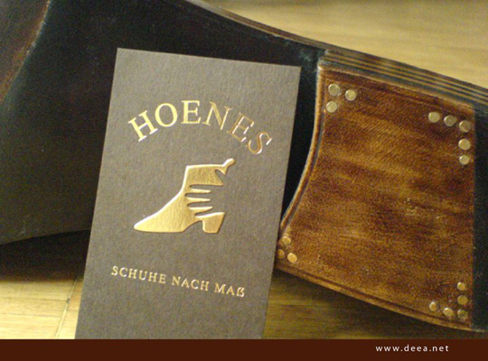
Nicely integrated into the Corporate Design
The capital Eszett is now used more every day. It is included in several Windows 7 fonts and more and more type designers are designing a capital Eszett for newly released typefaces. I would like to finish with a quote about the capital Eszett from 1879, which I consider as true today as it was then:
“Indeed—it is a new character; but maybe this newness is the only thing you can hold against it.”
(Original quote: „Allerdings – es ist ein neues Zeichen; vielleicht ist aber die Neuheit das Einzige, was sich dagegen vorbringen lässt.“)


Recommended Comments
Create an account or sign in to comment