
To begin with, please tell us a little bit about yourself!
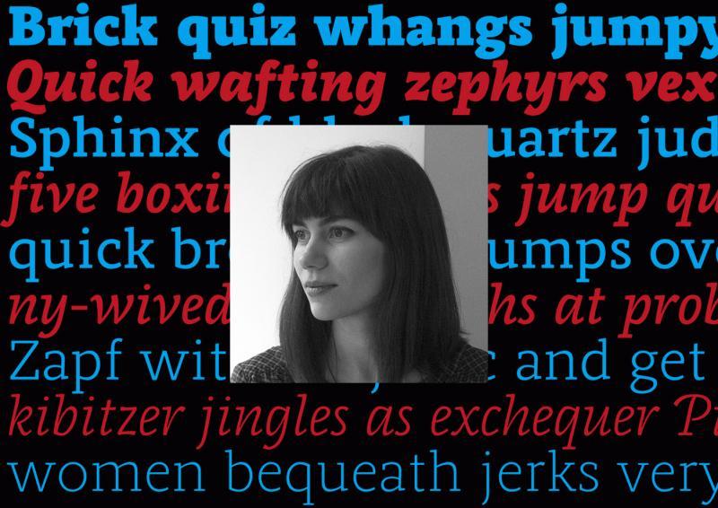
I was born in Romania, in a small town called Medgidia, about 50 km from the coast of the Black Sea. When I as 12, my family moved to Vienna, where I attended the American International School. I feel like I got the best of both Eastern and Western Europe, and I consider myself to be an “international.” When I was in high school, I wanted to be a lawyer (to be able to argue my point of view in front of a judge), an artist (I had always loved drawing and painting), or a psychologist (to analyze people’s thoughts and behaviors, then help them come to a solution). However, there did not seem to be a job that combined all of these … until I discovered graphic design. Practicing graphic design and working for clients is pretty much like being a creative psychologist lawyer. Later, while studying graphic design, I developed a love for typography, calligraphy, and type design. When I work on type design projects, it is more than art (I never liked creating for the sake of art), it is a system that is dictated by a series of rules, traditions, and historical implications. It gives just enough room for creativity while allowing me to do what I do best: analyze, test, and systematize.

How did you get to work with a type foundry from India, which has its roots in the developments of fonts with Indian scripts?
The Indian Type Foundry has been doing extremely well with Indian scripts, but they aim to become a global distributor of quality typefaces, so they have been expanding their font library with Latin script type families and more. They recently released their first Arabic type family.
Satya Rajpurohit, the co-founder of ITF, contacted me at the end of 2013, knowing that I had just graduated from Type and Media at KABK. He proposed that I design a slab serif family for ITF, which was something I never had designed before. I love a good challenge and, after some back and forth emailing, we agreed to create a bigger family including sans and slab, as well as italics, so that it could be used in all kinds of editorial projects, branding, and packaging. This was going to be one of the biggest ITF families so far and my most complex project yet. I couldn’t wait to start.

What was the idea or inspiration for Equitan? Is it based on historical typefaces?
Knowing I had to make a slab serif design, I did my research and was not very inspired with what I could find. There were flavorful slab serifs that were a bit old-school looking (Clarendon, Century Schoolbook), where the slabs seemed well integrated in the letter shapes; and there were modern designs (Museo, Neutraface), where the slabs were just sort of slapped onto existing sans serif letters, which made them seem a bit too static. I generally appreciate the approach of typefaces like Eames Century (designed by Erik van Blokland), Maple (designed by Eric Olson), where it seems as though the designers just created their own path, without being influenced by related designs, and it works! These designs are usable, yet full of life.

While browsing through the old specimen book of Palmer and Rey’s from 1844, the skeleton forms of their typefaces really spoke to me. They had some typefaces called Antique, some Clarendons, and some Gothics that looked very related with each other in their basic shapes and proportions. Without forming a family, they were obviously following the same logic.
I was fascinated by the skeleton forms and general character of these Antiques, with very long serifs and closed apertures. Although the letters seemed clumsy for today’s standards—the shapes were overcorrected, and the caps were much to heavy— it seemed that these letters were hiding a secret elegance that I could possibly tap into by creating a modern family. So this is what I started doing.

How did you approach the development of so many styles from different sub-families? Which styles came first or were they developed all at the same time?
I started by shaping the slab serif, because this has the most personality so it would help me to define the family. My first attempts were quite literal replicas of the shapes I saw in the book from 1844, but slowly the design progressed into a family with its own merit.
I knew that the sooner I introduce other weights and styles, the better I will be able to make decisions about the family as a whole. I see the whole type family as a system where members have to work with each other, support each other, and yet share the same DNA. That is why I start working on a few “strategic” weights from the early phases.
Within the first month, I gave the Sans a try, which would inform me if the skeleton shapes of the slab are transferable. Then I started the Slab Black weight, where I knew that I could pump up the personality even more. The Slab Thin weight would tell me whether the proportions of the letters were fitting well with each other and whether the skeleton shapes were interesting on their own, without contrast. With each development, the type family took shape. The masters for each of the sub-families were Thin, Regular, and Black.

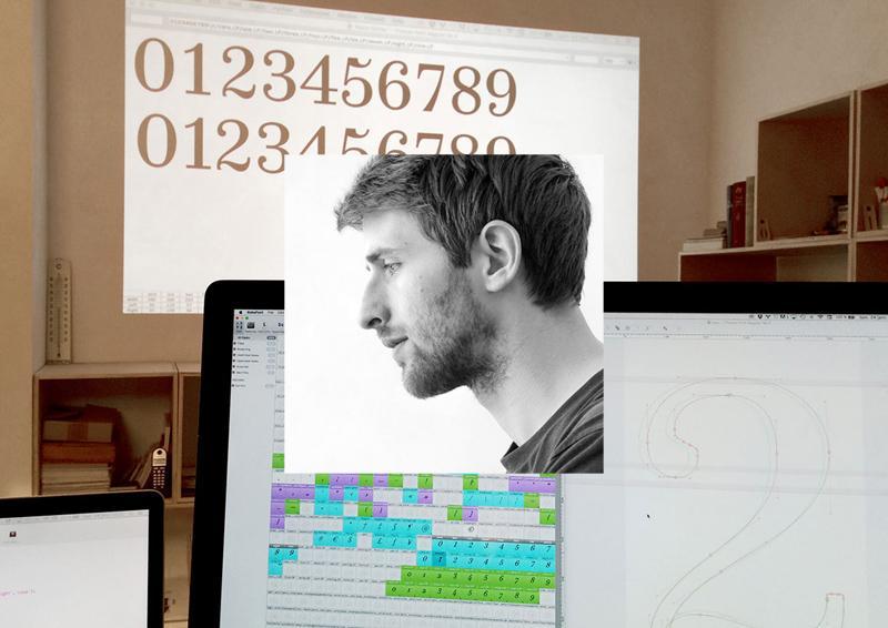
When I added the italics, I felt like a machine, working on 12 masters at once. I bought a new 27 inch computer screen (I can recommend this conveniently priced monitor for any design work: Dell Ultrasharp U2715H), rotated the old 23 inch screen by 90° and placed it on the right hand-side. This helped divide my screen real-estate wisely and work more productively. I love this part of the process, when I am juggling dozens of numbers in my head, remembering decisions I made the day before, applying changes in all the masters at once. I had the privilege to be working on this almost full-time, so I could keep all the details fresh in mind. This helps a lot for being efficient! I ran many checks and tests, designed many editorial-like pages to see how the weights played together, how the numerals and other symbols fit in.
After 6 months of work, in August, I handed over the final files to the Indian Type Foundry. They were not yet kerned and the character sets were still rather small. In January of 2016, I was asked to add kerning and expand the character sets of the Equitan family. This was a great opportunity to see the typeface one last time, and I ended up making, once again, all kinds of small corrections. After this, we generated and tested all the interpolated weights.

What typical uses did you have in mind while designing the family? Is there a specific application you would love to see your typeface used in?
Equitan is a multi-purpose family, generally for use that requires typographic richness. The Thin and Black weights are great for headlines. The other weights offer the designer a lot of freedom for text use.
Equitan would be great as the in-house type family for a larger company, because the Slab is very recognizable, yet the Sans can be a trusty replacement for Helvetica in office use.
Secretly, I would love to see Equitan Slab be used on some meat packaging. The all-caps deliver such BBQ-awesomeness! But, honestly, I would be excited if my typefaces are used in any way. That would mean I did my job right.

Which tools did you use and which challenges did you face while designing the type family?
Like most designers who grew up with a computer in front of their face, I designed most of this family on-screen (rather than sketching whole alphabets by hand). However, and this is very important to me, I checked every weight in print so many times, and optically adjusted what looked strange. The result is a typeface that is not entirely “perfect.” Some things are measured, others are judged by eye. If you look at the “o” shapes for a long time, you will notice that they are … potatoes. Not all circles are really circles. I think this is something that helped the typeface retain some of that dynamic quality that the original 1844 letters had.
I used RoboFont to design this family. I used MetricsMachine to kern it. I used Prepolator & Superpolator to make some test interpolations and extrapolations (The final interpolations were made in-house at ITF, and I don’t know what software they use).
Inside RoboFont, I use a bunch of extensions that help make life easier when designing a family:
- Overlay UFO: shows an overlap of the same glyph in multiple weights. This helps you see if the details match in those weights, compare angles in italics, control if the heights of your ascender or oldstyle numerals are the same in all weights.
- Ramsay St: shows related characters left and right of the one you are currently designing. This helps you design in context, and you can even define the neighbors yourself.
- AdjustMetrics: makes sidebearing adjustments in batch
- Word-o-mat: generates very customizable strings of real words. This is great for testing words when your character set is not yet complete.
- ScalingEditTool: also known as interpolated nudge, helps you make small changes to letters quicker by proportionally adjusting the length of the handles while you are moving a point or group of points.
- TestInstallAllOpen: test installs all open font files. I must have clicked this a thousand times.
I use custom scripts for generating anchors and accented glyphs and making character set overviews. I design using InDesign and I use an HP LaserJet Pro 400 M401 to print tests, which gives a sharp print for a good value. I use either 80 or 90 gsm off-white paper for testing type, because the lower contrast of type-to-paper not only resembles real books, but is also a bit nicer for your eyes.

The beginning of the type design process is always the hardest part for me. I want to make something new and relevant, yet without copying previous work. The best advice I got about this was from someone who told me, “It is unique because YOU are making it for the first time.” That takes away part of the pressure; the second thing is to just keep working on it, shaping it until it becomes yours.
In my hope of making something very unique, I had added slabs even to the bottoms of capital V and W. These looked totally strange for a text type. I knew the usual story would unfold: I would at some point realize that most of these details are irrelevant and I chopped everything off. Yet, like with most things that you fall in love with, you cannot just say “Goodbye.” You need to get angry, you need to be pushed into letting go! To speed up this process, I asked for feedback from a ruthless friend, whose opinion I respect very much; and she told me to my face what I already knew: that the shapes still looked very dated, that I was not supposed to be making a revival, and that I had to bring my own voice to the design. Bingo! I immediately fell out of love with the letters.

Working so long on one project, it becomes personal. This can often be an issue because your emotions get in the way of progress. The fact that the timeline was rather short helped me not to get lost in iterations and details. My best advice here would be to work as if you are working on someone else's typeface. That way, you can keep rational about decisions and progress much faster. If you cannot do that, have a friend help you with an honest and critical opinion once a month.
Of course, there are also design challenges. Some shapes were harder to pull off and took days of tweaking and testing. It was difficult to design the Q, R and k in such a way that they stay interesting, legible in small sizes, and that their sans versions retain some queues from the quirky slab shapes.
Although this was my most complex project yet, it was not overwhelming to be working on so many styles at the same time. Because I was able to dedicate large chunks of time to this project, my short-term memory helped keep all the details together, and I was able to work effectively.

Are there plans to extend the typeface even further with more families or scripts? Or what other type projects will you work on next?
At the moment, I am not planning to extend Equitan. If ever, I would like to add an even fatter slab weight, for crazy display use; and maybe an impossibly thin version, the kind that Lucas de Groot would work on.
For now, I am working on my 10,000 hours (which apparently is the number of hours of practice you need to become a master at something). I have been commissioned to create another type family for ITF: a sharp, not-so-strictly geometric sans serif for text use. This is turning out to be a bit more challenging than I thought: striking the balance between quasi-geometry and text-appeal inside a multiple-weight family.
This year, I want to finally finish up my Type and Media graduation typeface, Editura, which will be released with Bold Monday. This is a type family for “serious” publications, possibly with the phonetic alphabet and other goodies that linguists need included in it.




Recommended Comments
There are no comments to display.