“Legiblity … a word that can lead into an ocean of misunderstanding and argument” R. Hague, 1936 (via Dear Reader)
Definitions of Legibility & Readability
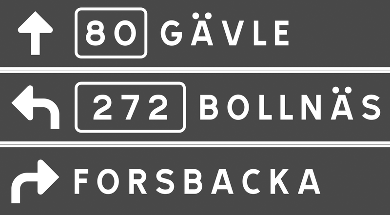
Legibility and readability are common terms within different areas. Surprisingly, convincing definitions are hard to find and in different areas very different things are meant. In psychology scientist who study reading usually just talk about the time we need to read a certain text. In linguistics it is all about the content and the structure of the information. And in typography we usually mainly care about the visual presentation of the text. In typography we often judge typefaces to be more or less legible than other typefaces. Certain typefaces from the era of Renaissance and Baroque (Garamond, Jenson, Bembo, …) are said to be some of the most legible typefaces. But if that is true, why is it, that road signs are never ever set in one of these typefaces? Isn’t legibility a key issue for road signs? Shouldn’t we then use the most legible typeface for road signs?
This problem puzzled me ever since I started to think about the legibility of signs or type in general. In order to solve it, at first, a clear definition of all relevant terms is indispensable. In the most broad sense, legibility deals with the perception or decoding of information and readability deals with the understanding of these information. Imagine taking a mountain hike. You can clearly perceive your surrounding. You recognize the mountain range at the horizon, you remember the path you walked and everything salient along it. You can perceive your surrounding and understand it. But suddenly mist comes up. Your surrounding instantly becomes illegible. You can’t make out the paths, trees and mountains that surround you. Even if you would proceed, without a clear perception of your environment, you would eventually loose your understanding of where you are and where you are headed. So a clear decoding of the information in your environment is essential for understanding it. But understanding is not always the logical outcome of decoding information. The mist might clear up and you have no trouble perceiving your surrounding again. But you went too far and now everything looks unfamiliar and you have lost your understanding of where you are what you see. Still, in that same environment, an experienced guide is literally able to read the information in the environment, which means he can not only perceive them, but understand them and easily find the way back to the starting point of the trip. So in a literal sense, to read means to interpret or to understand certain information. Legible on the other hand comes from the Latin legere, meaning just to gather, collect or to pick out.
This example of decoding and understanding information is also true for reading text. To decode letters and words, they need to be legible—thus perceivable. They need to stand out from the background, they need to have a proper size and letter spacing to be decodable and so on. So legibility describes the ease or speed with which letters or other pieces of information are decoded. Readability is the aim. At best, the reader should not only perceive the information, he or she should also understand it. This is based on a legible typesetting and the content and writing style of the author. But understanding is also a rather subjective issue. People with proper eye sight will all perceive the silhouette of a mountain range in more or less the same way. But to make use of it, we also need to understand its meaning within a bigger context. And letters are not different in this regard. A big chinese letter might be perfectly legible by itself, but I will not be able read it. It is a visual piece of information I can easily perceive, but not understand. In the same way, a specialized scientific text might make perfect sense to one individual, but might be incomprehensible to another. So, in a textual or typographic sense, legibility deals with the perception or decoding of letters and words and readability deals with their understanding. With this clear distinction between legibility and readability it is much easier to talk about all kinds of phenomena of reading. But to fully understand what makes certain texts and typefaces more legible that others, we need an extended model, which I will present here. I dubbed it …
The Onion Layer Model of Legibility
Before I even started thinking about the design of a new wayfinding typeface, I needed a clear theoretic framework to talk about all aspects of legibility. The literature in graphic design and typography frequently mentions the importance of legibility, but definitions and the explanation of relevant factors are rather seldom and sometimes even contradictorily. So in the end, I had no choice but to build my own model. And I will present the basics of it in this article.
Context
One of the most important factors of legibility, which is sadly often neglected is simply the context. Is is rather pointless to talk about legibility without specifying what is supposed to be read, by whom and under which circumstances. Reading one word on a direction sign while driving is very different from reading a 300-page novel in an armchair. These different uses have very different requirements concerning the typeface and the typesetting. So in my model the context is the basis of the model itself.
Now we get to the typesetting itself. It is grounded on basic principles of perception and Gestalt laws. In our model this is represented by the outer layer of our onion. We need to lay out the information in a way in which they can be perceived and decoded. This is influenced by parameters of the used materials, the surrounding (e.g. lighting) and many typographic factors (like letter spacing, line height—just to name a few). Like I said before, these parameters are basically objective. They can easily be measured. For example, we can define type sizes, minimum viewing distances, background/foreground contrasts and so on, which are necessary to pick up the information for people with a certain level of eye-sight. In Germany some colleagues and I are currently updating the norm “DIN 1450 legibility” which does exactly that.
Recognizability
The inner (blue) layers of the model describe the main features of the used typeface which influence the legibility of a typeface. The first and most obvious one is recognizability.
It s a feature that mainly relates to individual letters. We recognize a letter if we have learned an abstract model of its shape—usually by being exposed to thousands of variations of it and by having learned to write it. Humans are exceptionally good at this kind of tasks. Even if the actual outline or image of the letters might be completely different in every font or written text, we are still able to easily decode the underlying design principle, thus we are able to decode the letter.
It is therefore noteworthy, that the actual design of the character outline (in terms of stroke width, serifs and so on) plays a minor role in this basic sense of recognition. What matters most is the actual design principle or the skeleton of the letter. And therefore, it must be considered a myth that serif typefaces are more legible than sans-serif typefaces when they share a similar letter skeleton. A legible typeface is therefore one, that aids recognition by using a rather generic letter skeleton the readers are familiar with, no matter if that typeface has serifs or not.
Distinguishability
An additional legibility feature of typefaces is distinguishability. It’s the characteristic of a letter to be easily told apart from other letters. The one-storey “a” of Avant Garde or Futura might be perfectly fine in terms of recognition. These letters have a very simple and generic skeleton and can easily be recognized in contexts like magazine headlines. But when viewing conditions get worse or when we quickly read longer text and therefore skip many letters, distinguishability becomes crucial.
Take these letters from the Swedish road sign font Tratex. Apart from their descenders they are completely identical and this slows down letter decoding under poor viewing conditions. For example drivers reading road signs might easily confuse an “a” for an “o” or vice versa when viewing the sign at a large viewing distance or when the letters are lit by the headlights of a car.
Now let’s look at the same letters in a different typeface. In this case, letter differentiation is stressed thru a more individual, yet well known letter skeleton. So such kind of typefaces have a much better distinguishability, which might or might not be necessary in different kinds of typesetting tasks.
Reading comfort
So far, I have mostly talked about the skeleton of letters and not about stylistic differences. So what about them? Do serif typefaces like Garamond and Bembo do have any advantages over Helvetica and Frutiger if it all depends on just letter skeletons? The typographic literature usually just mentions the supposed fact, that serif typefaces are somehow better or “more legible” because the serifs guide the reader along the line of text. There is probably some truth in that, but I always found it hard to believe, that this should be the only and most important reason why after 500 years we still set most of our books in serif typefaces. To explain this phenomena, my model introduces the term reading comfort. It describes subtle features of a typeface, that are not directly related to recognizability and distinguishability. But these features make it possible to read even long texts with as little distraction and fatigue as possible. And that’s where the type design styles of the Renaissance and Baroque are so good at, because they were developed specifically for this kind of typesetting. For an experienced reader, the task of reading is mostly automatic. It is basically impossible not to read a word we see in front of us. But still, reading long texts is a cognitively strenuous exercise. Reading is not an evolutionary ability that developed over tens of thousands of years. We simply use (or misuse) our highly developed ability to schematize the world around us—in this case: to use abstract images to represent sounds. While some typefaces might perform well in terms of recognizability and distinguishability, they might not necessarily be suited for setting a novel in it. The clean sans-serif typefaces of today often sacrifice reading comfort for even typographic color and the possibility to set large amounts of text within as little space as possible. The stems of these typefaces then become endless rows of “picket fences”, which can easily cause fatigue. But variance in stroke and letter width can make the process of reading more pleasant and comfortable. We all know, how tiring a sheet of paper in a monospaced typeface can be. This is caused by the missing variance of the character widths. A typeface suitable for longer text will stress variance in letter design and character width. This influences how the letters and word shapes are perceived outside of the fovea—the small part of a line of text that we can actually see sharp and detailed. This helps to perform effective saccades, to understand the structure of the sentence and to anticipate the following words.
So now our model is complete and it allows us to easily talk about different aspects of reading and legibilty. Now it also easy to answer the question, why road signs are set in sans-serif typefaces and novels in serif typefaces. If we talk about signage, we just need to consider the upper half of the model. The textual information need to be presented in a legible way and set in a typeface which letters are both recognizable and distinguishable. That’s it! The features of a typeface that aim at reading comfort are not necessary when just short pieces of information are presented. On the other hand, if we want to set a novel, all layers must be considered.
This image shows some typical uses applied to the model. For a headline, we need a legible layout set with recognizable letters. Distinguishability and reading comfort are certainly dispensable. Signage requires a much more careful layout using typefaces that are optimized for recognition and letter differentiation. Copy texts require all layers to be considered carefully. We need a legible type setting and the letters of the typeface should not only be recognizable and distinguishable, but also comfortable to read over many paragraphs or pages.
-
 1
1






Recommended Comments
There are no comments to display.
Create an account or sign in to comment
You need to be a member in order to leave a comment
Create an account
Sign up for a new account in our community. It's easy!
Register a new accountSign in
Already have an account? Sign in here.
Sign In Now