To begin with, please tell our readers a little bit about what you do, and how you came to the field of web typography.
I’m Bram Stein and I work at Adobe Typekit on web font serving. Like many people in the type world I kind of stumbled into it. Because something was not right and I wanted to fix it. About 10 years ago I had an idea to build a web-based book reader. I mostly went with web technologies because that’s what I was used to as a web developer. After making a basic layout, I started noticing all sorts of discrepancies between printed books and what I saw in my web browser. Things like hyphenation, justification, and high quality typefaces were not supported on the web and I needed them to meet my quality expectations. So I set out to improve things.
The first thing I did was to implement the Knuth and Plass line breaking algorithm, which improves on the justification algorithm used by all web browsers. Of course that is useless without good hyphenation so I ended up implementing Hypher, a hyphenation engine. Then I turned my attention to web fonts and several other type and typography tools.
I never got around to actually building that book reader, but I hope to get back to the idea some day.
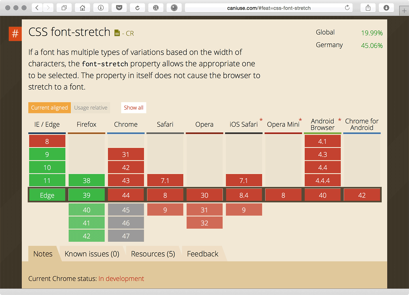
Browser support for fonts was originally built with the available system fonts in mind, i.e. 4 styles (regular/italic/bold/bold-italic) and not more, no true small caps, no OpenType features and so on. When web fonts emerged, the limitations became quickly obvious. What’s the situation now? What has been fixed? What is still missing regarding the font support? Are there still many browser problems, Typekit needs to work around with specific tricks?
Luckily, most obvious things have been fixed. I think the most obvious limitation is “font-stretch” which isn’t supported by all browsers. This means fonts can only be classified using “font-style” and “font-weight”. This limits your @font-face descriptions to only 27 possibilities: “font-style” with its three values (normal, italic, and oblique) and “font-weight” with its nine possible values. While this sounds like a lot, it isn’t sufficient for many typefaces which often come in more weights and styles. Hopefully “font-stretch” will be supported by more browsers as it will give web developers a total of 243 variations.
It would be even better if the rules for both “font-weight” and “font-stretch” were relaxed. The 100 to 900 range for font weight is arbitrary. There are many type families that can not be mapped to these nine values. The same applies to “font-stretch”. It is hard — or even impossible — to map every typeface to those nine predefined values. Ideally, both properties would accept percentages between 0 and 100. This will open up the possibility of font interpolation, where two or more master fonts are used to create an infinite number of combinations. Now that we’re talking about that, a new font web format for font interpolation would be nice as well.
Another problem I’m struggling with is the lack of support for OpenType features in Safari. All modern browsers support OpenType features except for Safari. There really isn’t a good work-around for it, so we’ll have to wait for Apple to implement support. Luckily, they’ve said it is on their roadmap.
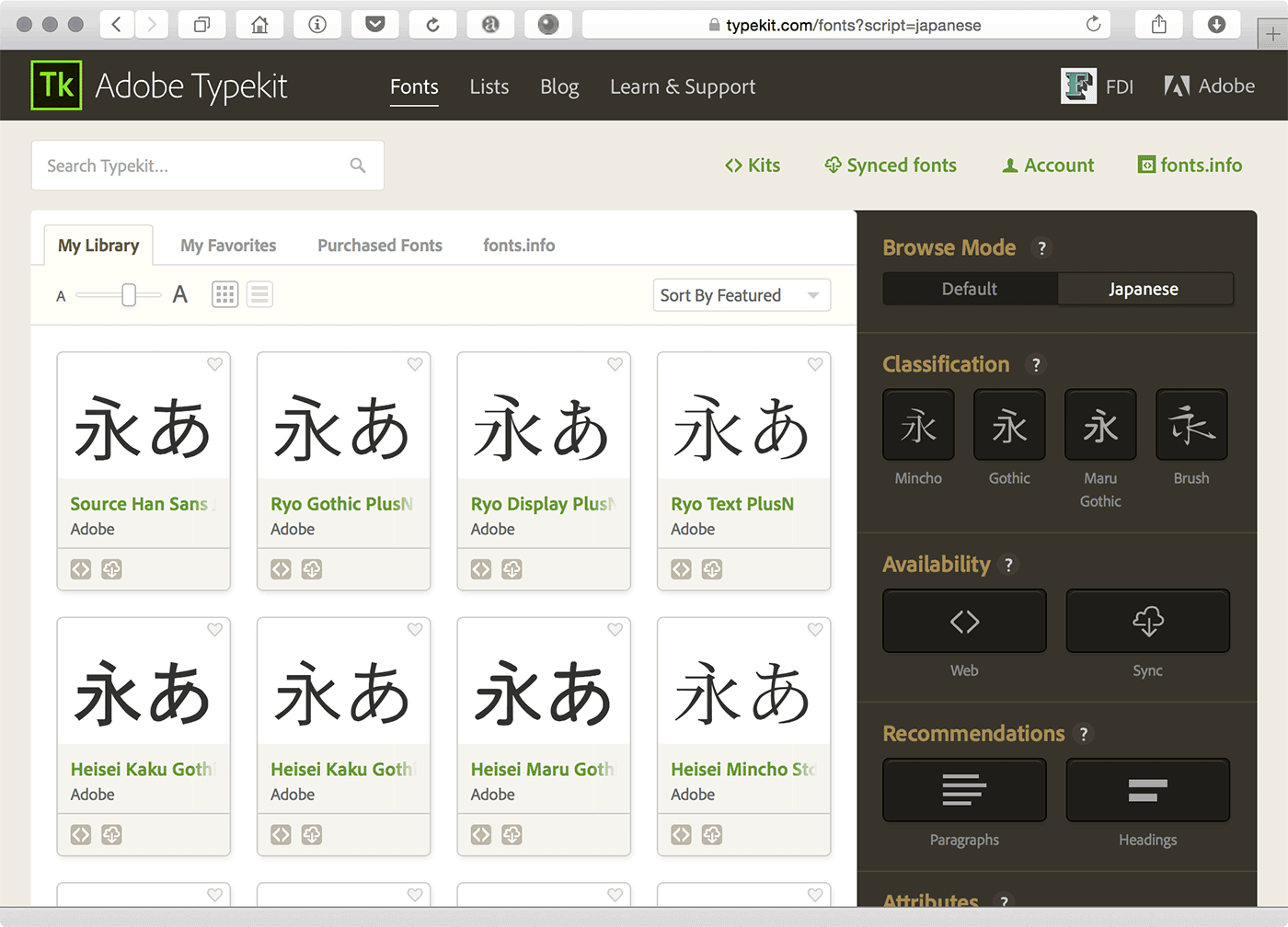
At Typekit focus has shifted from problems with web font formats to web font performance: how do we get the smallest possible font to your visitors as fast as possible. This involves optimising web font delivery, improving compression, etc. We are also trying to support more languages and scripts. This is particularly challenging for Asian fonts which are usually very large (even when subset). To solve this we have built a font streaming solution where a font is dynamically constructed on the client-side based on what is needed for that page. The OpenType format isn’t very suited for streaming and adding glyphs on the client-side, so ideally a new format should support this use-case as well.
At The State of Web Type you document the browser support for things like OpenType features. An intentionally provoking question: Do they matter much? Or are the “decadent” and just slow down page rendering, as some claim?
OpenType features matter. While some are stylistic there are many that are required to render text correctly (for example in Arabic). There are also ligatures that improve the legibility of the text. I don’t really want to be too negative about that article, but their methodology is not correct. The article appears to be measuring something else and blames the difference in performance on OpenType features. This is nonsense. A better test would only measure the rendering impact of OpenType features.
While it is true that there is a small cost to enabling OpenType features (after all, the text rendering engine has to do some extra work), it is insignificant to, for example, making a network request. As a general rule, you should enable the OpenType features you need to make your text legible and look great.

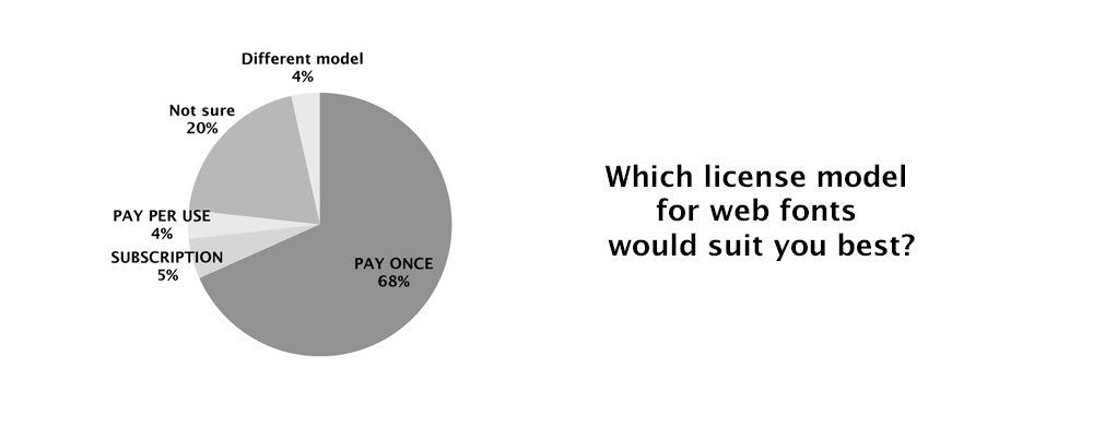
In 2008, when the topic of web fonts emerged after Safari started to support them, I made a web fonts survey. Almost half of the participants didn’t want external font hosting and only 5% could imagine to use a subscription-based service. With your insights at Typekit, how have things changed since then? What, in your opinion, are the current trends regarding the different license models for (web) fonts?
The problem most web designers and developers run into is restrictive licensing. You can buy a typeface (they’re really quite affordable) but you can’t do much with it. Want to create a new web font format? You can’t. Want to subset it? You can’t. Want to embed it in a CSS file? You can’t. I think this is an area web font services handle really well. They let you use a web font without having to worry about licensing. Some web services even let you sync fonts to your devices so you can use them in your design applications. Most services also give you access to their entire library, so all in all, I think font services are still an attractive option for most people.
Another concern when web fonts were new was the render quality of web fonts in contrast to the highly screen-optimized system fonts like Georgia and Verdana. How do you judge this problem now, several years later and how does Typekit deal with the differences of render engines?
This is becoming less and less of a problem. A couple years ago we had to make sure web fonts worked great on GDI and DirectWrite on Windows, Core Text on OS X and iOS, and FreeType on Linux and Android. Nowadays, all modern browsers on Windows use DirectWrite, so the horrible rendering of GDI is much less of an issue. This has interesting consequences for type designers as well. Because DirectWrite (and Core Text and FreeType) renders CFF based fonts really well, the need for extensive TrueType hinting is becoming a thing of the past.
At Typekit we used to serve specific outline formats to certain browsers and operating systems to make sure the type rendered as good as possible. We even manually hinted some typefaces. Luckily, the usage of browsers and platforms that required such extensive hinting is now below a point where it no longer makes sense to invest so much time in hinting. We’re moving to a model where we primarily serve CFF-based outlines with minimal hinting. This drastically simplifies our processing and font serving.
Web type isn’t just fonts, it’s also text layout—automatic hyphenation, grids and line-spacing, effects like drop-caps build on those grids, text flow through columns or even arbitrary shapes, widows and orphans and much more. What’s the state of web type in this regard?
We’re in a pretty good place with web fonts. The same can not be said about other web type features.
Justification is supported by every browser using “text-align: justify”, but it is of very low quality. It doesn’t look like browsers will ever adopt the advanced justification algorithms used in TeX and InDesign. This is a shame because it really improves the quality of fully justified text (and to a lesser degree the quality of left, center and right justification).
In fact, fully justified text is pretty useless because we don’t have good browser support for hyphenation (remember, never justify text without hyphenation). While CSS hyphenation is supported by most browsers, it is not on Chrome. You’ll need to do your hyphenation on the server or using a client-side library for now.
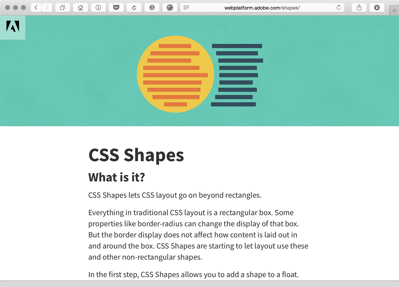
CSS columns are supported by pretty much all modern browsers, but you don’t see them used very often. I think this is because columns have horrible usability if the canvas (viewport) doesn’t have a fixed size — it is rather annoying to scroll up and down a page to go from the end of one column to the start of another. I’m more excited about CSS shapes and regions which lets you flow text from one element to another and define arbitrary shapes. Unfortunately, there isn’t much browser support for either.
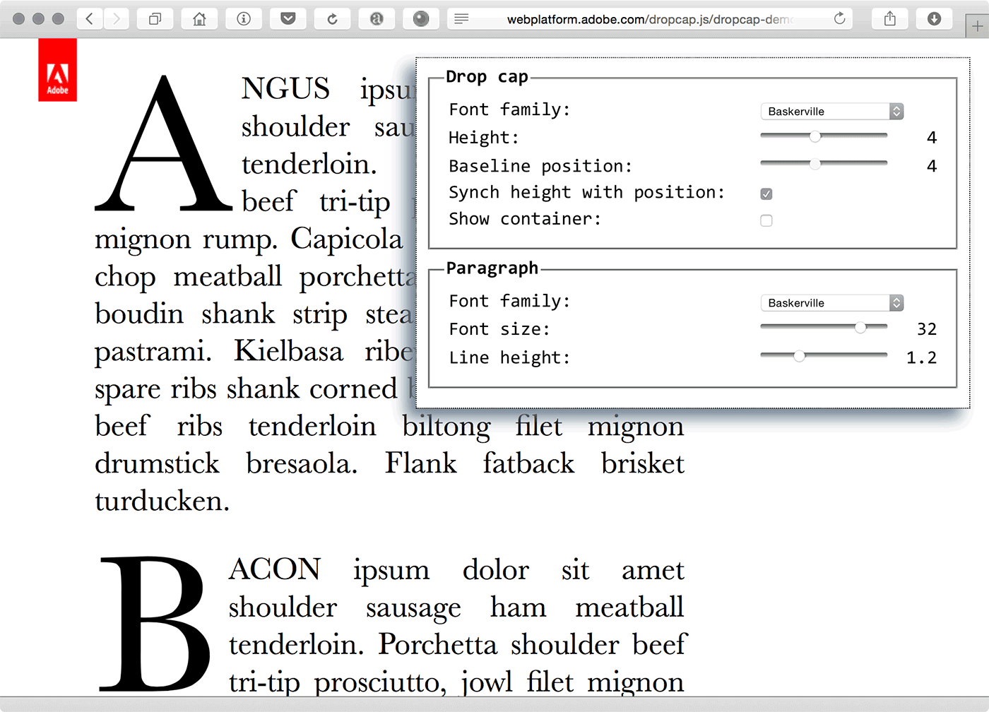
There is many other features that would benefit designers but are not implemented. Drop-caps can only be achieved by using a JavaScript library. Math typesetting is useless (though there are decent JavaScript solutions). Widows and orphans are not supported. Colour font support is all over the place (with each browser implementing their own favourite format). We still have a long way to go before we reach the same quality as print typesetting.
In an article you suggested that browser should by default show fallback fonts instantly and then switch to the web fonts once they are loaded. Can you elaborate on why you propose that? Personally, I often find a text reflow while reading more annoying than waiting.
What it comes down to is that your visitors come for the content on your site and not for the web fonts. It is fine for your visitors to have to wait for web fonts to enhance the experience, but this should be be less than a second. Anything more than that is unacceptable, especially when it becomes more than 3 seconds. This is particularly bad on Safari, which has an infinite timeout for loading fonts. So if your fonts load very slowly (or do not load at all), you’ll be staring at a blank screen until you give up. This is not a good user experience.
Web developers often overlook these problems because they work on fast machines with high speed internet connections. To get a feel for how bad this is, use Chrome’s network throttling and set it to 2G or 3G speeds for a day. It’s painful.
Showing fallback fonts right away solves this problem. The browser can show the content as soon as possible and web fonts can load afterwards and enhance the experience. You are right that the switch from fallback font to web font is very distracting. You can minimise this by selecting fallback fonts that roughly match the metrics of your web font, but a small amount of visible reflow will almost always happen.
This is can very bad if you already started reading the content and the web fonts come in after several seconds. This is not what I’m proposing. Showing fallback fonts as the default behaviour does not excuse bad font loading performance. You should still aim to to load your fonts in less than a second. If you do that it is likely the page hasn’t even started rendering yet and any reflow is less likely to be distracting.
This can be combined with a cut-off: if the fonts do not load within a certain amount of time don’t bother showing them. It is too distracting to show them once the user has already engaged with the content.
What this all comes down to is that the current browser behaviour is inconsistent and very hard to control. The default timeout is too high; waiting three seconds for a web to load is unacceptable. We need to standardise the default behaviour, and showing the fallback fonts first is a good default. It works well with the basic ideas behind HTML and CSS: progressive enhancement. Make the content work in all browsers and devices and enhance it for the smart ones.
What we need is a way to control the display behaviour (i.e. show fallback fonts first, or block rendering, etc.) and a way to control when a font is loaded. Luckily, both are being specified. The “font-display” property will let you control the display behaviour and the CSS font loading API will let you control when and how fonts are loaded. So we’re getting there and I hope that as part of standardising these features we’ll also standardise the default behaviour.


Recommended Comments
There are no comments to display.