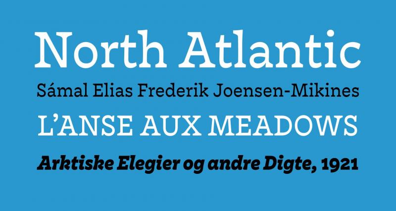
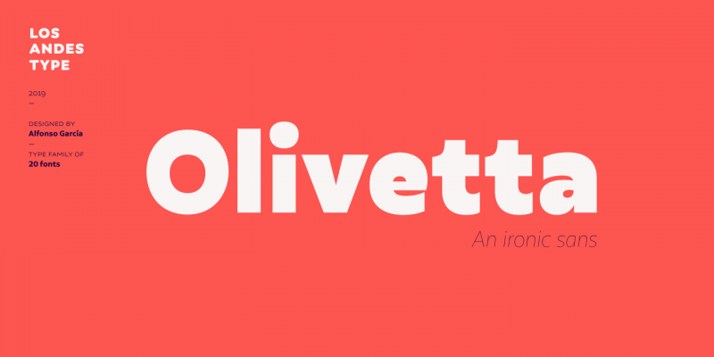
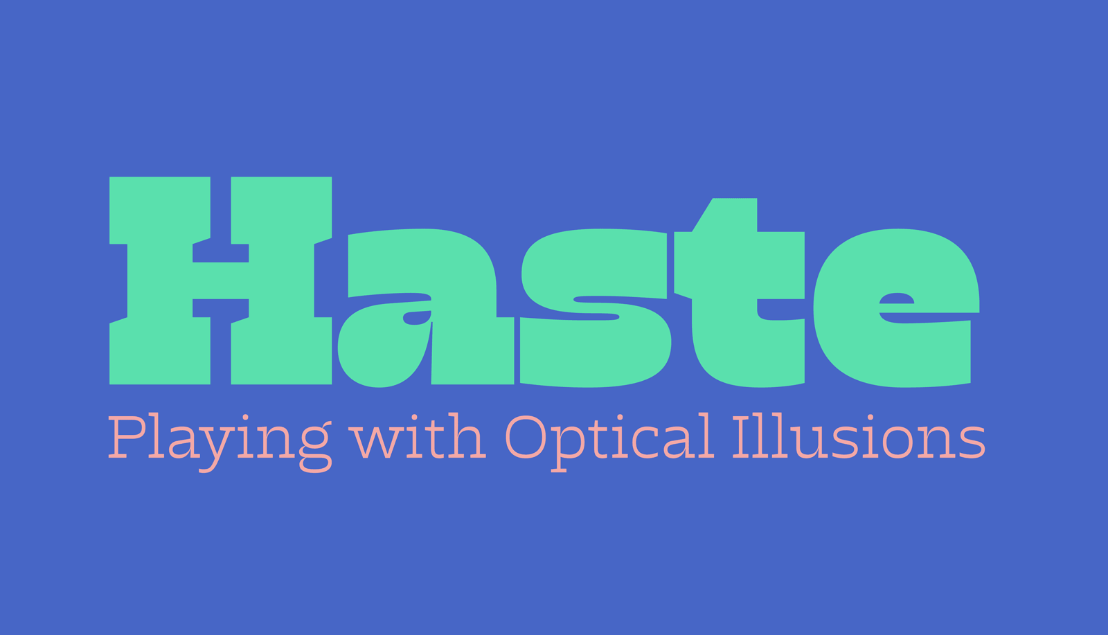
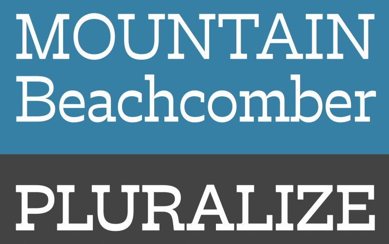
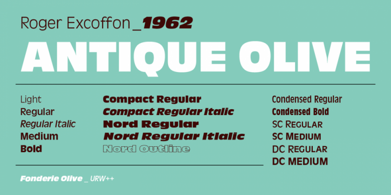
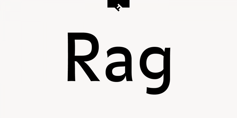
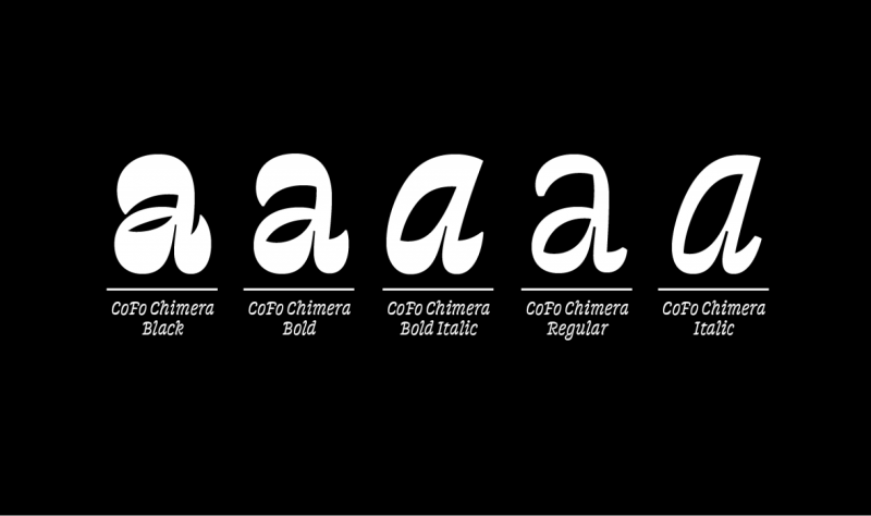
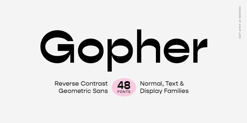
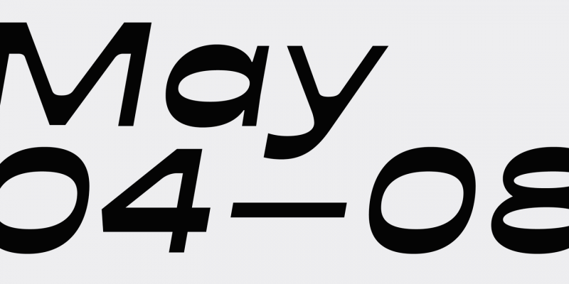
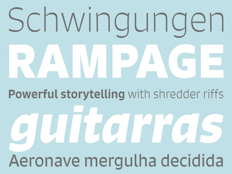
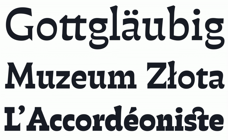
Instead of the vertical lines being the same width or thicker than horizontals, a reverse-contrast font has the horizontal lines which are thicker than verticals. This list collects modern designs with this feature, but excluding the highly decorative reverse-contrast designs of the 19th century.
-
Font Lists:
Fonts by topic/style-
Free Font Lists
-
Font alternatives
-
Fonts by topic/style
- Bauhaus Fonts
- Best fonts for academic papers/writing
- Emoji Fonts
- Fairy Tale Fonts
- Go figure!
- Modern reverse-contrast Fonts
- Rough Brush Lettering Fonts
- Serif, but no curves allowed
- The Best Coding Fonts
- The Best Contemporary Blackletter Fonts
- The Best Layer/Chromatic Fonts
- The Best Monolinear Script Fonts
- The Best Sports and College Fonts
-
Fonts by region
-
Signage Fonts
-
Fonts by User
Modern reverse-contrast Fonts (2024)

By Ralf Herrmann (edited) | Views: 10020
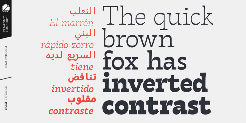
Tarif
Designed for Zetafonts by Andrea Tartarelli, Tarif is a slab serif typeface with a humanist skeleton and inverted contrast.
-
 1
1
-
 1
1
User Feedback
-





Recommended Comments
Create an account or sign in to comment
You need to be a member in order to leave a comment
Create an account
Sign up for a new account in our community. It's easy!
Register a new accountSign in
Already have an account? Sign in here.
Sign In Now