Search the Community
Showing results for tags 'ios'.
-
Typography tips and tricks for users of Mac OS, iOS and iPad OS.
-

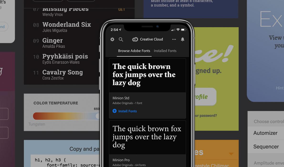
Adobe Brings Fonts to iOS in Creative Cloud Mobile
Ralf Herrmann posted a news entry in Typography Weekly #96
-
- adobe
- creativecloud
-
(and 2 more)
Tagged with:
-

Custom font installation finally arrived with iOS 13 and iPad OS
Ralf Herrmann posted a journal article in Journal
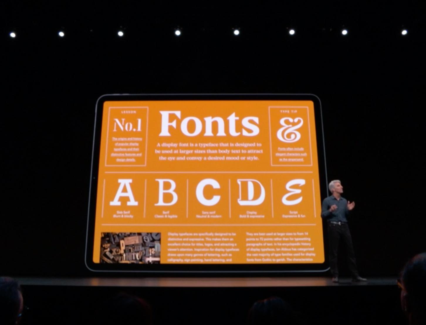
Apple is known for its closed ecosystem and font use is no exception. Until recently, there was no official way to install fonts on the mobile operating system of Apple devices. With iOS 13 and the new iPad OS, font installation on the system level is now officially supported. But you might have guessed it: you won’t be able to just use a mobile browser on your iPhone or iPad and download and install any font from the internet. Apple only lets apps install fonts on the system level. So foundries and other font providers need to create an app or embed this functionality into an existing one. We can expect implementations from companies like Adobe and Monotype soon, since Apple already announced a partnership during their keynote in June 2019. One of the first apps to support the new font installation feature is the Font Diner app. At this time, it only lets you install a bundle of fonts free for personal use, but it’s a good and easy way to try out the feature. The fonts delivered through this new feature can be directly included in the app package or downloaded in the background. Apple performs a validation of the fonts to make sure they are secure and functional. As you can see on the screenshot above, system-level font installation always requires user consent. Once the fonts are installed, you can get an overview of all custom fonts under Settings → General → Fonts. You can browse an alphabetic list of the fonts and see the styles, file size, copyright information and a font sample. You can also remove a font directly without having to access the app which installed it. Uninstalling a font installation app will also remove all fonts which came with the app. It is also worth mentioning that custom fonts being installed with this new method will not be available automatically in every app that uses system fonts. Apps need to opt in to use custom fonts. Going forward, most apps will likely do so, but you might need to wait for future updates of your favorite apps, before your custom fonts will appear as a choice in the font menu of certain apps. If you want to try out the feature, you can check out Pages, which already supports custom fonts. Custom fonts in the Pages app -
Apparently, San Francisco, in it’s several incarnations, offers various advanced typography features, and supposedly, the OS will automagically handle them in the most appropriate way (yay for tabular figures in clocks, we only waited for decades). Speaking of figures, one such feature is the inclusion of alternative numerals with open counters: The problem is, they seem to be used only on Watch’s faces. I would love to see them used on my Mac or iPhone when the numbers get very small. Better yet, wouldn’t it be nice to be able to set a preference, akin of that for font smoothing, to always use them under a given point size?
- 1 reply
-
- san francisco
- macos
-
(and 2 more)
Tagged with:
-
Hi everyone, I've searched hard for a good typography app to work with on ipad, but couldn't find any! I am looking for something simple, laying fonts, change size, rotate letters......basic typesetting stuff. I've been struggling with two apps: Adobe Comp and Concepts, but both have limitations. Do you have any suggestions? Much appreciated!
-

Apple explains the extended San Francisco Type Family
Ralf Herrmann posted a journal article in Journal
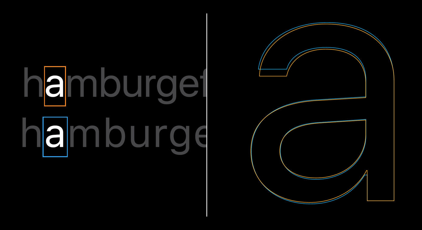
Apples search for a fitting and consistent typography is an ongoing quest. Lucida Grande defined the look of Mac OS X since 2001, while the iPhone uses Helvetica. But Apple’s corporate typeface used in ads, on the web or on packaging is a version of Myriad. Lately, Mac OS X took over Helvetica from iOS, while a completely new typeface appeared for the Apple Watch: San Francisco. With the upcoming releases of Mac OS X and iOS yet another change was announced. The watch font is now renamed to “SF Compact” and iOS and Mac OS will use a new branch of the San Francisco type family called “SF”. The SF branch is a compromise between the current use of Helvetica and Apples own watch font design. SF uses the same metrics and proportions as Helvetica, but borrows design features from the watch font. The main difference between SF and SF Compact is the treatment of the curves. While they are rounded in the SF branch, they are rather flat in the SF Compact branch. This gives the latter a more legible appearance on smaller screens, such as on the Apple Watch. The fonts currently cover extended Latin, Cyrillic and Greek. Both branches of the San Francisco type family come with optical sizes. There are 6 weights (including italics) for the text sub-family and 11 weights for the display sub-family (without italics). The correct choice for the optical sizes and the tracking values can be made automatically by the operating system. The fonts are also equipped with smart font replacement options like subscript/superscript figures, different figure sets (including variations for the figures 6 and 9), as well as special versions of punctuation and math characters which better suit all-caps or number settings. Numbers with a centered colon Conclusion: It’s good to see that Apple now has in-house type designers who create this extensive family and pay great attention to details. I also like that advanced features such as optical sizes are not only available in the font family, but can be automatically applied throughout the system. The look of the typeface itself is unfortunately rather bland. Apple is known for creating trends rather than following them. This design mix of typefaces such as Helvetica or Akkurat can’t really achieve this. It doesn’t have its own clear voice and doesn’t separate Apple’s UI from that of competitors such as Google who use a pretty similar font. An open question is the use of Myriad as a corporate font. Mixing Myriad and San Francisco doesn’t seem like a good idea. The fonts are different, but not different enough to be a good mix. So will San Francisco become the corporate font as well someday? The great variety of styles would certainly allow it. The full presentation (around 30 minutes) from the developer conferenced can be watched here. The fonts are available free of charge for Apple developers. But I would like to point out, that the fonts are currently only licensed for the development of apps for Apple devices. The fact that you might find these fonts for free on certain websites does not mean that you can use them like regular freeware or Open Source fonts.


