Search the Community
Showing results for tags 'linotype'.
Found 13 results
-

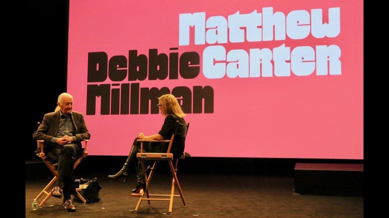 Matthew Carter discusses his career as a typographer in an interview by Debbie Millman for her podcast, "Design Matters." This interview and podcast is part of the second annual day-long Type Directors Club conference held at SVA Theatre in New York City on March 23, 2018.
 -
 This talk took place on June 20, 2017 at the Koret Auditorium at the San Francisco Public Library as part of Type@Cooper West's Letterform Lecture Series W. A. Dwiggins and Linotype’s Chauncey Griffith developed an affectionate and productive partnership that lasted for nearly thirty years. Dwiggins first drew the sans-serif Metro (1929), intended to be Linotype's answer to Futura, Gill Sans, and Kabel; Metro faded from the scene here in the U.S. but continued to be used in U.K. newspaper into the 1970s. Spurred by his deep interest in book design, Dwiggins next produced the tour de force text types Electra (1935) and Caledonia (1939), which have been used to produce countless thousands of books up to the present day. As his next assignments Dwiggins — the virtuoso user of stencils for illustration and decoration — created an elaborate suite of decorative units called Caravan, which could be used as single glyphs or combined in myriad ways to create lines and fields of decoration. (Prior to its commercial release, this design had the working title, “Chinese Spinach”!) Returning once again to text types, Dwiggins drew Eldorado (1953) and Falcon (released postumously in 1962). Beyond his five designs for Linotype, Dwiggins also imagined four alphabets of decorated initials for the Plimpton Press (1936) which saw widespread use in the books Plimpton printed for Alfred A. Knopf; these will also be given attention in the presentation. Book designer, photographer, and teacher Bruce Kennett lives in rural New England. After earning a B.A. in humanities and working as an architect and printer, he moved to Austria to study calligraphy and book design with Friedrich Neugebauer, and later translated Neugebauer’s The Mystic Art of Written Forms. During the 1980s, he was the managing director of Maine’s renowned Anthoensen Press, and since then has maintained his own studio with clients that have ranged from the Folger Shakespeare Library, Boston College Law School, and the Grolier Club to L.L. Bean and the Mount Washington Observatory. In the peaceful surroundings of his country studio, Bruce designs illustrated books and exhibition graphics, and makes large-scale murals of his photographs. Bruce has collected the work of W. A. Dwiggins since 1972, and has been writing and lecturing about him since 1980. His comprehensive biography, W. A. Dwiggins: A Life in Design (Letterform Archive, 2017), captures the inspiring accomplishments and wit of this amazing artist.
 -
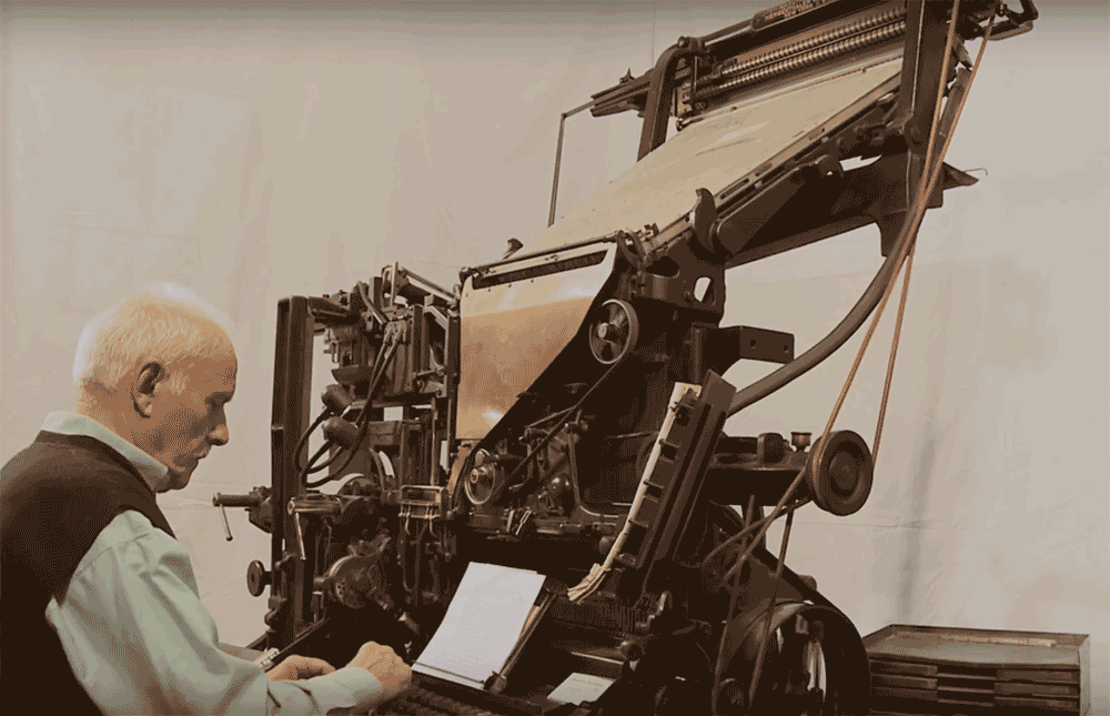 A video from the French “Musée de l'imprimerie et de la communication graphique” presenting how lines of type are cast with a Linotype typesetting machine.
 -
 Many typefaces available to us today are not stand-alone designs, but were introduced as inventive solutions to very specific problems of type manufacture, typesetting restrictions, or printing issues. As those designs become part of the overall typographic landscape, it’s easy to forget how closely connected they are to the original problem, or how much potential there may be to explore solutions to a new problem. Looking at some now-classic typefaces, we’ll see how they turned out the way they did, and hopefully encourage some fresh responses to newer challenges. Dan Rhatigan worked as a designer and typographer for 15 years in Boston and New York before moving to England in 2006 for graduate school at the University of Reading. After receiving his MA in Typeface Design, he spent 7 seven years working with Monotype as researcher, type designer, and eventually Type Director. He now lives in New York City again, where he works as an independent type designer and consultant.
 -
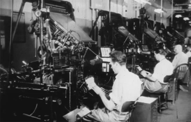
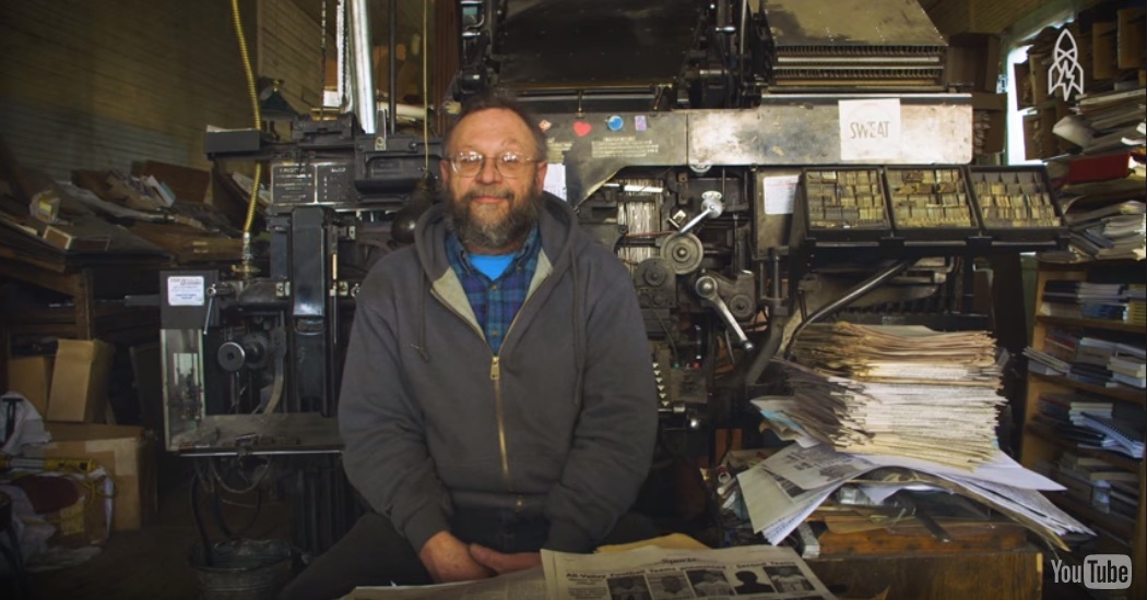 The Saguache Crescent newspaper in Saguache, Colo., has been printing its news the same way since the 1800s. Lay the letters. Ink. Press. Publisher Dean Coombs’ family has had the business for three generations, and has helped print out the weekly broadsheet on a linotype since he was 12 years old. See how the news is made the hard way.
 -
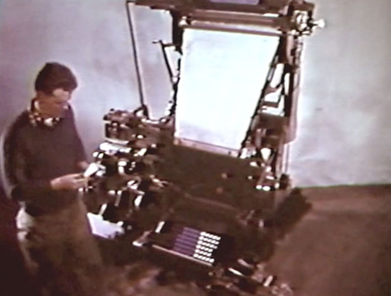 A movie made for the 75th anniversary of the Linotype in 1961.
 -
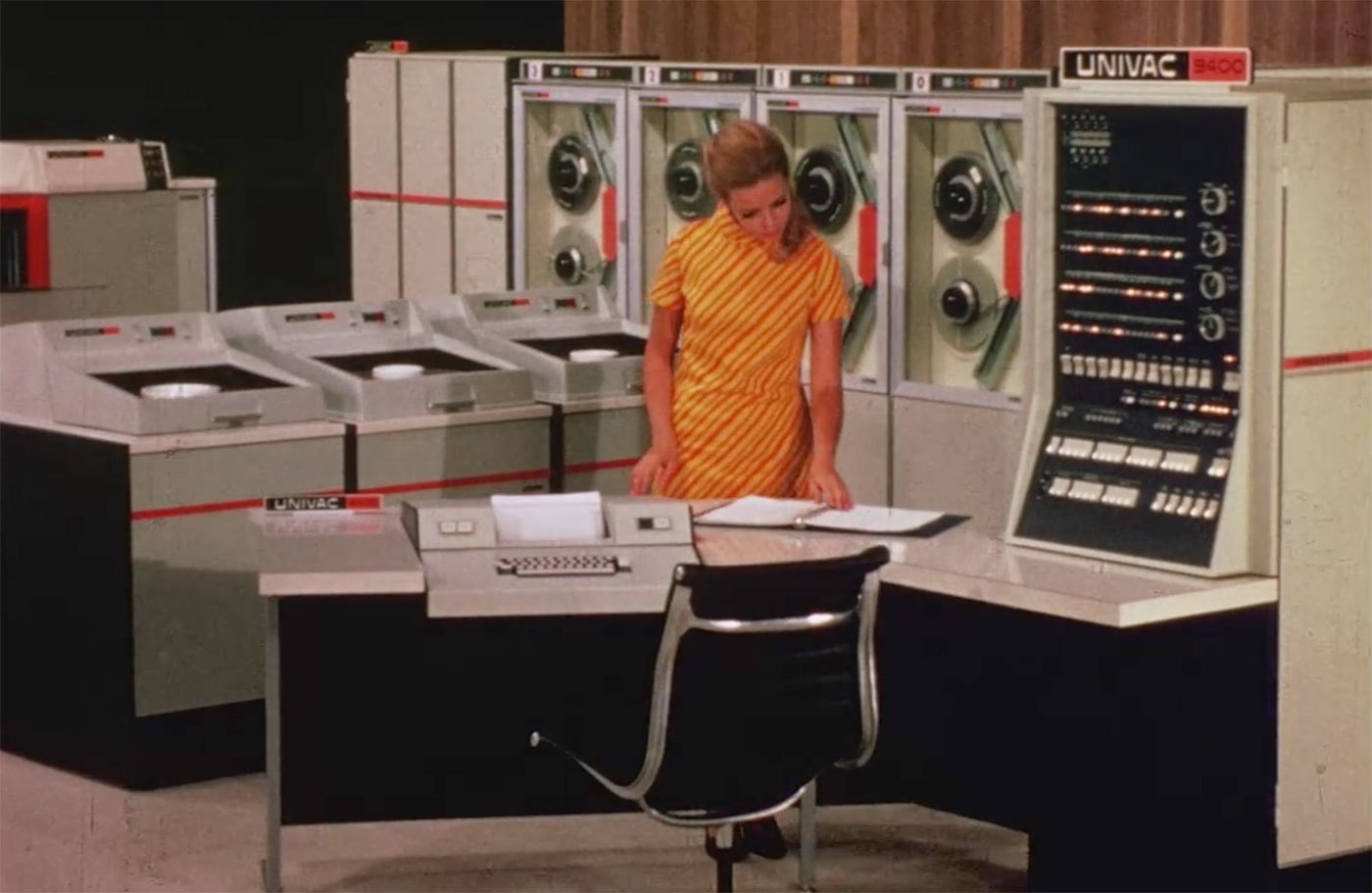
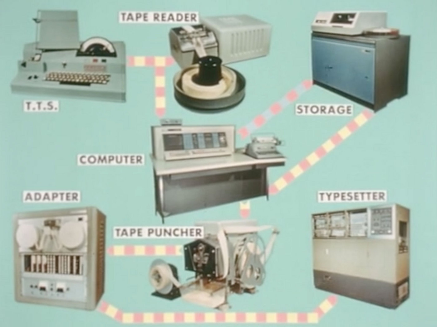 A film created by the International Typographic Union to display the advancing electronic technology being introduced to typesetting and printing. The film shows an IBM 1620 computer and additional storage disks working with Linofilm typesetters that were installed in July of 1963. There is a very in-depth explanation of the process of early computer and film typesetting. Additionally, new forms of plate making with cameras and photo composition are shown. Via printingfilms.com
 -
 This film features the Model 31 (with up to four magazines) and the Model 32 (with up to 8 magazines with the auxiliary magazines). Many new safety features and speed improvements are displayed. Originally produced for the Mergenthaler Linotype Company by Caravel Films, Inc., New York. Digitized by printingfilms.com
 -
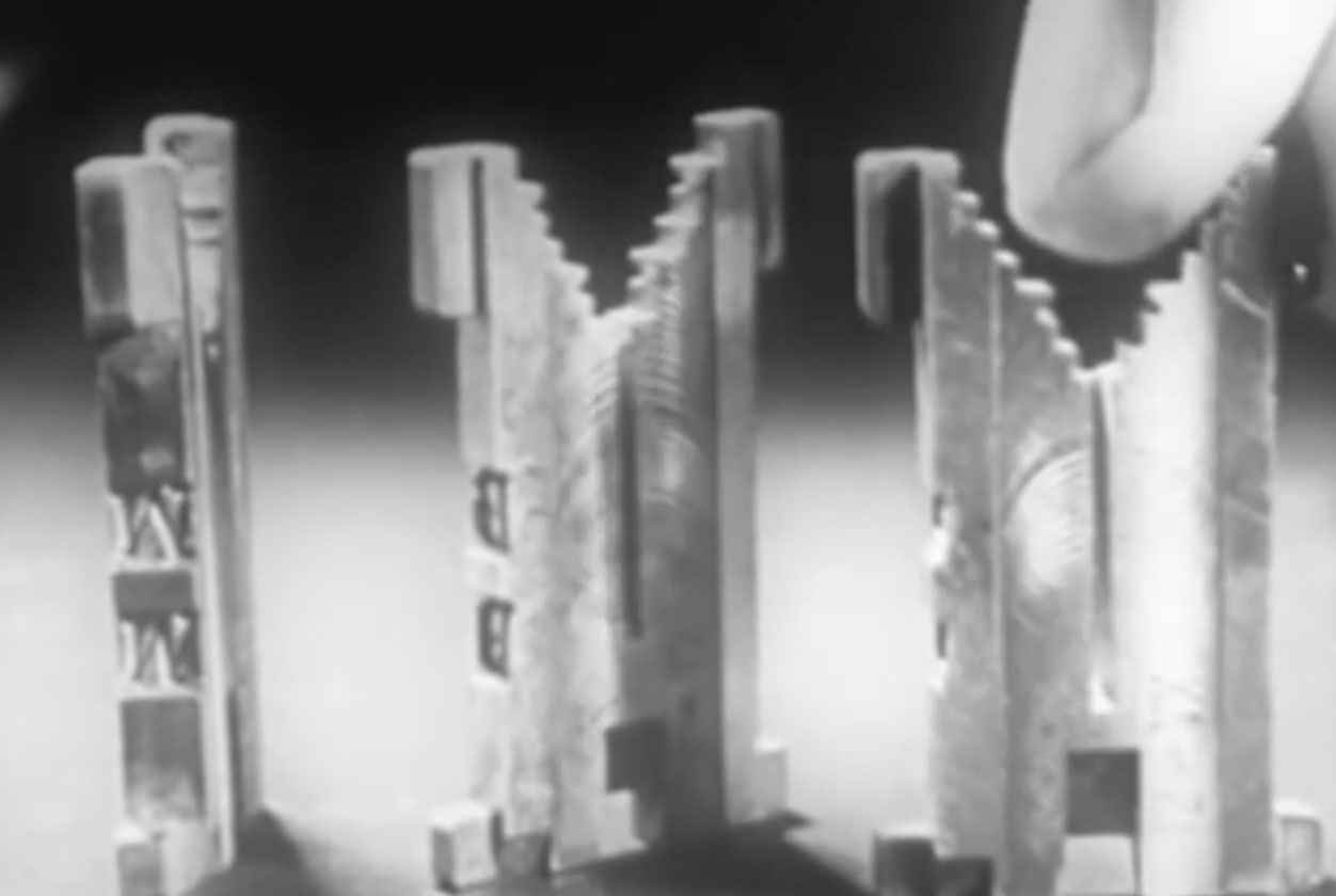
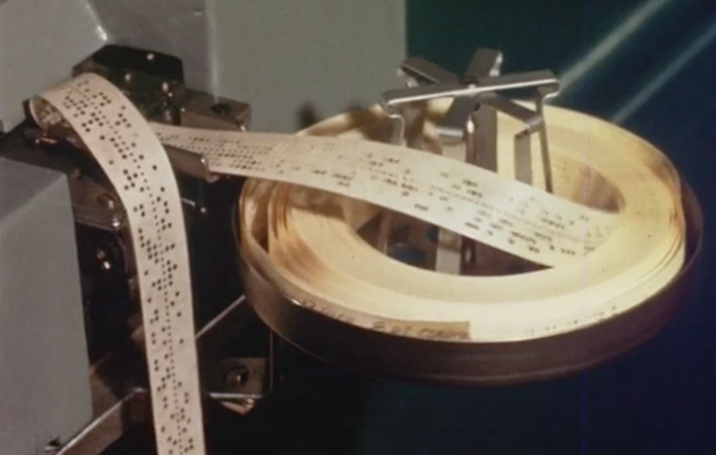
 Featuring the cathode-ray tube Linotron 505 for high-speed film typesetting. Although this is a film machine, the input is still controlled by perforated tape. The film features many interesting line diagrams on how the CRT machine works and exposes the characters onto paper or film. It goes into great depth about the optical grid system of characters on glass plates. Originally produced for the Mergenthaler Linotype Company by Franz Edson, Inc. Digitized by printingfilms.com
 -
 This film showcases the Elektron Linotype. Fed by perforated tape, the Elektron can cast up to 15 lines per minute without an operator at the machine. Originally produced for the Mergenthaler Linotype Company. Digitized by printingfilms.com
 -
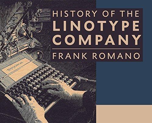 The book contains 464 pages of in-depth history of the people, places, and products manufactured by the Mergenthaler Linotype Company. Frank Romano traces the history of corporate acquisitions, product development, and competing machines all with his usual wit and experience. He also writes about his own personal history working at Linotype starting in 1959. There are hundreds of color reproductions of advertisements, publications, photographs, and typeface specimens. It also includes 120 pages listing every font manufactured by Linotype or its subsidiaries. A hardcover edition is available exclusively in the Linotype Film shop, a paperback version at Amazon.
 -