Search the Community
Showing results for tags 'phototypesetting'.
Found 9 results
-

Hand drawings for Berthold’s phototypesetting library
Ralf Herrmann posted a news entry in Typography Weekly #130
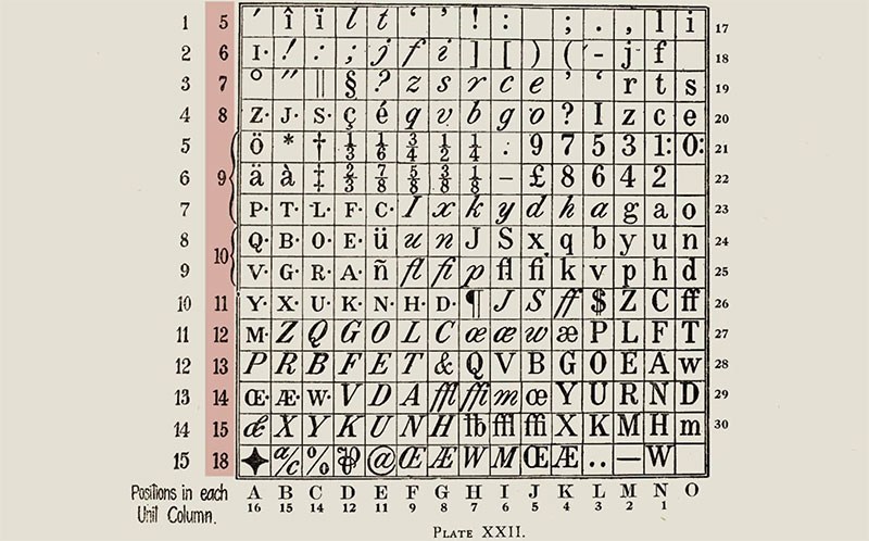
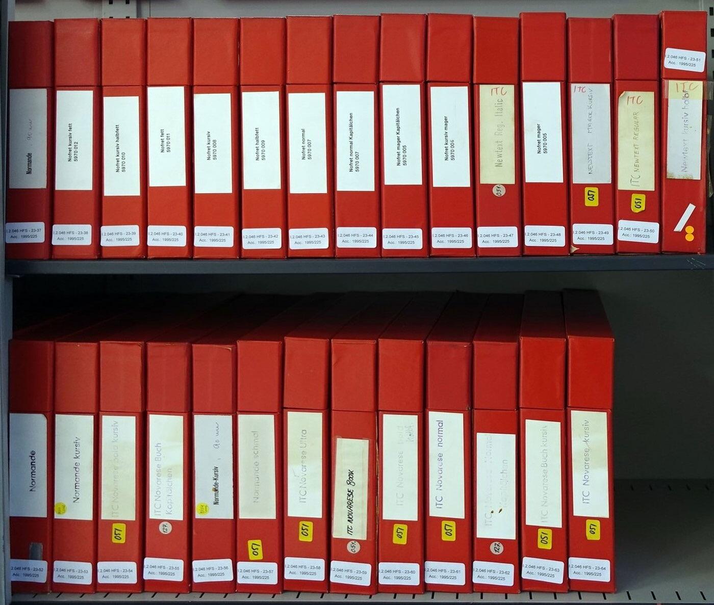 Most of the Deutsches Technikmuseum’s collections are not on public display, including the original hand-made drawings for Berthold’s phototypesetting faces. The storage for Berthold’s Diatronic typefaces alone takes up 19 meters of shelf space and fills 32 metal cabinets …
 -
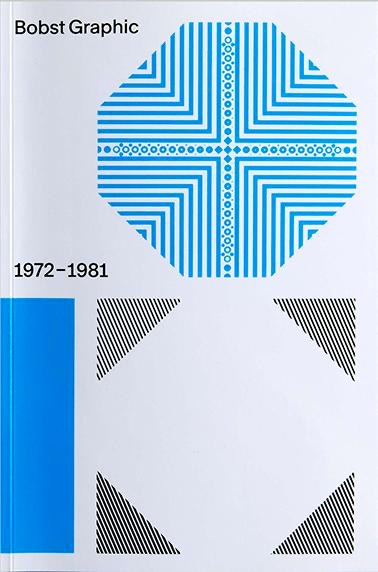 In the early 1970s, the Swiss packaging company Bobst S.A. began to wonder whether it would be ready for the future with only one product type. The Lausanne-based company, already far advanced in terms of packaging manufacturing technology, decided to launch phototypesetting machines. Thanks to the participation of some of the best font designers in the country, e.g. Team 77, different font families were developed for the new technique. The history of Bobst Graphic – a pioneering feat in the development of the phototypesetting at the time – has never been included in the rich history of Swiss graphic and font design.
 -
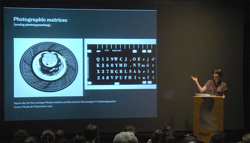
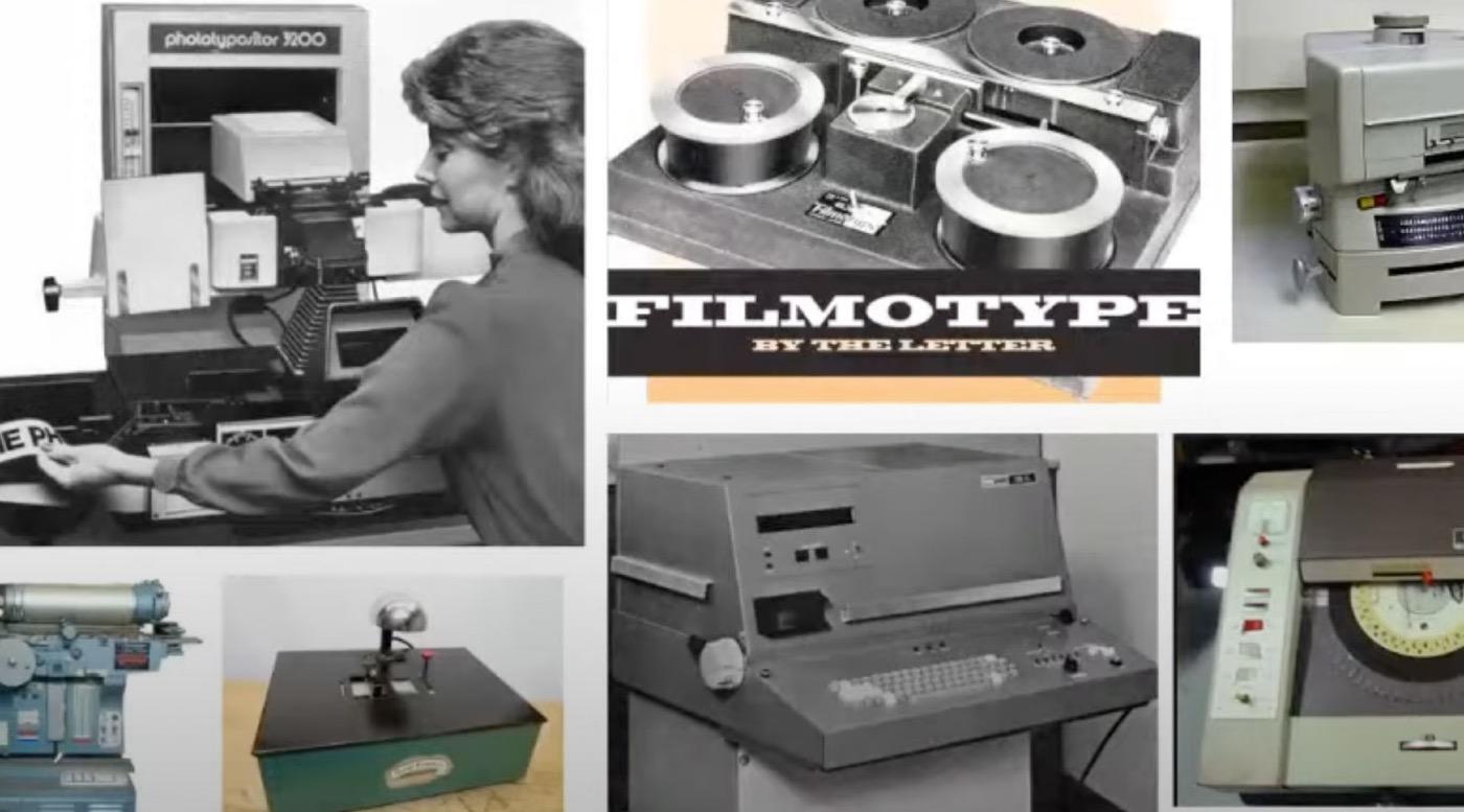 The emergence of photographic typesetting in the 1960s expanded typographic creativity and production. The classic font libraries of Monotype, Linotype, Ludlow and others were transferred to film—badly in most cases. The advent of the digital imagesetter and PostScript saw an explosion of new and derivative typefaces. Romano’s talk covers the technologies, libraries, and luminaries of the phototypesetting era.
-
- 1
-

-
- phototypesetting
- coldtype
- (and 2 more)
-
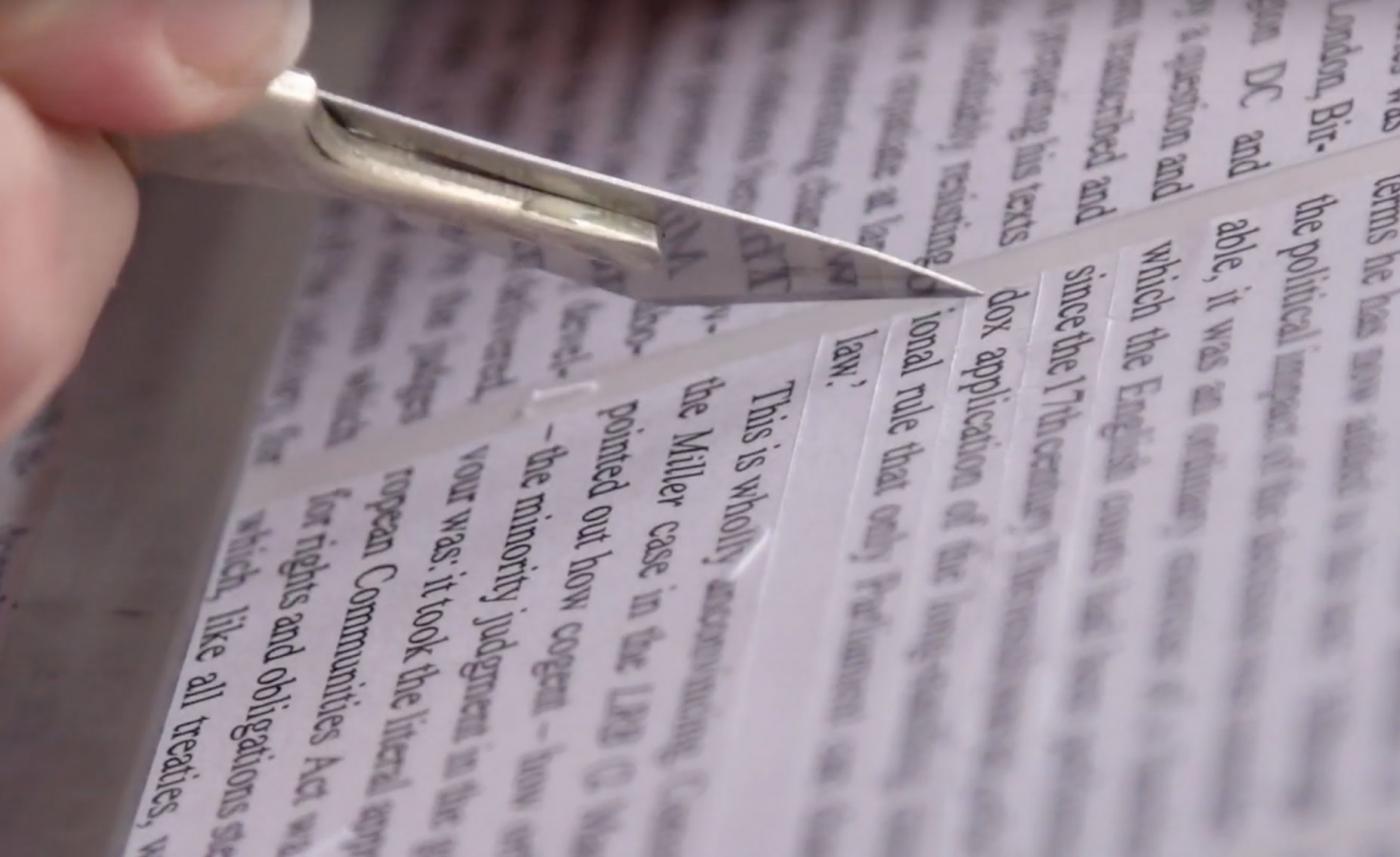 Arranging and rearranging a magazine’s layout before it goes to press is all done on computers now. But in the years before desktop publishing software, the work of cutting and pasting required a sharp scalpel, a parallel-motion board and plenty of glue.
- 3 comments
-
- 2
-
-

-
- 1980s
- phototypesetting
- (and 1 more)
-
 Many typefaces available to us today are not stand-alone designs, but were introduced as inventive solutions to very specific problems of type manufacture, typesetting restrictions, or printing issues. As those designs become part of the overall typographic landscape, it’s easy to forget how closely connected they are to the original problem, or how much potential there may be to explore solutions to a new problem. Looking at some now-classic typefaces, we’ll see how they turned out the way they did, and hopefully encourage some fresh responses to newer challenges. Dan Rhatigan worked as a designer and typographer for 15 years in Boston and New York before moving to England in 2006 for graduate school at the University of Reading. After receiving his MA in Typeface Design, he spent 7 seven years working with Monotype as researcher, type designer, and eventually Type Director. He now lives in New York City again, where he works as an independent type designer and consultant.
 -
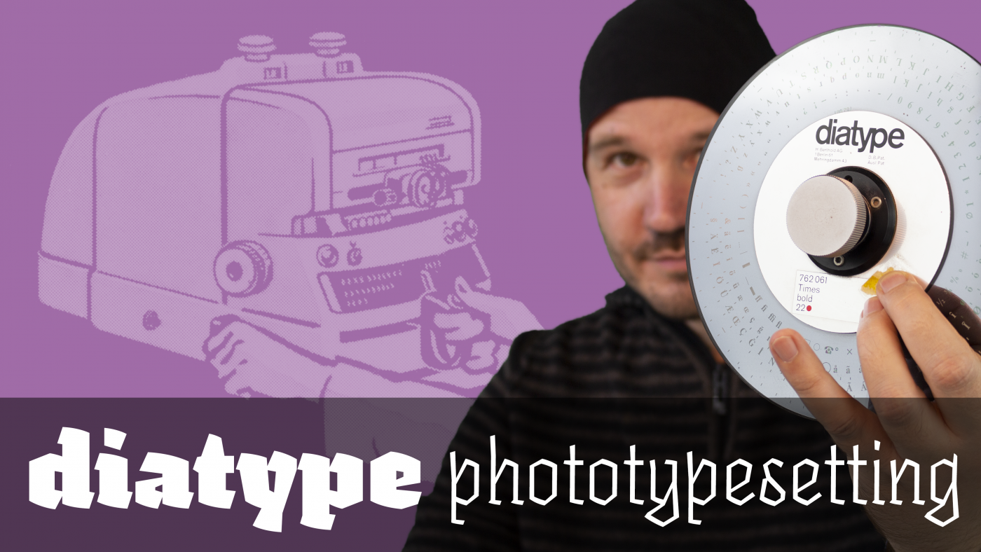 The Berthold ‹diatype› was a phototypesetting machine introduced around 1960. This video, shot at the printing museum Pavillon-Presse in Weimar, Germany explains how this device works.
 -
 In this ISType talk, Alice Savoie will tell us why she thinks the phototypesetting era is a fascinating period that is often overlooked, and why it is still of relevance for practicing designers today.
 -
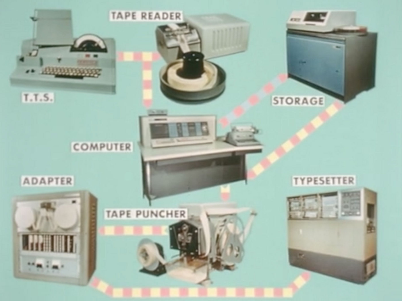 A film created by the International Typographic Union to display the advancing electronic technology being introduced to typesetting and printing. The film shows an IBM 1620 computer and additional storage disks working with Linofilm typesetters that were installed in July of 1963. There is a very in-depth explanation of the process of early computer and film typesetting. Additionally, new forms of plate making with cameras and photo composition are shown. Via printingfilms.com
 -
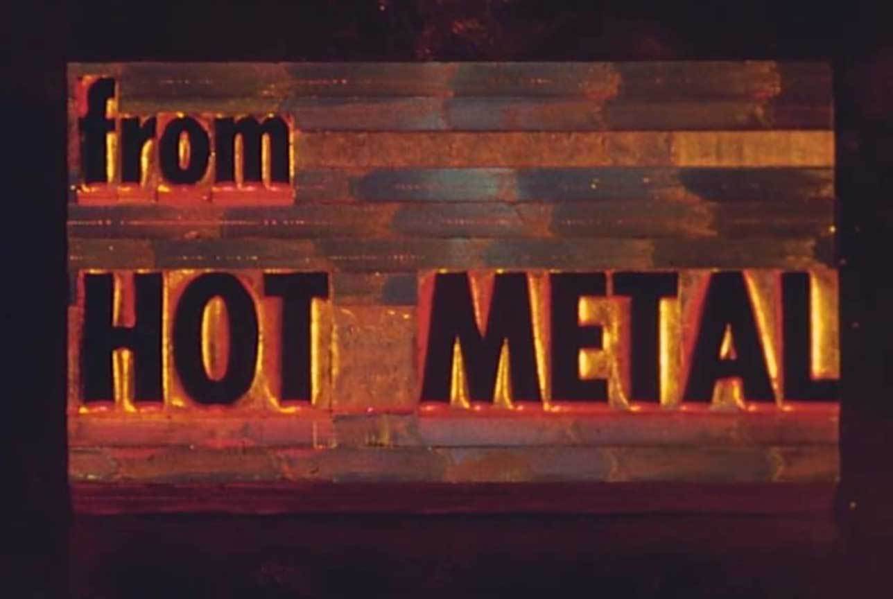 This film was created by the International Typographic Union to encourage their members to become more comfortable with the new “Cold Type” technology revolutionizing the typesetting industry. Starting with an explanation of the hot-metal process, they feature the Intertype Fotosetter and then go through the entire photo-composition process. The film shows camera work, stripping, chemical development, and paste-up. It ends with an aerial view of the ITU building in Colorado Springs, CO. via printingfilms.com