

Search the Community
Showing results for tags 'poland'.
Found 5 results
-
 Pracownia PanBonTon is a letterpress studio in Bielsko-Biała, a city in the south of Poland. They print business cards, stationary, invitations, coasters, postscards and so on.
 -
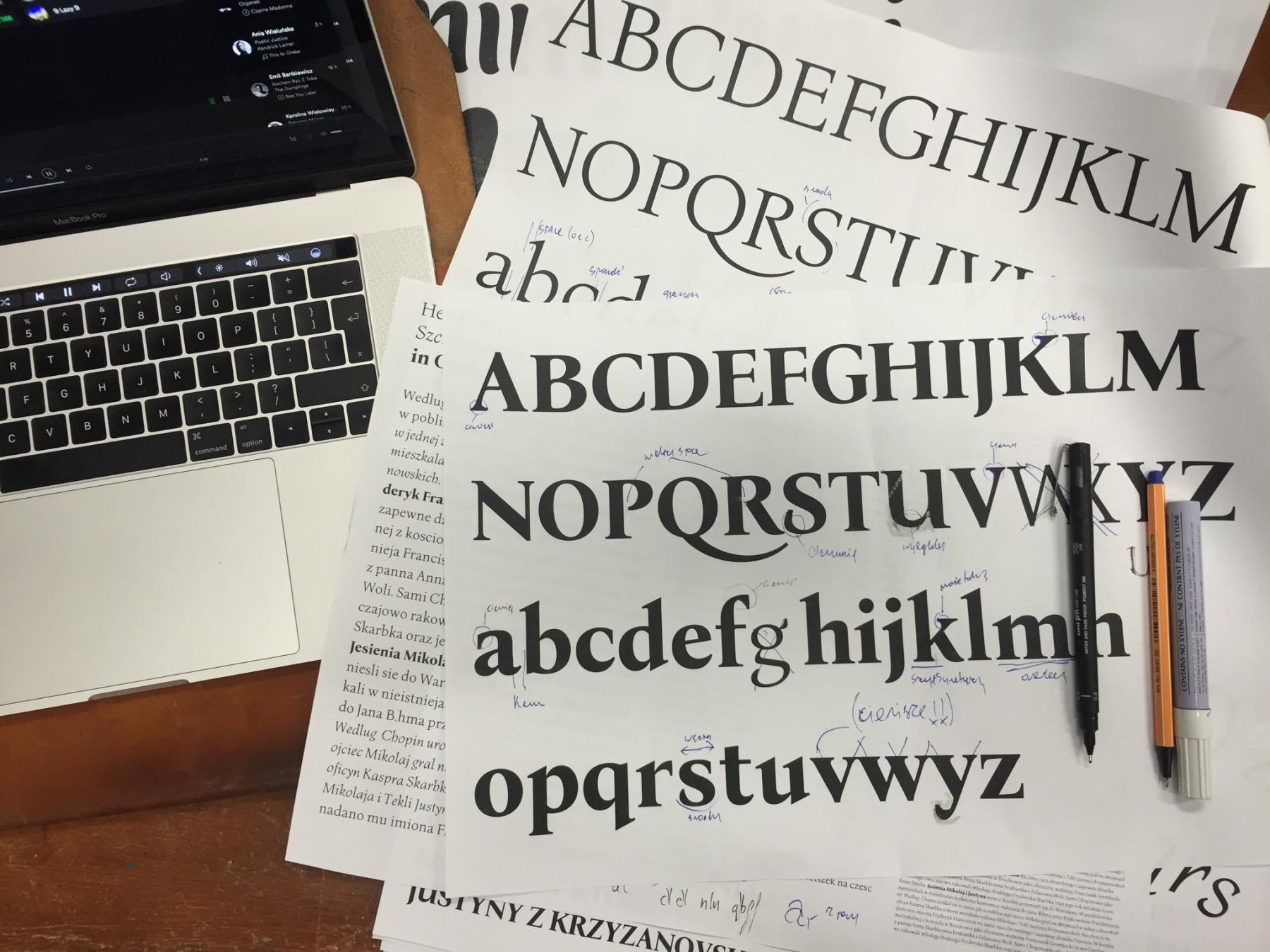 Letterpress version and type specimen of Bona Mateusz Machalski started the project in 2011, when he was in his second year at the Academy of Fine Arts in Warsaw. The font had only existed in metal type and it was available in the typesetting room of the academy. When Machalski became interested in the font, his professor arranged a meeting with its designer Heidrich. “I was surprised that he did not laugh at my projects. It made me more confident and I told him about my idea. He reacted with real enthusiasm” Machalski remembers. Digitization started quickly after that meeting, but the work remained unfinished for a few years. In 2016, together with Leszek Bielski, the project was revived again. More meetings with Heidrich took place and an extended type family (regular, italic, bold) was planned. Bona was Heidrich’s only full type design. But as graphic designer in those days, lettering for book jackets for example was a typical job. But there was little choice for body copy texts. “We always worked with 12 pt Times or Garamond—to the point of boredom. Each book looked the same inside. There was a deep need for new typefaces. For each cover or other design the lettering was custom made. It had to be drawn or painted, as there was not enough time to create and cast new letters.” Original sketches and matrices Heidrich worked on Bona as a side project—for the “pure pleasure” of it as he remembers. There was no specific brief or job for the design. The typeface was cast and a full set ended up in the typesetting studio of the Academy of Fine Arts in Warsaw, where it was used occasionally. For the digitization Heidrich provided all the original sketches of the italic and the matrices could be inspected as well. But there were still so many design decisions to be made for the digital version. “With Bona Nova, the most interesting things happened during the design work. I published images and details about the progress on the internet and the Bona Nova fanpage became a stage for a typographic debate on many levels” says Machalski. Among other details, the design for the Capital Sharp s was heavily discussed on Facebook And of course a roman design had to be developed from the italic, which is rather unusual. Letters on stamps and banknotes by Heidrich helped to work out certain characteristics. The final designs got an extended Latin character set with over 1000 glyphs, including small caps, lots of ligatures, multiple figure sets and ornaments. But the family still continued to grow. Three inline versions were added and three title versions with a very high contrast. These are available as commercials offers. And there might be more in the future. “There are some plans—perhaps Cyrillic? Maybe a sans serif version … Only time will tell.” Specimen images from Bona Nova The free styles of Bona Nova The commercial styles of Bona Nova The free and the commercial styles are available on the Capitalics website. More information about the project in Polish and English here: http://bonanova.wtf
 -
 The Printing Museum was established in 1996 to preserve and to protect the material and cultural values of the Cieszyn printing guilds. Its aim is also to commemorate the rich traditions of typography in the area of Cieszyn. All the machinery is in perfect working condition. The museum is one of the best- equipped places of its kind in the entire country. It also collects all possible documents on the history of printing and on persons of merit in this field. Beside visiting, the museum offers an especially elaborated programme for young visitors – pupils from primary and secondary schools. Within one hour they visit the museum and witness the creation of prints by an archaic way; from the types set by hand, then mechanically obtained cast of types to the final printout. The Graphic Studio started in 2004.The graphic room offers special stands for designing and creating graphic works and is adapted for bookbinding workshops. Typographic workshops take place in an historic composing room and also offer examining the whole exhibition.
 -
 The Book Art Museum is a library of knowledge about the history and the future of a book. In fact it is a library of “books about books” which have been collected since the beginning of the museum. Most of the books, due to the poor condition of the building (leaking roof, for example) are stored in boxes. Library equipment is being collected as well (mainly donations), however not as intensely as we would like due to the unclear legal status of the building. The “Library of books about books” is waiting for administration decisions and so far it has been created virtually. It consists of Polish and German “books about books” donated to BAM in 2011 by professor Alfred Świerk from Mainz (more than 1200 items), of Polish and foreign publications collected by the Tryznos, as well as the catalogues of the book art exhibitions collected by Alicja Słowikowska. The main themes are: technologies (printing, binding, paper-making), history of a book (of writing, illustrating, ornamenting), history of art (artists, styles, trends), new media (e-books, experiments), encyclopedias, compendia, dictionaries. At the moment there are but two registers available: the one made by Dominika Biernat for her MA thesis, and of the books donated by professor Alfred Świerk. The direct access to the books will be possible after the renovation, when a few rooms will be prepared for this function. The OK'ART library is a separate part of the “library of books about books”; it both collects and initiate publications “about artist's books”. It consists of critical papers accessible non-abridged at the Museum website. The first papers were written as referring to the collection of “Polish artists' books from the end of the 20th and the beginning of the 21st centuries”. The OK'ART Library will enlarge as new papers are sent from Poland and abroad. The texts will be in Polish and English. During two decades there were many exhibitions at the Museum, both Polish and foreign ones. The Museum showed also its collections in many venues in Poland and abroad.
 -
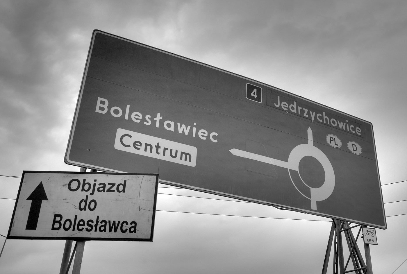 When I first saw a digital version of the Polish traffic typeface, I though I must have gotten a really bad digitization. It had characters which were obviously cut off by mistake … But I later found out that this is the way the typeface is supposed to look like according to the official specifications: The typeface has a very simple geometric design almost without any typographic corrections. Only one style is in use. There is no condensed style available and no variations for positive/negative contrasts. The typeface was originally developed in 1975 by Marek Sigmund for the Ministry of Transportation and put into effect on April 1 of that year. It is currently used in accordance with the Ministry of Infrastructure regulation of July 3, 2003 on all types of road signs in Poland. But Poland is a good example that type design isn’t everything when it comes to the design of traffic signs. The Polish signs compensate for the poor type design by making most of the information and direction signs very large, thus still achieving a good legibility. Unfortunately, the typeface almost always fails when the type has to get smaller. See this next example on a motorway, which is supposed to be read at 110 km/h (70 MPH). There are two digital versions available: Tablica drogowa by Grzegorz Klimczewski and Drogowskaz by Emil Wojtacki. The latter is freeware and I recommend using the TrueType version. The OpenType PS font has some outline bugs.


