

Search the Community
Showing results for tags 'reading'.
Found 7 results
-
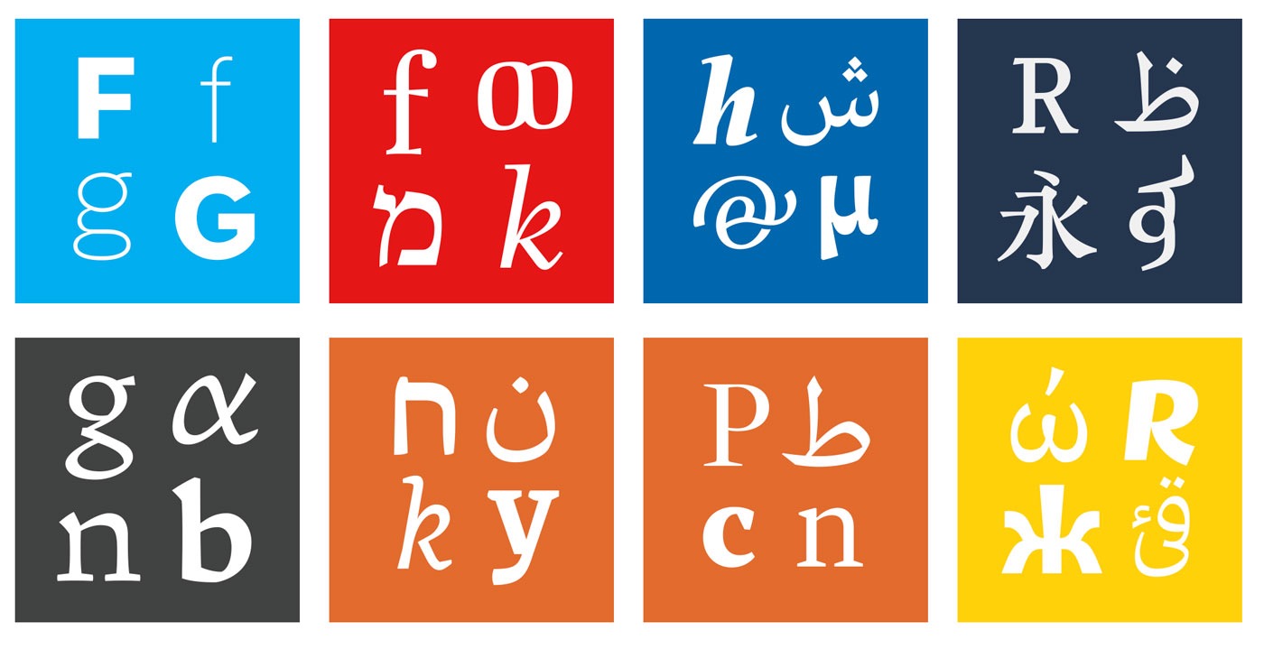 Latest student typefaces from the Department of Typography & Graphic Communication at the University of Reading.
 -
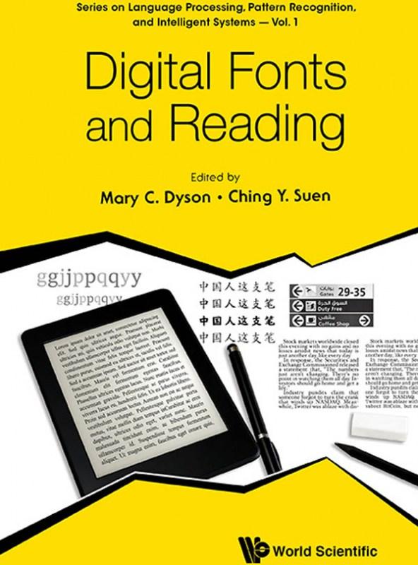 The book is a collection of invited chapters by renowned experts and is part of a series on Language Processing, Pattern Recognition, and Intelligent Systems. The content is wide-ranging, encompassing perspectives from computer science to social science to design and reflecting the considerable experience of researchers, teachers and practitioners. This diversity offers rigorous approaches to the topic of Digital fonts and reading, organised in four sections: vision and reading; scientific approaches to reading; perspectives on type design practice; and using type. The heavily illustrated text includes original research, case studies, reviews, and practical advice, serving as a useful handbook or reference to inform design for reading. Traditionally, there has been a separation between researchers and practitioners, with different agendas. This book bridges the gap between scientific testing and design experience and considers the reader's perspective. The collection aims to resonate with academics and students, experienced or novice typographic or interface designers and software engineers, and engage with anyone who has an interest in type and reading. Contents: Vision and Reading: The Effect of Type Design and Typesetting on Visually Impaired Readers (Eleni Beveratou) Matilda: A Typeface for Children with Low Vision (Ann Bessemans) Scientific Approaches to Reading: Sitka: A Collaboration Between Type Design and Science (Kevin Larson and Matthew Carter) Eye Movements: From Psycholinguistics to Font Design (Timothy J Slattery) Designing Legible Fonts for Distance Reading (Sofie Beier) Effects of Interword Spacing on Chinese Children's Reading Abilities (Hsiu-Feng Wang) Perspectives on Type Design Practice: Elements of Chinese Typeface Design (Xiaoqing Lu and Ting Tang) Optimizing Type for Use in Specific Media (Eben Sorkin) 'Harmonised Type Design' Revisited (Titus Nemeth) Using Pattern Languages in Typographic Design (Rob Mckaughan) Using Type: How Does Expertise Contribute to the Recognition of Latin and Chinese Characters? (Mary C Dyson, Keith Tam, Clare Leake, Brian Kwok) Newspaper Text (Lucie Lacava) Perception of Fonts: Perceived Personality Traits and Appropriate Uses (A Dawn Shaikh and Barbara Chaparro) Legibility and Readability of Arabic Fonts on Personal Digital Assistants PDAs (Mrouj Almuhajri and Ching Y Suen)
 -
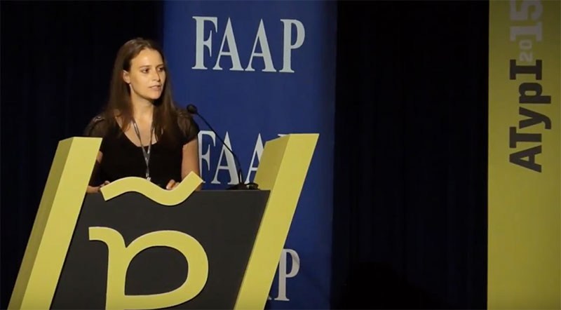 Ann Bessemans’ talk from ATypI 2015 in São Paulo These days rhythm within typefaces is treated very homogenously. The perfect example is the currently dominant early 21th century letter model where all the letters within a typeface get roughly the same width. But how does this development affect reading comfort? Currently, there is no closed definition of reading comfort and how to test it (quantitatively) in the best possible way. Tracy (1986) describes readability in terms of quality of visual comfort, as an important requirement in the comprehension of long stretches of text without experiencing physical complaints. There is strong evidence that visual comfort has to do with the rhythm of the typeface. Studies show that stripe patterns impede the reading process due to visual discomfort. Visual discomfort refers to the adverse effects of viewing certain kind of visual patterns, like text. This lecture will offer new insights into the way how to define reading comfort and why measuring visual comfort, independent from reading performance, seems to be innovative.
-
- 1
-

-
- legibility
- reading
- (and 3 more)
-
 The Department of Typography & Graphic Communication at the University of Reading is a small design school within a traditional, research-intensive university. Typeface design has been a teaching and research theme since the late 1960s. Today the Department hosts the preeminent Masters programme in the field, a high-end summer course, and a range of PhD and post-Doc researchers in typeface design. We are also setting up a distance-learning MA focusing on academic aspects in typeface design. MATD The MA Typeface Design (MATD, for short) was the first MA programme in the field, and the only one operating in a research-intensive university environment. Central to the programme is the idea that typeface design does not exist solely as an area of practice, isolated from its context, but is a quintessentially interdisciplinary field. The main activities of the typeface designer are easy to define: designing typeforms, and specifying typefaces. But these rely on a deep web or of historical, cultural, and technical understanding, as well as plain-old form-making skills. From the impact of traditional forms of writing, the developments in the technologies of type-making and typesetting, the typeface designer needs to be aware of how texts are transmitted and shared in each society, and respond to the editorial practices and conventions of each market. Some may even engage with the sprinkling of usability and human perception discourse (although, the impact of such studies on typeface design is probably minimal). MRes TD The MRes TD is a new programme, targeted specifically at experienced, practicing typeface designers who want to develop a deeper understanding of the historical and theoretical aspects of their field, and gain a research-intensive qualification that allows them to teach a postgraduate level. The programme is structured on a hybrid model, over two years of part-time study. This structure extends the core seminars of the residential MATD programme, and integrates intensive sessions modelled on the TDi short course.
 -
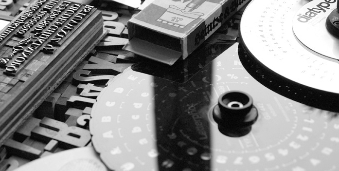
A selection of dissertations from students at the Department of Typography & Graphic Communication at the University of Reading.
-
 As you probably know, our eyes don’t move continuously along a line of text. Instead we perform so-called saccades, fast eye movements from one word or phrase to the next. This is caused by the fact, that only the fovea—the central part of our retina—allows a sharp and detailed visual perception. In a typical reading situation just four to five letters around the fixation point are seen with 100% acuity. Still, an experienced reader will also gather information in advance from outside the fovea. This is called peripheral vision and while reading this can include up to 15 letters, which unfortunately are too blurred and distorted to be read in a true sense. The Word Shape or “Bouma” Within the field of typography there is still a strong belief that words can be recognized as a whole. According to this idea, words form a certain shape—referred to as so-called bouma (shape)—and we can recognize (and therefore read) this shape or outline if we have seen it over and over again. Even though this has never been proved nor explained in detail, it has been widely accepted as common knowledge in the fields of graphic design and typography. But evidence from the last 20 years of work in cognitive psychology indicate that we use the letters within a word to recognize a word.[1] For a detailed review of scientific studies in this area check out the paper of psychologist Kevin Larson, which is available online and was printed in issue 13 of Typo magazine. Here I am just quoting his conclusion: “Word shape is no longer a viable model of word recognition. The bulk of scientific evidence says that we recognize a word’s component letters, then use that visual information to recognize a word.” Case closed? Not quite! The discussion around word shapes is also a discussion around the question whether or not mixed-case type setting is superior to uppercase type setting. And this is still a controversial topic. Mixed case vs. uppercase So let’s look again at the theory of word shapes. Even the supporters of this theory hardly offer any detailed descriptions or models how reading words through word shapes should actually work. I could think of two scenarios: the existence of ascenders and descenders makes words readable on their own a detailed envelope around the letters makes words readable on their own In the first scenario, the existence of ascenders and descenders forms one of three basic shapes. The distribution of theses three shapes could make words readable. So, does it work? I guess not. Or to quote Paul Arthur[2]: “The average English word is five or six characters long and to think that each of these tens of thousands of five- or six-letter words has its own distinctive shape is nonsense.“ Way too many words have the same distribution of characters with ascenders, descenders and characters without neither of those. And almost all uppercase characters don’t have any ascenders or descenders at all. So how are they even readably if word shape is so important? In fact, in a study Miles Tinker[3] found mixed-case text just 12 % percent more efficient (quicker to read) than uppercase text. That’s a pretty weak result for anyone believing that word shapes are a fundamental concept of legibility. Or think of typing errors or scrambled letters like in this famous example: “Aoccdrnig to a rscheearch at Cmabrigde Uinervtisy …” The known word shapes are complete destroyed but an experienced reader can still read such texts without much problems. In the second scenario we could try to lay the outline closer around the characters … Doesn’t help much either, does it? We could put it closer and closer around the characters until we reach a point, where we might actually have chance to guess the letters. But then we would end up with a detailed image of our word shape. We might actually learn this image and recognize it again later. But such a detailed image can easily be broken and become unrecognizable if we just changed the tracking a little bit or switched to a different typeface. But the power of human reading is based on the fact, that is not based on detailed images but combined features. Just think of handwriting: Even the same character looks different every time it is written and so would detailed word shapes. Therefore if abstract word shapes are not readable (scenario 1) and detailed word shapes as images that appear over and over again in the same way are just not realistic (scenario 2), we can only come to the conclusion, that word shapes cannot be a fundamental principle of reading. Now you might tend a little bit more to the (parallel) letter recognition model that scientist propose, but you might still think, that word shapes somehow support reading. (At least that’s the usual response I get, when I talk about this topic.) But that’s like the catholic church saying to science “Well, now that you found all these proofs of evolution, let’s agree there is probably evolution and creation.” If we read single letters instead of whole words there seems to be no room for anything that we should gain from word shapes. In fact, we might even argue, that mixed-case text might not be in any way better than uppercase text. So not surprisingly, Kevin Larson explains the fact that uppercase text is read slightly slower this way: “This is entirely a practice effect. Most readers spend the bulk of their time reading lowercase text and are therefore more proficient at it. When readers are forced to read large quantities of uppercase text, their reading speed will eventually increase to the rate of lowercase text.” But why is there not a single novel written in uppercase text, when mixed-case and uppercase text setting are supposed to be so similar? Why has the practice of writing mixed-case even evolved, considering uppercase writing was there first? Why are even small paragraphs of uppercase texts so unpleasant to read? Why is it that graphic designers and typographers insist that mixed-case is more legible than uppercase? The value of mixed-case typesetting To answer the above questions we need to consider the context we are talking about. So let’s look at my Onion-Layer Model of Legibility again: The upper half (grey background) deals with single letters and words. Here it is all about a legible text setting and the recognizability and distinguishability of letters. In this area uppercase letters can perform indeed very well. They have a very simple and distinguishable letter skeleton, without leaving much room ambiguity. Lowercase letters might be more troublesome in this regard. Just think of the similar outer shapes of e, o and one-storey a, which differences can easily blur together under bad viewing conditions. But in return, uppercase letters need much more space, and this is often ignored in scientific studies that just compare the legibility of single letters flashed on a computer screen. If the space is limited, for example on a sign, the uppercase text would need to be set smaller and the legibility would therefore be decreased. But when we talk about short pieces of information like headlines in a magazine or on a billboard, there is actually nothing wrong with uppercase text. Both uppercase and letters have their pros and cons and I consider it a myth to say that mixed-case setting is more legible per se. But if we look at the lower half of our model (white background) the rules do change. Here it is all about the reading comfort of longer texts and this is an area where uppercase text will fail. It is no coincidence, that mixed-case typesetting, word spacing and modern punctuation all emerged from setting long texts (usually in books), because they all aid the reading comfort. When reading longer texts it not just about recognizing single letters one by one. Peripheral vision becomes an important factor and with it the vague and blurred information we can gather from it. Just look at the following simulation. The same paragraph (Georgia, standard tracking) is set in mixed-case and in uppercase and the latter was scaled down so it takes up roughly as much space as the mixed-case text. From which text can you pick up more information? The mixed-case text clearly offers much more information. Even though the single letters are not clearly recognizable we can guess pretty much all the words of the whole paragraph. It is also obvious that ascenders and descenders play an important role in this regard. Just look at the word typography/TYPOGRAPHY in the first line of each paragraph. In the first paragraph the letters that only use the space between the baseline and the x-height (o, a and r) are not clearly visible but the letters with ascenders or descenders leave no doubt, that it actually says “typography”. So does this mean we have recognized a stored image of the word shape of the word “typography”? No. It means that ascenders and descenders helped us to guess these single letters and consequently guess the whole word correctly. (Or to be more precise: Both things happen rather simultaneously and support each other.) I would love to see a scientific study which analyzes the role of ascenders and descenders in mixed-case reading, for example by simply varying the amount of ascenders in a reading test. The uppercase paragraph on the other hand doesn’t provide much information. Guessing the words is much harder or even impossible and the only thing we can clearly see, is the space between the words, even though it is also obvious that the single words appear much more clearly and separated in the mixed-case paragraph. And that’s what makes uppercase text so unpleasant to read. There is less information to pick up from outside the fovea and this makes reading more strenuous. So we should admit that science has smashed our lovely idea of reading words as a whole. But still, that does not mean that we need to abandon our typographic principles that have evolved over centuries. It don’t think it is true, that uppercase letters are intrinsically less legible—quite the contrary! But there are many situations where mixed-case text is still the better choice. For example, for longer texts where peripheral vision is important and also when text is supposed to be read under difficult viewing conditions like signage, where the text is supposed to read from a distance, might be lit or reflective and so on. In such situations, ascenders and descenders will support reading, even though not in the sense of whole word shapes, but in the sense of single letter recognition. Footnotes ^ Kevin Larson, 2004, The Science of Word Recognition ^ Arthur & Passini; 1992; Wayfinding, People, Signs, and Architecture, McGraw-Hill Book Company ^ Tinker, Miles; 1963; Legibility in Print. Ames, Iowa: Iowa State University Press
-
- 1
-
-
- legibility
- typography
- (and 2 more)
-
 “Legiblity … a word that can lead into an ocean of misunderstanding and argument” R. Hague, 1936 (via Dear Reader) Definitions of Legibility & Readability Legibility and readability are common terms within different areas. Surprisingly, convincing definitions are hard to find and in different areas very different things are meant. In psychology scientist who study reading usually just talk about the time we need to read a certain text. In linguistics it is all about the content and the structure of the information. And in typography we usually mainly care about the visual presentation of the text. In typography we often judge typefaces to be more or less legible than other typefaces. Certain typefaces from the era of Renaissance and Baroque (Garamond, Jenson, Bembo, …) are said to be some of the most legible typefaces. But if that is true, why is it, that road signs are never ever set in one of these typefaces? Isn’t legibility a key issue for road signs? Shouldn’t we then use the most legible typeface for road signs? This problem puzzled me ever since I started to think about the legibility of signs or type in general. In order to solve it, at first, a clear definition of all relevant terms is indispensable. In the most broad sense, legibility deals with the perception or decoding of information and readability deals with the understanding of these information. Imagine taking a mountain hike. You can clearly perceive your surrounding. You recognize the mountain range at the horizon, you remember the path you walked and everything salient along it. You can perceive your surrounding and understand it. But suddenly mist comes up. Your surrounding instantly becomes illegible. You can’t make out the paths, trees and mountains that surround you. Even if you would proceed, without a clear perception of your environment, you would eventually loose your understanding of where you are and where you are headed. So a clear decoding of the information in your environment is essential for understanding it. But understanding is not always the logical outcome of decoding information. The mist might clear up and you have no trouble perceiving your surrounding again. But you went too far and now everything looks unfamiliar and you have lost your understanding of where you are what you see. Still, in that same environment, an experienced guide is literally able to read the information in the environment, which means he can not only perceive them, but understand them and easily find the way back to the starting point of the trip. So in a literal sense, to read means to interpret or to understand certain information. Legible on the other hand comes from the Latin legere, meaning just to gather, collect or to pick out. This example of decoding and understanding information is also true for reading text. To decode letters and words, they need to be legible—thus perceivable. They need to stand out from the background, they need to have a proper size and letter spacing to be decodable and so on. So legibility describes the ease or speed with which letters or other pieces of information are decoded. Readability is the aim. At best, the reader should not only perceive the information, he or she should also understand it. This is based on a legible typesetting and the content and writing style of the author. But understanding is also a rather subjective issue. People with proper eye sight will all perceive the silhouette of a mountain range in more or less the same way. But to make use of it, we also need to understand its meaning within a bigger context. And letters are not different in this regard. A big chinese letter might be perfectly legible by itself, but I will not be able read it. It is a visual piece of information I can easily perceive, but not understand. In the same way, a specialized scientific text might make perfect sense to one individual, but might be incomprehensible to another. So, in a textual or typographic sense, legibility deals with the perception or decoding of letters and words and readability deals with their understanding. With this clear distinction between legibility and readability it is much easier to talk about all kinds of phenomena of reading. But to fully understand what makes certain texts and typefaces more legible that others, we need an extended model, which I will present here. I dubbed it … The Onion Layer Model of Legibility Before I even started thinking about the design of a new wayfinding typeface, I needed a clear theoretic framework to talk about all aspects of legibility. The literature in graphic design and typography frequently mentions the importance of legibility, but definitions and the explanation of relevant factors are rather seldom and sometimes even contradictorily. So in the end, I had no choice but to build my own model. And I will present the basics of it in this article. Context One of the most important factors of legibility, which is sadly often neglected is simply the context. Is is rather pointless to talk about legibility without specifying what is supposed to be read, by whom and under which circumstances. Reading one word on a direction sign while driving is very different from reading a 300-page novel in an armchair. These different uses have very different requirements concerning the typeface and the typesetting. So in my model the context is the basis of the model itself. Now we get to the typesetting itself. It is grounded on basic principles of perception and Gestalt laws. In our model this is represented by the outer layer of our onion. We need to lay out the information in a way in which they can be perceived and decoded. This is influenced by parameters of the used materials, the surrounding (e.g. lighting) and many typographic factors (like letter spacing, line height—just to name a few). Like I said before, these parameters are basically objective. They can easily be measured. For example, we can define type sizes, minimum viewing distances, background/foreground contrasts and so on, which are necessary to pick up the information for people with a certain level of eye-sight. In Germany some colleagues and I are currently updating the norm “DIN 1450 legibility” which does exactly that. Recognizability The inner (blue) layers of the model describe the main features of the used typeface which influence the legibility of a typeface. The first and most obvious one is recognizability. It s a feature that mainly relates to individual letters. We recognize a letter if we have learned an abstract model of its shape—usually by being exposed to thousands of variations of it and by having learned to write it. Humans are exceptionally good at this kind of tasks. Even if the actual outline or image of the letters might be completely different in every font or written text, we are still able to easily decode the underlying design principle, thus we are able to decode the letter. It is therefore noteworthy, that the actual design of the character outline (in terms of stroke width, serifs and so on) plays a minor role in this basic sense of recognition. What matters most is the actual design principle or the skeleton of the letter. And therefore, it must be considered a myth that serif typefaces are more legible than sans-serif typefaces when they share a similar letter skeleton. A legible typeface is therefore one, that aids recognition by using a rather generic letter skeleton the readers are familiar with, no matter if that typeface has serifs or not. Distinguishability An additional legibility feature of typefaces is distinguishability. It’s the characteristic of a letter to be easily told apart from other letters. The one-storey “a” of Avant Garde or Futura might be perfectly fine in terms of recognition. These letters have a very simple and generic skeleton and can easily be recognized in contexts like magazine headlines. But when viewing conditions get worse or when we quickly read longer text and therefore skip many letters, distinguishability becomes crucial. Take these letters from the Swedish road sign font Tratex. Apart from their descenders they are completely identical and this slows down letter decoding under poor viewing conditions. For example drivers reading road signs might easily confuse an “a” for an “o” or vice versa when viewing the sign at a large viewing distance or when the letters are lit by the headlights of a car. Now let’s look at the same letters in a different typeface. In this case, letter differentiation is stressed thru a more individual, yet well known letter skeleton. So such kind of typefaces have a much better distinguishability, which might or might not be necessary in different kinds of typesetting tasks. Reading comfort So far, I have mostly talked about the skeleton of letters and not about stylistic differences. So what about them? Do serif typefaces like Garamond and Bembo do have any advantages over Helvetica and Frutiger if it all depends on just letter skeletons? The typographic literature usually just mentions the supposed fact, that serif typefaces are somehow better or “more legible” because the serifs guide the reader along the line of text. There is probably some truth in that, but I always found it hard to believe, that this should be the only and most important reason why after 500 years we still set most of our books in serif typefaces. To explain this phenomena, my model introduces the term reading comfort. It describes subtle features of a typeface, that are not directly related to recognizability and distinguishability. But these features make it possible to read even long texts with as little distraction and fatigue as possible. And that’s where the type design styles of the Renaissance and Baroque are so good at, because they were developed specifically for this kind of typesetting. For an experienced reader, the task of reading is mostly automatic. It is basically impossible not to read a word we see in front of us. But still, reading long texts is a cognitively strenuous exercise. Reading is not an evolutionary ability that developed over tens of thousands of years. We simply use (or misuse) our highly developed ability to schematize the world around us—in this case: to use abstract images to represent sounds. While some typefaces might perform well in terms of recognizability and distinguishability, they might not necessarily be suited for setting a novel in it. The clean sans-serif typefaces of today often sacrifice reading comfort for even typographic color and the possibility to set large amounts of text within as little space as possible. The stems of these typefaces then become endless rows of “picket fences”, which can easily cause fatigue. But variance in stroke and letter width can make the process of reading more pleasant and comfortable. We all know, how tiring a sheet of paper in a monospaced typeface can be. This is caused by the missing variance of the character widths. A typeface suitable for longer text will stress variance in letter design and character width. This influences how the letters and word shapes are perceived outside of the fovea—the small part of a line of text that we can actually see sharp and detailed. This helps to perform effective saccades, to understand the structure of the sentence and to anticipate the following words. So now our model is complete and it allows us to easily talk about different aspects of reading and legibilty. Now it also easy to answer the question, why road signs are set in sans-serif typefaces and novels in serif typefaces. If we talk about signage, we just need to consider the upper half of the model. The textual information need to be presented in a legible way and set in a typeface which letters are both recognizable and distinguishable. That’s it! The features of a typeface that aim at reading comfort are not necessary when just short pieces of information are presented. On the other hand, if we want to set a novel, all layers must be considered. This image shows some typical uses applied to the model. For a headline, we need a legible layout set with recognizable letters. Distinguishability and reading comfort are certainly dispensable. Signage requires a much more careful layout using typefaces that are optimized for recognition and letter differentiation. Copy texts require all layers to be considered carefully. We need a legible type setting and the letters of the typeface should not only be recognizable and distinguishable, but also comfortable to read over many paragraphs or pages.
-
- 1
-

-
- legibility
- signage
- (and 1 more)


