

Search the Community
Showing results for tags 'united kingdom'.
-
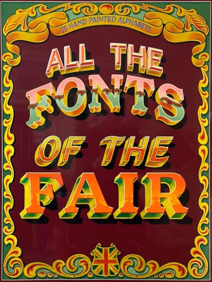 All the Fonts of the Fair, Joby Carter’s second book, takes a deep dive into fancy lettering styles found at traditional British fairgrounds up until the 1960s. Many of these vibrant, whimsical designs are missing from graphic design manuals and typography archives. This book helps continue their legacy and give them a new lease of life. This full colour book includes 26 hand drawn fairground inspired alphabets. Each alphabet has a reference guide with tips on how to accurately recreate the lettering alongside details about the origin of the style and photographs of variations of the lettering in use. The alphabets represent an enormous amount of hours in the workshop with each letter drawn, painted and decorated by hand, ensuring it worked alongside the other alphabet letters and could stand up to scrutiny and be accurately copied and scaled. https://jobycarter.com/product/all-the-fonts-of-the-fair/
 -
 Indiepop Press is a letterpress print shop in North Wales run by Lisa Harman. It was born from a desire that she had to create designs, prints and stationery using a more tactile, robust and raw median. She undertook a year long course under the tuition of the fine artist Elizabeth Willow. Most of Lisa Harman’s work is created using metal or wooden type and ornaments on our antique presses, turning what was once and industry into an art form; but she also enjoy experimenting with polymer plates and other materials to create unique and tailored pieces. The desire to share this art form with others has lead to the creation of a not for profit, open access letterpress studio in North Wales called ffowndri.
 -

A Two Pipe Problem Letterpress
Ralf Herrmann posted a directory entry in Artisanal workshops & studios
 Established in 2007, A Two Pipe Problem Letterpress is run by Stephen Kenny from The House Of Problems in Leyton, East London. Everything here is designed & printed directly on one of 3 machines using movable wood & metal type. Everything is printed one at a time by hand. The type in the collection come from type foundrys in England, France, Germany & the USA. The House Of Problems produces a range of stationery, prints & apparel. Projects are as varied as the wood type itself: book covers, record covers, luaggage labels, beer mats, notepads & fabric for Eames chairs in Japan. A Two Pipe Problem Letterpress also offers letterpress workshops.
 -
 Bringing slumbering presses back to life to engage with artists, writers and community projects in Bristol. The Letterpress Collective, run by Nick Hand and Ellen Bills, is teaching both type composition and printing skills in Bristol. The Letterpress Collective has spent 2013 gathering beautiful wood and lead type as well as collecting amazing printing presses including a lovely Heidelberg Windmill Platen (winched out of the store MShed by dockside crane), a Stephenson Blake proofing press and a set of nice little Adana hand presses.
 -
Andrew James, Carved Stone Letters & Masonry
Ralf Herrmann posted a directory entry in Artisanal workshops & studios
 With over 20 years experience in stonemasonry, sculpture and architectural restoration, Andrew is qualified with the Guild of Master Craftsmen and trained to work in both classical and contemporary styles. Having worked on prestigious heritage sites including Bath Abbey and Wells Cathedral, he now specialises in hand carved lettering and his work is on display in private homes and public buildings throughout the West Country and Home Counties. In the same way that stone has been carved for thousands of years, Andrew carves everything by hand using a simple mallet and chisel—ensuring that every letter is cut with a care, attention and clarity that retains the nuances often lost by mechanisation and that allows each stone to resonate with its own unique strength and beauty.
 -
 The British Printing Museum is a comprehensive private museum collection of letterpress printing equipment with working press exhibits dating from 1860 up to the 1960s. Open to the public by prior arrangement and to industry and education groups for meetings, workshops and demonstrations, the museum collection is based upon some of the original presses, type, wood letter and printing blocks used by The Portland Press, Mablethorpe from the 1940s and added to significantly. Activities include: Letterpress workshops – on an ad hoc basis Letterpress typesetting / printing courses – arranged for individuals or small groups Educational tours, active, fun with small creative workshops Activities for students of all ages and abilities – curriculum related Disabled access and facilities with special guided tour for the visually impaired
 -
 The Counter Press is a London-based design studio and letterpress workshop. The studio specifically rejects today’s typical uses of letterpress printing for things like wedding invitations or business cards and it also doesn’t print from digital artworks. Instead they want to “work with writers, designers, brands and businesses who share our love of the exquisite and who are looking to create something beautifully unique. Whether it’s a branding and packaging project, a limited edition print, or a piece of original typographic artwork.”
 -
 Hand & Eye is a letterpress workshop in London run by Phil Abel and Nick Gill. Phil Abel started Hand & Eye in 1985, equipped with an Adana 8x5, an Arab treadle platen, a passion for good printing and a pile of typographic journals. The presses are long gone, but the passion remains, and he hopes to continue, in a small way, the legacy of great twentieth century printers like the Curwen Press. Nick Gill is a writer and musician who was lured into letterpress when he wanted to make CD covers. He is the enthusiastic custodian of our Monotype machines, which he runs, services and strips down when needed. He keeps a record of his typecasting at Adventures in Monotype.
 -
 Thomas Mayo creates bespoke products that posses a distinctive quality and level of craftsmanship only achievable via time-honored techniques. Letterpress Printing: Bespoke printing service, everything is printed by hand using letterpress printing presses, moveable lead and wood type. Business cards, wedding & personal stationery, invitations, posters, birthday cards etc can all be printed using this method. Laser Cutting & Laser Engraving: For printer's blocks, from entire cases of wood type to missing characters and bespoke designs. Blocks can be cut from a variety of materials using different techniques. Also signage, stencils and custom objects can be created using this process.
 -
 Mark Brooks is a freelance calligrapher, designer and artist who lives and works in Canterbury, Kent, UK.
 -
 Mostly Flat specialises in hand printed paper goods. Created by artist, designer and letterpress aficionado, Dulcie Fulton, Mostly Flat is a letterpress design and print studio based in the medieval town of Ludlow in Shropshire. Each and every one of Mostly Flat's items are hand-set and hand-printed by Dulcie herself in her workshop, from greetings cards to prints, from business and correspondence cards to special commissions. Wherever possible Dulcie chooses recycled and FSC certified paper to minimise Mostly Flat's impact on the environment. When she's not printing, nor hunting down new acquisitions, Dulcie teaches the fundamentals of letterpress printing to individuals or small groups.
 -
 Mount Street Printers in London offer a diverse and complete printing service, including bespoke writing papers, creative and unusual invitations, full colour brochures, as well as an assortment of ready-to-write stationery. Using various printing processes such as engraving, die stamping, foiling, embossing, gilding and lithography, everything is produced on-site guaranteeing high quality, fast turnaround and complete discretion.
 -
Urbanfox Design - Letterpress Miscellany
Ralf Herrmann posted a directory entry in Artisanal workshops & studios
 Urbanfox Design is a small business run by Roger Beevers from a small unit in St Peters near Broadstairs in Kent, United Kingdom. The owner sells vintage and antique print trays, cabinets and wood and metal letters. After a chance buy at an auction, Beevers ended up with a large collection of letterpress type. After selling this to a collector he became hooked. Through a mix of luck and good timing in 2012 he was offered more and started to acquire all sorts of type, ornaments, decorations and all manner of Letterpress related miscellany. The letterpress goods are sold via ebay with worldwide shipping.
 -
 Fishbone Press is a small, independent letterpress and design studio set in the Herefordshire countryside. It has been running since 2013 providing a modern take on old printing techniques. Fishbone Press is the endeavour of Liam Bromage, who uses photopolymer plates (printing plates developed from a digital design) on antique printing presses. Fishbone Press produce bespoke stationary and promotional materials for businesses that want a unique handmade touch, offering a timeless tactile quality that stands above the throwaway digital designs that confront people on a daily basis.
 -
 New North Press is an artisan letterpress print studio in east London, UK. Established in 1986, the press was founded by Graham Bignell in New North Road, a short walk from Coronet Street where we have been since 1993. The partnership now includes Richard Ardagh and Beatrice Bless, assisted by Angie Gough and Ian MacDonald. Their aim is to keep the craft of letterpress alive by teaching regular workshops to pass on the knowledge; working on commissioned projects for clients large and small; and producing their own print editions and books which they exhibit and sell in UK and Japan.
 -
 Berrington Press is a family firm, started by David in 1984 after moving with his wife and young daughters from Lancashire to Herefordshire. Over the years the business had to evolve and adapt to keep pace with the contemporary print industry. From printing with metal type to offset lithography, new technologies and changes within the trade came in quick succession creating fierce competition. After many years of successfully navigating the highs and lows of commercial printing David began to contemplate retirement and what he would do in his twilight years. Being a printer of the old school and having ink in his blood he found he couldn't give up printing entirely and turned his attention to renovating vintage presses in a bid to preserve the craft that he had learned many years ago. Three renovated machines later, plus an apprentice printer in the form of daughter Sarah, Berrington Press has come full circle. Now with a revived interest in "doing it the old fashioned way" the craft of letterpress printing has been enjoying a marked revival in recent years and by drawing on David's craft skills as a printer and vast experience of the print industry together with his clever and creative two daughters Berrington Press has forged a new future from it's own heritage.
 -
 From the invention of typesetting with moveable types by Gutenberg in the middle of the fifteenth century, until the advent of the computer some five hundred years later, printing had been a highly skilled but labour intensive process. The John Jarrold Printing Museum is a window on the many hours and variety of skills that were involved in printing before they were made obsolete by advancing technology. The Museum is open from 09.30 to 12.30 every Wednesday and by special arrangement.
 -
 The Type Archive holds the National Typefounding Collection, purchased with grants from the National Heritage Memorial Fund; broadly comprising; the typefounding materials of the Sheffield typefounders, Stephenson Blake, a collection dating from 16th century London typefounders to their 20th century counterparts; the hot-metal archive and plant of the Monotype Corporation, operating from Salfords in Surrey from 1897, and in London's Lambeth from 1992 to date; the Woodletter pattern collection and plant of Robert DeLittle in York from 1888, and in Lambeth from 1996. The Type Archive’s collection spans the nearly 600 year period when the foundry cut letters in steel, drove them into brass blanks, and cast lead type from them in molten lead.
 -
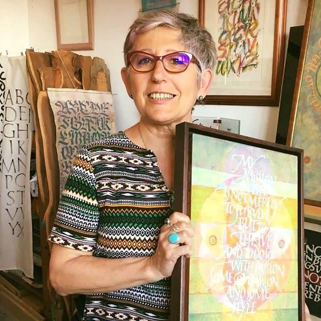 Rosella Garavaglia is an artist working on a wide range of calligraphy and lettering projects. Her main interest is to explore the expressive potential of the written word through various media and writing implements including the brush, fabric, wood, stone, glass and collage. Some of the provided services: logo design signs and advertisements wedding stationery corporate events poem and quotations lettering art
 -
 The dialogue between the calligrapher and the designer of type has been significant from the earliest days of print. Ewan looks at some of the issues raised through the lens of the life and work of Edward Johnston whose block letter type for the London Underground celebrates its centenary in 2016.
 -
 A short film about letterpress and one of the few remaining movable-type printing workshops in the UK, situated at Plymouth University, featuring Paul Collier. plymouth.ac.uk
-
- 1
-

-
- letterpress
- printing
- (and 2 more)
-
 As a history teacher in the late eighties, Graham Moss acquired an interest in paper conservation and book repair. In 1990 he acquired a small printing press to print labels for the paper wrappers and spine labels. Of course a printing press requires metal type, and soon learning about the differences in type faces and designs became an inspiration for him to try more than simply printing labels. Printing stationery and cards for friends and relations was the next step. When an Arab press, albeit in pieces, was offered for sale, he bought it, blissfully uncaring that it wouldn't fit in the dining room. The backyard shed, once home to a three-wheel motorbike, was transformed into a print shop, its entrance off Incline Road conveniently providing a name for the new press. In 1993 Incline Press found its first publishing project when a chance meeting with the artist Pete Carter coincided with the purchase of a first edition of Oliver Goldsmith’s The Deserted Village. Carter's modern-day interpretation of Goldsmith’s poem provided the title-page illustration, and a generous gift provided the funds for large fount of Baskerville type with the “long s” from John Eickhoff’s Acorntype Foundry—enough to set by hand a type facsimile of the poem including all the errors and differences that Goldsmith later changed for the fourth printing. While we were still printing this, the designer Enid Marx asked if we would like to produce a new edition of her 1938 set of wood engravings for Nursery Rhymes, which had recently been returned to her from the original publishers, Chatto & Windus. Thus the first book from Incline Press became its second, and we learned about some of the detours and distractions which are both the curse and the reward of the private press printer. Since those days, the Press has grown. Over fifty books have been published and the fount of Baskerville has been transformed into probably too many cabinets of type—several of which were featured in the first Incline Press type specimen portfolio, Forty Sheets to the Wind. The table-top Adana, Vandercook proofing press and the Arab treadle press have been joined by an Auto-Vic, and the Victoria Art Platen, both of which run on electricity and serves as our 'tip of the hat' to the twenty-first century, while a Heidelberg has just been fettled and will be pressed into action during 2012. All this expansion has long outrun the confines of the backyard shed, requiring a move to larger quarters. The most recent home of the press—a three-storey building built in the 1820’s—now houses the entire workings of the Press: paper, ink, bookcloth, type and machinery. Located on one of the oldest streets in the heart of Oldham town centre, 36 Bow Street was originally built as a small cotton mill, but continues life in the twenty-first century as a letterpress print shop.
 -
Typographica was a print magazine for typography and visual arts. It was founded and edited by Herbert Spencer and published between 1949 and 1967. Typographica was produced in two series (labeled “Old” and “New”) with sixteen issues each.
-
A bi-annual magazine founded by Elliot Jay Stocks, based on the “Desert Island” concept applied to type. In each issue eight designers whose work is known for its typographical slant, are asked the question: “if you could only use eight typefaces for the rest of your life, what would they be?”. The interviews then expand into open-ended discussions about all things typographic and are punctuated with examples of the designers’ work. The interviews are also accompanied by various related contributions. The entire run consists of four issues. A book which will collect them is in the works. #1 interviewees: Erik Spiekermann, Jessica Hische, Ian Coyle, Jason Santa Maria, Jos Buivenga, Jon Tan, Bruce Willen, Nolen Strals. #2 interviewees: Martin Majoor, Ale Paul, Stephen Coles, Tim Brown, Nick Sherman, Rich Rutter, Veronika Burian & José Scaglione #3 interviewees: Ellen Lupton, Frank Chimero, Steve Matteson, Mark Caneso, Vincent Connare, Yves Peters , Jason Smith & Phil Garnham #4 interviewees: Elliot Jay Stocks, Jeremy Leslie, Jan Middendorp, Robert Slimbach, Fiona Ross, Steven Heller, Erica Jung & Ricardo Marcin
-
The Fleuron was a British journal of typography and book arts. It was published in seven volumes from 1923 to 1930. The first four volumes were edited by Oliver Simon and the last three by Stanley Morison. Each volume contained a rich variety of papers, illustrations, specimens, inserts and facsimiles along with essays by leading writers of typography and the book arts.


