


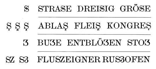
The letter ß came into existence in German blackletter writing, where it didn’t require an uppercase counterpart, because it stood never at the beginning of words and blackletter was never set in uppercase only. But since German is set in Roman script, there is an obvious gap in the German alphabet. Proposals to fill this gap were made since the 19th century. Here are designs that were discussed at the beginning of the 20th century:
A commission of German publishers, printers and type foundries introduced the lowercase ß when German was set in Roman script, but the introduction of a capital ß was postponed because the commission could not agree on a design at this point. This comes as no surprise, because it had to be created from scratch and there was nothing to base the design on and the German readers where not used to see such a new character in their alphabet.
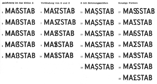
New proposals appeared in the 1950s in the German magazine Papier und Druck:
Even though the capital ß never became an official part of the German orthography during the 20th century some type foundries included it in their alphabets and it appeared occasionally in print.


The Capital Sharp S today
Since 2008 the capital ß is an official part of Unicode and it is now included in more and more typefaces. But type designers are unsure about how to draw this character. Here are some thoughts from a German type designer and reader on the different approaches …
The Ligature Approach
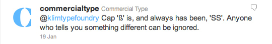
Not true! In German blackletter writing ß was understood as combination of long s (ſ) and z. We still call this character “Eszett” in German which just means “SZ”. So that’s the reason why many of the proposal shown above are drawn as an uppercase SZ ligature. And SZ was also the recommended replacement for ß in uppercase writing in the beginning of the 20th century. The dictionaries called this an interims solution to be used until a proper capital sharp S has been introduced. Over time, SS also became another replacement for ß in uppercase and by the end of the 20th century the original replacement with SZ was dropped and SS remained the only official writing according to the German orthography.
Type designers are drawn to this ligature approach for the design of the uppercase ß, because it sounds like the most logical thing to do in terms of the history of the lowercase character. But I don’t think so. First of all: the history of the letter ß has yet to be fully explained. At this point we cannot be sure that it has definitely derived from a ſs or ſz ligature. And creating a new character based on assumptions alone, would not be a good idea. Secondly, the knowledge that ß has probably derived from a ligature is purely limited to typographers and graphic designers. Young German readers today don’t know a long s anymore and they don’t see the character ß as a ligature either. To them, it’s just a letter of the alphabet, just like any other letter. So they don’t expect an uppercase ß to look like a ligature. Letters are just conventions among the people who use them. They are “correct” when they are accepted by the users of this language—not because they are correct in a certain historical sense. And this is true for all Latin letters. We don’t draw an A so it looks like a Mediterranean ox head—we draw it the way, people are used to. In the same way, a capital ß should be designed according to the user’s expectations and not according to a possible, but still unclear history of the letter ß. It needs to work as a tool of communication and that is all that matters.
A ligature approach using S and Z would certainly be possible, just like Æ and Œ are part of the Latin script. But I don’t think it would be desirable. It’s a forced design that doesn’t develop naturally. Even though some of the SZ ligature designs presented above look pretty nice, they feel more like stylistic ligatures for display use and I don’t see them as something Germans would want to use on a regular basis or for example in fine print or handwriting.
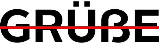
Another popular idea among type designers is a design based on two S (see image above). But this is not an option at all! The whole point of having ß in the German alphabet today, is that it represents a different pronunciation than ss. An uppercase SS ligature will be understood as a stylistic ligature as you can see in this example:
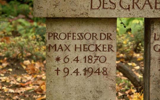
It represents “Professor” with a short vowel in front of the SS. So we can’t use a SS ligature as an uppercase representation of ß.
The diacritical mark approach
Diacritical marks are used frequently in languages which are written in the Latin script and in the old proposals for the capital ß several solutions are presented that use an S as the base glyph and added diacritical marks above, below or inside the letter. But a diacritical mark that is just used in the uppercase version and has a totally different counterpart in lowercase writing would be a very strange thing. German readers would only see it as a strange S, not as a capital ß and such a solution has little chance of getting accepted.
The arbitrary shape approach
Instead of using ligatures or diacritical marks the uppercase ß could also be based on arbitrary shapes. We could create a totally new character that would be in harmony with the design principles of the Latin script or we could borrow a design from a different language that isn’t used in German. But again: such solutions have little chance of getting accepted. The uppercase ß will hopefully be used more and more over the next couple of years and maybe even become an official norm. But if someone just uses an arbitrary shape today, it is very unlikely that Germans would agree to this design.
The capitalized Eszett
If you look at the capital sharp S designs that were introduced in the last couple of years, it is pretty obvious which approach is the most promising one. It is to start from the shape of the lowercase ß and turn it into a design that fits the uppercase letter. And that’s not a surprise: people in Germany and Austria often deal with the gap in their alphabet by simply using the lowercase ß inside uppercase writing. You can see that in Germany every day—from handwritten notes to TV ads. But the lowercase ß doesn’t belong into uppercase writing and the simple and obvious solution is to equip the German users with an uppercase Eszett that can easily be used and read, but looks also typographically correct in uppercase writing. And this is the solution I am also suggesting. The German readers don’t need to learn something new. They understand this letter instantly and the use of it solves all the common problems that result from the gap in the German alphabet.
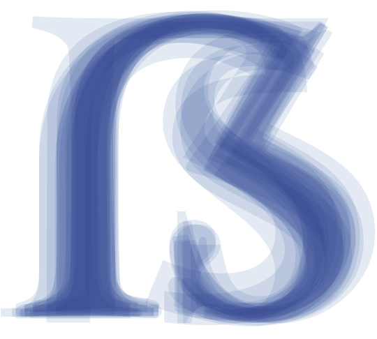
So how should this capitalized ß look like? There are now over a 100 designs done in this fashion and some work better than others. Here are a the two basic principles to design a capitalized ß:
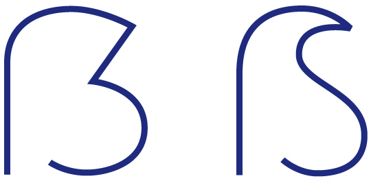
The left one is the most common design. The defining characteristics are the aperture on the bottom and the diagonal stroke on the top right side. The top left is usually done as a curve, but there are also designs where this part has been drawn as a corner or even with a serif. It also doesn’t hurt to make the capital ß wider than letters like B, but that is not a real requirement.
The version on the right might fit in better with more calligraphic typefaces. The stem can even get a descender in italic version. Here are some examples of this approach which I consider successful:

Note: The top right part is what makes this character unique! So make sure, you design this part in a unique way. The following example does not work for me …
I just read it as a B, even though it has an aperture at the bottom. The top right part is what matters and it should never be rounded like a B. Make sure this curve is clearly broken by a diagonal stroke or even an inward S-like shape. So draw it either like this …

or like this …


Recommended Comments
Create an account or sign in to comment