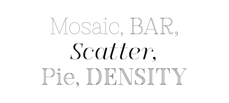
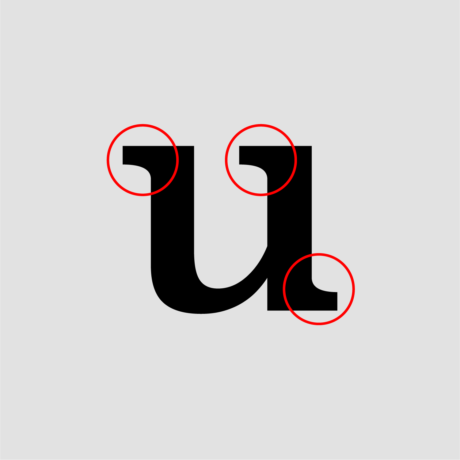
Antiquas in which curves are simulated by angled straight lines. Significant historical inspirations for many but not all of these designs are the work of Czech designer Vojtěch Preissig in the 1910s, and the early vector fonts developed by Allen V. Hershey in 1967.
-
Font Lists:
Fonts by topic/style-
Free Font Lists
-
Font alternatives
-
Fonts by topic/style
- Bauhaus Fonts
- Best fonts for academic papers/writing
- Emoji Fonts
- Fairy Tale Fonts
- Go figure!
- Modern reverse-contrast Fonts
- Rough Brush Lettering Fonts
- Serif, but no curves allowed
- The Best Coding Fonts
- The Best Contemporary Blackletter Fonts
- The Best Layer/Chromatic Fonts
- The Best Monolinear Script Fonts
- The Best Sports and College Fonts
-
Fonts by region
-
Signage Fonts
-
Fonts by User
Serif, but no curves allowed (2024)
By Riccardo Sartori | Views: 9454
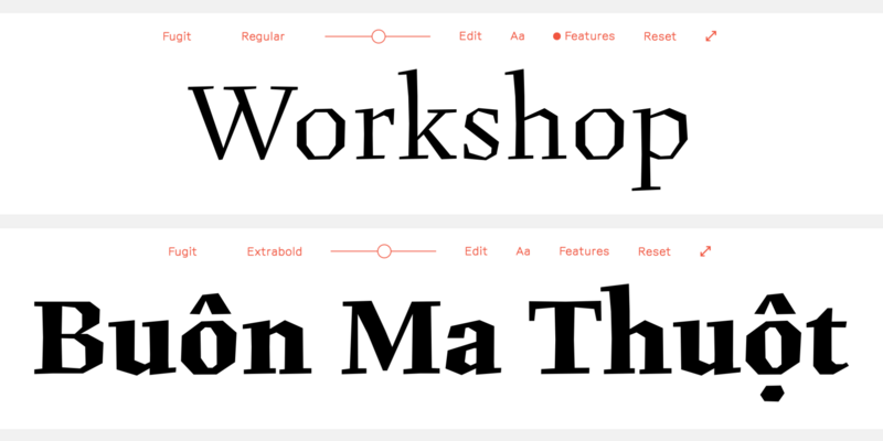
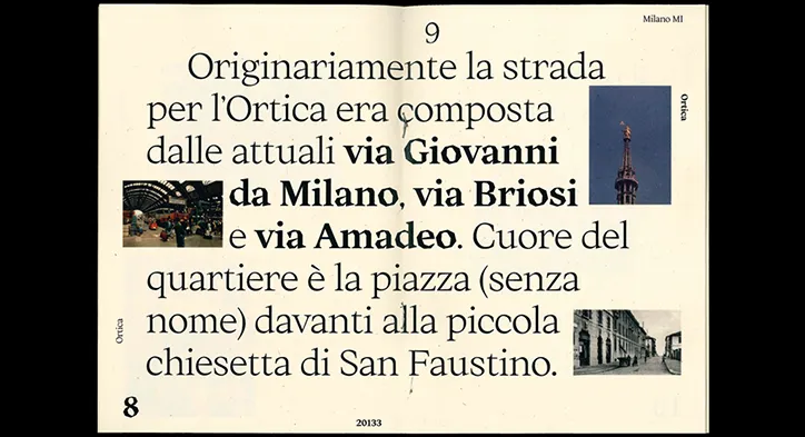
Fugit
A text typeface reinterpreting and impersonating Figural, the 1940s typeface of Czech designer Oldřich Menhart.Preissig Antikva
A revival of Vojtěch Preissig’s design by František Štorm, approved by the author’s family. Other digital interpretations have been made by P22 and PSY/OPS.
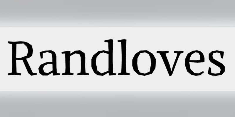
FF Beowolf
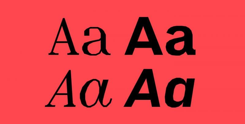
“FF Beowolf came about at the end of the dark and murky 1980s when Just van Rossum and Erik van Blokland found a way to hack PostScript fonts. When printed, each point in each letter on the page would move randomly, giving the letters a shaken, distraught appearance.” In 2011, FF Beowolf was added to the MoMA Architecture and Design Collection in New York.
Journal
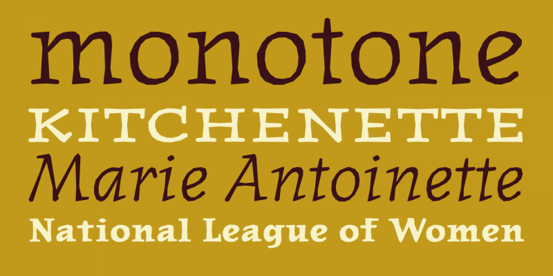
”Suzana Licko wanted to try her hand at an old style stress design, but found the curves difficult to draw with the relatively primitive font tools of the day. […] This inspired the designer to construct her new typeface with straight line segments instead of curves; approximating each curve by a series of tangent polylines.”
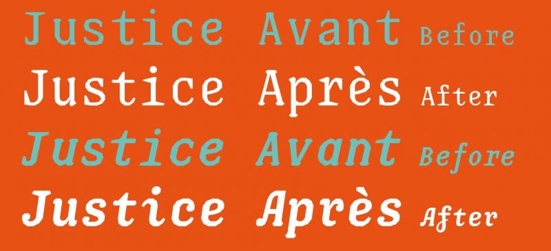
Justice
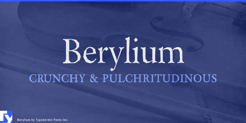
“Drawn without any curve, Justice can be painted, cut out, engraved more easily. Creating stencils is a child’s play.”
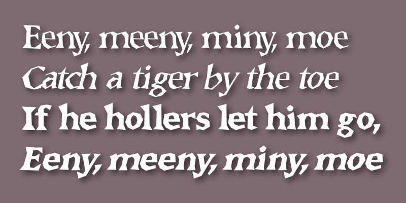
Alike Angular
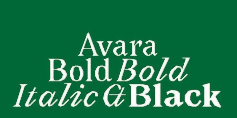
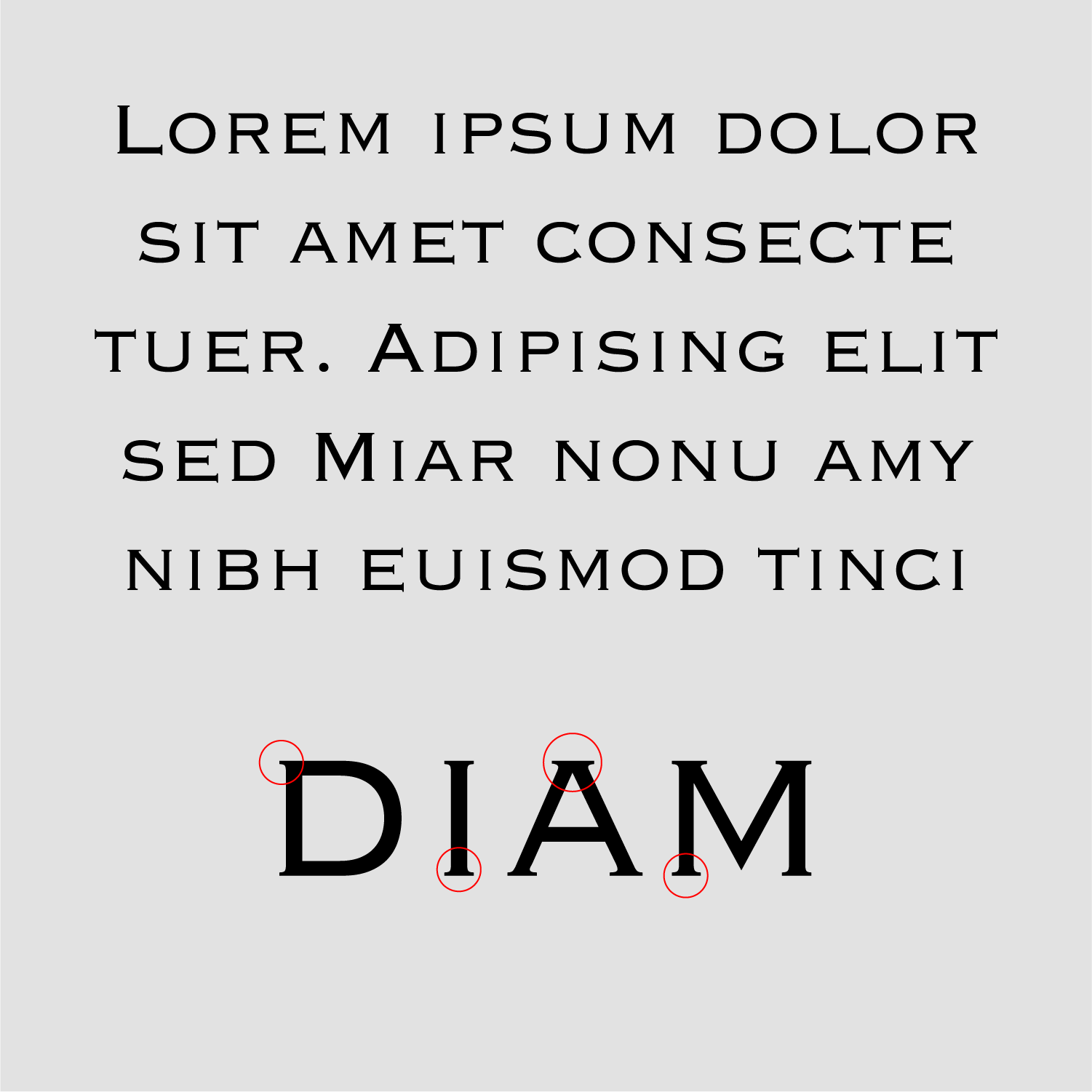
“Alike Angular is a complementary titling style to Alike Regular. It shares the same proportions as its counterpart for compatibility, and is designed for larger display sizes.
As opposed to the soft Regular its letterforms consist of only straight splines and additional expressive features are introduced in characters like T, Z, M, E.”Minotaur
Initially created for a Paris art museum, Minotaur is a family of straight lines inspired by the Cubist movement. Its roots are two serif models: Bruce’s Scotch Roman and A. V. Hershey’s series for early vector-based computing.
It includes alternate Lombardic initials and is part of a superfamily along with Minotaur Sans and Minotaur Beef.MAD Serif
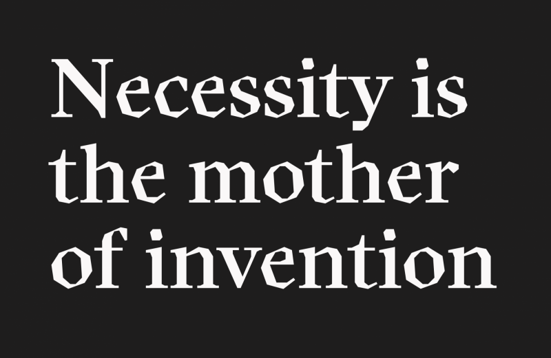
A reinterpretation of the early vector-based fonts developed by Allen Vincent Hershey in 1967.-
 1
1
User Feedback
-






Recommended Comments
There are no comments to display.
Create an account or sign in to comment
You need to be a member in order to leave a comment
Create an account
Sign up for a new account in our community. It's easy!
Register a new accountSign in
Already have an account? Sign in here.
Sign In Now