Jump to content
Check out our typography channel on Instagram

Search the Community

Showing results for tags 'design'.

  • Search By Tags

    Type tags separated by commas.
  • Search By Author

Content Type


The Typography.Guru Forums

  • Public Typography Forums
    • Talk
    • Font Identification
    • Font Downloads
  • Exclusive to Members
    • Type Design Forum
    • Letterpress Forum
    • Calligraphy/Lettering Forum
    • Show
    • Internal
    • Coffee Shop

Categories

  • Artisanal workshops & studios
  • Museums & Libraries
  • Apps
  • Education
  • Organizations
  • Online Typography Resources
  • Educational Video Channels
  • Typography Books
  • Magazines
  • Publishers

Categories

  • Link suggestions
  • Newsletter Archive (1-99)
    • Typography Weekly #1
    • Typography Weekly #2
    • Typography Weekly #3
    • Typography Weekly #4
    • Typography Weekly #5
    • Typography Weekly #6
    • Typography Weekly #7
    • Typography Weekly #8
    • Typography Weekly #9
    • Typography Weekly #10
    • Typography Weekly #11
    • Typography Weekly #12
    • Typography Weekly #13
    • Typography Weekly #14
    • Typography Weekly #15
    • Typography Weekly #16
    • Typography Weekly #17
    • Typography Weekly #18
    • Typography Weekly #19
    • Typography Weekly #20
    • Typography Weekly #21
    • Typography Weekly #22
    • Typography Weekly #23
    • Typography Weekly #24
    • Typography Weekly #25
    • Typography Weekly #26
    • Typography Weekly #27
    • Typography Weekly #28
    • Typography Weekly #29
    • Typography Weekly #30
    • Typography Weekly #31
    • Typography Weekly #32
    • Typography Weekly #33
    • Typography Weekly #34
    • Typography Weekly #35
    • Typography Weekly #36
    • Typography Weekly #37
    • Typography Weekly #38
    • Typography Weekly #39
    • Typography Weekly #40
    • Typography Weekly #41
    • Typography Weekly #42
    • Typography Weekly #43
    • Typography Weekly #44
    • Typography Weekly #45
    • Typography Weekly #46
    • Typography Weekly #47
    • Typography Weekly #48
    • Typography Weekly #49
    • Typography Weekly #50
    • Typography Weekly #51
    • Typography Weekly #52
    • Typography Weekly #53
    • Typography Weekly #54
    • Typography Weekly #55
    • Typography Weekly #56
    • Typography Weekly #57
    • Typography Weekly #58
    • Typography Weekly #59
    • Typography Weekly #60
    • Typography Weekly #61
    • Typography Weekly #62
    • Typography Weekly #63
    • Typography Weekly #64
    • Typography Weekly #65
    • Typography Weekly #66
    • Typography Weekly #67
    • Typography Weekly #68
    • Typography Weekly #69
    • Typography Weekly #70
    • Typography Weekly #71
    • Typography Weekly #72
    • Typography Weekly #73
    • Typography Weekly #74
    • Typography Weekly #75
    • Typography Weekly #76
    • Typography Weekly #77
    • Typography Weekly #78
    • Typography Weekly #79
    • Typography Weekly #80
    • Typography Weekly #81
    • Typography Weekly #82
    • Typography Weekly #83
    • Typography Weekly #84
    • Typography Weekly #85
    • Typography Weekly #86
    • Typography Weekly #87
    • Typography Weekly #88
    • Typography Weekly #89
    • Typography Weekly #90
    • Typography Weekly #91
    • Typography Weekly #92
    • Typography Weekly #93
    • Typography Weekly #94
    • Typography Weekly #95
    • Typography Weekly #96
    • Typography Weekly #97
    • Typography Weekly #98
    • Typography Weekly #99
  • Newsletter Archive (100-199)
    • Typography Weekly #100
    • Typography Weekly #101
    • Typography Weekly #102
    • Typography Weekly #103
    • Typography Weekly #104
    • Typography Weekly #105
    • Typography Weekly #106
    • Typography Weekly #107
    • Typography Weekly #108
    • Typography Weekly #109
    • Typography Weekly #110
    • Typography Weekly #111
    • Typography Weekly #112
    • Typography Weekly #113
    • Typography Weekly #114
    • Typography Weekly #115
    • Typography Weekly #116
    • Typography Weekly #117
    • Typography Weekly #118
    • Typography Weekly #119
    • Typography Weekly #120
    • Typography Weekly #121
    • Typography Weekly #122
    • Typography Weekly #123
    • Typography Weekly #124
    • Typography Weekly #125
    • Typography Weekly #126
    • Typography Weekly #127
    • Typography Weekly #128
    • Typography Weekly #129
    • Typography Weekly #130
    • Typography Weekly #131
    • Typography Weekly #132

Categories

  • Free Font Lists
  • Font alternatives
  • Fonts by topic/style
  • Fonts by region
  • Signage Fonts
  • Fonts by User

Categories

  • How to choose and pair fonts
  • Understanding Kerning & Tracking
  • How to use OpenType in InDesign
  • Font Licensing 101
  • How to use color fonts
  • Variable fonts for graphic and web designers
  • Typography on Apple devices

Categories

  • Hall of Fame
    • 2023
    • 2022
    • 2021
    • 2020
    • 2019

Find results in...

Find results that contain...


Date Created

  • Start

    End


Last Updated

  • Start

    End


Filter by number of...

Found 9 results

  1. Riccardo Sartori

    It’s time to act

    We ask the type and design industry • to actively include more BIPOC • to stop using the term Non-Latin • to diversify education • to challenge the practice of designing for scripts we did not grow up reading and writing
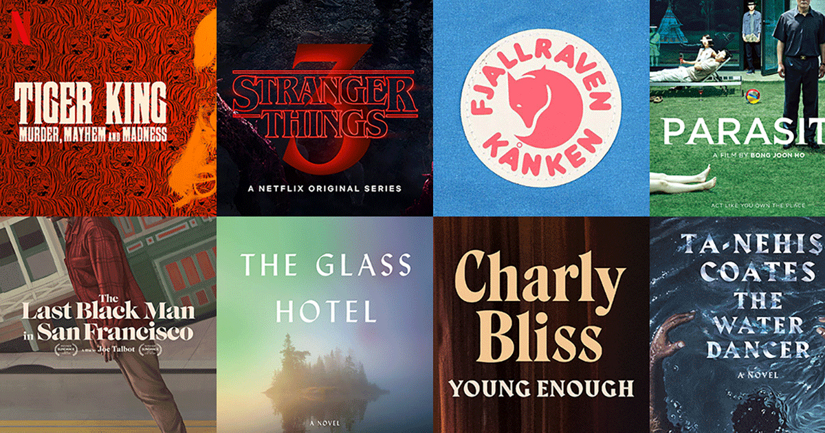
  2. See the fonts used in popular culture—featuring Tiger King, Stranger Things, Parasite, Fjallraven and more.
  3. Gecko

    Typography Reference Books

    Some mind blowing reference to typography here, enjoy folks. https://archive.org/details/letterformarchive
  4. Gecko

    Áron Jancsó 1986 - 2015

    This young guy did some beautiful creative typography. What a lovely talent. For me he was an unknown who died far too early. https://blog.8faces.com/post/136876631916/aronjancso1986-2015
  5. Riccardo Sartori

    Typeface vs. Lettering

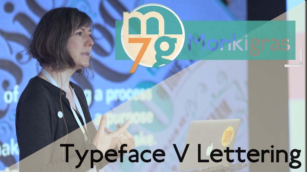
    “Typography is remarkably complex. Catherine Dixon stopped by Monki Gras to clear up some of the issues facing the modern designer and to discuss some of the finer details of typography. explaining the way design is taught and how skills can be maintained.”
  6. sdumbliauskas

    Elegante Press

    Elegante Press is a Lithuanian print and design studio. They print wedding invitations, custom letterpress business cards, business stationery and announcements. They also produce custom wine labels and packaging. Elegante Press uses letterpress, silkscreen, hot foiling, engraving technologies in-house. They will work together with you in designing and printing custom print works to come up with a unique design tailored only for you, to outline your individuality and elegance.
  7. Cornelius Hirsch

    Letters · Poster series

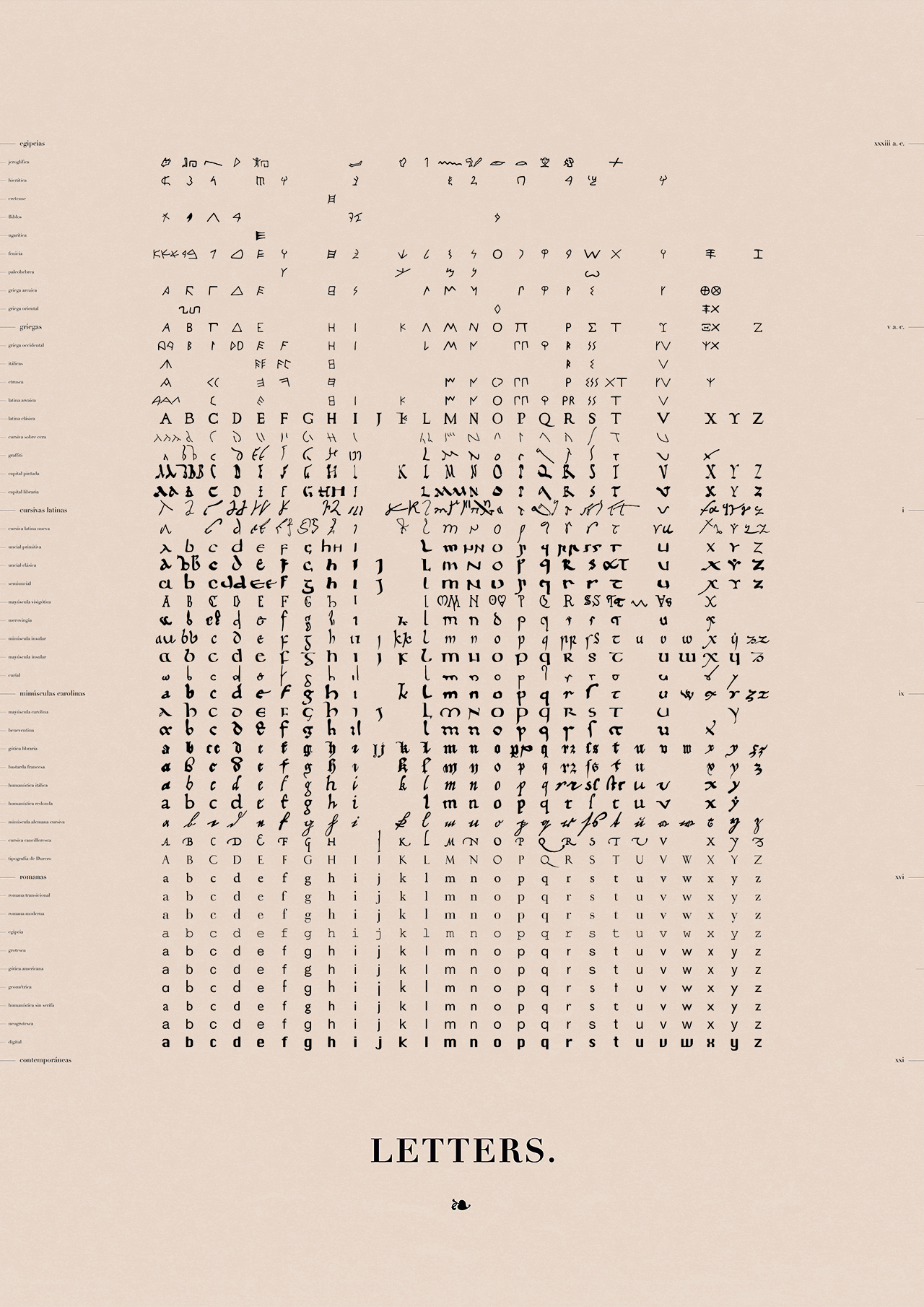
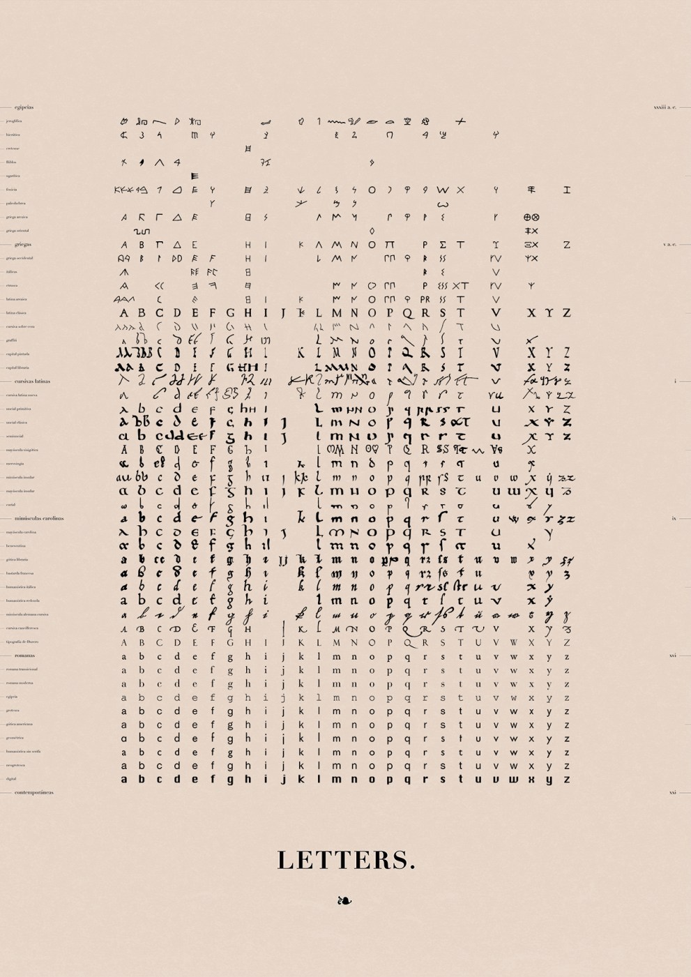
    Just wanted to share this work with you, a LETTERS poster that shows the evolution of the latin alphabet throughout the different stages of history, from those theories that relate it to Egyptian hieroglyphs to its settlement into the Phoenician culture and Greek and Latin decantations. These structures would be radically altered with the appearance of printing press in the middle of the 15th century. Very interested in your feedback. Follow the link to check the project: https://www.kickstarter.com/projects/561205570/order-poster-series
  8. Kayatcha4

    Engraver's Old English

    Hello, I'm doing a design project displaying what Engraver's Old English is used for. Besides religion and newspapers, I'm looking for some help coming up with other ideas that it would be used for. Thanks!
  9. thetypographist

    IJ done right

    Hey there, I’m quite stucked at the moment with the letter/ligature IJ and ij. It seems there are plenty of different kinds how to draw it. The most of the classic sans-serif fonts like Helvetica, Univers and Meta for example just uses ordinary glyphs of I and J, put them together and abracadabra here is your ligature. This seems are little bit to easy in my opinion. So I started a little research and what you see down here are my actual results. But now I’m a little bit confused right now. What is THE definitely form of IJ and ij. Is it better to ad points to the glyphs? Or without? Is the form of the ij correct in overall? It looks like a school form of the y. Looking forward for your answers on this. :) Kind regards Florian
Wayfinding Sans Symbols: the pictogram font for signs
×
×
  • Create New...

Important Information

We are placing functional cookies on your device to help make this website better.