Search the Community
Showing results for tags 'fditype'.
Found 8 results
-
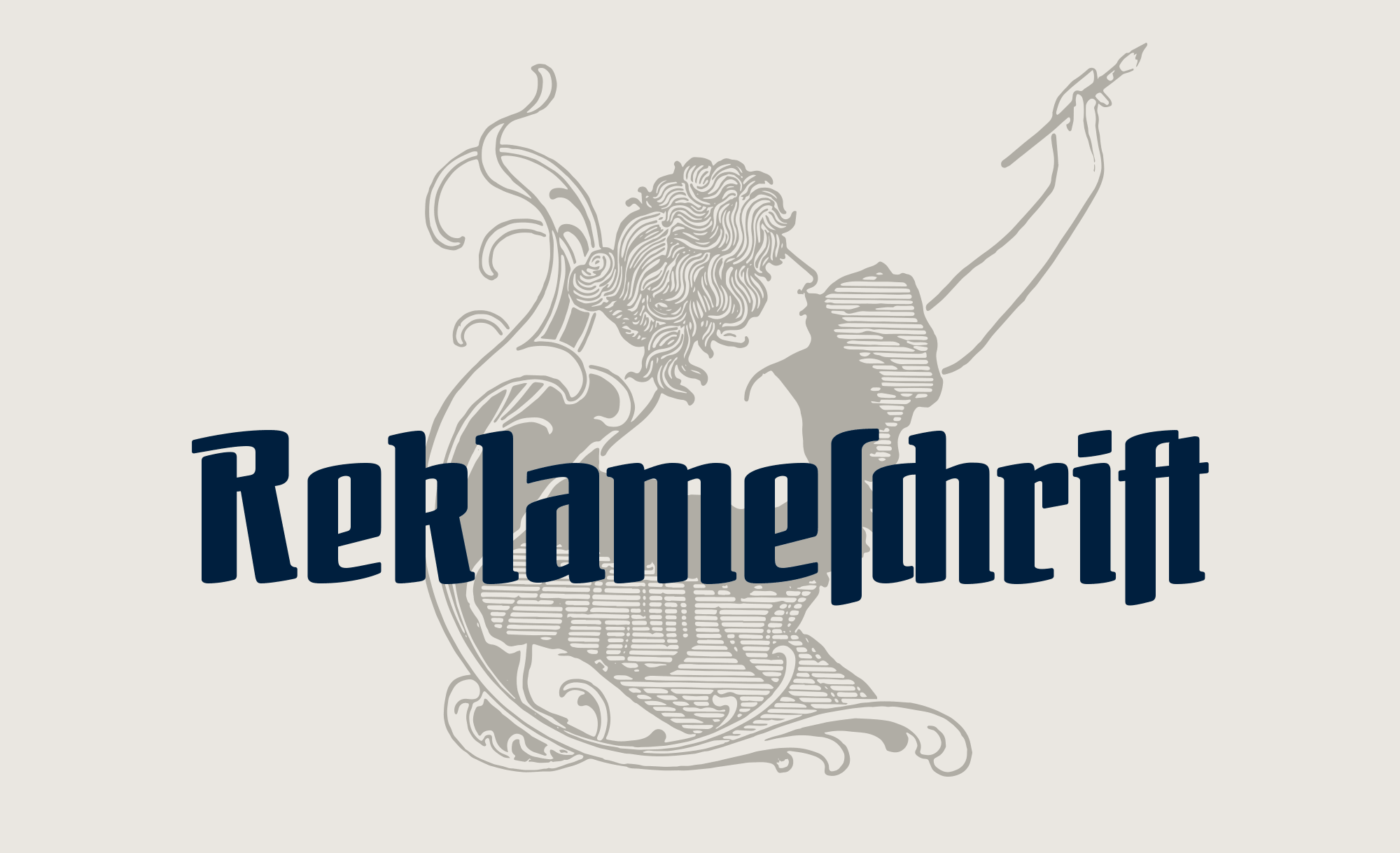 Otto Ludwig Naegele (1880–1952) was a German designer, illustrator and painter. Along with people such as Lucian Bernhard and Ludwig Hohlwein, he was a well-know commercial artist of its time. And just as Lucian Bernhard, Naegele also worked with type foundries. Naegele’s type designs included Feder-Antiqua (Ludwig & Mayer), Nero Kursiv (Genzsch & Heyse) and Reklameschrift Bombe (Ludwig & Mayer). Original type specimen pages for Reklameschrift Bombe “Reklameschrift” means advertising typeface. With its narrow and semibold design, the typeface was meant for ‘striking’ headlines, which is likely the reason for calling the typeface “Bombe” (bomb). The typeface was a released at a time, when Germans were debating the continued use of blackletter and some designers tried to bridge the gap between blackletter and roman typefaces. Reklameschrift Bombe is one of these designs. The design borrows elements from blackletter while still being a legible and modern roman design. FDI Reklameschrift is an authentic revival that was digitized directly from the original letterpress font. In addition, the character set was extended. The font supports the codepages Windows 1252 and Mac Roman completely and contains Western, Eastern and Central European characters. As you can see in the image above, the fonts can be used for traditional German typesetting with letters such as ſ and ligatures such as ch, ck and ſch. The latter can be accessed with the OpenType feature “discretionary ligatures”. The traditional German character designs are available as part of FDI Reklameschrift A. In cases where the blackletter letterforms are not suitable, FDI Reklameschrift B offers ‘romanized’ character designs. For the time being, the fonts cannot be purchases directly. Instead they are made available exclusively to Typography.Guru patrons. The standard FDI desktop license applies, so the fonts can be used for private or commercial projects (but not including digital publishing). Download FDI Reklameschrift as patron become a patron More information about the design at the FDI Type foundry page Download the type specimen PDF
 -

On Kickstarter: Deutschmeister blackletter revival project
Ralf Herrmann posted a news entry in Typography Weekly #109
 Six carefully crafted blackletter revival fonts that even let you type with the look of real metal and wood type letters.
 -
FDI Farbmeister: Letterpress meets digital typography
Ralf Herrmann posted a journal article in Journal
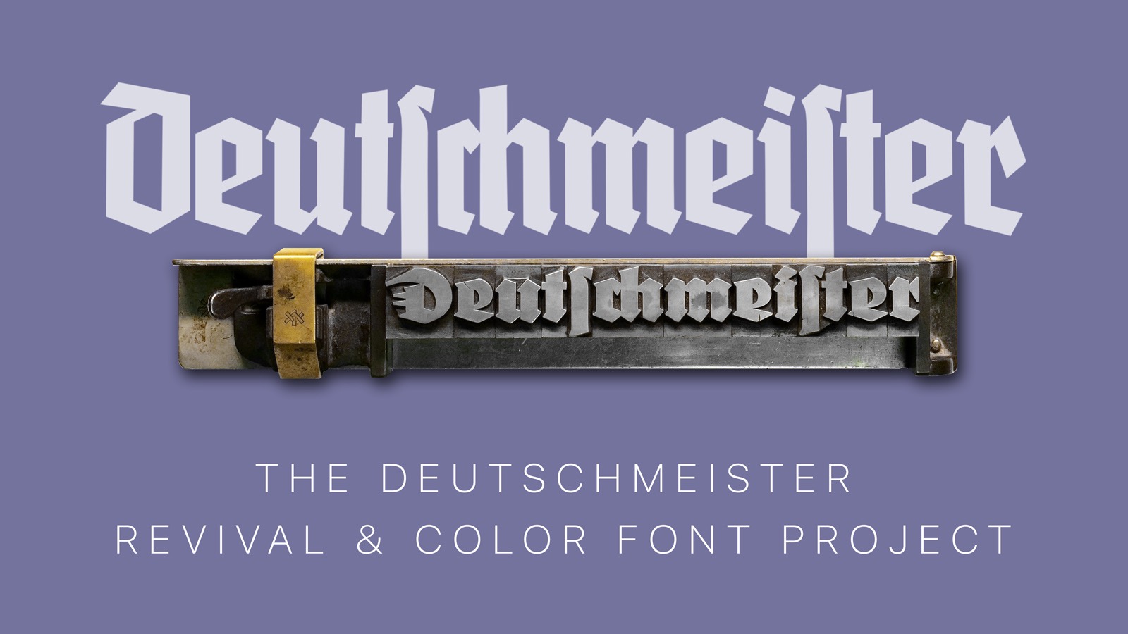
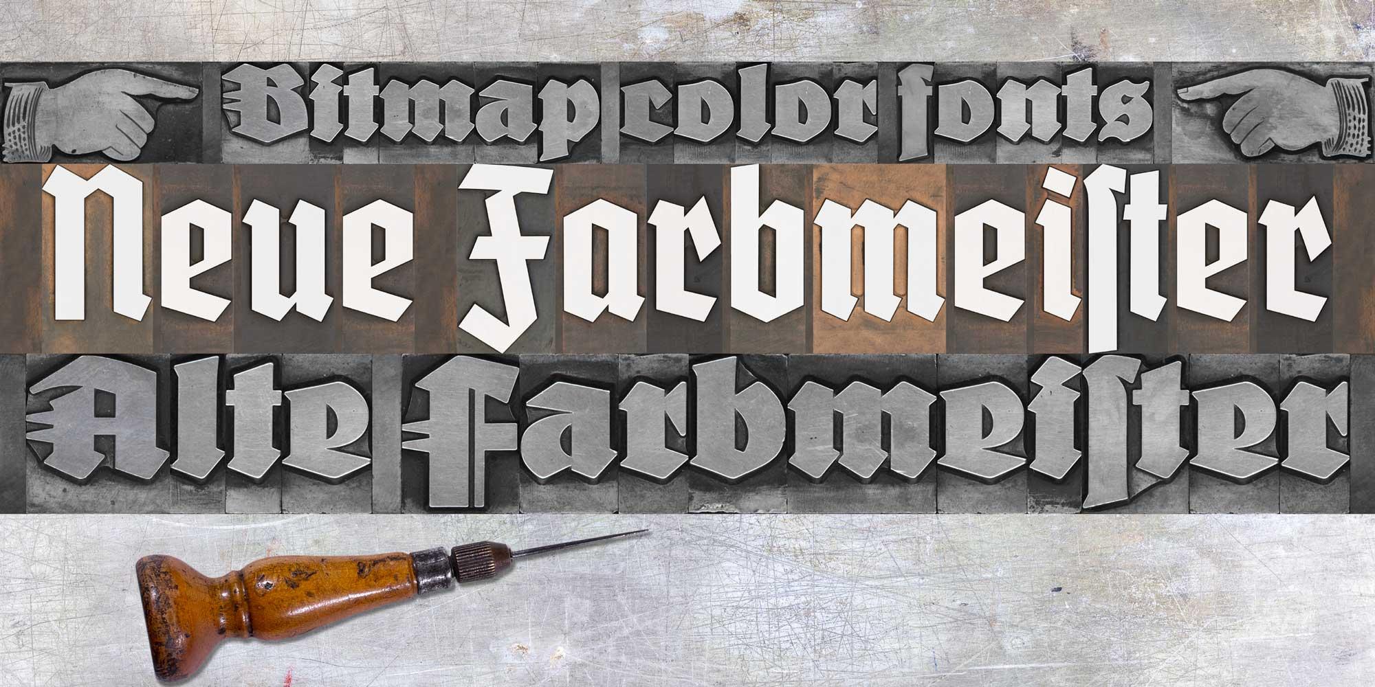 In 2020, I created a Kickstarter campaign to revive the blackletter font Wiking. In 2021 I planned an even more elaborate campaign regarding the blackletter font Deutschmeister. Thanks to the support from people around the world, this project got funded too and the digital fonts FDI Altmeister and FDI Neumeister are now also available for free under the Open Font License. This time, I didn’t digitize the fonts from printed samples, but from the original letterpress letters themselves. After decades of use in different print shops, the appearance of those letters has its own charm. But of course that wouldn’t be visible in a digital vector font. And that gave me an idea: What if wouldn’t just digitize the outlines, but the appearance of the physical letters as well? The support for bitmap and vector color fonts has increased in recent years and became even part of the OpenType standard with SVG. Well, one year after having the idea, the fonts have now been released and I am really happy with the result, even though there were quite a few challenges along the way. The general idea was to create a rectangular bitmap image for each letter using a bird’s eye perspective. That would allow typesetting with the appearance of a real letterpress layout where each letter touches the surrounding letters. But creating these images wasn’t as easy as I originally thought. Parts of the face of the letters extend to the side of the letterpress body. So, from a camera perspective, those parts would extend well over the letterpress body (see image below). My first attempts with scanners also wasn’t successful, since they will usually distort anything that isn’t directly touching the glass surface. But in the end, I found a suitable scanner using the CCD technology, which would not distort parts of the image. Each letter of the two original letterpress fonts was scanned separately, so I got clear edges for all letters. But the edges were far from being straight and the issue of overlapping letter-parts was also present with scanned images. I solved all this by manually retouching all letters in Photoshop. I slightly increased the size of each letter and with that, the edges got straight and the overlapping parts were now inside the rectangular bitmap image. The result was a “pixel perfect” design. The digital letters of FDI Alte Farbmeister connect as they would in a letterpress layout The PNG glyphs are included in two sizes in the font. A version 256 pixels high for low-resolution previews and a version with a height of 1000 pixels for the full resolution. As a result, even in a size of more than 3 inches, the fonts will appear sharp in print. The type size works just like it does with letterpress fonts, because the bitmap images use the full type size. So, if you set the line-height equal to the type size, all lines will connect perfectly. You can even combine different type sizes as you would in a letterpress layout. For example: a drop cap in 36 points can sit next to three lines of text in 12 points. Creating the wood type version was also challenging, because I ran into a problem I hadn’t anticipated. Because some letters had been used more than others, there was a significant color contrast between the individual letters of the font, while there was almost no contrast between the face of the letters and the shoulder area. As a result, putting these letters together without ink would just create a series of rectangles with different colors. But the letters weren’t legible. After considering and testing various options, I decided to create “digital ink” in Photoshop in two versions. One version of FDI Neue Farbmeister uses white ink, which creates a sufficient contrast and can be used as is. A second version uses blue ink. I chose blue because there aren’t any blue hues on the wood type letters itself. So, in a photo-editing app like Photoshop it is very easy to target the blue hues and change them to any color you like. Using the software tools for kerning and tracking isn’t recommended with these fonts. With increased letter-spacing the background would appear and with decreased letter-spacing, the bitmap images would overlap in a way that wouldn’t look natural. But users of these fonts can still apply spacing changes as a letterpress compositor would do it. For this purpose, the fonts contain a thin space (U+2009) and a hair space (U+200A). The fonts use two color font technologies within the same font files: Apple’s SBIX format, which works in many apps on Apple’s operating systems and SVG, which is supported across multiple platforms and already works in many design applications. For more details check out https://www.colorfonts.wtf/ More details about FDI Farbmeister can be found on the foundry website, where there is also a link to a demo font to test the support in the apps you are using. ☞ https://fdi-type.de/fonts/farbmeister/
- 1 comment
-
- 3
-

-

-

-
- colorfonts
- fditype
- (and 1 more)
-
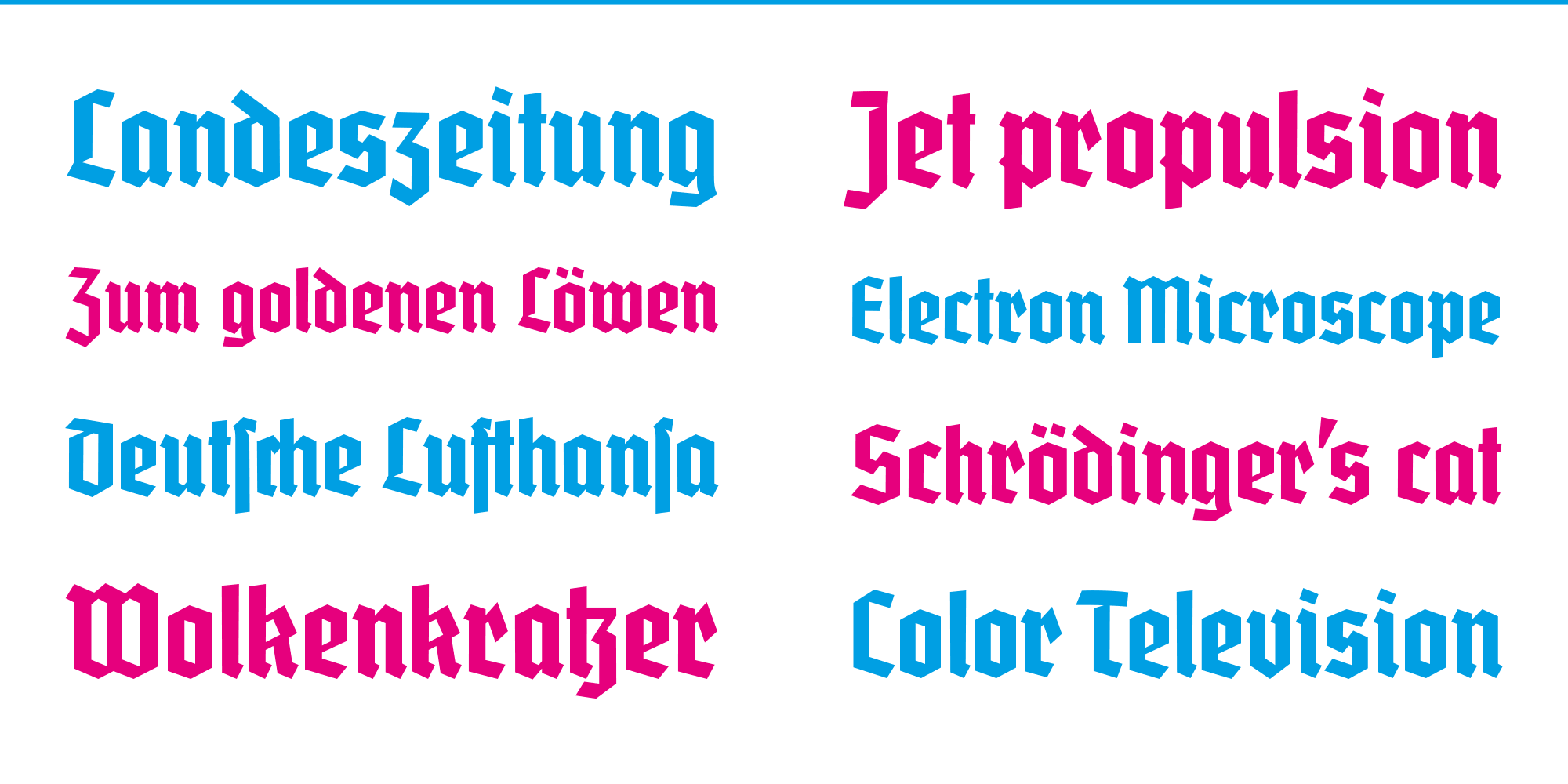
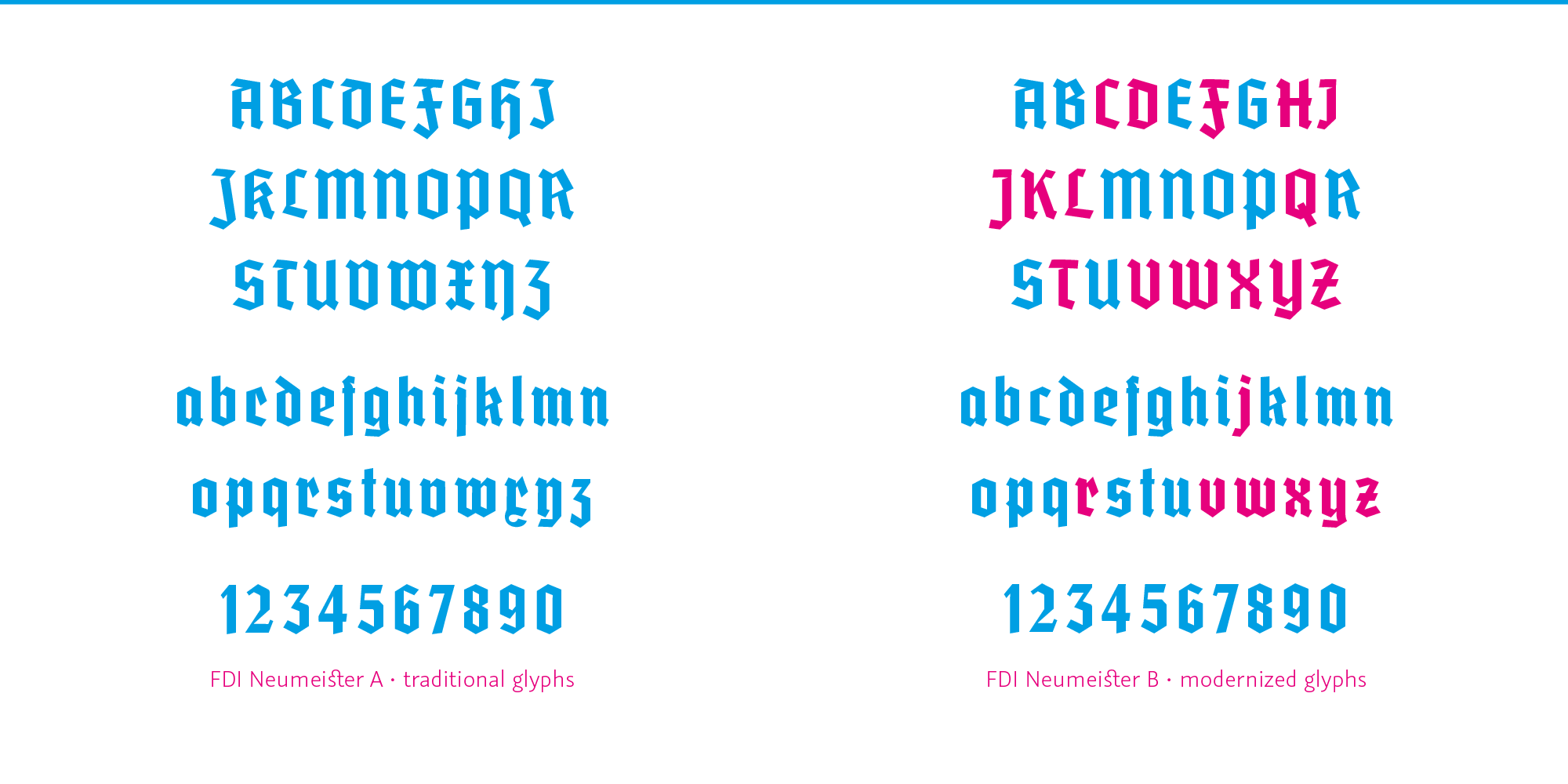
All information about the font: https://fdi-type.de/fonts/neumeister/ The font can be downloaded for free by all Typography.Guru members. Guests need to register so the download in this post becomes available. neumeister-1000.zip


-
- 2
-
-
- blackletter
- fditype
- (and 1 more)
-
Free blackletter revival FDI Wiking released
Ralf Herrmann posted a news entry in Typography Weekly #103
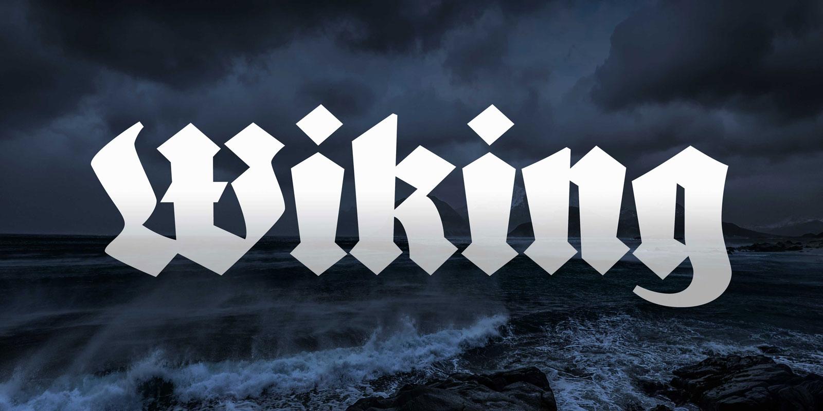 After the successful Kickstarter campaign, the revival of the blackletter font Wiking was now finished and is available for free to anyone under the Open Font License.
-
- 4
-
-
- blackletter
- fditype
- (and 1 more)
-
Reviving a blackletter font from a museum’s archive
Ralf Herrmann posted a journal article in Journal
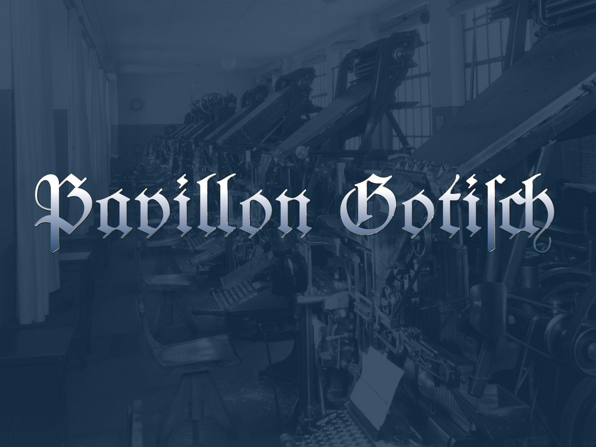 The font in use in the printing museum Pavillon-Presse Many of today’s revivals of letterpress fonts are created from original type specimen prints. Scanning and digitizing the letterforms is easy to do, but it also has its limits. For one, the technique of letterpress printing doesn’t create an exact representation of the original face on the letterpress letters. The way the letters press into the paper makes the ink spread out. The outline of the letters gets larger and softer and the ink might even close gaps or create unwanted blobs. The smaller the type, the stronger the impact of those effects. Type designers of digital type always need to make a choice about how they want to deal with this. Do they want to keep those letterpress effects or do they try to guess the original design of the face on the letterpress letters? Original type specimen print And there is another problem when typefaces are digitized from printed type specimens: The prints don’t reveal the actual size of the letters, so setting the sidebearings of each letter is usually guesswork. But with access to the original font, there was a way to overcome this problem. Not by trying to measure the tiny distances with a ruler, but by revealing them in a print. So the alphabet was set in a way, where all letters are enclosed in brass borders. Things got a little bit more complicated than originally expected—as you can see in the picture above. Some letters had overhanging parts (a.k.a. “kerns”), so a full brass line in the type size pressed against the letters would have easily broken off the kerns. So a matching combination of brass rules and spacing material was used for certain letters. But in the end, this process proved to be successful. From the print of this form specifically made for digitization, vectorizing the font using the original metrics was rather easy. The design was carefully digitized and extended to a complete Latin 1 character set. The font is called “Pavillon Gotisch” after the museum. Version A contains the original design with all the ligatures and swash characters, which can be accessed easily through OpenType. A second style (“B”) was added, which contains romanized letter variations, so the font can be more legible for people not trained in reading German blackletter texts. The fonts cannot be licensed directly. They are exclusively available to supporters of the museum or the Schriftkontor community websites Typography.Guru and Typografie.info. You can become a Typography.Guru now and get instant access to Pavillon Gotisch A and B with a full desktop license for up to 5 users. About becoming a patron
 -
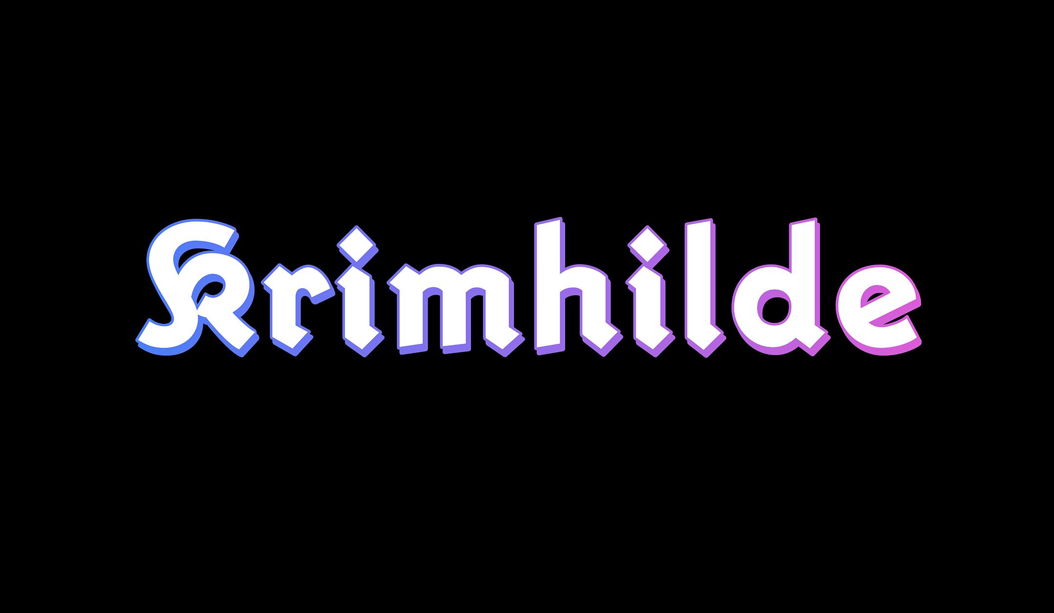 In 2015 I published a revival of Elfen-Fraktur—a unique monolinear blackletter typeface. With the release of Krimhilde I am continuing on this path. Elfen-Fraktur was originally published in 1919—the year the Bauhaus school was founded in Weimar. The Bauhaus designers had radical ideas about typography. They tried to reduce the letterforms to the most simple geometric shapes and even proposed to stop using uppercase and lowercase together in favor of one alphabet. Their experimental designs didn’t came into broad use, but type designers outside the Bauhaus incorporated some of the ideas. This gave birth to the category of the “geometric sans”, which remains popular until today. Erbar-Grotesk (by Jakob Erbar released at Ludwig & Mayer), Kabel (by Rudolf Koch released at Gebr. Klingspor) and Futura (by Paul Renner released at Bauersche Gießerei) are typical and successful examples of this category. While blackletter was still in broad use during that time, the type modernization of the 1920s was almost exclusively applied to non-blackletter or “roman” typefaces—called Antiqua in German. As Jan Tschichold put it in his New Typography manifest: ❝ None of the typefaces to whose basic form some kind of ornament has been added (serifs in Roman type, lozenge shapes and curlicues in Fraktur) meet our requirements for clarity and purity. Among all the types that are available, the so-called “Grotesque” (sanserif) or “block letter” (skeleton letters would be a better name) is the only one in spiritual accordance with our time.❞ In the 1930s, designers and type foundries started to consider to replicate the popular modernization of sans-serif designs in the category of blackletter typefaces. But how should this be done? The typical German blackletter design of this time was the Fraktur—a rather calligraphic, broad-nip pen design, that wasn’t very suitable to be reduced to simple geometric shapes. So the designers came up with a different approach: They went back to the origins of blackletter—the textura of the Gothic period. Those designs already used a very simple and geometric letter skeleton, but often had elaborate decorations at the same time. By stripping all the decorations, a modern blackletter look was created. Several of these typefaces started to appear from 1933 onwards, creating a new blackletter category. Modern German blackletter in the 1930s. Left: Element typeface by Max Bittrof. Right: Hindenburg Lettering by Georg Wagner But there was another benefit in going back to the origins of blackletter. At that time, roman and blackletter designs were much closer together. So using the old textura letter skeletons bridged the gap between roman and blackletter designs. This contributed to the modern look and reduced legibility concerns. And this brings us back to Krimhilde. Its designer Albert Auspurg also tried to bridge the gap between blackletter and roman typefaces to create modern and legible letters. But he chose a different path to achieve this. Instead of going with textura letter shapes, he merged the geometric sans with Fraktur in a rather unique way. The lowercase letters of Krimhilde use roman proportions and geometric designs, just as typefaces like Futura. But where possible, a blackletter treatment is added as well. The angular stroke endings are an example of this. The uppercase letters of Krimhilde use the typical Fraktur designs, but in an unusual monolinear application. Type specimen images of the metal type version of Krimhilde published by Ludwig & Mayer Krimhilde was published in a regular and a bold style. It didn’t became very successful in the 1930s. After World War II, blackletter came out of use in Germany and so there was little demand for any of the modern blackletter fonts from the 1930s. Krimhilde was dropped from the catalogs of the type foundry Ludwig & Mayer and became forgotten. Krimhilde from FDI Type, released in 2018 But I believe Krimhilde has its charm and so I decided to revive it. Just as with Elfen-Fraktur, I did not just digitize the outlines from scans. Instead I recreated both the regular and bold design by starting with just the letter skeletons. And I also created two versions again: version A is close to the original design with all its traditional blackletter shapes. Of course the fonts also include a long s (ſ) and the German blackletter ligatures such as ch/ck/ſch/tt and tz as stylistic set. Version B swaps some letters with roman letter shapes, which are more legible to readers not familiar with the traditional blackletter designs. Version A and B of the new Krimhilde In addition to the basic set (regular and bold as version A and B), I added some display styles to use Krimhilde as layer font with multiple colors. There is a shadow and a fill style available for the regular and the bold version and an outline style just for the bold versions. All Krimhilde styles have a full Latin 1 character set. Krimhilde at Fontspring Krimhilde at FDI Type Foundry
-
- 2
-
-
-
- fditype
- blacketter
- (and 3 more)
-
 1. How did you become a type designer? I once bought one of those CD packages with 10,000 typefaces for 10 bucks in a local supermarket—the quality of those typefaces was of course miserable but the versatility of type and type use started to fascinate me. And during my study at the university my interest in typography and type design grew even more. I just loved the balance between freedom and convention that typography and type design requires. Some of my teachers probably found this approach to boring, but luckily I also had some teachers who supported me in my rather slow and analytical design approach. 2. Which role do traditional and digital tools play in your work as a type designer? As much as I would like to answer, that I do extensive calligraphic experiments, the truth is that I usually just sketch out some basic characters on paper and then quickly move the design to the computer screen, where can I can play and experiment with all the tiny details until they match my original ideas. When the basic alphabet is drawn I also do a lot of testing in design application. Even when the font is targeted to print use, working with the font on screen in a design application is where the user “feels” the font for the first time—in terms of proper spacing, the behavior of OpenType features and so on. Many problems with a font appear at this stage and can be corrected instantly in the font editor. After several proof runs and corrections I also do a lot of print-outs—both in the targeted sizes but also much larger. This helps to find tiny errors and inconsistent proportions, stroke widths, angles and so on. When the design of the letters is close to getting finished I am trying to use them in real-world projects with high-quality printing methods. Just before the release I usually completely start over with the design of the PDF type specimen. It’s like the final proof, where I am trying to use the font without any manual corrections of spacing. The quality you see in the type specimen represents the fonts you would get. 3. Your Iwan Reschniev typeface emerged from a forum discussion and you have presented you work in progress on sites like Typophile.com and Typografie.info. How important is that kind of feedback to you? When I was a beginner, such internet forums provided an excellent way to receive feedback, discuss design details and to compare my work and my way of working with those of other established type designers. But I don’t believe the internet provides a very efficient way of learning to draw type. The feedback is of very mixed quality and everyone has its own opinion. But what I do find extremely helpful are the ongoing discussion about design details, such as a recent discussion about the perfect placement of the @-sign compared to the baseline. Such discussions raise my awareness about certain design details and when I later design a typeface I am more familiar with all the possible options and the needs of the type users. 4. What is your opinion about the role of classical type-setting techniques in the education of today’s graphic designers? I consider collecting, exploring and understanding of the historical methods and point of views as valuable and inspiring. Design, typography and type as part of the human culture and the current state of knowledge and methodology are the product of what we have perceived as right and useful. But our task is to build on that treasure trove of experience and to find new solutions, where the old methods are not adequate any more. Just sticking to the past, will not get us any further. You cannot blame a graphic designer of the 21st century, never to have worked with metal type-setting. Much of the old techniques and terms are of very little practical use today and will slowly disappear. That’s an inevitable development—which we shouldn’t try to speed up, but there is nothing to regret about it either. 5. Your most elaborate type design project so far was the creation of the Tierra Nueva type family. What did fascinate you about this project? I simply love old maps. The are a testament of how people imagined the world around them. When I came across the map of America from Diego Gutierrez from the year 1562 I was blown away by the richness of detail. I especially like the type which was entirely made as copperplate engravings and consisted of several alphabets, including a Roman, a title-case version and a delicate italic. 6. What were the challenges in creating Tierra Nueva? The look of the typeface is of course heavily influenced by the copper engraving tools, which don’t permit the flowing movements of writing with a quill. Instead each stroke is carved individually, usually without the possibility to change the direction while carving. This gives the typeface it’s chiseled and sturdy appearance. The character set of the type family grew to over 1000 glyphs in the final upright versions: Small caps, title case, eight sets of figures, astrological and astronomical symbols, arrows, ornaments and a huge set of standard and discretionary ligatures. Without the intelligent OpenType feature replacements, the fonts would consist of 13 fonts instead of 4. 7. What other type design projects are you working on? I am currently working on my biggest release so far: A friendly type family, which consists of a sans and slab serif and two alternative italics. I hope to finish it in 2012 or 2013.