Search the Community
Showing results for tags 'serif'.
Found 12 results
-
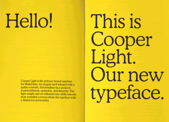
Hi everyone! I'm new to Typography.Guru, so excuse me if i'm posting this in the wrong channel. I am currently looking for a "modern"/ "playful" serif font. What i'm looking for is similar fonts with some or the same characteristics as: - GT Alpina - KansasNew (I don't like the f's) - Cooper Light (Mailchimps custom font) - Tiempos Text (a bit too serious) Do you have any recommendations or similar fonts in mind? Any help is Much appreciated - yes i know i'm new, but i will try to contribute to the community as much as i can over time 🙂

-
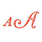
 Hi Typefaces that have their roots in incised or engraved lettering often have small thin serif like strokes at the end of the terminal. For example Copperplate by Frederic Goudy (see image) and Sophia by Matthew Carter have such hairline terminals. What is the correct term in English language for these terminals? Thanks
-
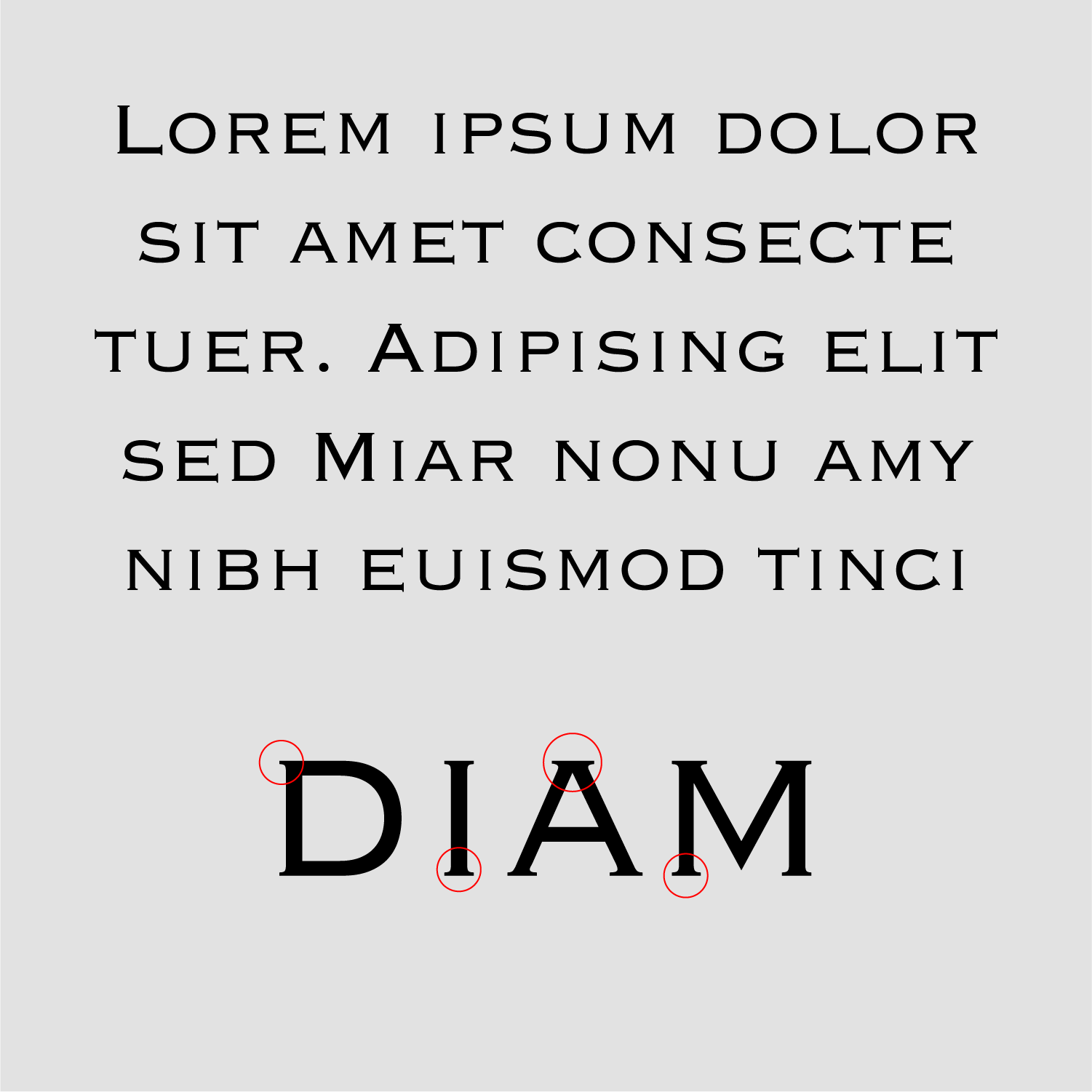
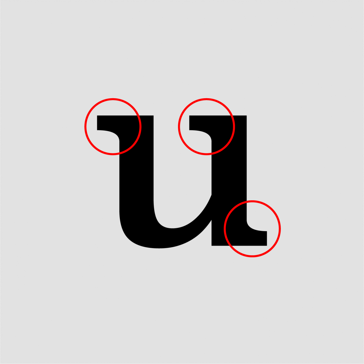
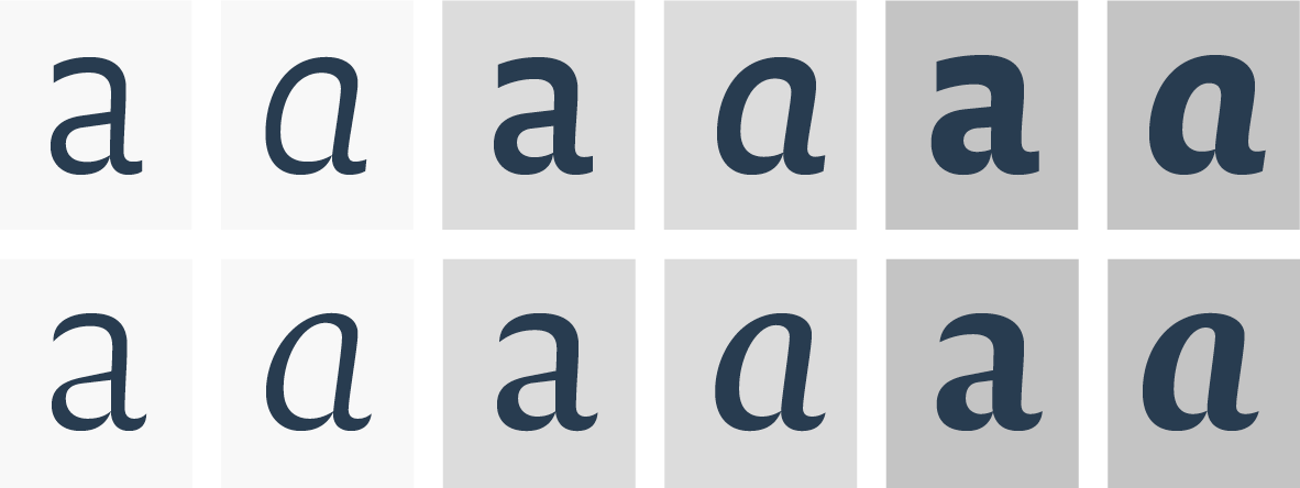
Hi I'm reading about serifs and how they are connected to the stem. I come across the term pairs bracketed / unbracketed and adnate / abrupt. Are bracketed serifs the same as adnate serifs, or vice versa, are unbracketed serifs the same as an abrupt ones? Are these term pairs interchangeable? Thanks Bracketed / Adnate Unbracketed / Abrupt

-
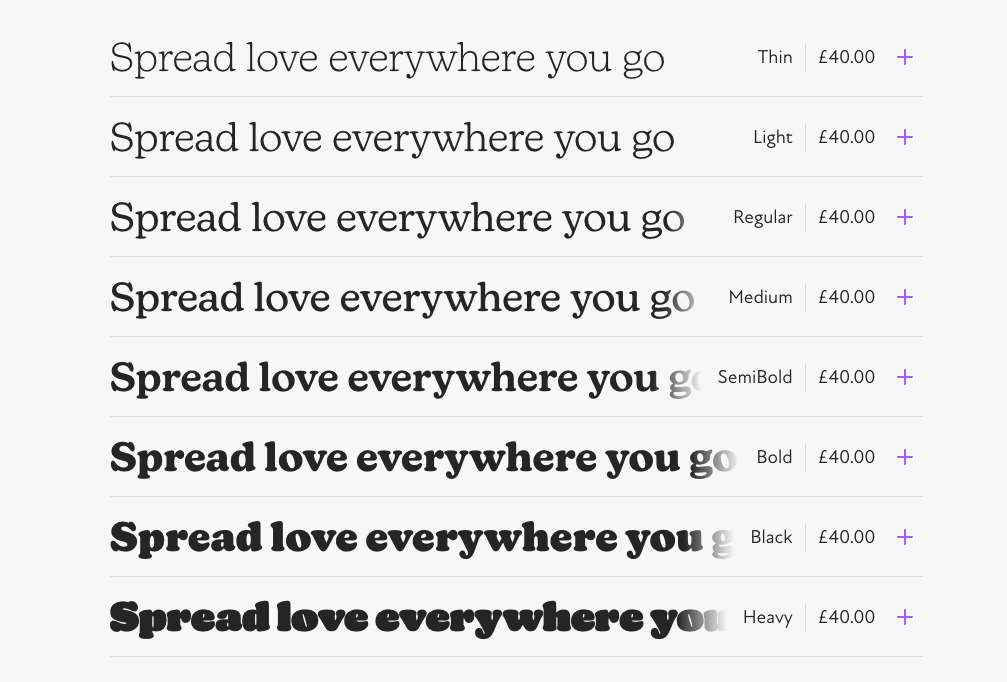
 Thousand of freeware fonts are available today. Here are some which are actually recommendable in the category “serif”. They have a sufficient number of styles, a sufficient (Latin) character set and an acceptable stylistic and technical quality.
 -
 Antiquas in which curves are simulated by angled straight lines. Many but not all of these designs are inspired by the work of Czech designer Vojtěch Preissig.
 -
 At least 2 related families (e.g. serif and sans serif). At least 2 styles per family (e.g. regular and italic). At least 2 weights per family (e.g. regular and bold). Free for commercial use.
 -
Fellow typophiles, As a book designer, I am creating this topic in order to get help and learn from members who are certainly more knowledgeable and have more experience than me in setting typography. I love humanist typefaces and want to use Robert Slimbach's revival distributed as Adobe Jenson. As you all know, it provides optical sizes ranging from caption do display as well as different weights from light to bold. What I am trying to achieve is a correct type color on the page. Jenson regular is too aggressive and lack elegance while Jenson light is too anemic (but has elegance). I want to know how to strike a balance between these two extremes and get a weight that is between the light and regular. I know editing software such as fontographer provide such tools but don't know how to proceed artfully (which I know takes a lifetime). It seems to me that choosing an em size in fontographer by simply clicking on "change weight" is not all there is to it. So could a generous soul guide me on this path to achieving music for the eyes. (This could be references to books, websites, tutorials, suggestions, advice, etc.) I recently discovered the I Tatti Renaissance Library series published by Harvard. I thinks that its design, beautifully orchestred by Dean Bornstein of Perpetua Press, interprets quiet elegantly the Renaissance period. He used Adobe Jenson and definitely changed the weight of the typeface but I think it still remains too thin, especially the italics. Do you think he made Adobe Jenson light weightier or Adobe Jenson Regular thinner ? How do you proceed in doing this? Here's a sample page from the series: And here are two links for more information on the design: http://www.theperpetuapress.com/?p=223 http://www.hup.harvard.edu/features/itatti/about-book-design.html
-
What were some of the first classical fonts that were optimized for the computer? I cant seem to find the answer anywhere so I was hoping someone here would be able to help me out thx
-
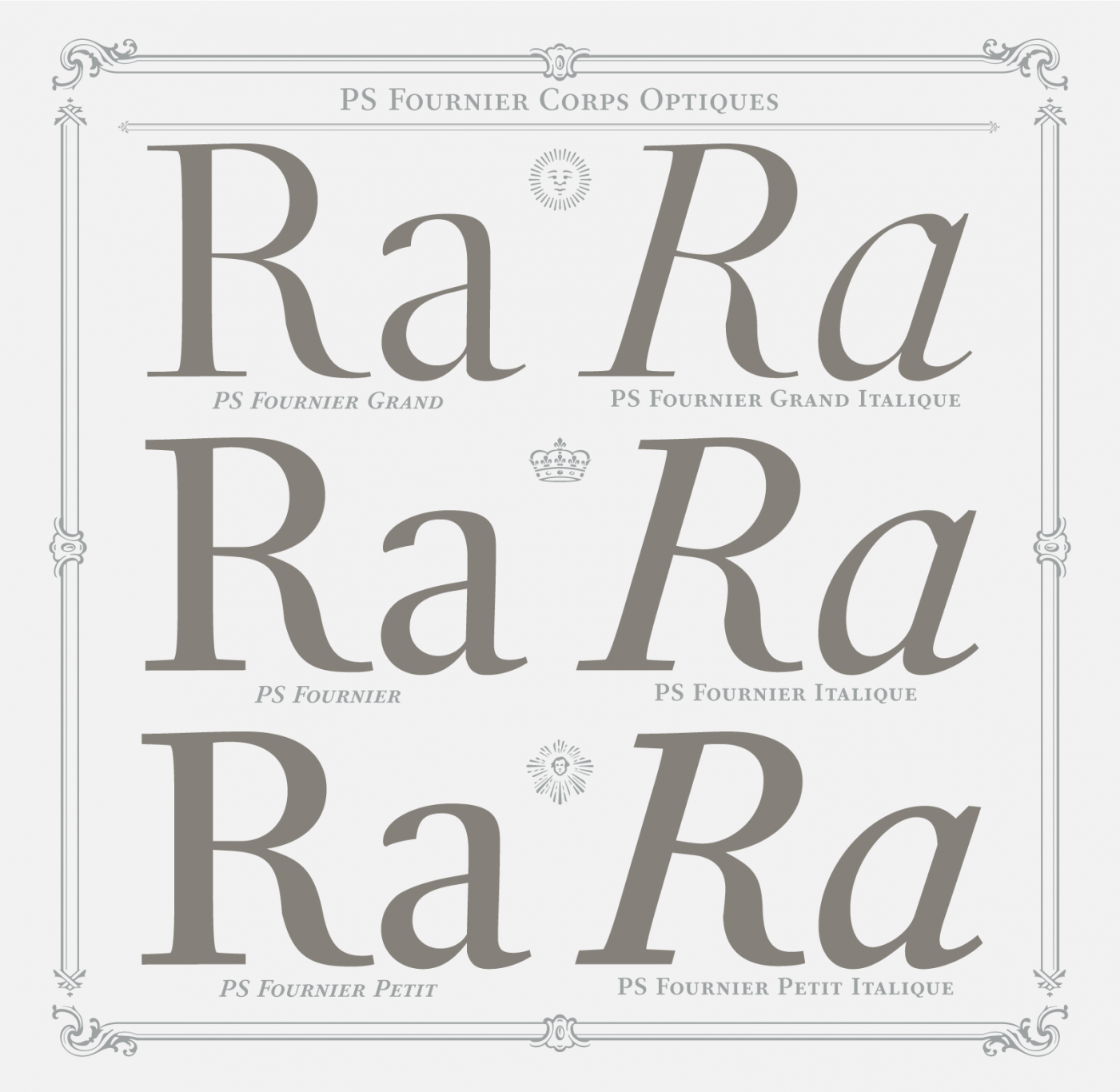
¶ Find a brand new design of Pierre-Simon Fournier’s transitional serif typeface entitled PS Fournier: http://typofonderie.com/fonts/ps-fournier-family/ It's released throughout designer Jean-Franois Porchez's home website. ¶ Find a profile for PS Fournier designer Stéphane Elbaz: http://typofonderie.com/designer/stephane-elbaz/ ¶ Find the ‘glyphs’ page: http://typofonderie.com/fonts/ps-fournier-family/#glyphs ¶ It includes three optical sizes: caption (Petit), bodytext, display (Grand). The display size is particularly beautiful. ¶ Previously, the Fournier typeface was fashioned by: Monotype (1924 and 1925) under the name Fournier and Barbou Ron Carpenter (1986) Joshua Darden (2006) under the name Corundum Text François Rappo (2011) under the name New Fournier BP
-
¶ I'd like to start a thread about a topic that remains rather unclear. How do you define the typeface from the Victorian era? ¶ I always find four designers related to that kind: the German-born Carl Schraubstadter Jr, Gustave F. Schroeder and Hermann Ihlenburg the American John F. Cumming Oddly enough, not a single British designer is highlit. I watched some catalogues from French foundries of the late XIX th century with this kind of typeface. ¶ Can you help me with this riddle?
-
 Not suitable for longer text, but extensive enough to be versatile. Free for commercial use, but not necessarily libre.
 -
Hi typography gurus. I'm a graphic designer and have inherited a project which uses the St Marie font family [http://www.myfonts.com/fonts/stereotypes/st-marie/] Was wondering if anyone could recommend a good sans family to work alongside it. Thanks Simon