Search the Community
Showing results for tags 'readability'.
-
- 6 replies
-
- 1
-

-
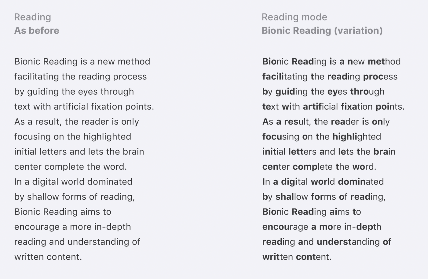
- bionic
- legibility
-
(and 1 more)
Tagged with:
-
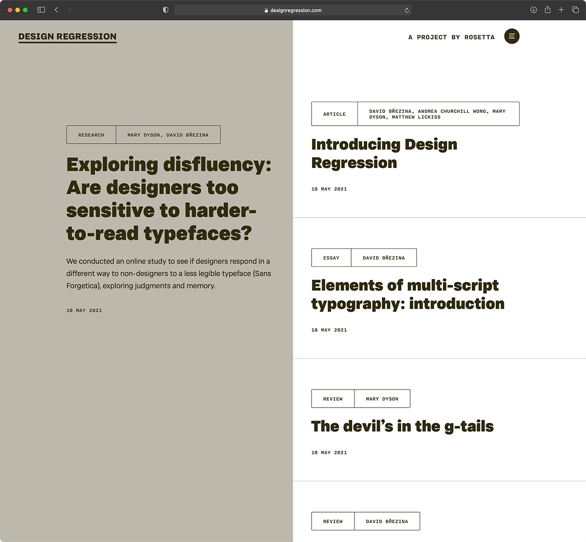
Design Regression, a journalette by Rosetta
Riccardo Sartori posted a news entry in Typography Weekly #112
-
- journal
- legibility
-
(and 4 more)
Tagged with:
-

Centre for Visibility Design
Riccardo Sartori posted a directory entry in Online Typography Resources
“When a typeface is illegible the reader will always notice; when a typeface is legible no one gives it any thought. We strive to produce new knowledge that can provide the tools to create the most legible typography or pictogram.”-
- visibility
- readability
-
(and 2 more)
Tagged with:
-
I've been studying a lot about type legibility and readability and found a helpful slideshow with lots of graphical examples describing a handful of important considerations when creating type and also page layout. Anyway, just thought I'd share it if anyone is interested: http://www.slideshare.net/shawncalvert/15-type-rules-intro-to-gd-wk-11-presentation
-
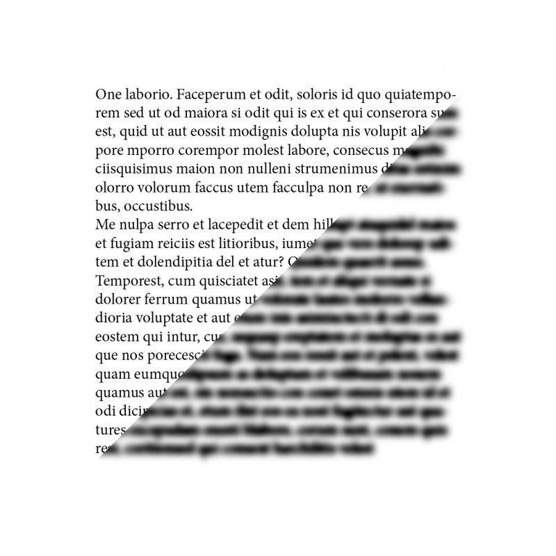
Ann Bessemans’ talk from ATypI 2015 in São Paulo These days rhythm within typefaces is treated very homogenously. The perfect example is the currently dominant early 21th century letter model where all the letters within a typeface get roughly the same width. But how does this development affect reading comfort? Currently, there is no closed definition of reading comfort and how to test it (quantitatively) in the best possible way. Tracy (1986) describes readability in terms of quality of visual comfort, as an important requirement in the comprehension of long stretches of text without experiencing physical complaints. There is strong evidence that visual comfort has to do with the rhythm of the typeface. Studies show that stripe patterns impede the reading process due to visual discomfort. Visual discomfort refers to the adverse effects of viewing certain kind of visual patterns, like text. This lecture will offer new insights into the way how to define reading comfort and why measuring visual comfort, independent from reading performance, seems to be innovative.
-
- 1
-

-
- legibility
- reading
-
(and 3 more)
Tagged with:
-
I was schooled to set paragraphs tight and even, so I’m skeptical about the claims of Asymmetrica Labs that there are ‘decades of science have proven that uneven spaces add significant value to comprehension’. What do others think of their claims? http://www.asym.co/blog/2015/7/14/intro-asym-spacing What about that line length when viewing the site on a desktop. That’s not good for readability right...?
-


