

Search the Community
Showing results for tags 'road sign'.
Found 11 results
-
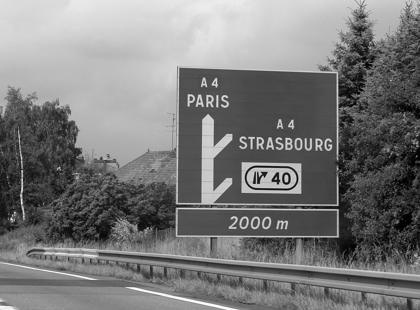 In France four fonts are currently used. The main fonts are called L1 and L2. L1 and L2 are caps-only alphabets. L1 is set in black letters on white background and is used for local targets. L2 is set in white on blue (Autoroutes) or green (Routes Nationales) background and is used for distant targets. L1 and L2 are basically the same design, but L2 is lighter and set with increased spacing to compensate for the overglow effect of white letters. The design of L1 and L2 are neither very good nor very bad. It’s a typical semi-geometric design similar to the traffic typefaces used in other European countries. A unique feature are the large counters of P and R. In general it is a good idea to have large counters for a typeface used for traffic signs, but a letter is also recognized by the white-space around it, so they might have overdone it a litte bit. Another problem might be the descenders of Q and Ç, which are designed not prominent enough. For local target and public facilities the italic font L4 is used. The uppercase letters are similar to the L2 fonts and the lowercase letters bear resemblance to Frutiger’s Univers typeface. In theory it sounds like a good idea to use different type styles to mark different kinds of targets, but when I look at the different styles and sizes in this image, the result looks rather confusing: The same is true for the overall design of the signs on which the content looks very scattered. The color coding works fine, but the separated signs and the type treatments don’t give me any clues about a clear hierarchy of the presented information: An additional font is the L5 alphabet. It seems to be derived from Frutiger and is apparently used for signs of less importance, for example the ones pointing to local points of interest. A freeware version of L1, L2 and L4 is called Caracteres and can be downloaded from here. URW++ offers a commercial digitization called Signal.
- 2 comments
-
- 1
-

-
- signage
- wayfinding
- (and 2 more)
-
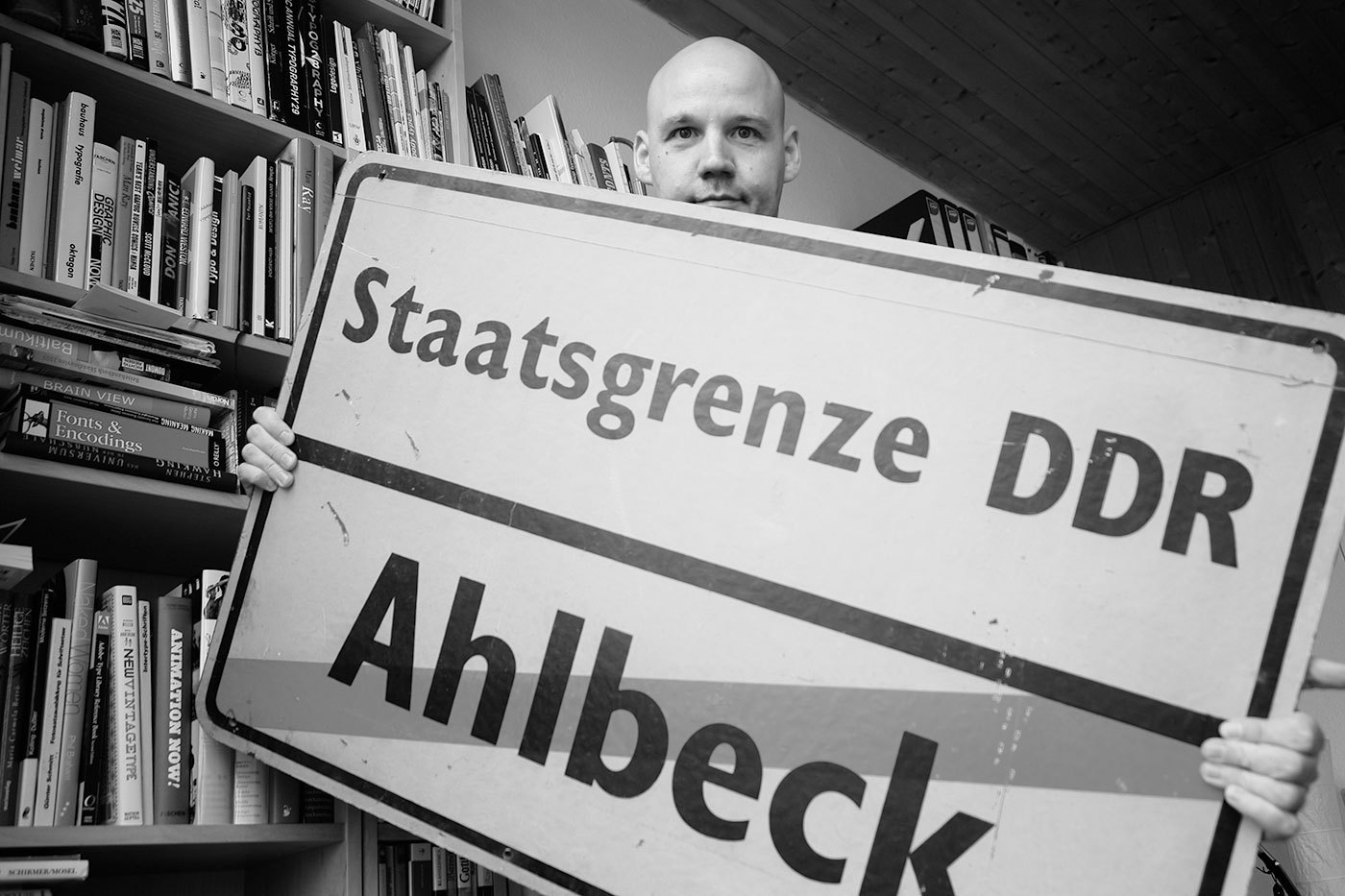 In the German Democratic Republic (GDR) the road traffic regulations were revised in the 1970s. The GDR had signed the treaty of the Vienna Convention on Road Signs and Signals (1969) and in the years 1974 till 1978 the official norm for the design and content of road signs was changed significantly. The new, quite remarkable layout also included a new typeface. In tests with a tachistoscope Gill Sans Bold Condensed supposedly performed better than DIN 1451 and so Gill Sans was used as the standard traffic typeface in East Germany. Because the old road signage typeface was usually just called DIN, the new typeface became the equally short name GIL. Source: Martin Q., Flickr. Used with permission They were certainly ahead of their time in choosing a humanistic sans-serif, but it is obvious that the spacing was way too tight for traffic signs. Here is a scan of the official norm papers (TGL 12096/91): There was just one style in use. The design is pretty close to Eric Gills original design for Monotype. The figure 1 got a hook to differentiate it from the I and the crossbar on the f seems to be wider on the right side (but still appears too short on the left side). They even took over the ridiculously small dots on the lowercase umlauts ä,ö and ü. Dear international type designers, take it from a German reader: the dots on umlauts need to look like the dots in the character i and j! So what about legibility? The GIL and DIN typeface can be easily compared. Even though the GIL typeface is actually a condensed typeface, it only uses just a little bit less space the the regular DIN 1451 (“Mittelschrift”) and the x-heights are also similar. At close range, GIL looks slightly superior. In this example, the design of a, g and r appears just more distinct. But if we simulate a greater distance, DIN 1451 actually takes the lead. Its very clear and basic design with the smaller stroke width makes it more legible under difficult viewing conditions. As you can see, the umlaut dots even disappear completely in GIL. So I find it hard to nominate a winner in this competition, but it probably safe to say that both typefaces performed rather well in those days. Other countries at the time were still using geometric designs with poor legibility that were drawn by engineers. The new design came into effect in 1977 with the new road traffic regulations. On top are signs used on regular roads and the next image shows examples of motor way (“Autobahn”) signs. Even though the new typeface was supposed to be used for all signs throughout East Germany, Autobahn signs seemed to have remained in a very old version of DIN 1451 (see next image). This was probably due to financial problems. East Germany always struggled to purchase or develop the materials they needed. That’s why most of the signs were either made from plastic or mounted on wooden plates. The majority of the signs was also retroreflective, but the GDR couldn’t effort to buy the Scotchlite materials from the USA, so they developed their own, but less effective retroreflective sheeting which was called Mikrolux. When Germany was reunited in 1990 almost all signs in GIL were quickly replaced with new signs using DIN 1451. Only some signs in rural areas remained unchanged – or ended up in my living room.
 -
 Typefaces used for national road signs.
 -
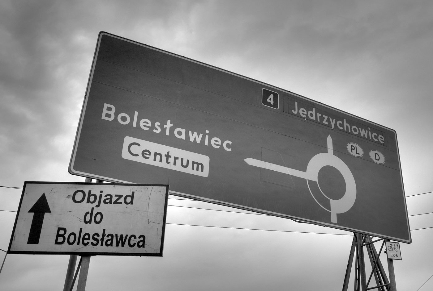 When I first saw a digital version of the Polish traffic typeface, I though I must have gotten a really bad digitization. It had characters which were obviously cut off by mistake … But I later found out that this is the way the typeface is supposed to look like according to the official specifications: The typeface has a very simple geometric design almost without any typographic corrections. Only one style is in use. There is no condensed style available and no variations for positive/negative contrasts. The typeface was originally developed in 1975 by Marek Sigmund for the Ministry of Transportation and put into effect on April 1 of that year. It is currently used in accordance with the Ministry of Infrastructure regulation of July 3, 2003 on all types of road signs in Poland. But Poland is a good example that type design isn’t everything when it comes to the design of traffic signs. The Polish signs compensate for the poor type design by making most of the information and direction signs very large, thus still achieving a good legibility. Unfortunately, the typeface almost always fails when the type has to get smaller. See this next example on a motorway, which is supposed to be read at 110 km/h (70 MPH). There are two digital versions available: Tablica drogowa by Grzegorz Klimczewski and Drogowskaz by Emil Wojtacki. The latter is freeware and I recommend using the TrueType version. The OpenType PS font has some outline bugs.
 -
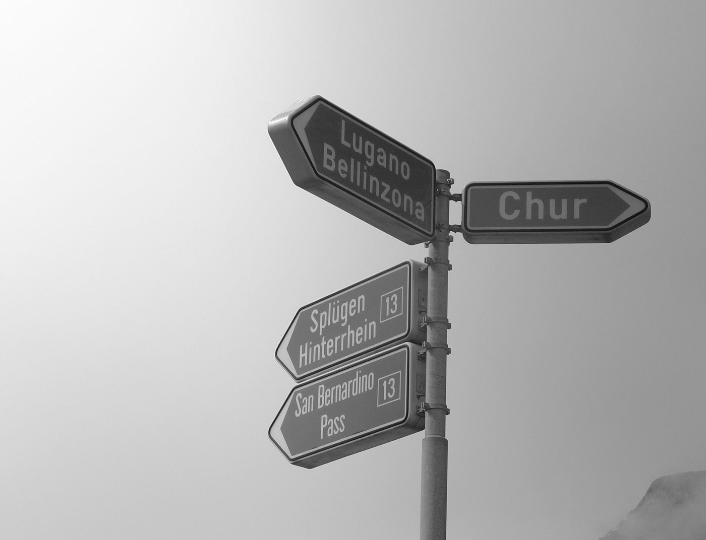 The old Swiss traffic sign font is called SNV (“Schweizerische Normen-Vereinigung”). It is a very geometric typeface with obvious legibility problems. The SNV fonts can still be found on older Swiss traffic signs and also in Belgium where it is still the main font on road signs. Since 2003 a new font called ASTRA Frutiger is used. It is based on Frutiger 57 Condensed with slight changes. ASTRA Frutiger is used in two styles: “Standard” for normal roads and “Autobahn” for motorways. The latter uses a slightly wider spacing. Frutiger is of course a perfect choice for traffic signs. It was derived from a design by Adrian Frutiger for the signage of the Roissy Airport in France. The clean and open design of the letters make the typeface very legible and it became one of the most popular sans-serif designs in the 20th century. Nevertheless there is some room for critique. The Frutiger typeface is already available in many different widths and weights, so it would have been no problem to obtain different versions for positive and negative contrast as well as styles with different widths. Choosing a condensed style as the main font could be problematic since a condensed style will always be slightly less legible than the corresponding style in the normal width. The official norm even allows the already condensed font to be further reduced in width. This is done without any typographic correction and decreases the legibility.
 -
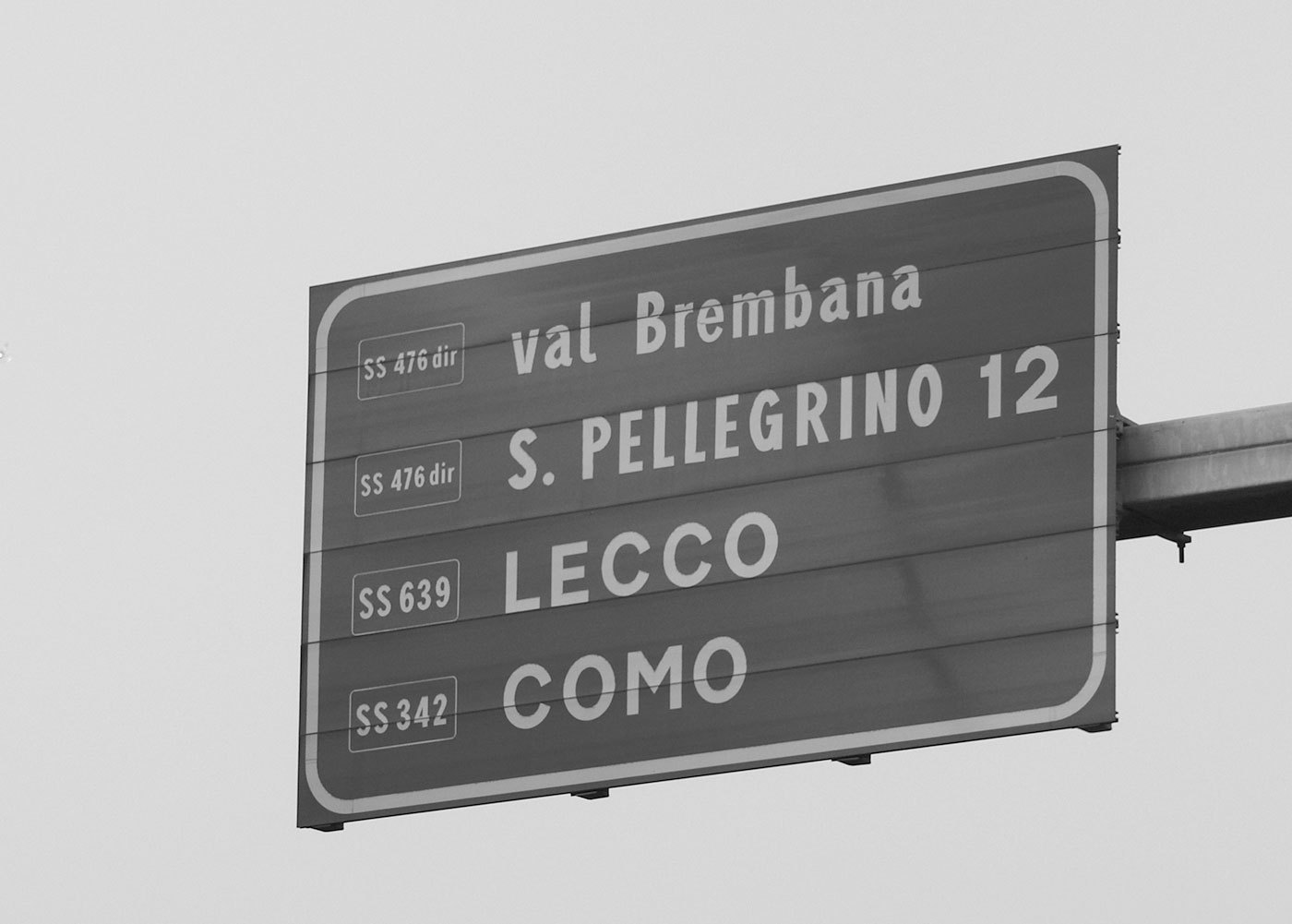 The main typeface used in Italy is called Alfabeto Normale and is a bolder version of the British Transport alphabet. From its use in Spain it is also known as Carreta Conventional or CCRIGE and it is available as Traffic Type Spain from URW++. A slightly thinner version is available for white letters on dark backgrounds. But nonetheless both version are way too bold for today’s retroreflective road signs. It's easy to imagine how the details will get lost when those letters are viewed from a greater distance or when the sign is lit by headlights. This is also true for the condensed style called Alfabeto Stretto, which is also available for positive and negative contrast. City names are always set in uppercase letters, but I usually didn't had trouble reading them, since Italian city names are usually short and set in large sizes. But the overall sign design has many problems. A typical mistake is not to limit the amount of information on the sign. One sign in Italy may present dozens of targets and additional information which are impossible to read even if you would slow down. Road numbers are usually very hard to read, since they are scaled down to fit in a rectangle the size of the capital letters. Another typical Italian problem I encountered was the missing continuity. You might follow a road (let’s say to Venice), but then hit a roundabout where this major target just isn’t listed for any of the available directions. And when it comes to Italian motorways you don’t get a chance to easily correct your direction, since they are all toll routes with very few exits. In the northern part of Italy the signs are usually set in German and Italian, but a typeface borrowed from the U.K. obviously doen’t have German letters …
 -
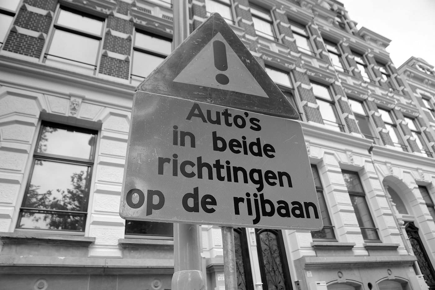 The Netherlands are a special case when it comes to traffic signs… Until recently the organization being in charge of the traffic signs was the ANWB. It was founded as a Dutch bikers(!) society (“Algemeene Nederlandsche Wielrijders Bond”) in 1883 and later became the royal tourist society. In my opinion these roots are still visible in the design of the traffic signs. On local roads you will see a lot of these sign posts, which are certainly based on the old finger-post signs, used long before the invention of the automobile. The typeface used since the 1960s is called ANWB-Ee (also RWS-Ee) and it is based on FHWA series E (Modified) from the United States. A condensed version (ANWB-Cc) is also available and it is based on the FHWA series C design. In the late 1990s Gerard Unger was commissioned to design a new typeface called ANWB-Uu. (source: designworkplan.com) Mr. Unger's task was to create a font which needs less space to fit the text on the smaller fixed-size direction signs. He achieved this goal. But in my opinion the the briefing itself was wrong. The size of a direction sign must be based on the content, not the other way around! What do you do, if you need to set Gasselterboerveenschemond on such a sign? On top of that, I found these sign posts often mounted at the most unfortunate places, for example behind traffic lights or far away and too high above the ground in the middle of a large roundabout, impossible to read. By contrast on a local direction sign in Germany the type size is based on the maximum speed of the traffic at this point and the width of the sign will grow according to the content. Recently the ANWB-Uu typeface is also appearing on the larger motorway (“autosnelwegen”) signs in the Netherlands, but using only a rather condensed typeface on large signs is usually not appropriate. It would at least need a corresponding version that is not condensed and can be used whenever there is enough space. The layout of the signs could also be improved. The signs sometimes appear way too crammed … … or simple but pretty ineffective:
 -
 The official traffic typeface in Germany is called DIN 1451 and has a very long history. It goes back to the beginning of the 20. century when the Royal Prussian Railways (Königliche Preußische Eisenbahn) defined a new master drawing for the lettering for the description of freight cars, The typeface was later adapted for all kinds of signages of the German railways. In the 1920s major German industrial companies met to agree on all sorts of technical standardization including type standards. The result was called DIN 1451 and was based on the railway typeface. The typefaces were created on a very simple grid system and with a continuous stroke width. The type norm was published in 1936 and became a standard for traffic signs, road signs, street names, house numbers and license plates. Over the next decades the typeface also appeared on all kinds of goods and household articles, making it THE German typeface. You can read the full story of the history of the DIN typeface in a series of articles by Albert-Jan Pool (designer of FF DIN) in the issues 13, 14, 15, 17 and 18 of the encore magazine. East Germany In East Germany the use of DIN 1451 was reviewed in the 70s. In tests with a tachistoscope Gill Sans performed better than DIN 1451 and so Gill Sans was used as the stadard traffic typeface in East Germany. They were certainly ahead of their time in choosing a humanistic sans-serif, but it is obvious that the spacing was way too tight for traffic signs. (But then again, East German cars couln’t go very fast.) When Germany was reunited in 1990 all signs in Gill Sans were replaced with new signs using DIN 1451. DIN 1451 today Today two revised styles with typographic adjustments are used. DIN 1451 Mittelschrift is the main typeface: The condensed style (DIN 1451 Engschrift) should only be used when there is not enough space to use Mittelschrift. Even in this improved design it is still apparent, that these fonts were never made for traffic signs and reading at high-speed in the first place. The weight and the tight spacing is only working well at a close distance. Several foundries (e.g. FSI, Linotype Parachute) have developed font families based on DIN 1451. download at MyFonts download at MyFonts
 -

Traffic Sign Typefaces: Dansk Vejtavleskrift (Denmark)
Ralf Herrmann posted a journal article in Journal
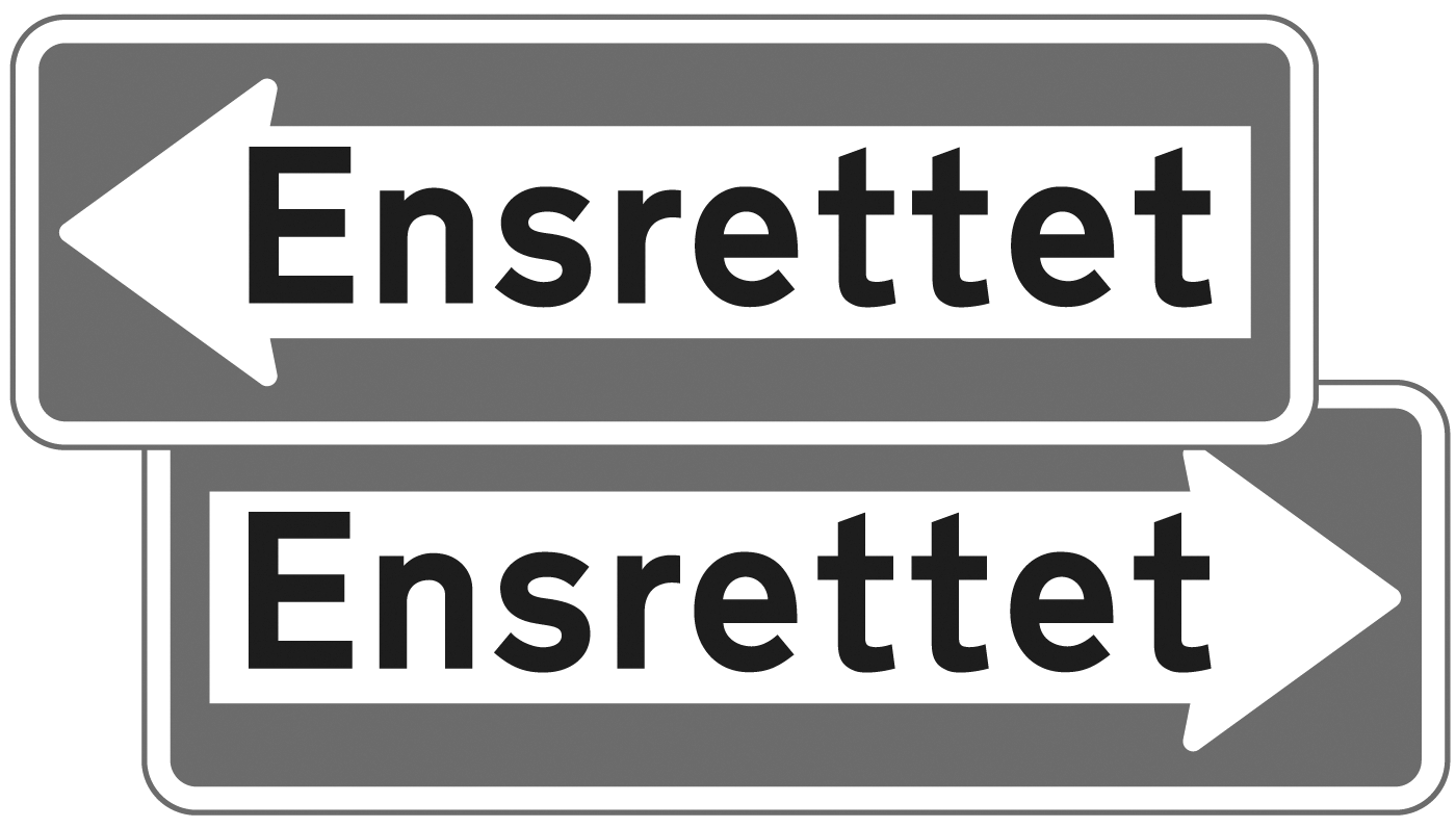 Denmark is very generous with colors. Road sign can be red on white, white on green, blue on white, black on yellow and white on blue. Red (usually reserved for emergency icons) is the main color, because it is the color of the national flag of Denmark. Between 1955 and 1978 a relatively light typeface with large ascenders and descenders was used (see first line in the above image). In 1978 a new typeface was approved by the Ministry of Transport (bottom line). It was taken over from the British Road Alphabet (“Transport”), designed by Jock Kinneir. The Danish letters æ,ø and å were added and a few details were adjusted. For example: the figures were made more open and the spacing was increased. The typeface decides the size of the sign. The size of the typeface (cap height: 25–480 mm) is based on the speed of the cars and technical qualities like contrast and retroreflection. Since there is no condensed style available, signs can get very wide. The Dansk Vejtavleskrift is used in two styles: “Positiv skrifttype” (for dark text on light backgrounds) and “Negativ skrifttype” (for light text on dark backgrounds). The latter has increased spacing, but no changes in weight.
 -
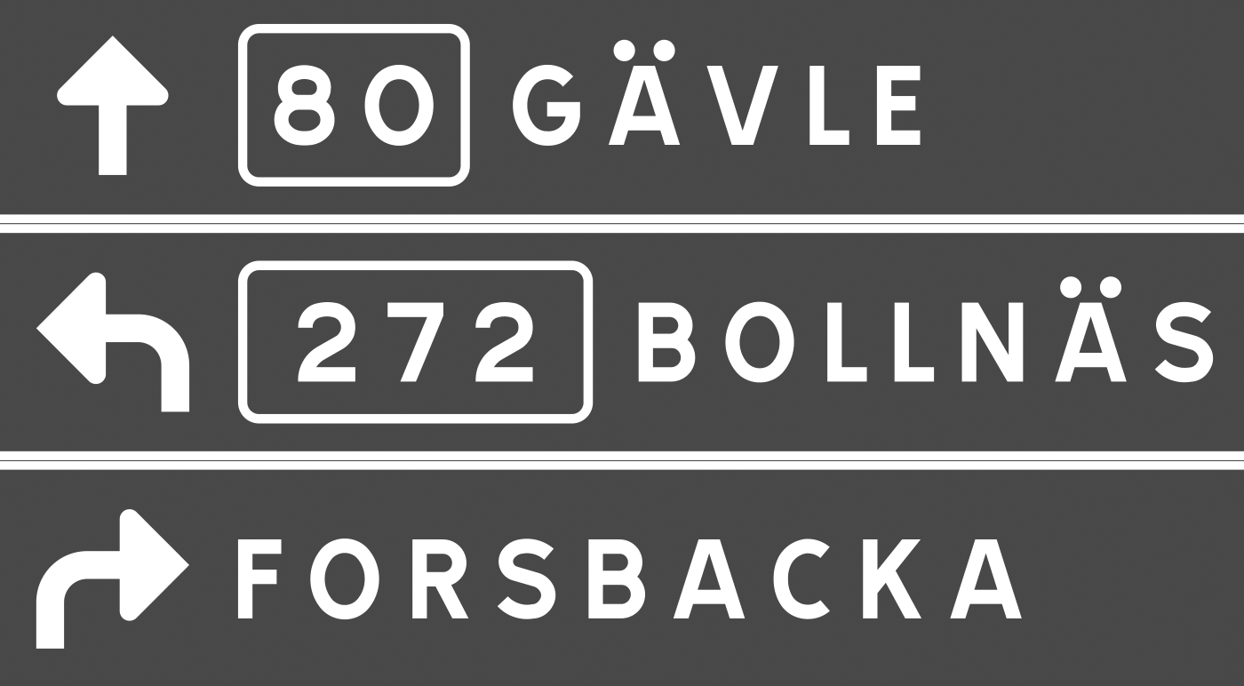 The swedish typeface for traffic signs is called Tratex and was designed by Karl-Gustav Gustafson and modified by Chester Bernsten. Tratex is available in 4 styles. The first one is called Svart (“Black”): Vit (“White”). It has an increased spacing to compensate the overglow effect. PosVersal (“Positive Caps”): NegVersal (“Negavite Caps”). Identical to PosVersal, but with increased spacing: Swedish signs are mostly set in all caps. This seems to be a common practice in all Scandinavian countries. Signs with lowercase letters seemed to be reserved for local targets and tourist information signs. You can download the Tratex fonts from here. A better commercial version is offered by URW++, but they only have one style.
 -
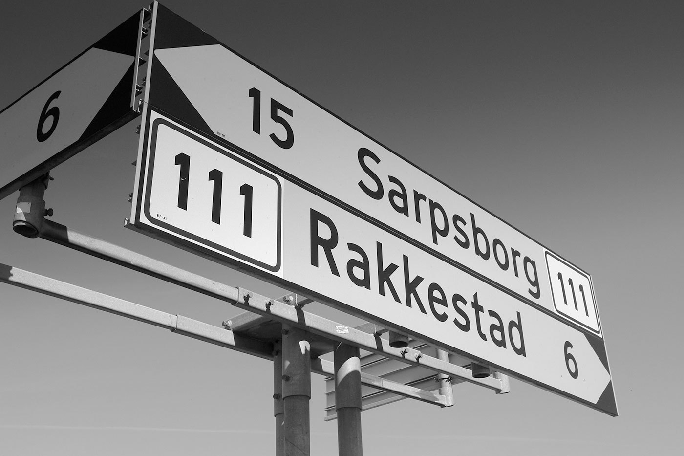 The typeface on the traffic signs of Norway is called Trafikkalfabetet and was designed in 1965 by Karl Petter Sandbæk. It bears a resemblance to the German DIN typeface, but it also has some unique features, some of them are good, some are bad. Both typefaces share a very simple geometric design and they are good examples of typefaces, that look like they were made on the drawing-board of an engineer rather than designed by a type designer. Look at these letters from Trafikkalfabetet: A type designers knows how to optically adjust geometrical shapes to make them look right. The tip of the M needs to go below the baseline and the dot of the »i« needs to be wider than the stem. But the design of the Trafikkalfabetet typeface rather aims at consistent values. As a result, the dot of the »i« is way too small, especially for a typeface that should be legible at great distance. The spacing of the typeface has the similar problems. Uniform values for left and right sidebearings cannot create uniform spacing. The counters of Trafikkalfabetet are more open (red circles) and the oval shapes are emphasized (compared to DIN). But on the other hand, important details are better executed in DIN than in the Trafikkalfabetet typeface (green circles). Trafikkalfabetet has only one style. So for longer pieces of information you can only make the type smaller or the sign longer. A digitized version by Jacob Øvergaard is available here.

