

Search the Community
Showing results for tags 'denmark'.
Found 5 results
-
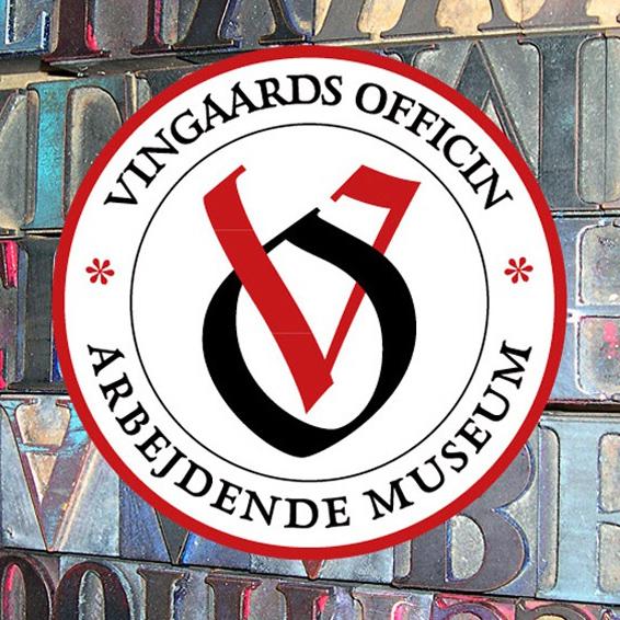 Vingaards Officin is a Danish printing museum in the city of Viborg. It shows working printing machines like Monotype, Intertype linecasting, Ludlow, Typograph, Intertype photosetter, Heidelberg cylinder. The museum opens Tuesday, Wednesday and Thursday.
 -

Bogtrykker Jens Jørgen Hansen
Ralf Herrmann posted a directory entry in Artisanal workshops & studios
 Jens Jørgen Hansen was born in 1969 and qualified as a silk screen printer in 2002 and as an adult teacher in 2005. He has been employed as a publicist and workshop leader at the Printing Museum in Esbjerg from 1995 to 1998. He started his own private printing office in 2003 and took the title: bogtrykker (the Danish term for Printer). Today the workshop has a well equipped composing room with more than 450 fonts of wood, Monotype and foundry types. In the press room he works with my two flatbed proof presses, three (eight) tabletops and a Victoria A2. In his studio he also has a relative large library relating to the trade. Jens Jørgen Hansen has also started to hold private letterpress workshops at the letterpress workshop at the Academy in Copenhagen and in his private studio in Holsted.
 -
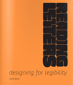 Sofie Beier from Denmark holds a PhD from the Royal College of Art in London. Her research focuses on typeface legibility, aiming at a better understanding of how different typefaces and letter shapes can influence the reading process. Her book “Reading Letters—designing for legibility” tries to bridge the gap between scientific research and applied graphic and type design. The purpose of the book is to support type designers in creating legible typefaces and help graphic designers to determine the optimal typeface for a given project. But the book doesn’t work like a “manual”. It does not list the most legible typefaces or will tell you settings for font-sizes, line-heights and so on. It’s all about understanding the principles of legibility. Definitive answers about the fundamental parameters of legibility are yet to be found and Sofie Beier was certainly well advised, not to speculate too much in this book. But still, even though this book cannot answer every question about legibility — if you are interested in legibility research from a typographic point of view, this is a book worth reading.
 -
Type and its legibility: 7 Questions for Sofie Beier
Ralf Herrmann posted a journal article in Journal
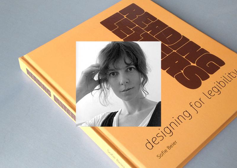 There are two groups who deal with typographic legibility: On the one hand, there are scientist, usually from the field of psychology, who carry out scientific tests to study how we read texts and which parameters influence the legibility of type. On the other hand there are graphic designers and type designers which base their opinions about legibility on the conventions of hundreds of years of type setting and their personal experience. Unfortunately, until recently both sides rarely talked to each other, resulting in designer’s opinions about legibility which contradict the current state of scientific legibility research and scientists doing research with insufficient test set-ups and questionable interpretations of their studies. Luckily, this is currently changing. More and more research is done, where scientists and designers work together—designers like Sofie Beier. For her dissertation she researched the effects of type familiarity. Her new book Reading letters is in parts based on this work. It combines scientific theories and findings with typographic and historic background knowledge about the design principles of type for certain applications. You can take a look at the table of contents here. The purpose of the book is to support type designers in creating legible typefaces and help graphic designers to determine the optimal typeface for a given project. But the book doesn’t work like a “manual”. It does not list the most legible typefaces or will tell you settings for font-sizes, line-heights and so on. It’s all about understanding the principles of legibility. Definitive answers about the fundamental parameters of legibility are yet to be found and Sofie Beier was certainly well advised, not to speculate too much in this book. But still, even though this book cannot answer every question about legibility — if you are interested in legibility research from a typographic point of view, this is the book you need to read. 1. How did you became interested in the scientific research of legibility in the first place? Many years ago, I was looking for a book on the subject. I wanted to expand my knowledge on typeface legibility in relation to my own type design. I couldn’t find such a book, so I started a more systematic collection of what various writers had put forward on the topic. This eventually led to me taking up a PhD at the Royal College of Art in London. 2. The design of print typefaces has evolved for over 500 years without any scientific research of legibility. Do you think we can still improve our designs through science or is the purpose of the current research more about understanding reading & legibility instead of actually applying the findings to new type designs? I have no doubt that scientific legibility investigations can improve the design of new typefaces. Until the industrial revolution, typefaces were solely applied in printed books. Contemporary typefaces have to meet a range of new demands. Sometimes they are 2 meters high on a billboard, sometimes 10 pixels high on a computer display. Legibility varies depending on the situation the typeface is presented in. Scientific legibility investigations can help us understand these differences. 3. Has your research influenced your own type designs? Yes, three of my typefaces (Ovink, Pyke, Spencer) all came out of a study on the individual letter shape that I ran in collaboration with Kevin Larson. Within each typeface we looked at the shapes of those lowercase letters that are known to be misread most often. The three typefaces are based on these findings. On top of that, I also added other legibility improving elements related to their individual usages. Ovink is a signage typeface, Pyke is a text typeface, and Spencer is more an allround typeface. 4. In your study together with Kevin Larson you proved that certain letters designs (like the one-storey a) are much more likely to be confused with other letters. Why do you think such typefaces (like Futura) are still used so often in situations where legibility is crucial? Many designers do not care much about legibility; the focus is often on other things. That being said, it depends on the circumstances. Research shows that we are quite capable of reading words even when some of the letters are illegible. We simply use the surrounding letters and our knowledge of possible letter combinations to guess what letter it is. So in some situations, the one-storey a might not be a problem. 5. The typeface legibility comparison done for the new Heathrow Airport terminal suggested that condensed typefaces perform worse than wider typefaces set smaller. Do you agree? And if yes: why do you think that is? Everything indicates that it is the case. I have no idea why. It is an interesting topic, which I hope to run experiments on in the nearest future. 6. What was the most surprising result from all of your legibility research? The issue mentioned above, of character proportions in distance viewing might be the biggest surprise. When we know more, it can end up having a large implication on the design of new signage systems. 7. Serifs or no serifs? Do they play a role in terms of legibility? Throughout the history of legibility research, this has been the most popular question to investigate. I believe serifs play a role, sometimes good and sometimes bad.
-
- 1
-

-
- 7questions
- interview
- (and 3 more)
-
Traffic Sign Typefaces: Dansk Vejtavleskrift (Denmark)
Ralf Herrmann posted a journal article in Journal
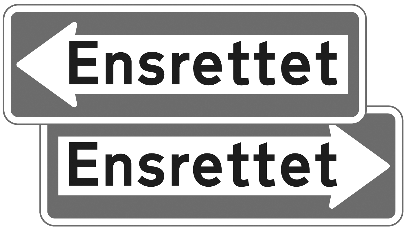 Denmark is very generous with colors. Road sign can be red on white, white on green, blue on white, black on yellow and white on blue. Red (usually reserved for emergency icons) is the main color, because it is the color of the national flag of Denmark. Between 1955 and 1978 a relatively light typeface with large ascenders and descenders was used (see first line in the above image). In 1978 a new typeface was approved by the Ministry of Transport (bottom line). It was taken over from the British Road Alphabet (“Transport”), designed by Jock Kinneir. The Danish letters æ,ø and å were added and a few details were adjusted. For example: the figures were made more open and the spacing was increased. The typeface decides the size of the sign. The size of the typeface (cap height: 25–480 mm) is based on the speed of the cars and technical qualities like contrast and retroreflection. Since there is no condensed style available, signs can get very wide. The Dansk Vejtavleskrift is used in two styles: “Positiv skrifttype” (for dark text on light backgrounds) and “Negativ skrifttype” (for light text on dark backgrounds). The latter has increased spacing, but no changes in weight.

