What is kerning?
Normally, the distance between the bounding boxes of consecutive letters in a text will be zero. Changes that are applied to specific glyph pairs are called kerning. These changes can be saved within the font as part of the font’s metrics, or they can be applied or overridden by the font user for a specific text.
The term kerning goes back to the days of letterpress printing, where parts of a letter would have to be physically cut off in order to bring letterforms closer together. The overhanging part was called the “kern” and the process of creating it “kerning”. Today, any spacing change between two consecutive letters is called kerning and any positive or negative kerning value is possible.
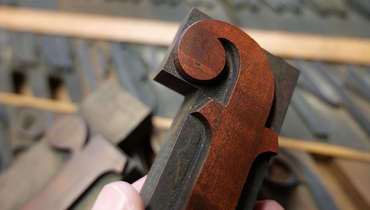
A kerned wood type letter
Why is kerning necessary?
Kerning is used to create an equal appearance of white-space between all letters. Equal letter spacing helps us to focus on the letterforms. Uneven spacing would inevitably draw the reader’s attention. Another crucial aspect is the difference between the letter spacing within a word and the space between words. If the spacing between letter pairs in a word is uneven or too big in some cases, it confuses the readers, because they are tempted to see a word space where there is none. So, properly kerned text will not only look more visually pleasing, it will also be more legible and increase the reading comfort for longer texts.
Type designers define the sidebearings of each letter in a way that corresponds with the letterform. As a result, most letters can be combined with other letters while automatically creating the appropriate amount of letter-spacing. But with roman fonts, there are going to be letter combinations which require a custom setting for specific letter pairs—kerning!
What kerning depends on
Kerning depends on the writing system and the font style. Connected script fonts for example might not use kerning at all, since each letter ends with a connecting stroke, which needs to touch all following letters at exactly the same spot. Tracking or kerning changes would break this connection. Blackletter fonts also rarely require kerning, since the letterforms don’t have diagonal lines which would create a lot of white-space between letters. But unfortunately, the roman style—the most common style for Latin text today—with its geometric letterforms (especially among the capital letters) requires a lot of kerning pairs.
The need for user-defined kerning also depends on the type size. While it’s usually recommended to have the kerning pairs in the font turned on for every size, it’s often not feasible to manually improve the kerning for hundreds of pages of a novel for example. For headlines however, manual kerning improvements might be useful and for designs like a logotype it is absolutely crucial.
Lastly, kerning also depends on the tracking. If the distance between the letterforms is rather small, the varying distances between the letterforms and the varying areas of white-space between the letterforms will be clearly visible and therefore require more kerning. Looser tracking requires less or no kerning. So, it is useful to always set the tracking first.
How to judge the white-space between characters
As already explained, the general idea of manual kerning is to equalize the space between the letters by adjusting the distance between the letters. We can visualize areas of white-space between consecutive letters and compare them. And then we tweak the spacing where necessary until all areas of white-space between letter pairs look roughly equal.
As a general rule: The distance between the letterforms needs to be the largest, when two stems are next to another, for example with an “n” followed by an “m”. When a stem is next to a curve (as in n + o), less distance is needed, since some of the white-space is over and under the curve. And when two curves meet, the distance is reduced even further.


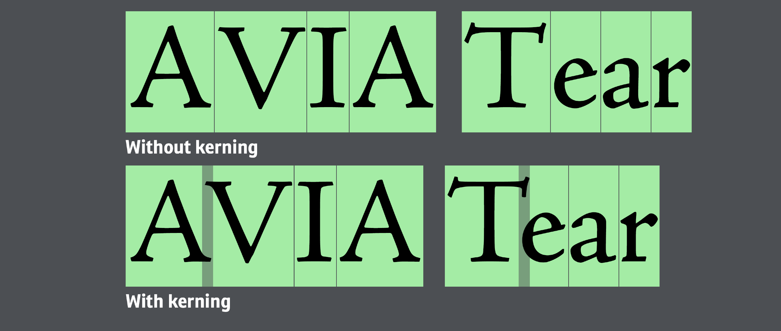
Equal space, different letterform distance
Unfortunately, judging the space between letter pairs isn’t an exact science, since letterforms are rarely perfect geometric shapes. And therefore, font users can potentially disagree about how to judge the space exactly and some letter combinations require compromises, because the goal of equalizing the white-space conflicts with the goal of keeping every letter legible by clearly separating it from surrounding letters. To demonstrate this, have a look at the following examples.
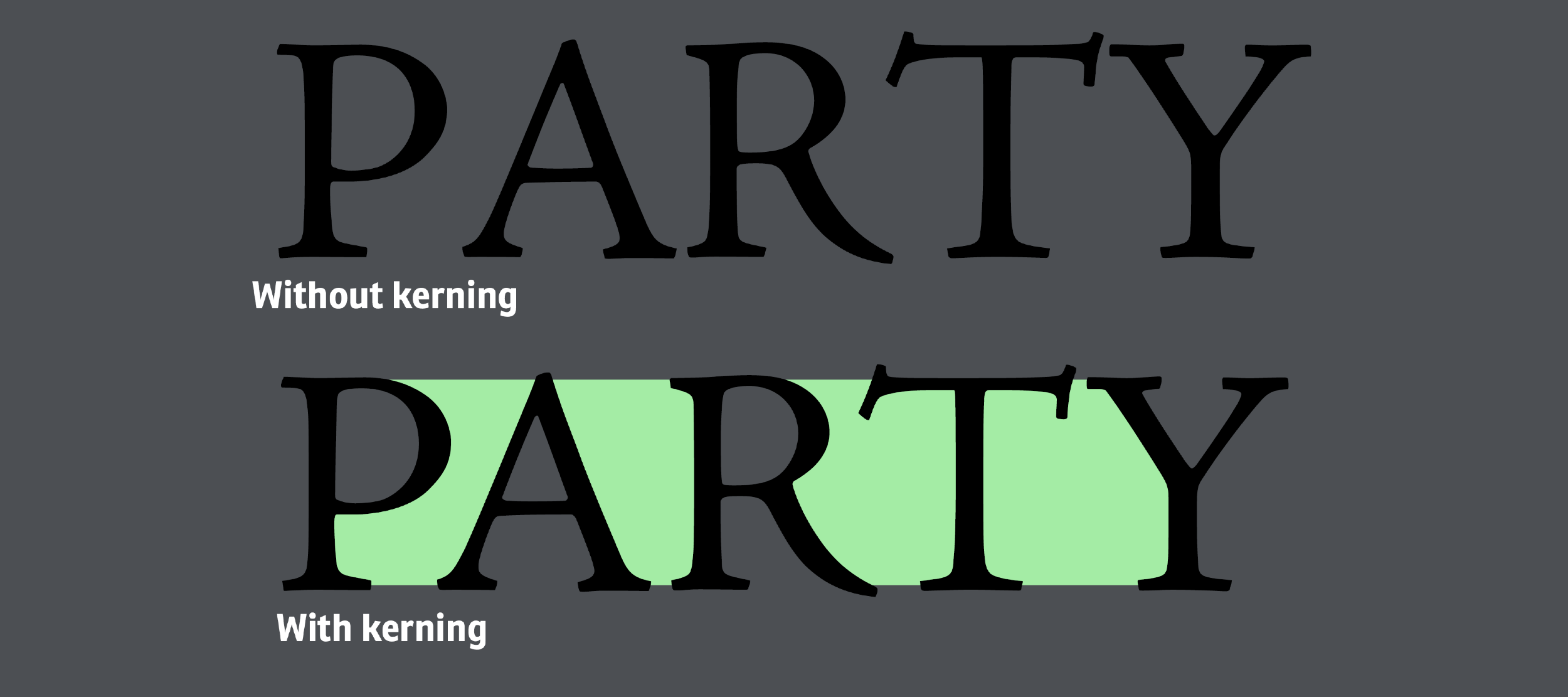
In the word without kerning, the letter-spacing isn’t even. It rather looks like P-AR-TY. So the P and A and R and T need to be brought closer together. Now the word is spaced more evenly. The white-space between the T and the Y still feels rather large, but because it T and Y are already almost touching, it makes sense to not bring them closer together.
As shown above, when the sides of a letter have clear boundaries such as stems (e.g. in letters such as n) or arcs (as in the letter o), judging the spacing between such letters is rather easy. It gets more tricky when the white-spends extends into the letters. As an example, look at this picture:

We can clearly judge the highlighted white-space in the word “from”. But the white-space in the letter pairs “Ea” and “es” in the word Eames is much larger than the average white-space of the entire line of text. Yet, it wouldn’t make sense to overlap these letter just to reduce that space. But we also cannot ignore that white-space inside those letters either. The solution is to think of this letter-space as a gradient, as shown in the second line. The more the white-space reaches into the letter, the more we can ignore it.
By the way: Especially as a beginner, feel free to actually make the white-space visible as in the images on this page. Judging the size of these areas is much easier this way. Over time and with more experience, you will probably not need it anymore.

The kerning process
A typical suggestion to apply kerning is to go through the text looking at three letters at a time (see image above). With this method, you always have two areas of white space to compare and as you progress through the word or phrase, you can use the spacing created before as a template to match. But this approach also has its disadvantages. First of all, you might start out with spacing that is rather small or rather large and then you have to needlessly force this spacing on all the following letter pairs. Furthermore, you might run into situations, where the necessary area of white-space simply isn’t possible, because you can’t bring certain letters closer together.
So an alternative approach is to look at an entire word or phrase at once and to start with the extreme cases. Look for areas of white-space that are clearly too small or clearly too large in relation to the rest of the text. Bring the spacing for these letter pairs closer to the average letter-spacing of the other letter pairs. After that, look at the entire word or phrase again. Which areas still stick out now? Fix those as well. And so on. While this approach might require a little more experience, it makes sure that the tracking that was set upfront stays the same.
Which letter typically need kerning?
It helps to be aware of which letters typically require kerning adjustments, because their letterforms usually create a rather large white-space area. Here are some typical cases for the Latin script:
-
Letters with diagonal strokes like A, V, W, Y, K, X, y, v, w
- examples: LV, AV, KO, WA, Ay, Av …
-
Top-heavy or bottom-heavy letters: T, L, F, P, r
- examples: Te, Pe, Ly, Fe …
Letters like these may or may not cause a problem, depending on the surrounding characters. And don’t forget that kerning isn’t just about letter combinations. Letters combined with punctuation marks like a period or a comma will also often require kerning adjustments. Another area of concern are potentially colliding characters like the letter f colliding with a closing bracket or a quotation mark.
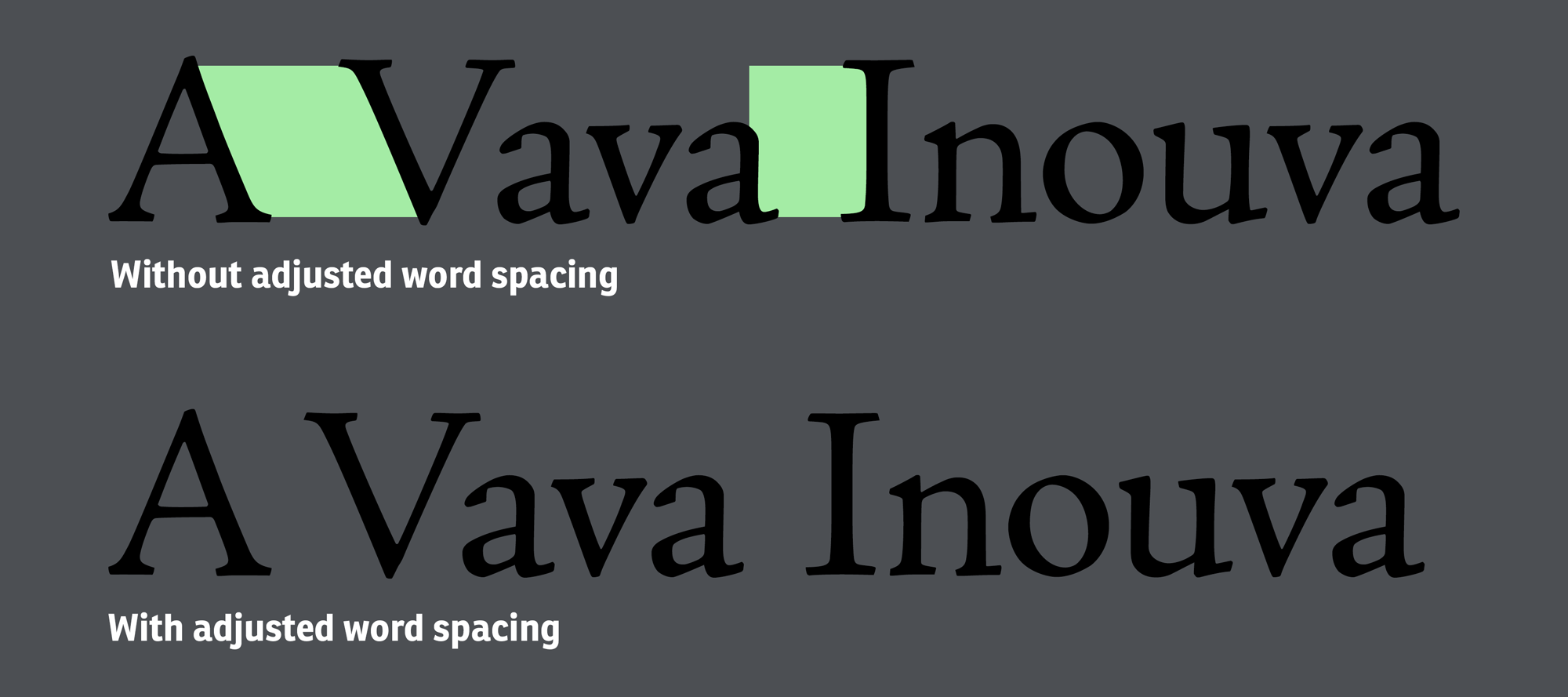
And finally, also pay attention to the word space. It too can require kerning adjustments, for example when the surrounding letters create a lot of white-space on the side facing the word space.
Exceptions and compromises
If you look at professional fonts, you can see that type designers do kerning in a way where gaps—especially in combination with uppercase letters—are reduced, but still not closed as much as they could be. In other words: the designers try not to overdo it. Have a look at the following example:
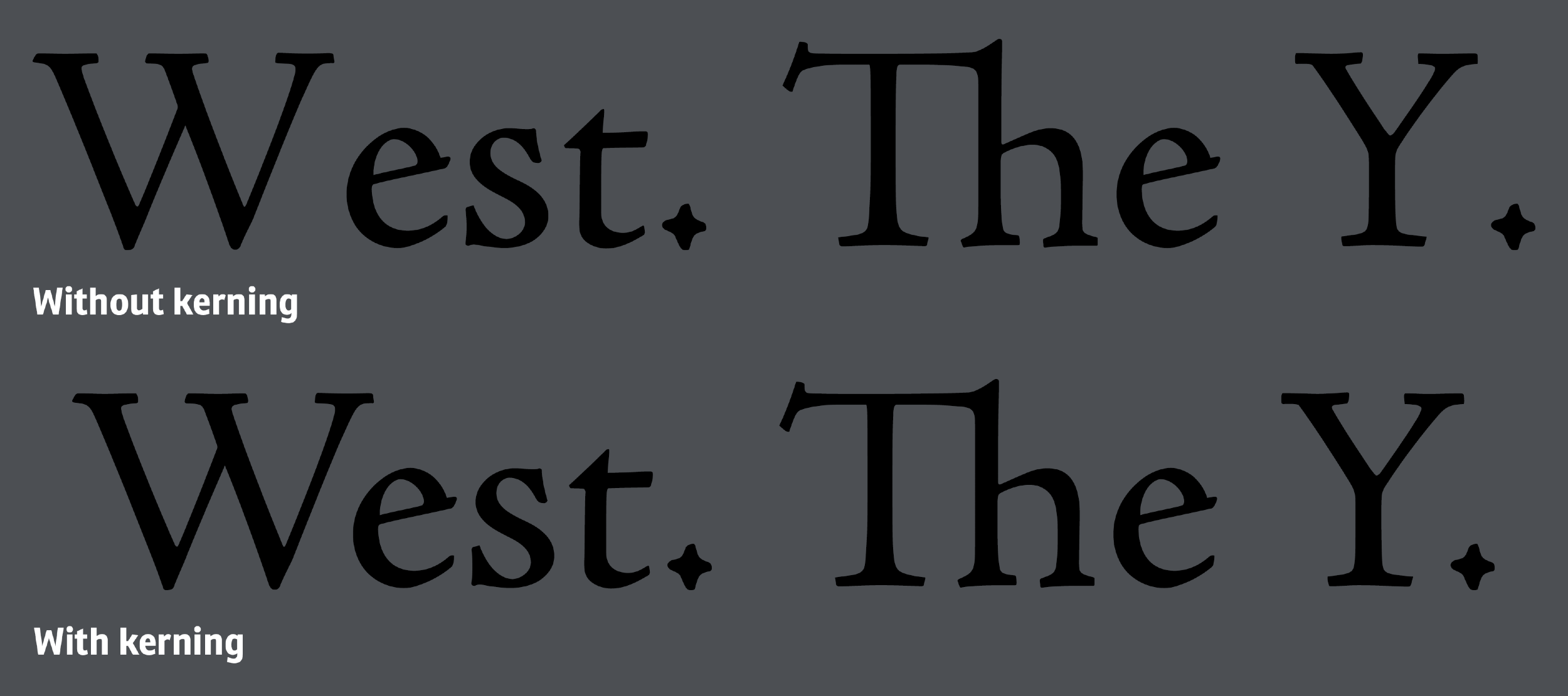
The letter combinations “We” and “Y.” are in desperate need of kerning and the font’s internal kerning, as shown in the second line, delivers that while still leaving white-space between the kerned letter pairs that is larger than the spaces between other letter pairs in the same line. Capital letters in fonts will often have a more generous spacing and as you can see here, this will also be kept for kerning pairs. This spacing helps when capital letters are used for all-caps typesetting and it also delivers a reading experience that readers are used to from letterpress prints. The spacing is indeed improved in comparison to what would be possible with letterpress printing, but it isn’t so different that it could become noteworthy by being so different from letterpress printing. But you have to decide for yourself whether you would keep or use this kerning practice for something like a logo design.
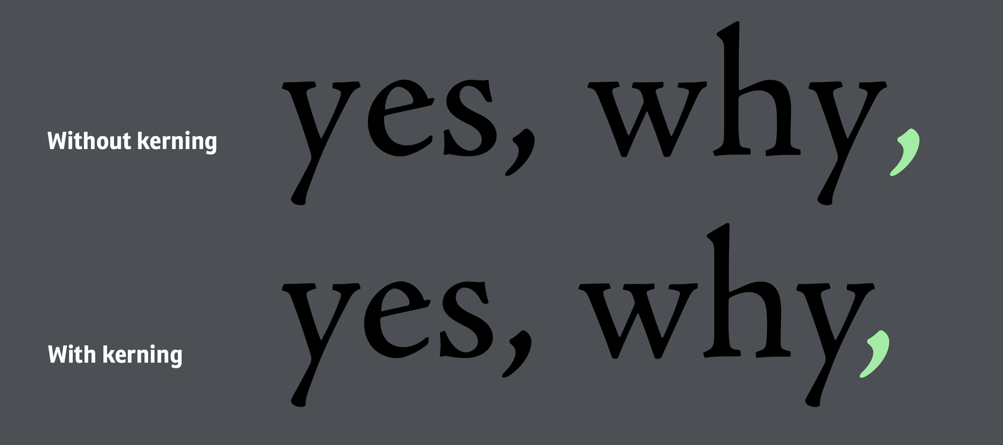
When equalizing the space would mean that letters would touch and overlap, it’s usually okay to keep a spacing that is a little bit too large to avoid the overlap. A typical case is the letter “r”. While it creates a lot of white-space, it looses its legibility when it touches the next letter. A poorly kerned r + n would easily be misread as m. So keeping a sufficient distance to the following letters is required. But in some cases, especially with rather shallow diagonal lines, the white-space can get so big that it can be mistaken for a word space. In this case, the better solution is to let the letters overlap.

Sometimes touching letters (“wy” in the first line) are the lesser evil