


1. Logo
Johannes Gutenberg established the use moveable type for printing texts in the West in the 15th century. There were later attempts to speed up the typesetting process by casting syllables or entire words as one piece. Those pieces were called logotypes—from Ancient Greek “lógos” meaning “word”. But handling type cases with hundreds of compartments was just not practical and so this kind of typesetting didn’t really catch on. But entire words cast as one piece of metal type still became quite common—for example for newspaper section headlines, which had to be used every day in exactly the same way.
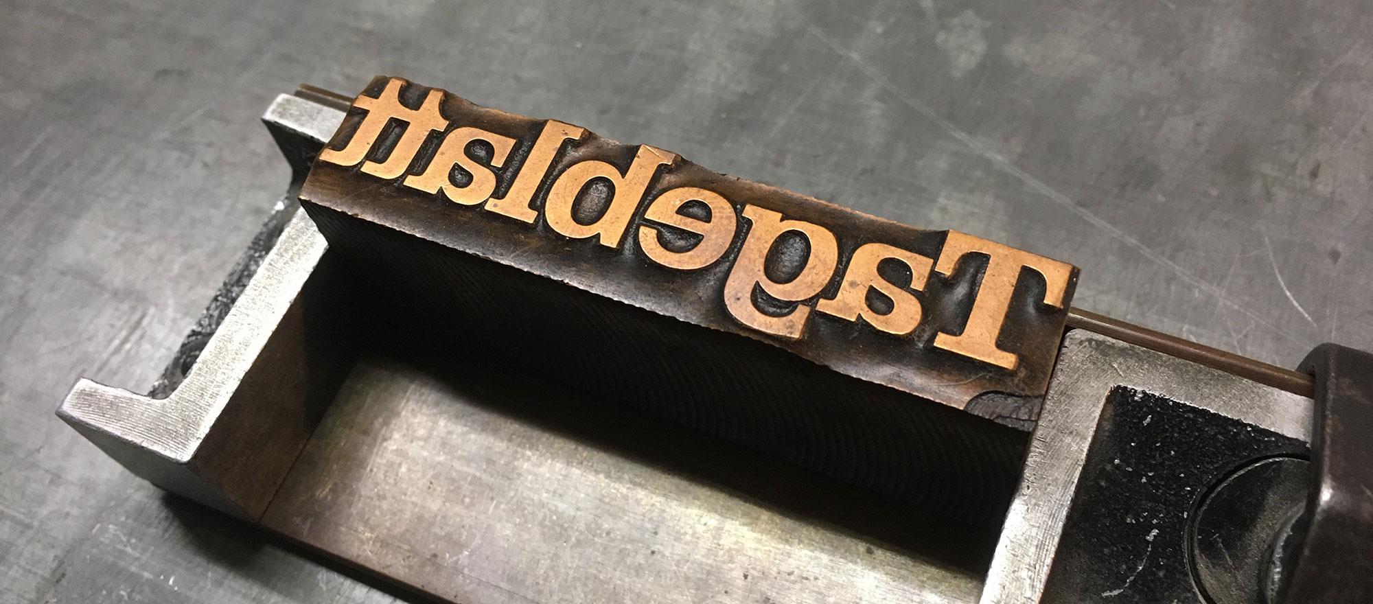
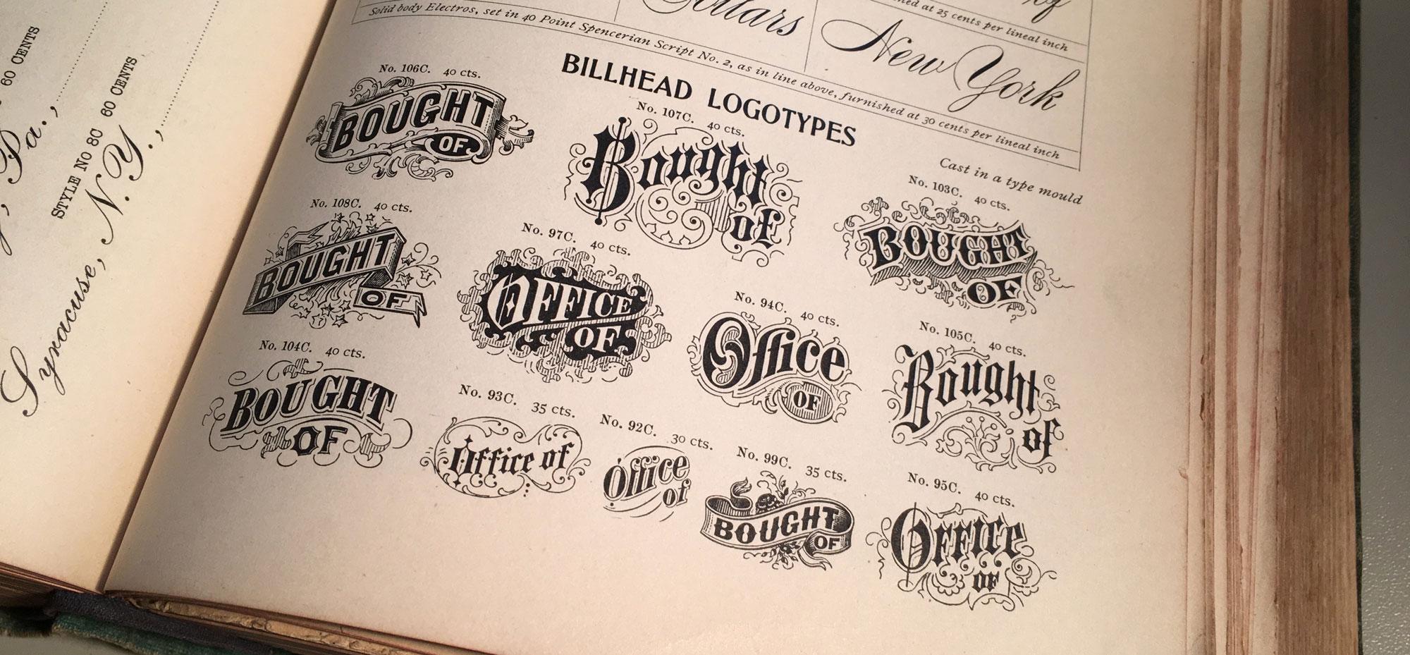
Other uses were words like invoice, certificate, invitation and so on, which were designed in a decorated way that couldn’t be typeset with individual letters. And logotypes were also used to print the names of companies. And that is where the modern usage of the word logotype—or just logo for short—comes from. This typical use in letterpress printing started to not only describe the object, which was used to print a company name, but the specifically designed appearence of the name itself. And while this originally only applied to printing blocks with text on it—for example a wordmark—the modern understanding of the word logotype is much broader and can also apply to graphic marks, emblems and symbols, which might not not contain any letters.
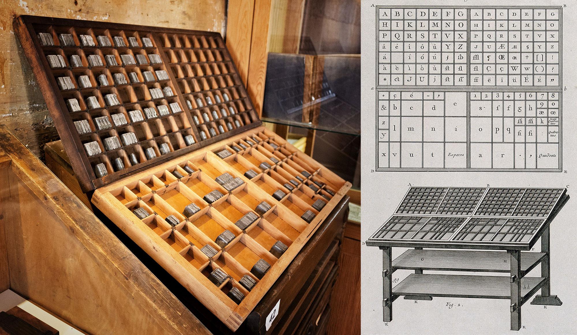
1. Uppercase & Lowercase
These commonly used terms go back to the print shop tradition in some countries of having separate type cases for one typeface in one size—one case for the small letters and one for the capital letters. The case with the capital letters was put on top—so it was literally the “upper case” and the type case with the small letters was put below that, so it was the “lower case”. And that’s how these terms were coined.
2. Cliché
To add an image to a letterpress form, printing blocks were needed that behaved just like the metal letters. Creating them was an elaborate and time-consuming process—at least in the first centuries of printing with moveable type. But there was a work-around: Instead of creating printing blocks with images for a specific use in a single print-run, generic images were often created and print shops could use them for multiple prints and for various clients.
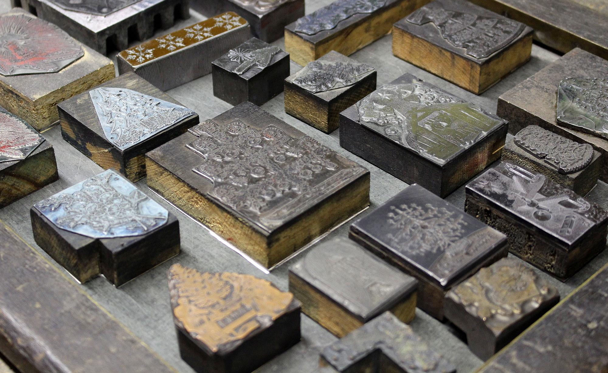
So with these blocks, printers were replicating a rather generic artwork over and over again. In a print shop those printing blocks were called a cliché and later people outside this field started to use this word as well for something that is not original, overused, generic, or stereotypical. And speaking of stereotypical …
3. Stereotype
Creating a letterpress form with text and printing blocks can take a lot of time. And if the prints were all handed out or sold out and needed to be reprinted, the print shop essentially had to start from scratch, recreating the typesetting and the entire layout. It was possible to store the original letterpress forms to be used later, but that meant that all the letters and printing blocks that were used were not available for other prints anymore. So very often that just wasn’t an option. But the stereotype solved this problem.
A material like papier-mâché was pressed on the letterpress form and created a precise negative impression of the entire layout. And from that a new single form could be casted. And the result of that process was called a stereotype – which means “a solid form or impression”. And using this technique had another important advantage: this new cast didn’t necessarily had to be flat like the original letterpress form, but it could also be casted in a cylindrical shape to be used on the much faster rotary printing presses with cylindrical printing forms.
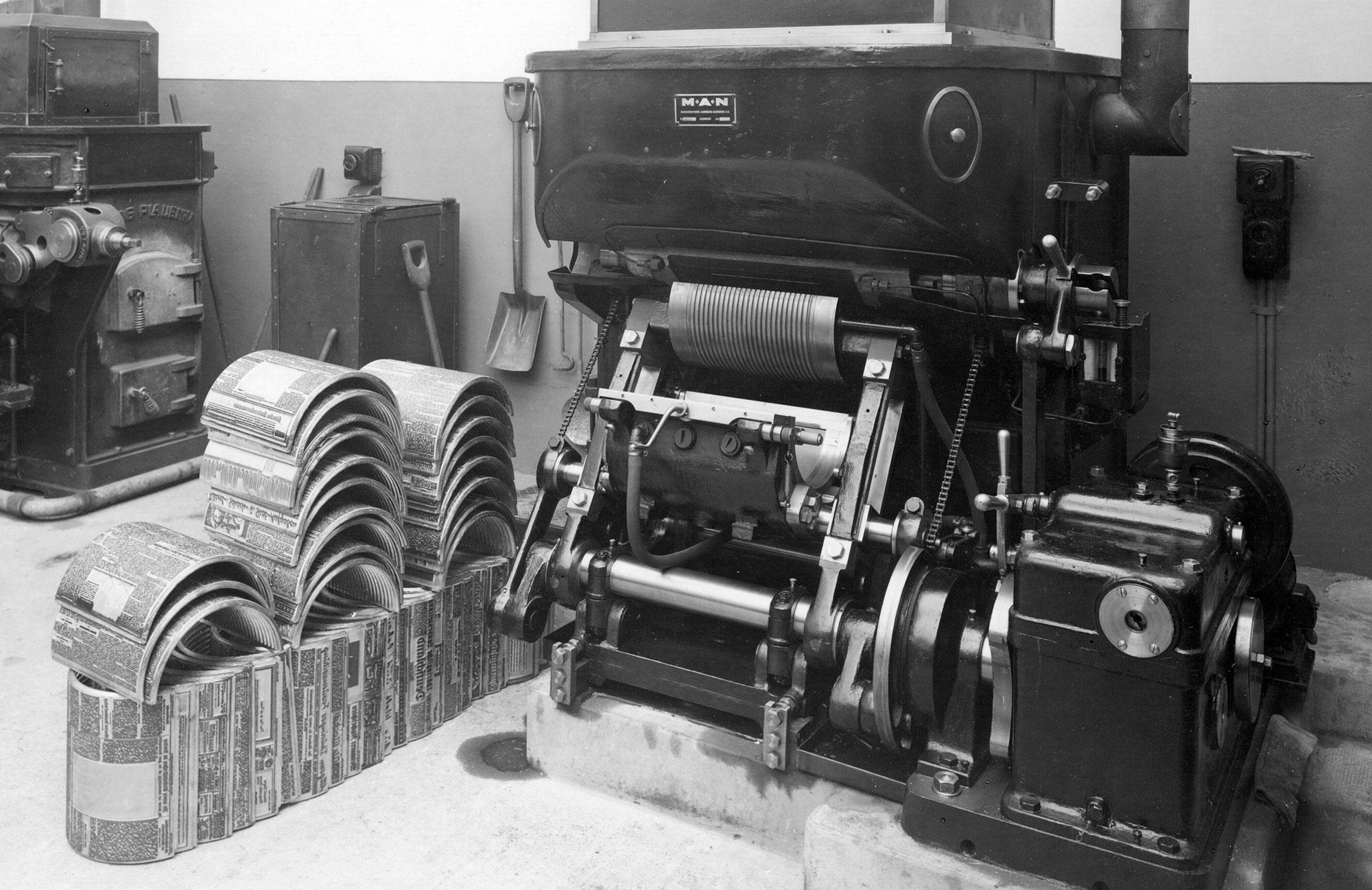
A machine for casting newspaper stereotypes in the early 20th century
And just like with the word cliché, people started to use the word stereotype outside the printing trade in a more metaphorical sense referring to generalized and replicated ideas or images.
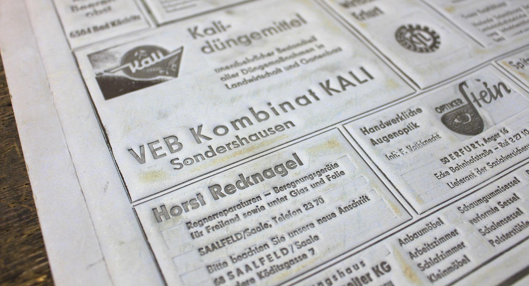
4. Being “out of sorts”
“Sorts” are the various pieces of type stored in the compartments of the type case. Being “out of sorts” (i.e. not having enough of certain letters in a font) remained a continuous problem for hand composition. The compositor’s misery in such cases continues to live on in the phrase “out of sorts”, now meaning “being mildly unwell”.
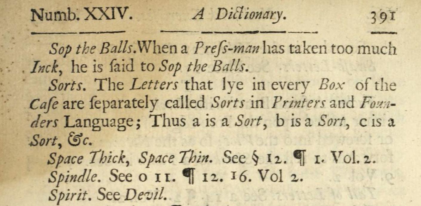
The definition of “sorts” in Joseph Moxon’s Mechanick exercises from 1683
5. Cut and Paste
This is a comparatively young phrase. It was coined in the days of phototypesetting in the second half of the 20th century before the introduction of desktop publishing. Before desktop publishing, the text columns were already created with (phototypesetting) machines, but the make-up or “paste-up” of the pages for printing was usually still done by hand. Columns, images, lines and even individual words had to be cut with scissors and scalpels to be moved to the right place and an adhesive (“paste”) was used to have all parts stick in place and allow further corrections until the finished layout could be photographed to be transferred onto an offset printing plate. Even though scalpels and adhesives are no longer necessary with digital type, the phrase “cut and paste” is still in use.
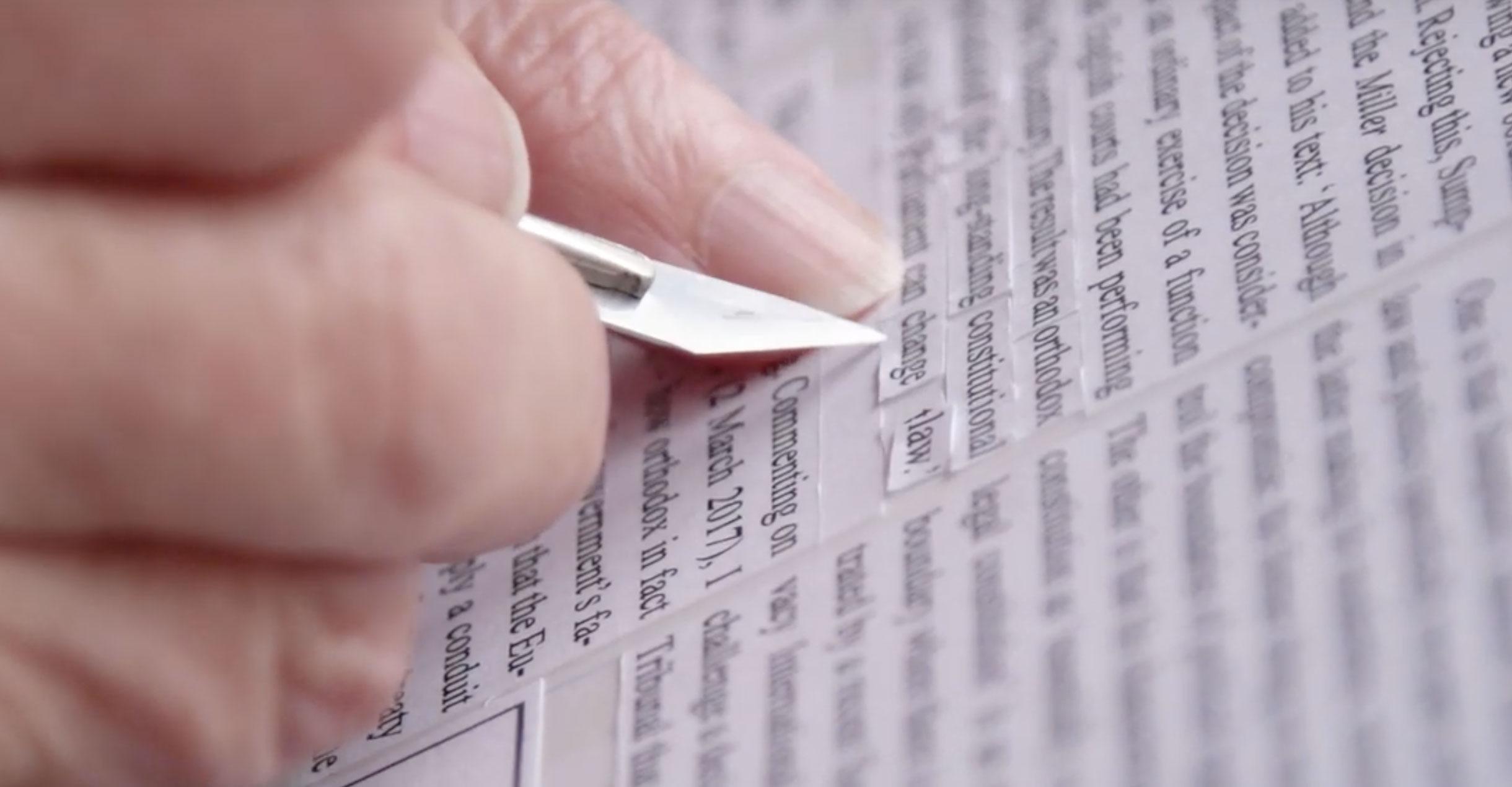
The video The Lost Art of Paste-Up in our video directory shows how this process was done in the past.
You know other interesting terms, which would fit in this article? Let us know in the comments below. And if you want to learn more about typography terms, check out our typography term glossary with hundreds of translations added by our community members.


Recommended Comments
Create an account or sign in to comment