Finding your way through a new city has never been easier than it is today. There is a wide array of gadgets available to help you locate yourself and your destination, plan out a route to get there, and take the right turns along the way. But as you follow along to the voice of your navigation system, how much are you actually learning about the environment around you? Could you retrace that same route the next day? Could you draw your path on a map? There is a growing body of both anecdotal and experimental evidence suggesting that turn-by-turn navigational guidance hinders learning. Once you’ve punched in your destination, your mind goes on cruise control.
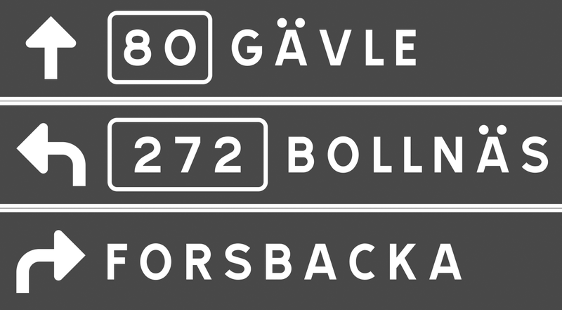
Typical directional signs, like in-car navigation systems, simply point you in the right direction at each turn along your route. Following a series of these signs, you might arrive at your destination without understanding exactly how you got there – or how to get back home. In a previous post, Ralf Herrmann explained this downside of directional signs:
Directional signage is purely egocentric. The signs will tell us to go left, right or straight at a decision point, without providing us information of how we move thru the environment in connection to cardinal directions or landmarks along the way. We will reach our target only if the signs work at every decision point. If one part of the way is blocked or we missed a sign, we cannot reach our target, because we have no idea where it actually is. And it will be hard to trace back our route to the starting point, because we just followed endless signs and did not built a large-scale cognitive map of the surrounding.
In a recent study, I aimed to identify how directional signs could be designed to not only get people to their destination, but also help them construct a mental map of the area along the way. Drawing from research in cognitive science, I predicted that road signs featuring highly simplified maps would encourage this spatial learning by showing travelers an image of the layout of the area. Using the guidelines for U.S. highway signage as a foundation, I developed three types of signs to evaluate, shown below.
The ‘separate’ type, which is the standard highway directional sign, uses arrows to indicate which way to turn to reach various destinations. Roads and towns are shown on two separate signs in order to not overload travelers with too much information at once. The ‘combined’ type shows route and town information all on one sign, and merges the simple arrows to form a schematic diagram of the intersection. This type of sign is much more common in Europe than in the U.S., and a similar sign is often used for roundabouts. The ‘cartographic’ signs display this same information in the form of a simple map, with route and town labels placed on lines that represent the roads.
Perspective and mental effort in wayfinding
These sign types connect to the different perspectives used to communicate or remember spatial information. The ‘separate’ and ‘combined’ types use the route perspective, while the ‘cartographic’ signs use the survey perspective. Route information, which is from a perspective within an environment, is a sequence of turns at decision-making points along a route. In contrast, survey information is from an imagined perspective above an environment, and can convey an interconnected and hierarchical network. With this more complex understanding of an area, it’s easier to identify shortcuts and alternate routes. In other words, you can communicate more complex information about the layout of an area by offering a map (survey perspective), than by providing a series of simple directional signs (route perspective).
These two perspectives also differ in terms of the amount of mental effort they require for navigation. To find your way using a paper map, for example, you must locate and orient yourself, identify your destination, plan a route to get there, and translate that route into a series of turn actions. A well-designed you-are-here map would help you with self-location and orientation, but you’re still on your own to plan out your route and the turns it would require. Following signs to your destination, in contrast, may not require any understanding of the broader layout of the area, because you’re provided with turn-by-turn guidance along the way.
In general, we prefer to do things the easy way when it comes to wayfinding. Most people with smartphones or in-car GPS would be unlikely to ditch them in favor of a paper map or gazetteer. But if you distilled a map down to only the absolutely essential information, could you give travelers a mental image of the layout of the area in only a few seconds? The aim of the ‘cartographic’ sign type, shown above, is to present the directional guidance offered at an intersection in the form of a simple map that can be read while driving past. By needing to interpret a map in order to make a turn decision, perhaps people will incidentally piece together a better ‘cognitive collage’ of their environment. (See: Tversky, B. (1993). ‘Cognitive maps, cognitive collages, and spatial mental models’, in Spatial Information Theory, Springer-Verlag).
How much can you learn from signs?
I’ll spare you the details of the experiment I developed to evaluate how well the three sign types support spatial learning, but if you have any questions or want to learn more, don’t hesitate to contact me. Basically, participants viewed a slideshow of signs as if driving through a fictional environment, and then were given an unexpected mapping task to demonstrate what they had learned from the signs. I then had the participants repeat the same sign viewing and mapping tasks, in order to see how much they could learn from the signs when they knew that they would be tested afterwards. In the first mapping task, people viewing the ‘cartographic’ signs constructed significantly more accurate maps than those viewing the other two sign types. This suggests that signs with maps do help people incidentally develop a mental map of their environment. What’s particularly interesting is that there was no significant difference between the map accuracy scores of the ‘separate’ and ‘combined’ sign groups. In other words, combining route and town information on a single sign didn’t really help people learn unless the information was presented in the form of a map (as was the case with the ‘cartographic’ signs) The second mapping task, which gauged how much people could learn intentionally, showed no significant differences between any of the sign type groups. Basically, when people knew that they would be tested on their knowledge of the area, the type of sign didn’t have a notable impact on how much they learned. In practice, however, intentional learning from directional signs is much less common than incidental learning. Would you focus on constructing a mental map of an airport as you follow signs to the baggage claim? Probably not. So while the results of the second mapping task are interesting to note, they’re less relevant to the practice of designing wayfinding signage.
Beyond the lab
While it may seem narrow and unrealistic to test changes to the carefully regulated signage of the U.S. highway system, it was in fact essential to start with such a restrictive wayfinding scenario. On the highway, you only have a few seconds to interpret each sign you pass by, so an overly complicated sign could be life threatening. For pedestrians, however, viewing time is much more flexible, which would allow you to include a greater complexity and quantity of information on a sign.
In other contexts, the possibilities are endless. Imagine pedestrian signs with simple maps that orient you relative to a river, coastline, or another key geographic landmark that’s not always in view. Or as you enter a grocery store you’ve never been to, imagine seeing a simple map of the different departments. (I swear I thought of that before I saw the sign below, at a Fred Meyer store in Oregon!) Imagine if the typical subway directional signs, which only show the name of the last station on a line, were supplemented with a simple map of which direction the line would take you in the city.
Whether you’re designing wayfinding guidance for drivers, bicyclists, pedestrians, or transit riders, the basic principle is the same: simple maps on signs can help people learn the layout of the area.
The full paper was published in the Cartographic Journal, Volume 49, Number 4, November 2012 and is also available online.


Recommended Comments
There are no comments to display.
Create an account or sign in to comment
You need to be a member in order to leave a comment
Create an account
Sign up for a new account in our community. It's easy!
Register a new accountSign in
Already have an account? Sign in here.
Sign In Now