

Search the Community
Showing results for tags 'belgium'.
Found 7 results
-

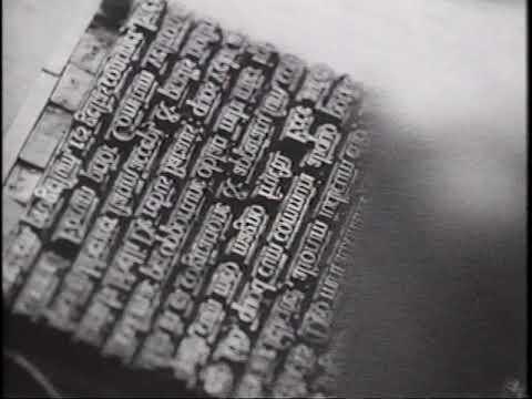 “The Making of a Renaissance Book”, originally issued as a black-and-white film shot on location at the Plantin-Moretus Museum in Antwerp, covers cutting a type punch; making a copper strike and justifying the matrix; casting and dressing the type; composition, imposition and proof-reading; inking and running off the sheets; stop-press corrections.
 -
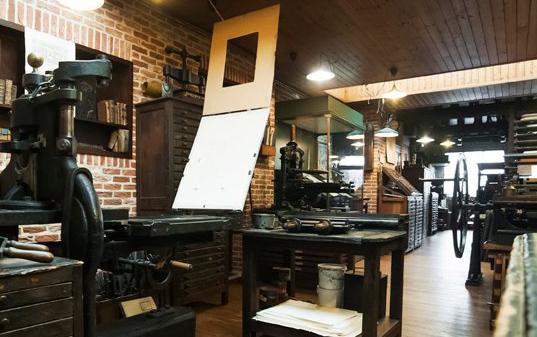 The “Historische Drukkerij Turnhout” is a printing museum in the city of Turnhout in Belgium. It opens every other sunday (free of charge) or by appointment.
 -
 A video about how music was printed during the Renaissance with examples from the Plantin workshop in Antwerp.
 -
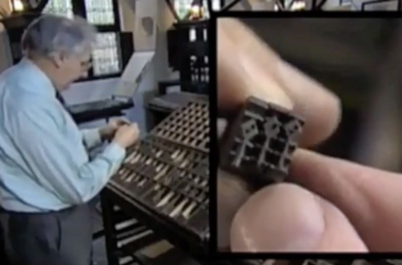
 The Plantin Institute of Typography, teaches Expert classes on Typography and related design. As an independent organisation it offers a unique program combining theoretical insights and historical backgrounds with technical knowledge and practical skills. The practica expert classes Type design and Book design are given annually and take place in the auditorium of the Plantin Institute of Typography in the Museum Plantin-Moretus/ Prentenkabinet in Antwerp. In adddition there are short theoretical modules Basic typography, History of the printed character and Letter design.
 -
 The Museum Plantin-Moretus is unique. It is just as if after 440 years the working day is about to begin for the type founders, compositors, printers and proofreaders in the world-famous printing works. The oldest printing presses in the world are there, intact and ready to roll. The offices and shop echo with conversations between Christoffel Plantijn and aristocratic and scholarly clients from all over the world. Feast your eyes on the home of the Plantin and Moretus families! Stroll through the drawing rooms, soaking up the atmosphere of life in Antwerp in the sixteenth and seventeenth centuries and admiring the impressive art collection which includes portraits by Peter Paul Rubens. Continue on your way through the rarefied libraries lined with the breathtaking 30,000 old editions that make up the Moretusses’ collection. Marvel at the magnificent manuscripts and some of the finest examples of European typography. Heritage comes alive The Museum Plantin-Moretus/Print Room is a dynamic museum. Highlights from the collection are shown in special exhibitions and other displays. The workshops are a chance for everyone to try their hand at printing, etching or bookbinding. Visitors who have been granted access to the reading room for research purposes can study the books, prints and drawings. There are fun trails through the house for children and opportunities for them to discover their creative side. Finally, the walled garden is an oasis of peace, conducive to a moment of quiet reflection.
 -
 The European Lettering Institute, set up by a team of professional lettering designers, is a unique place, combining education and creative entrepreneurship. The school is directly linked to Studio XII, a lettering design agency, run by Lieve Cornil, with over 20 years of experience. The programme offers students a full training in lettering & graphic design, aiming to develop a thorough practical knowledge of written, carved, handdrawn and digital letterforms, in a historical and contemporary graphic context.
 -
Legibility Research: Type Design for Children with Low Vision
Ralf Herrmann posted a journal article in Journal
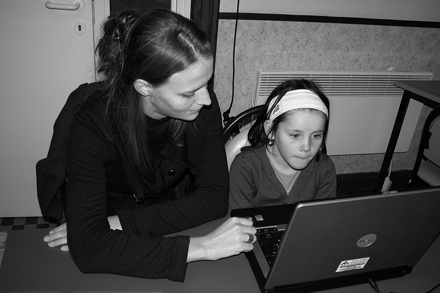 My PhD research ‘Type Design for Children with Low Vision’ is certainly the work I’m most proud of. For 6 years I studied the influence of design parameters in type design (serif and sans serif) aiming to improve the reading skills of children with low vision. Additionally I provided insights into the sensoric aspect when reading. Type design always was the central point throughout my research. Notice that I am a graphic designer and that I studied design in my higher education, but for my PhD I came across other scientific fields which were of huge interest to me. As a design researcher I developed a strong interest in legibility. In some ways it is nice to challenge yourself by integrating different points of view into design research, and to not just become a complacent designer. Staying critical in the creative process seems to be my approach to design. My doctoral dissertation is a design study that examines legibility and carries out a legibility research in the interests of children with a visual impairment. More specifically, this research aims at finding a meaningful sense of legibility within the context of low vision children and seeks to examine which typographical design parameters can influence the legibility for beginning readers with low vision. Finally the question is raised whether the findings, regarding legibility for visually impaired children and the possible influence of typography, can be used in the aesthetic design of a new font for this target group. Reading is done without consciously recognizing letters[1]. Nevertheless letters constitute an important aspect of determining legibility[2]. Letters need to be decoded in order to obtain meaning. Reading is a complex, cognitive and fast process. Children having serious problems with reading are at an increased risk to end up in a cycle of failure[3]. When reading is a slow and cumbersome process, it will have consequences for the cognitive behaviour and motivation. A person whose reading process is impeded is less able to develop both intellectually and socially. Because most of the process of learning to read is finished after the age of 9 it is important that children who encounter difficulties are supported in the initial stages of this process[4]. Due to the low quality level of visual input they receive in the form of printed text, beginning visually impaired readers are at a disadvantage in comparison to their peers. The reading process is disturbed due to a reduction in visual input[5]. Children with a visual impairment have problems with the decoding of words, the deciphering of visual patterns and the recognition of letters. Because their decoding is hampered, the reading speed is lower, which eventually can lead to cognitive problems. To improve the visual input, a lot of attention goes to optical reading aids or the use of large print. Large print is often seen as a quick fix to show that efforts have been made for the visually impaired. Research has shown that large print books are not so effective for the technical reading process for most of the children with low vision[6]. research and design In the past, typography has often been looked upon as a useful instrument to improve the legibility of the printed reading material that is being offered to children with low vision. However, the legibility research efforts that were at the base of this conception were not always of good quality. For the cognitive scientists this is all too often caused by inadequate domain knowledge of typography. For the designers, this is due to a merely intuitive way of approaching legibility research[7]. Many legibility studies focusing on the influence of design, both within cognitive science and within the design world, lack internal and/or external validity. This internal and external validity should be a prerequisite. Internal and external validity means that the testing material allows for isolating the effect of different design parameters on legibility (internal validity) and that the testing material allows for discussing the result with regard to printed matter used in daily life (external validity). Moreover, most legibility research focused on people with low vision in general, ignoring the fact that visually impaired children constitute a very particular group with specific issues. Both the fact that their reading process has just started, as well as the fact that their visual impairment is not caused by ageing, make it difficult or even impossible to simply transfer results. Another problem within the existing legibility research is the confusion regarding the term legibility. Many different groups of people (e.g. typographers, linguists, educationalists, ergonomics, psychologists, etc.) use the term and give it a personal related meaning without explicitly explaining it. The explanation is of importance to make legibility studies comparable. Within my PhD dissertation legibility is the ease with which visual symbols are decoded. This definition arose from the description of reading. Reading means: transposing visual symbols and converting them into linguistic meanings. To concisely define the term legibility attention goes to the two global and successive steps that occur when reading. Decoding and the acquisition of meaning, or the sensoric and the cognitive aspect of reading. Decoding or the sensoric aspect in reading is the conversion of the purely visual representation of words (which are not yet related to the meaning of these words). The definition used in this study is clearly related to this first sensoric aspect of reading. Comprehensive legibility research takes into account a clear definition and both scientific methods and typographic practice. A designer-researcher is able to combine these two and thus guarantee the internal and external validity of the test material. The methodology of the design research is systematically constructed. The design is the point of focus throughout the research. The methodology starts with the context which is shaped by theoretical research (consisting both of scientific and typographic matter) and practical work from other designers (mainly typefaces). This context will lead to an initial design that ultimately results in testfonts. During the process of designing the test typefaces the focus was on parameter designs. Departing from two existing typefaces (serif [DTL Documenta] and sans-serif [Frutiger]) a number of derived typefaces (five different parameters) was designed: variable x-height, conventional contrast, unconventional contrast, direction and rhythm. The five parameters were used to examine the balance homogeneous-heterogeneous in both form and rhythm. Using the concepts of homogeneity and heterogeneity we can say that in general sans serif typefaces are homogeneous within their letter forms and heterogeneous within their rhythm. With serif typefaces it is the other way around (certainly for serif typefaces based on the 20th century model): they are heterogeneous within their letter forms and homogeneous within their rhythm. Theoretical and practical insights concerning legibility in low vision children pointed in the direction of more heterogeneity. Notice that we never tested very extreme forms of heterogeneity. Experimental test The typefaces were tested by means of experimental (quantitative evaluation) and subjective (qualitative evaluation) legibility research. Both children with good eyesight and low eyesight were selected in order to study the reading skills and reading experiences in visually impaired children. For the experimental part a psychophysical method was applied, presenting the children with pseudowords in the test typefaces for a short time on a computer screen, registering the number of errors. Taking into account the legibility definition used in this study, it were mainly the decoding skills of the children with low vision that were needed for the execution of this task. Moreover, pseudowords were used because these specific nonexistent words are the perfect carriers of the basic fonts and their derived fonts since phonological rules and convention within letterforms remain, while semantic knowledge and the influence of the context are excluded. In the subjective part of the project reading experiences of children who were confronted with the test typefaces were examined. The children were asked to rank the test material, 12 fonts, by the legibility of the fonts. In het meanwhile it was examined which factors played a role in their subjective judgement by means of dialogue. Through the subjective legibility research, I was intensely involved with my target group before I started with the development of a final design. The feedback and the interaction with the children were of great importance for the design of the final typeface. The type designer very rarely gets immediate feedback from his readers. Type designers have always been very far behind the frontline when it comes to contact with the readers. The graphic designers, typographers, editors and publishers stand as a filter between the type designer and his readers. The legibility research results showed a rather early conditioning with daily reading material in beginning readers. Children associated sans serifs with school and considered them to be writable; serifs they associated with literature (e.g. books and newspapers) and they considered them to be difficult to reproduce themselves. The non-visually impaired children generally perceived the most conventional typeface as being the most easily legible one. Amongst the visually impaired children this was not always the case. Some of the children experienced social pressure to choose a normal letter. A remarkable finding is that children with normal vision read significantly better when the serif typeface DTL Documenta was used, instead of the sans serif Frutiger. This result is somewhat surprising because children (especially beginning readers) are mainly confronted in primary school with a sans serif. Zuzano Licko’s (1990) known quote: ‘…the readers read the best what they read most’ is thus jeopardized, certainly for beginning readers in the age group of 5-10 years. The teachers’ belief that letters for beginning readers should look as simple as possible and should reflect handwriting is falsified by this study. In visually impaired children the difference between both typefaces is less pronounced. During the reading (decoding) process non-visually impaired children appear not to be hampered by a homogeneous rhythm, but rather by a homogeneous form. The children with low vision however, seemed to be hampered more and even in particular by a homogeneous rhythm. Within the DTL Documenta font set (the basic font with a homogeneous rhythm) the design parameters – rhythm and direction – that made the rhythm the most heterogeneous, had the most positive effect on legibility (in terms of decoding). It appears that for visually impaired children a more irregular rhythm is beneficial for their reading. Also it may be so that a certain degree of formal heterogeneity offers support (as we saw with the normally sighted children). Matilda typeface Starting from these findings, together with my own understanding, knowledge, intuition and ideas as an design researcher, a typeface called Matilda was designed that is able to provide support for the target group of visually impaired children in the first stages of the reading process. The new typeface is similar to the basic fonts DTL Documenta and Frutiger in terms of letter width and text colour. Matilda is based on a serif typeface, in order to reduce the gap between the reading material for non-visually impaired children and those with low vision. Furthermore design parameters within the DTL Documenta font set had the most positive effect on the decoding skills for children with low vision. Matilda is in full development and a growing type family (also ready to test within new legibility research). The typeface includes a serif, an italic, a bold, a sans serif. Matilda is also extended by the design parameters that were most helpful to improve the decoding process of children with low vision. These are mainly the parameters rhythm and direction. More research will be done because it would be interesting to know in which a lesser degree is still helpful. Also the outcome of interaction effects would give more insight in legible fonts for children with low vision (and human perception). The main characteristics of Matilda are wide, open and round letters which have a friendly feeling. The letters are dynamic and solid, constructed and organic. The letters are built on a rather stable and vertical axis. The curves are open, the serifs are asymmetric, convex and concave. There are ball terminals to emphasize the letter terminations to augment its individuality and distinctiveness. The low contrast in the letters is necessary to easily enlarge or reduce text. If children with low vision are reading in different contrasts/colours (they often do by computers) the letters need to remain very clear. Matilda doesn’t have a very large x-height. The ascenders and descenders provide enough room for diacritics. Future research Typography is a crossing of several academic disciplines. Reading has been thoroughly studied in terms of how language is processed by the brain (e.g. psychology, neurology, pedagogy, linguistics) but reading scientists care mainly about what happens cognitively. When people see fonts and words, they are barely aware of the sensory aspects (perception and transformation of the visual stimuli). Although the latter is extremely valuable for the investigation of better reading materials, the number of theories devoted to the visual perception during the reading process[8] is limited. My new legibility project wants to shed a light on the degree of rhythm heterogeneity that is needed for reaching optimal legibility. The new research will also relate spatial frequencies to the rhythm within type. Whereas it has been proved that spatial frequencies – which play a central role in many theories on (letter) recognition[9] – are used when we read, no one has ever empirically shown the value of even typographic colour and good rhythm. You could reasonably argue that spatial frequency channels (or a periodic stripe pattern) within typefaces suggest that they should be valuable for normal readers (no impairment), but there is no data to support that thesis. In contrast to the previous there is data, including my own doctoral research, that proves that (some) stripe patterns within words slow down reading for specific groups of people[10]. My future aim is to gain more insight in the legibility of printed matter by studying stripe patterns (and spatial frequencies) within words during reading, link these to spatial frequencies when reading and translate this information into practical type designs. In other words, this research wants to investigate to what extent the rhythm and spatial frequency within a typeface can improve/declare legibility for normal and poor readers (e.g. low vision readers). This is in line with the findings of my doctoral dissertation where disturbed stripe patterns within words resulted in better decoding skills (and thus legibility) for those with a less developed perceptual system. Bibliography Bessemans, A. (2012). Letterontwerp voor kinderen met een visuele functiebeperking. (Dissertation, Leiden University & Hasselt University) Bessemans, A. (2012). Research in Typography. Typo 47, 60-63. Corn, A., et al. (2002). An Initial Study of Reading and Comprehension Rates for Students Who Received Optical Devices. Journal of Visual Impairment & Blindness May, 322-334. Dyson, M. C. (1999). Typography through the eyes of a psychologist. Hyphen, 2 (1), 5-13. Gompel, M. (2005). Literacy Skills of Children with Low Vision. (Dissertation, Radboud University Nijmegen) Gompel, M., et al. (2003). Visual input and Orhtographic Knowledge in Word Reading of Children with Low Vision. Journal of Visual impairment and Blindness May, 273-284 Hughes, L. E., & Wilkins, A. J. (2000). Typography in children’s reading schemes may be suboptimal: evidence from measures of reading rate. Journal of Research in Reading, 23 (3), 314-324. Jainta, S, Jaschinski, W., & Wilkins, A. J. (2010). Periodic letter strokes within a word affect fixation disparity during reading. Journal of Vision 10 (13), 1-11. Licko, Z. (1990). Do you read me? Emigre 15, 1-36 Lovie-Kitchin, J., et al. (2001). Reading performance in children with low vision. Clinical and Experimental Optometry 84(3), 148-154. Lund, O. (1999). Knowledge construction in typography: the case of legibility research and the legibility of sans serif typefaces. (Dissertation, The University of Reading) Majaj, N. J., et al. (2002). The role of spatial frequency channels in letter identification. Vision Research, 42, 1165-1184. Marquet, R., et al (2006). Slecht leren begint met slecht zien. Klasse 163, 10-13 O’Hare, L., & Hibbard, P. B. (2011). Spatial frequency and visual discomfort. Vision Research 51, 1767-1777 Rayner, K., & Pollatsek, A. (1989). The Psychology of Reading. New Jersey: Prentice Hall. Snowling, M. J., & Hulme, C. (2005). The Science of Reading: A handbook. Oxford: Blackwell Publishing. Solomon, J. A., & Pelli, D. G. (1994) The visual filter mediating letter identification. Nature 369, 395-397. Stanovich, K. (1986). Matthew effects in reading: Some con- sequences of individual differences in the acquisition of literacy. Reading Research Quarterly XXI/4, 360-407. Unger, G. (2007). Typografie als voertuig van de wetenschap. Amsterdam: De Buitenkant. Warde, B. (1956). The Crystal Goblet. Sixteen Essays on Typography. Cleveland: The world publishing company. Wilkins, A. J. (1995). Visual Stress. London: Oxford University Press. Wilkins, A. J., et al. (2007). Stripes within words affect reading. Perception, 36, 1788-1803. Wolf, M. (2007). Proust and the Squid. The Story and Science of the Reading Brain. New York: HarperCollins Footnotes ^ Warde 1956, Unger 2007 ^ Rayner & Pollatsek 1998 ^ Stanovich 1986, Wolf 2007 ^ Stanovich 1986, Marquet et al. 2006 ^ Gompel et al. 2003, Gompel 2005 ^ Lovie-Kitchin et al. 2001, Corn et al 2002 ^ Dyson 1999, Lund 1999, Bessemans 2012 ^ e.g. Snowling & Hulme 2005 ^ e.g. Solomon & Pelli 1994; Majaj et al. 2002; O’Hare & Hibbard 2011 ^ Wilkins et al.1995, 2007; Hughes & Wilkins 2000; Jainta et al. 2010
-
- 5
-

-

-
- belgium
- legibility
- (and 2 more)

