

Search the Community
Showing results for tags 'sharp s'.
Found 5 results
-

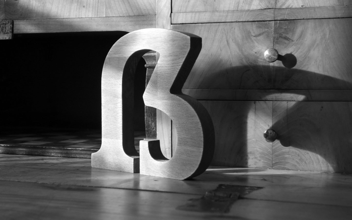
The Multifaceted Design of the Lowercase Sharp S (ß)
Ralf Herrmann posted a journal article in Journal
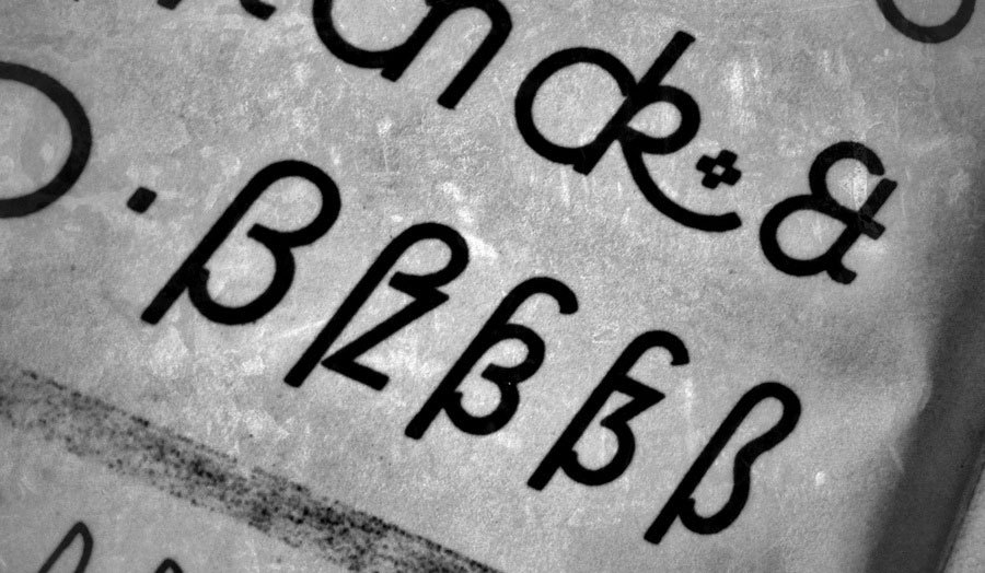
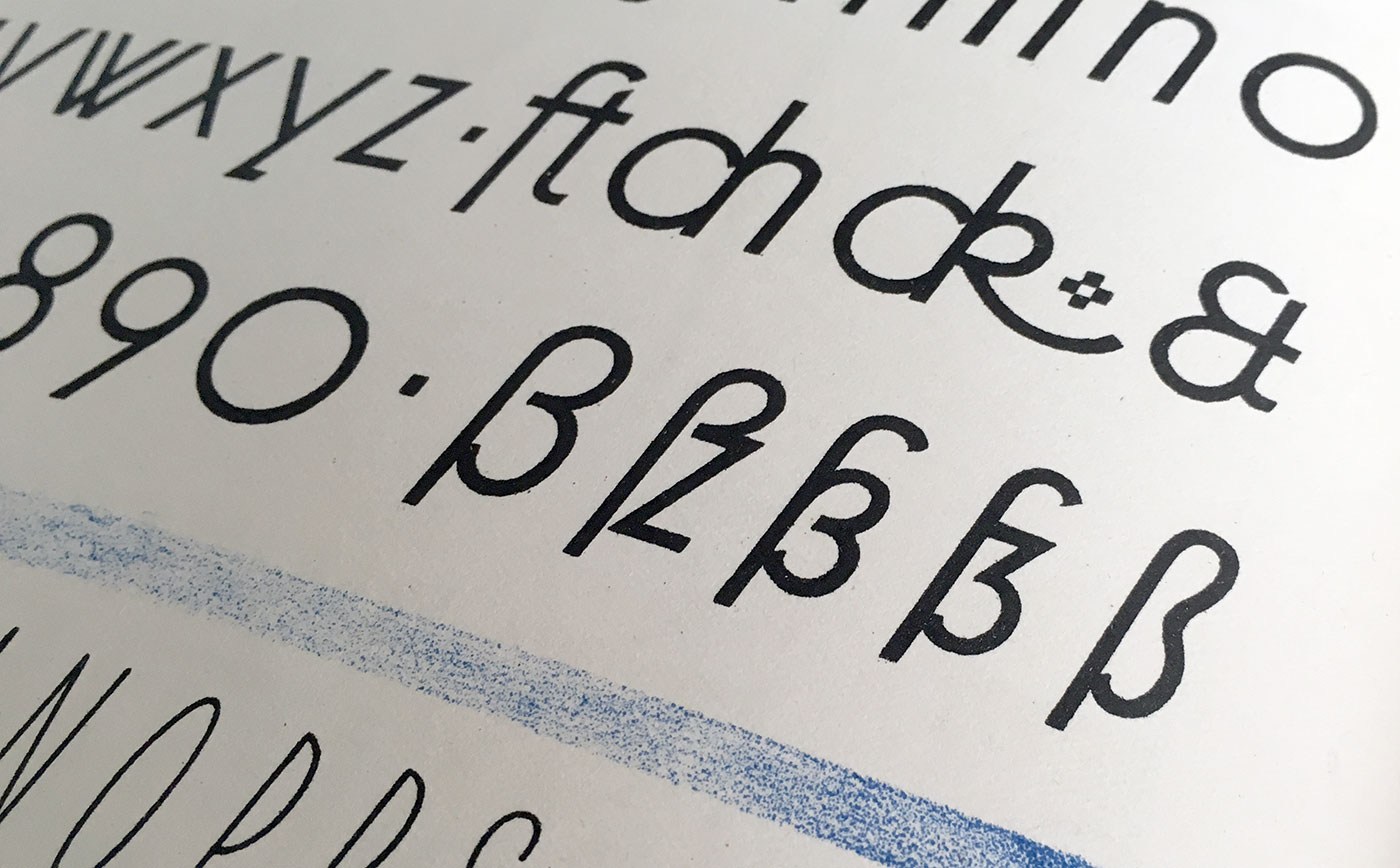 The sharp s (or “Eszett” as it is called in German) is a letter of the alphabet in Germany and Austria. The Unicode casing rules state: “The German es-zed is special”. Indeed it is! Its (still not fully explained) history is full of twists and today’s understanding of this history is often full of misunderstandings. The origins of this character won’t be the discussed in detail in this article. Instead I will focus on the stylistic options which have resulted from the recent history. Sharp s variations for an alphabet in a lettering/calligraphy book from the 1930s by Willy Schumann Today there are two standard models for the design of the ß character. They are explained at first and are recommendable for most of today’s typefaces. 1. The ſs Ligature Design This design is both very old and rather new at the same time. It was used for centuries across Europe, especially in cursive writing, either as a purely stylistic choice or in accordance with a typesetting practice which avoided a long s as the end of words and therefore displayed a double s (ſſ) as ſs, either visually connected or not. ſs ligatures from Giovanbattista Palatino, from a 1578 compendium Since this design in its connected form is so visually similar to the typical modern German ß, it is often mistaken as the actual origin of the German character. But using this design for German texts is a rather new practice, which only became typical since around the middle of the 20th century. At that time, the roman and italic type styles of the Latin script replaced blackletter and Kurrent for German texts and with that, the influence of blackletter on the design of German typefaces started to vanish. Typical German blackletter ligatures (such as ch, ck, tz) came out of use and the understanding of the ß character shifted slowly. In caps-only typesetting the ß would be set as SZ in the beginning of the 20th century, but later SS became more common and finally the only correct spelling—until the introduction of the capital sharp s. Without the influence of blackletter, a German alphabet in the roman type style was now again more clearly based on designs from the time of Classicism and Renaissance and the historic ſs ligature became a perfect fit for the German ß—both in its design and the understanding of the character. Using this ligature design is the typical choice for so-called humanistic typefaces, i.e. designs which have their roots in the traditional book typefaces of the Renaissance. Both serif and sans serif typefaces can use this design model of the sharp s character. The ſs ligature design in Optima and Syntax Designing the ß in this style is rather simple, since it really is just ſ and s connected with an arc. The connection however is mandatory today. While an unconnected design is a historic variation, it won’t be accepted by today’s readers. The upper counter area is ofter narrower than the lower counter area, as it can be seen in the examples above. But there are also typefaces with a more prominent upper counter area, especially in italic styles. The sharp s in Sabon The arc and the s shape usually connect as one continuous curve, but there are a few typefaces which stress the different letter parts more clearly by making an abrupt change of direction. This can also work fine. But just to be clear: German readers without a background in typography see the ß as one character. Stressing ſ and s as individual parts of that design is neither expected nor necessarily helpful. Just as a W exposing its origin as ligature of two V is a possibility, but not necessarily helpful. The sharp s in Utopia and Calibri The ſ in its upright version might have a horizontal stroke on the left side and the ß then gets this stroke as well. This is a traditional design feature, but not really required. In my opinion, it only supports the confusion of ſ and f and therefore the horizontal stroke might also be omitted for ſ and ß in modern typefaces. Either way, ſ and ß should always follow the same principles. And speaking of the long s: It will usually have a descender in the italic design, but not in the roman version. The same is true for the sharp s. Upright and cursive styles of Tierra Nueva. 2. The Sulzbach Design As already mentioned, German was mostly set in blackletter (or written in Kurrent) until the middle of the 20th century and the sharp s as German character was established and mandatory in these type and writing styles. When German was written or set in the roman type style, a counterpart for the blackletter ß wasn’t available for a long time. As a result we can find different alternative spellings until the end of the 19th century. For example: a word like “groß” (big) in blackletter could appear as gross, groſs or grosz in roman typefaces. German book from 1795 in a roman typeface (Prillwitz Antiqua) using ſs where a blackletter text would always use ß. Around 1900 an official German orthography was established and a committee of type founders and printers met to define rules regarding the design and use of German characters like ß, ö, ä, ü in upper and lower case. At that time, typesetting and writing German in the roman style had already gained popularity and there was a need to find solutions and regulations regarding the different practices used for blackletter and non-blackletter typesetting. Some differences were kept, some things were unified. The ſ character was kept for blackletter, but dropped for setting German in roman and italic typefaces. The ß on the other was understood as a character of its own, which had become so important, that it was decided to add it to all typefaces, not just blackletter ones as before. All German type foundries should add it to their roman and italic designs. The design proposal that was chosen had similarities with an unusual letter used in the 17th century by the printer Abraham Lichtenthaler in the city of Sulzbach and is therefore now known as “Sulzbacher Form” (Sulzbach design). Sharp s in the Sulzbach design added to Walbaum Antiqua in the 20th century. In the time of Justus Erich Walbaum such a roman typeface had no sharp s. The new design doesn’t include a clear s or z shape, but consists of a long s at the left side and two connected arcs on the right side. As a result, the letter often looks like an uppercase B to people not familiar with German. This design was applied to many German non-blackletter typefaces after 1903, including the traditional old-style and modern typefaces. It remains in use until today, but mostly for more geometric/constructed typefaces, where the simplicity of the two arcs works better than the flowing connection of the upper arc of the long s with a lowercase s. Sharp s in Futura The Sulzbach design can more easily use an upper counter area that is similar in size and as width as the lower counter area. A tear-shaped or ball-shaped terminal can be used for serif designs. The connection of the two arcs in the middle should reach to the left as far as necessary, to make the character legible, but not so far as to suggest a connection with the stem – after all, it is not a B. And of course the aperture at the bottom should not be closed. Sharp S with teardrop terminal in this version of Bodoni The Sulzbach design is also the standard model for German handwriting. It will usually be written with a descender and fonts might replicate this. Sharp s in German in the historic Kurrent handwriting Handwritten sharp s FF Schulschrift The Schulbuch typeface is aimed at children learning to read and uses the descender of the handwritten sharp s. The two models explained above should suffice to design a proper ß for almost all roman and italic typefaces, but there are more variations in existence. For the sake of completeness they are shown below. They should only be used where appropriate. An unusual design of the ß character can make a typeface unsuitable for setting German, especially when it is supposed to be used for copy texts. It’s often better to include uncommon/historic designs as stylistic alternates and put a standard ß in the default slot for this character (U+00DF). The beautiful sharp s in the metal version of Bernhard Schönschrift (1925) The unusual sharp s in Ratio-Latein (1923) Historic Variation: The “Blackletter ß” With German blackletter and non-blackletter typefaces being used side by side since the end of the 19th century, type designers also started to mix elements of the two. The sharp s in blackletter Blackletter fonts became more simplified and the letter skeletons of the early blackletter fonts became more popular, which were still closer to the design of the roman letter style. And roman typefaces from German foundries started to “look more German” in the first half of the 20th century. The mandatory ligatures of blackletter typesetting were often added to the character set of the roman typefaces and the design of individual letters was also borrowed from blackletter typefaces. A typical case for that is the sharp s character. Many, but not all typefaces used the recommended Sulzbach design. A design as a ligature of a long s with something like a 3 with a flat top resembled the typical look of a blackletter ß and also became a popular choice until the middle of the 20th century. The blackletter-inspired sharp s in Erbar Meister-Kursiv by Herbert Thannhaeuser, 1952 Technotyp by Herbert Thannhaeuser, 1948 Not using a descender is also possible for this kind of sharp s Because the “blackletter sharp s” in roman typefaces is typical for the first half of the 20th century, its use can still evoke a connection with that time. It appears—as default or stylistic alternative—in a few modern typefaces as well (e.g. FF Kava, Verlag, Metric, DIN Next Slab) and is legible within a word context, but it is not something that works for every font or use case. The examples shown above represent the most typical design of this “blackletter sharp s” approach. But as a variation, some typefaces also use a design that looks like a 3 with two arcs or a z design on the right side of the ligature. These designs might not work so well for today’s readers. The sharp s in Ehmcke Antiqua (1909), which is also in the digital versions named Carlton. The URW++ version of Bodoni While used occasionally in the 20th century—a literal Eszett (“sz”) ligature is not recommendable today. Historic Variation: The Connected Script ſs Ligature I already explained the ligature of a long s and a round s where the top part of the long s is used to make the connection to the round s. But in connected cursive writing there is also a way of writing a regular long s and then making a connection from the bottom, usually as extension of a descender loop in the long s. This style can also be found across Europe and across different languages over several centuries. It usually just represents a double s, but in a German text that isn’t written with a long s as individual character, this design represents the sharp s, as seen in the following examples. From an original type specimen booklet of Justus Erich Walbaum from the early 19th century. “daß” and “bloß” are typeset as “daſs” and “bloſs”. This design can be found in use until the 20th century, but it not common anymore and will probably confuse many of today’s readers of German. An undated German school poster shows the connected script ſs ligature as alternative to the regular ß in the Sulzbach design.
 -
Capital Sharp S designs. The good, the bad and the ugly.
Ralf Herrmann posted a journal article in Journal
 Two years ago I wrote an article with suggestions on how to design a Capital Sharp S (ẞ). Now that over 600 new type families with support for this new character have been released, I thought it would be a good time to review, how the type designers have drawn their Capital Sharp S. At first, I present the designs I consider most successful, grouped by their design principle. There is a convention in German of naming different designs of the uppercase and lowercase Sharp S by certain cities and I am following this convention. Design “Dresden” with a an arc at the top left This is the design most typefaces use. It works like a capitalized form of the lowercase character (ß). But in contrast to the lowercase design it has a diagonal stroke at the top right in order to differentiate it from the letter B. Note how wide the character is in those examples. Designs that start from the lowercase ß can easily be too narrow, which might not be ideal among the other uppercase characters. Typeface shown above: Espinoza Nova, Henriette, Ernestine, Scotch Modern, Andron, Museo Slab Design “Dresden” with a corner at the top left In the sample shown above, the arc on the top left is derived from the lowercase letter ß. Some designers think, that such an arc doesn’t work well within the Latin uppercase letters. So, to avoid this “lowercase look”, one could draw the top left of the Capital Sharp S as a corner. This works especially well with more geometric typefaces. Typefaces shown above: Iwan Reschniev, Backstein, Hypatia Sans, LiebeRuth, Rooney Design “Leipzig” This design uses a clearly visible S as the right part of the Capital Sharp S. It works especially well with typefaces with a more calligraphic look. Very few typefaces use it, even though it is an interesting design that doesn’t cause any ambiguity problems. Typefaces shown here: FF Oneleigh, Numina, FF Fontesque Design “Zehlendorf” This is a new approach that was introduced by Martin Wenzel and Jürgen Huber within their design for the corporate typeface of the German government. They named it “Zehlendorfer Form” after the district in Berlin where their office is located. Its design falls right between “Dresdner Form” and “Leipziger Form”. It doesn’t use a diagonal stroke in the top right part, but a narrow S-like arc. The white-space and width of the character makes it very distinct. Its very legible and cannot be mistaken for a B. Conclusion Up to this point in time, the design model “Dresden” is clearly the most popular one for designing the Capital Sharp S. But I would be happy to see more of the design model “Leipzig” (third letter) and “Zehlendorf” (fourth letter) in the future. What not to do: A rounded top right segment Not all Capital Sharp S designs are convincing yet. The problem I have seen most is to stick too close to the lowercase design of ß and give the Capital Sharp S a rounded top right part. This results in something like an “ugly B”, but cannot be read easily as sharp S (ẞ). I suggest this simple test: First, cover the left side of the letter. Now check: can the remaining right side be read as a B? Then the design should be improved. What not to do: Using a double S design I have seen several typefaces which just put SS in the slot for Capital Sharp S. This is like putting two independent V in the slot for W. Yes, there might be a historic, typographic or orthographic connection, but it’s still wrong. The Unicode slot U+1E9E was created for the character Capital Sharp S. A W is not the same as VV and ẞ is not the same as SS. If you don’t like the idea of a Capital Sharp S, you better not use U+1E9E at all. But don’t put a double S in it. In the same vein, don’t try to create an uppercase SS ligature as Capital Sharp S. The whole point of the Capital sharp S is, that ß and ss represent a different pronunciation nowadays and without ẞ this difference cannot be maintained in uppercase-only typesetting. So an SS ligature doesn’t solve anything. It is just read as SS and not as a representation of the sharp S character.
- 4 comments
-
- 1
-

-
- type design
- capital sharp s
- (and 3 more)
-
 The letter ß came into existence in German blackletter writing, where it didn’t require an uppercase counterpart, because it stood never at the beginning of words and blackletter was never set in uppercase only. But since German is set in Roman script, there is an obvious gap in the German alphabet. Proposals to fill this gap were made since the 19th century. Here are designs that were discussed at the beginning of the 20th century: A commission of German publishers, printers and type foundries introduced the lowercase ß when German was set in Roman script, but the introduction of a capital ß was postponed because the commission could not agree on a design at this point. This comes as no surprise, because it had to be created from scratch and there was nothing to base the design on and the German readers where not used to see such a new character in their alphabet. New proposals appeared in the 1950s in the German magazine Papier und Druck: Even though the capital ß never became an official part of the German orthography during the 20th century some type foundries included it in their alphabets and it appeared occasionally in print. The Capital Sharp S today Since 2008 the capital ß is an official part of Unicode and it is now included in more and more typefaces. But type designers are unsure about how to draw this character. Here are some thoughts from a German type designer and reader on the different approaches … The Ligature Approach Not true! In German blackletter writing ß was understood as combination of long s (ſ) and z. We still call this character “Eszett” in German which just means “SZ”. So that’s the reason why many of the proposal shown above are drawn as an uppercase SZ ligature. And SZ was also the recommended replacement for ß in uppercase writing in the beginning of the 20th century. The dictionaries called this an interims solution to be used until a proper capital sharp S has been introduced. Over time, SS also became another replacement for ß in uppercase and by the end of the 20th century the original replacement with SZ was dropped and SS remained the only official writing according to the German orthography. Type designers are drawn to this ligature approach for the design of the uppercase ß, because it sounds like the most logical thing to do in terms of the history of the lowercase character. But I don’t think so. First of all: the history of the letter ß has yet to be fully explained. At this point we cannot be sure that it has definitely derived from a ſs or ſz ligature. And creating a new character based on assumptions alone, would not be a good idea. Secondly, the knowledge that ß has probably derived from a ligature is purely limited to typographers and graphic designers. Young German readers today don’t know a long s anymore and they don’t see the character ß as a ligature either. To them, it’s just a letter of the alphabet, just like any other letter. So they don’t expect an uppercase ß to look like a ligature. Letters are just conventions among the people who use them. They are “correct” when they are accepted by the users of this language—not because they are correct in a certain historical sense. And this is true for all Latin letters. We don’t draw an A so it looks like a Mediterranean ox head—we draw it the way, people are used to. In the same way, a capital ß should be designed according to the user’s expectations and not according to a possible, but still unclear history of the letter ß. It needs to work as a tool of communication and that is all that matters. A ligature approach using S and Z would certainly be possible, just like Æ and Œ are part of the Latin script. But I don’t think it would be desirable. It’s a forced design that doesn’t develop naturally. Even though some of the SZ ligature designs presented above look pretty nice, they feel more like stylistic ligatures for display use and I don’t see them as something Germans would want to use on a regular basis or for example in fine print or handwriting. Another popular idea among type designers is a design based on two S (see image above). But this is not an option at all! The whole point of having ß in the German alphabet today, is that it represents a different pronunciation than ss. An uppercase SS ligature will be understood as a stylistic ligature as you can see in this example: It represents “Professor” with a short vowel in front of the SS. So we can’t use a SS ligature as an uppercase representation of ß. The diacritical mark approach Diacritical marks are used frequently in languages which are written in the Latin script and in the old proposals for the capital ß several solutions are presented that use an S as the base glyph and added diacritical marks above, below or inside the letter. But a diacritical mark that is just used in the uppercase version and has a totally different counterpart in lowercase writing would be a very strange thing. German readers would only see it as a strange S, not as a capital ß and such a solution has little chance of getting accepted. The arbitrary shape approach Instead of using ligatures or diacritical marks the uppercase ß could also be based on arbitrary shapes. We could create a totally new character that would be in harmony with the design principles of the Latin script or we could borrow a design from a different language that isn’t used in German. But again: such solutions have little chance of getting accepted. The uppercase ß will hopefully be used more and more over the next couple of years and maybe even become an official norm. But if someone just uses an arbitrary shape today, it is very unlikely that Germans would agree to this design. The capitalized Eszett If you look at the capital sharp S designs that were introduced in the last couple of years, it is pretty obvious which approach is the most promising one. It is to start from the shape of the lowercase ß and turn it into a design that fits the uppercase letter. And that’s not a surprise: people in Germany and Austria often deal with the gap in their alphabet by simply using the lowercase ß inside uppercase writing. You can see that in Germany every day—from handwritten notes to TV ads. But the lowercase ß doesn’t belong into uppercase writing and the simple and obvious solution is to equip the German users with an uppercase Eszett that can easily be used and read, but looks also typographically correct in uppercase writing. And this is the solution I am also suggesting. The German readers don’t need to learn something new. They understand this letter instantly and the use of it solves all the common problems that result from the gap in the German alphabet. So how should this capitalized ß look like? There are now over a 100 designs done in this fashion and some work better than others. Here are a the two basic principles to design a capitalized ß: The left one is the most common design. The defining characteristics are the aperture on the bottom and the diagonal stroke on the top right side. The top left is usually done as a curve, but there are also designs where this part has been drawn as a corner or even with a serif. It also doesn’t hurt to make the capital ß wider than letters like B, but that is not a real requirement. The version on the right might fit in better with more calligraphic typefaces. The stem can even get a descender in italic version. Here are some examples of this approach which I consider successful: Note: The top right part is what makes this character unique! So make sure, you design this part in a unique way. The following example does not work for me … I just read it as a B, even though it has an aperture at the bottom. The top right part is what matters and it should never be rounded like a B. Make sure this curve is clearly broken by a diagonal stroke or even an inward S-like shape. So draw it either like this … or like this …
- 1 comment
-
- 1
-
-
- type design
- capital sharp s
- (and 3 more)
-
Typographic Myth Busting: What’s a Ligature, Anyway?
Ralf Herrmann posted a journal article in Journal
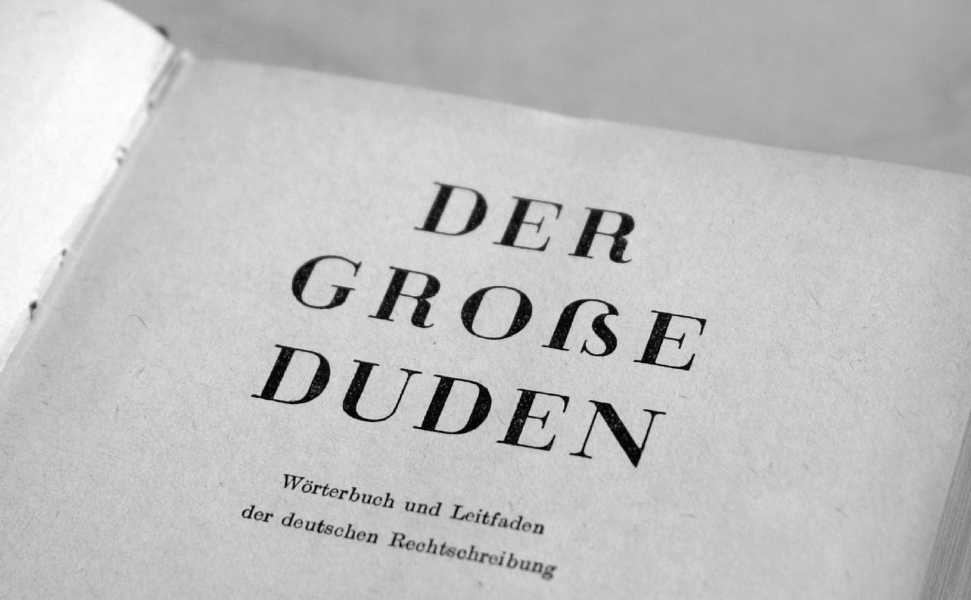
 We usually use the term ligature when we want to talk about a certain kind of ligature, to which cases like fi and fl belong. Their use suggests, that there are “real” letters of the alphabet like a, b, c and then there are ligatures like fi and fl. People then assume, that when something is a ligature, it cannot be a “real” letter of the alphabet. But this is not true. The truth is, that the term ligature just means “connection” (from Latin ligari). The term itself doesn’t imply a certain purpose or use itself. Today, there are two possible ways to define a ligature and both ways can appear in connection or individually. If we talk about the appearance of type, a ligature is made from two or more letters, which appear connected. In hand writing such connections are created all the time. But since the invention of moveable type, a new and more technical definition has appeared. When in metal typesetting two ore more letters are cast together to one sort, this is considered a ligature. This use in metal type has also transcended into the digital age. Ligatures are now usually included as single glyphs in a font, even though they might represent different characters in the underlying text. Often these definitions of appearance and technical implementation occur in combination. For example, the the “f” and the “i” in the fi ligature are visually connected and included as a single glyph in a font. A typical typographic ligature as one glyph But “f” and “i” might also appear connected, even if they are separated glyphs, just because the arc of the “f” extends over the right side bearing of the glyph. On the other hand, a type designer might create an fi ligature, where the unwanted collision is avoided by drawing an “f” with a shorter arc. Then “f” and “i” don’t appear connected, but they are still displayed using a ligature in the technical sense. A technical ligature, where the letters appear optically unconnected As we can’t judge a book by its cover, we also cannot always tell from the appearance of a text, whether or not ligatures have been used. Classifying Ligatures If its not clear from the context, it is a good idea to specify the types of ligatures we talk about. There are basically two main categories: typographic and orthographic ligatures. Typographic Ligatures These ligatures are just connected for typographic reasons. In today’s digital typesetting with smart-font technologies like OpenType we usually divide typographic ligatures in Standard Ligatures and Discretionary Ligatures. The first group of ligatures (fi/fi/ff/Th …) is usually applied by default, because they are considered an improvement of the text setting. Discretionary Ligatures (ct, st …) are used as stylistic option, often used in headlines or logotypes. Note that typographic ligatures never affect the orthography of the underlying text. As the name suggest, they are purely typographic. Orthographic Ligatures These ligatures serve a very different purpose than typographic ligatures. The best example of this category is the letter w/W. It actually derived from a ligature of two V or U, which were not differentiated at that time. And that’s why this character is still called Double-U. From this example it should be clear, that it doesn’t make sense to make a distinction between “real” letters and ligatures. In contrast to typographic ligatures, orthographic ligatures are not optional. Even though they might be derived from a ligature historically— in today’s orthography of a certain country they only stand for themselves and cannot be separated like an fi ligature. They are treated like any other letter of the alphabet. And that’s why they also usually exist as a lowercase and uppercase version. Typical orthographic ligatures in the Latin script are w/W, æ/Æ and œ/Œ. Orthographic Ligature or Digraph? But beside the obvious cases like Æ and Œ there are also some more complicated ones which usually cause confusion, even among typographers. Those cases are IJ/ij, DŽ/Dž/dž, NJ/Nj/nj, LJ/Lj,/lj. They do have a Unicode code point, so they can be used as one character/glyph. But it is also common to just type the individual characters, which is usually called a digraph. So what are they? A letter, a ligature or a digraph? From just viewing at printed text, we can’t even tell if one or two glyphs have been used. Just because we see two optically separated characters, doesn’t mean it was technically achieved this way. What we can tell, is that they are an orthographic and phonetic unit. And there is a simple way to find out: just ask a literate native if these cases would fill one square in a crossword puzzle. If they do, it is safe to say, that they are considered letters of the alphabet. Whether or not they are typeset as one glyph (→ ligature) or two glyphs (→ digraph) is a purely technical or practical side note, that doesn’t affect the orthographic use or understanding of these letters. Some orthographic ligatures might have earned a spot on typewriter and later on computer keyboards, some orthographic ligatures might not. In contrast, there are also digraphs which are never considered one letter. For example, in modern German there is the digraph ch/Ch/CH and even a trigraph (sch/Sch/SCH). So two or three letters represent just one sound, but those cases are never considered one letter when set in the Latin script—they fail the crossword puzzle check. So while the Dutch ij/IJ can indeed be considered a letter, the German ch/Ch/CH cannot. The latter are always considered individual letters. The Very Special Case of the Letter ß In such a discussion about letters, ligatures and digraphs one case always causes the most heated discussions: the German Eszett (ß). Many typographers and type designers insist, that the German ß is just a ligature, and they usually believe it is made from a combination of ſ and s. To put it simple: Those people are wrong. Let me straighten this out for you … It is true, that there is an ſs ligature in (usually cursive) Latin writing and printing, that has been used for centuries. And today’s type designers often use this old design principle for designing their modern ß characters. Looks like a modern ß, doesn’t it? But this Latin ligature is not the source of the German ß character. (Note that the example above isn’t set in German!) The real ß character developed in blackletter writing and there is no consensus yet, how it actually evolved. But while we don’t know for sure, how the ß character developed in blackletter writing, we know for sure, how the German ß in the Latin script came into being. And this is actually the source of the modern ß character we use today. German was traditionally set in blackletter writing. Up until the end of the 19th century there was no standardized orthography and also no agreement how the special rules of blackletter typesetting would translate to the Latin script. This changed around 1900. First there were orthographic conferences which defined the first “official” German orthography and then another committee of printers, publishers and type founders had to agree on typographic issues following those orthographic decisions. And that’s when the Latin ß was “invented”. Here is a scan from 1903 when the new Latin ß glyph was announced to type foundries and printers in Germany, Austria and Switzerland. It was agreed, that German type foundries had to add a new letter to their Latin typefaces and out of many different design suggestions, the so-called Sulzbacher Form was chosen. The design (see image above) was selected because it bears resemblance to an ſ + z connection, but that is a purely stylistic choice. The Latin ß came into being as one character of the German alphabet at the beginning of the 20th century. It served a purely orthographic, not typographic purpose, just like the “w” is not an option for two “v” in the German or any other orthography. The design principles of the ß character changed over the course of the 20st century. Some typefaces use the original Sulzbacher Form, some designers try to replicate the blackletter glyph and more and more type designers go for the connected ſs approach. But those are all purely stylistic decisions, as we can choose between different designs of “a” and “g”. It does not however, affect how these letters are understood and used orthographically. The letter ß came into the Latin script for German typesetting as a single glyph, introduced from one day to the next. Calling it a ligature is usually misleading, as the letter “w” is usually not called a ligature, despite its history. Some key facts to take away: When one talks about ligatures, it makes sense to differentiate between typographic and orthographic ligatures. It also makes sense to point out, if one talks about the technical implementation or the appearance of a ligature. What is considered a letter of the alphabet is defined by the orthography, not the appearance or the technical implementation. Therefore … … the ß in modern German is still one letter, even if it looks like ligature … the Croatian Dž is still one letter, even if it looks like two common glyphs and is typeset using two glyphs
- 1 comment
-
- 1
-
-
- typography
- ligature
- (and 1 more)
-
 Languages which use letters based on the latin alphabet are set in two separate alphabets: uppercase and lowercase. We set text usually either in mixed-case or in uppercase/small cap letters. At any time we can switch between the two without touching the content of the text. This however, is not possible in Germany and Austria where the lowercase alphabet consists of 30 letters (Basic latin + ä, ö, ü, ß), but the uppercase alphabet has just 29 letters (Basic latin + Ä, Ö, Ü). How did this happen? Well, Until the 1940s German was usually set in blackletter and such texts were never set in uppercase, because of the wide and decorated design of these uppercase letters. And since there is also not a single word that starts with an ß (Eszett), there was simply no need to have an uppercase version. But this has turned around. Today, we hardly set German text or names in blackletter and the use of uppercase/small caps is still popular for various reasons. So there is an obvious gap in the German alphabet. A design for a capital Eszett by the font foundry “Schelter & Giesecke” (Hauptprobe 1912) The existence of this gap was acknowledged a long time ago. In 1903 a commission of German, Austrian and Swiss printers and font foundries announced that the letter ß should also be included in any non-blackletter typefaces. A capital version was also discussed but the commission could not agree on one design at this time. So it became common practice to replace the letter ß with SS or SZ in uppercase text. This however was never meant as a real solution to this problem. In 1919 the Duden (a German orthography book) explained: “The use of two letters for one phoneme is just an interims solution, that must be stopped, once a proper letter for the capital ß has been designed.” (Original quote: „Die Verwendung zweier Buchstaben für einen Laut ist nur ein Notbehelf, der aufhören muß, sobald ein geeigneter Druckbuchstabe für das große ß geschaffen ist.“) During the 20. century a capital Eszett appeared occasionally as you can see in these examples here, but the topic couldn’t reach a broader audience. Capital Eszett on a German orthography book from 1965 A novel using a Capital Eszett, printed in 1971 So the interim solution of replacing ß with SS is still in use today. Germans are used to this practise but it constantly causes trouble. Here are the two main problems: Proper names Depending on where you live in Germany or Austria the letter ß is quite frequent in the names of cities or families (see illustration). In Germany there are 444 cities that use an Eszett. According to a rough estimation around 2 million people have to use an Eszett when they should write down their address. But how do you do that, when the form of the postal service asks you to write in uppercase only? Sure, one can replace the Eszett with SS, but unfortunately this is a one-way street. Once the name has been converted to uppercase it cannot be converted back to mixed-case letters, because it is then unknown if the name WEISS actually stands for Weiß or Weiss. Both names exist and this is true for almost all names with an Eszett. This is a real problem in today’s electronic data processing. When people enter their address in web forms they might do it in mixed-case, uppercase and lowercase letters. This can be fixed with methods of case folding, but when SS is used as a replacement for an Eszett this will not work properly. And beside these technical problems, the spelling of proper names is something that you shouln’t toy with. My first name for example, exists as Ralf and Ralph in German. Of course, I accept only one spelling. Imagine, my name would be Ralf Herrmann in mixed-case texts and RALPH HERRMANN in uppercase! Sounds absurd? Well, this is exactly what we do to people who have an Eszett in their name. Both Mr. Meißner and Mr. Meissner will be set as MEISSNER in uppercase. And so far, almost everyone I have talked to, who has an Eszett in the family name, hates such a replacement. Lowercase ß in uppercase text The same is true for city names. I come from a small town called Pößneck. The Eszett is part of the identity of the inhabitants and the spelling PÖSSNECK always causes heated debates. They rather use the lowercase letter between the uppercase letters: PÖßNECK. But this is of course a typographic nightmare. Pronunciation In 1996 the German orthography was changed and this also affected the use of the Eszett. Now the use of Eszett vs. double-s clearly points out if the vowel in front of the s-like sound should be spoken short or long. The ß in Fuß (foot) means long vowel – The ss in Kuss (kiss) means short vowel. As nice and simple as this rules is, it will certainly cause problems when uppercase text is used and the Eszett will be replaced with SS. Now Fuß becomes FUSS and this would require a different pronunciation, just because it is set in uppercase text! And it gets worse: there are common words like Masse (weight) and Maße (measures) which both become MASSE in uppercase texts. Conclusion As one can clearly see: replacing one character with two other characters just because the case of the text changes, doesn’t make much sense and causes serious problems. The simple and logical solution is to complete the alphabet, so there is a counterpart for every letter in uppercase and lowercase text. Anyone who cares about type and language should agree to this simple solution. And yet, there are some typical counter-arguments I always hear, when I talk to professional designers or typographers. Which is rather suprising! Those people, above all, should understand how the two alphabets in Western languages should work properly together. But anyway, here are the counter-arguments: There can’t be an uppercase form of the Eszett because it is actually a ligature! A really pointless argument. The term ligature just means that there is something connected in this letter. It doesn’t say anything about the purpose of the letter. Sure, we don’t need an uppercase fi-ligature, because the connection of “f” and “i” only serves a purpose in lowercase text, but as I have shown above, the Eszett is distinct letter of the alphabet in German and Austria with a specific function concerning the pronunciation of words. Just like the ligature W—which was formed from two V—has a distinct phonetic function. There can’t be an uppercase Eszett because the Eszett contains a long-s, which doesn’t exist as uppercase letter! Again, pointless! Letters are abstract symbols for anything we assign to it. This in everything that matters and we cannot divide letters into “right” or “wrong”, because of their history or the origin of certain letter parts. Or is the letter S wrong because it doesn’t look like a Phoenician tooth anymore? Letters, just like words, are tools of communication. They can change their structure and meaning and they can be invented whenever there is need for new tool at a certain time. Concerning the uppercase Eszett, this need was created when Germans stopped using blackletter and it is about time to fulfill this need. In a globalized society, the letter Eszett only causes trouble. We should stop using it. Before the uppercase Eszett became part of Unicode (where it is called Capital Sharp S), I was also sceptical about its use. Putting an non-standard character in digital documents will certainly cause problems. But since 2008 it is part of Unicode and this is the Lingua Franca of the modern world. It can be used on any device anywhere on the planet. There is now no need to omit any character of any language anymore. It also doesn’t prove anything that Switzerland is doing fine without an Eszett in their Alphabet. This character has a distinct function that millions have learned and it is written in millions of books. And while this is the case, there is no real point to remove it from the alphabet. A capital Eszett for the Bauhaus University Weimar The capital Eszett today While all attempts to introduce an uppercase Eszett during the 20. century failed, now all signals are go for it. The topic appeared in 2003 on my typographic website Typografie.info and quickly spread all over the German-speaking internet. And it hasn’t stopped since. The introduction of the uppercase Eszett in the Unicode specification allowed the instant use of this character. This is something that could hardly be done in the time of metal type. Nicely integrated into the Corporate Design The capital Eszett is now used more every day. It is included in several Windows 7 fonts and more and more type designers are designing a capital Eszett for newly released typefaces. I would like to finish with a quote about the capital Eszett from 1879, which I consider as true today as it was then: “Indeed—it is a new character; but maybe this newness is the only thing you can hold against it.” (Original quote: „Allerdings – es ist ein neues Zeichen; vielleicht ist aber die Neuheit das Einzige, was sich dagegen vorbringen lässt.“)

