Search the Community
Showing results for tags 'terms'.
-
-

Words and phrases in common use which originated in the field of typography
Ralf Herrmann posted a journal article in Journal
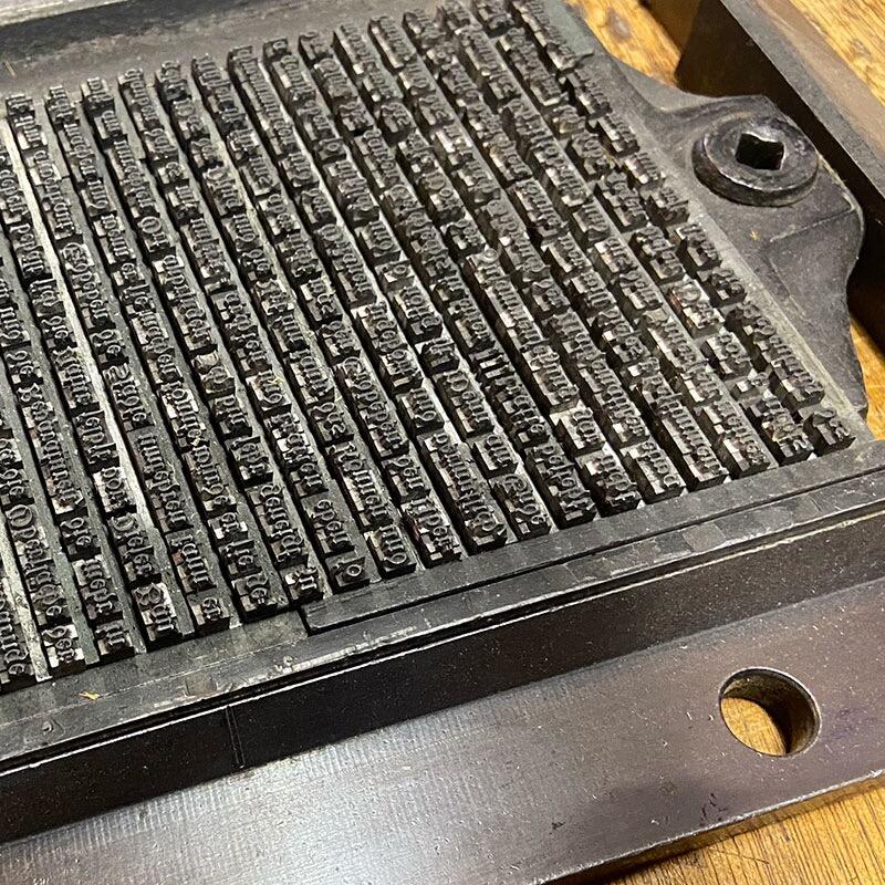
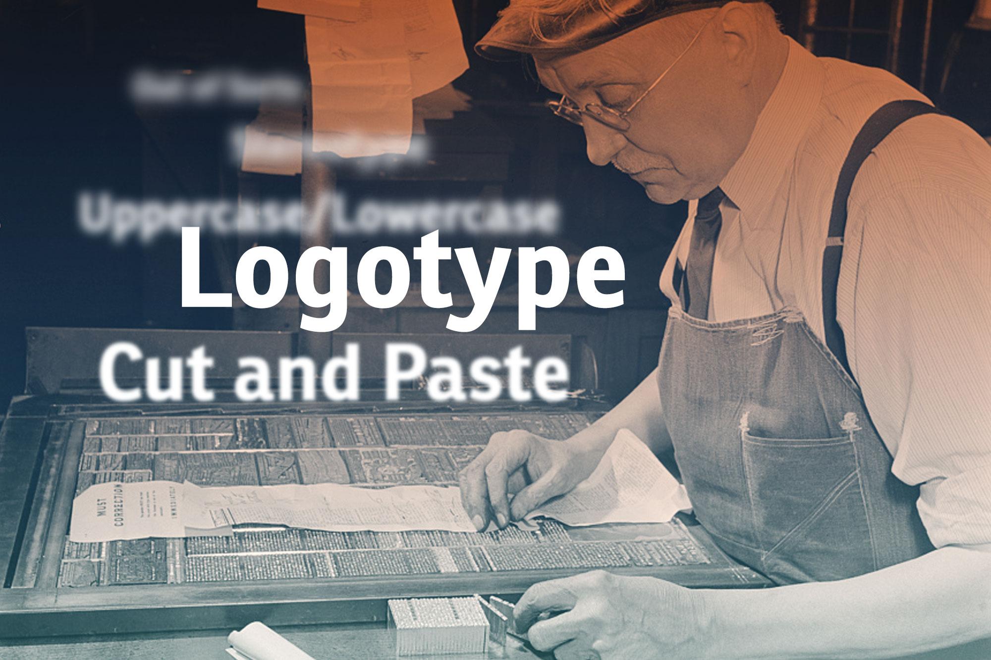
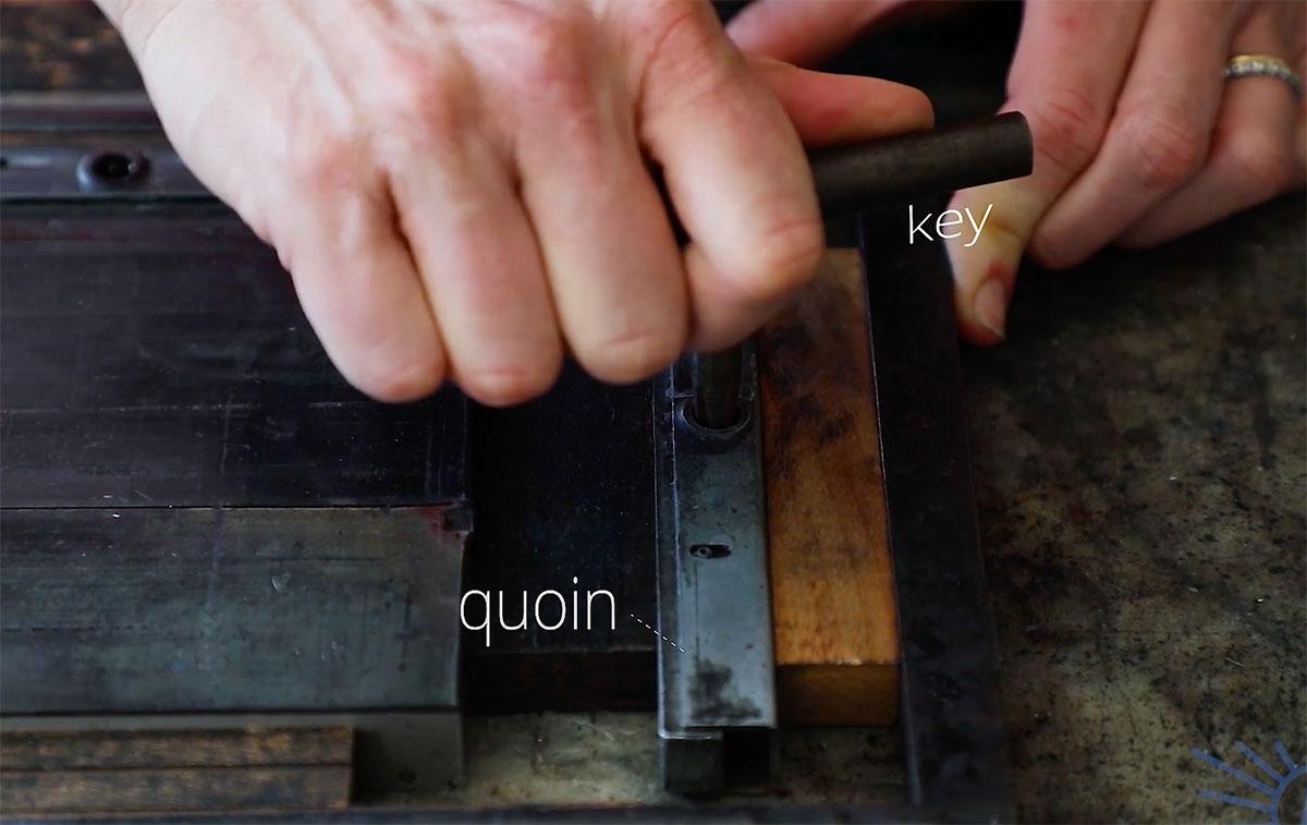
1. Logo Johannes Gutenberg established the use moveable type for printing texts in the West in the 15th century. There were later attempts to speed up the typesetting process by casting syllables or entire words as one piece. Those pieces were called logotypes—from Ancient Greek “lógos” meaning “word”. But handling type cases with hundreds of compartments was just not practical and so this kind of typesetting didn’t really catch on. But entire words cast as one piece of metal type still became quite common—for example for newspaper section headlines, which had to be used every day in exactly the same way. Other uses were words like invoice, certificate, invitation and so on, which were designed in a decorated way that couldn’t be typeset with individual letters. And logotypes were also used to print the names of companies. And that is where the modern usage of the word logotype—or just logo for short—comes from. This typical use in letterpress printing started to not only describe the object, which was used to print a company name, but the specifically designed appearence of the name itself. And while this originally only applied to printing blocks with text on it—for example a wordmark—the modern understanding of the word logotype is much broader and can also apply to graphic marks, emblems and symbols, which might not not contain any letters. 1. Uppercase & Lowercase These commonly used terms go back to the print shop tradition in some countries of having separate type cases for one typeface in one size—one case for the small letters and one for the capital letters. The case with the capital letters was put on top—so it was literally the “upper case” and the type case with the small letters was put below that, so it was the “lower case”. And that’s how these terms were coined. 2. Cliché To add an image to a letterpress form, printing blocks were needed that behaved just like the metal letters. Creating them was an elaborate and time-consuming process—at least in the first centuries of printing with moveable type. But there was a work-around: Instead of creating printing blocks with images for a specific use in a single print-run, generic images were often created and print shops could use them for multiple prints and for various clients. So with these blocks, printers were replicating a rather generic artwork over and over again. In a print shop those printing blocks were called a cliché and later people outside this field started to use this word as well for something that is not original, overused, generic, or stereotypical. And speaking of stereotypical … 3. Stereotype Creating a letterpress form with text and printing blocks can take a lot of time. And if the prints were all handed out or sold out and needed to be reprinted, the print shop essentially had to start from scratch, recreating the typesetting and the entire layout. It was possible to store the original letterpress forms to be used later, but that meant that all the letters and printing blocks that were used were not available for other prints anymore. So very often that just wasn’t an option. But the stereotype solved this problem. A material like papier-mâché was pressed on the letterpress form and created a precise negative impression of the entire layout. And from that a new single form could be casted. And the result of that process was called a stereotype – which means “a solid form or impression”. And using this technique had another important advantage: this new cast didn’t necessarily had to be flat like the original letterpress form, but it could also be casted in a cylindrical shape to be used on the much faster rotary printing presses with cylindrical printing forms. A machine for casting newspaper stereotypes in the early 20th century And just like with the word cliché, people started to use the word stereotype outside the printing trade in a more metaphorical sense referring to generalized and replicated ideas or images. 4. Being “out of sorts” “Sorts” are the various pieces of type stored in the compartments of the type case. Being “out of sorts” (i.e. not having enough of certain letters in a font) remained a continuous problem for hand composition. The compositor’s misery in such cases continues to live on in the phrase “out of sorts”, now meaning “being mildly unwell”. The definition of “sorts” in Joseph Moxon’s Mechanick exercises from 1683 5. Cut and Paste This is a comparatively young phrase. It was coined in the days of phototypesetting in the second half of the 20th century before the introduction of desktop publishing. Before desktop publishing, the text columns were already created with (phototypesetting) machines, but the make-up or “paste-up” of the pages for printing was usually still done by hand. Columns, images, lines and even individual words had to be cut with scissors and scalpels to be moved to the right place and an adhesive (“paste”) was used to have all parts stick in place and allow further corrections until the finished layout could be photographed to be transferred onto an offset printing plate. Even though scalpels and adhesives are no longer necessary with digital type, the phrase “cut and paste” is still in use. The video The Lost Art of Paste-Up in our video directory shows how this process was done in the past. You know other interesting terms, which would fit in this article? Let us know in the comments below. And if you want to learn more about typography terms, check out our typography term glossary with hundreds of translations added by our community members. -
There are diagrams on the web giving technical names for the parts of letter forms, such as "counter," "ascender," "bulbous terminal," etc. Are there any similar diagrams for the parts of numbers? I'm specifically interested in 19th century type, but I assume the same names would apply. Thanks!
- 5 replies
-
- terminology
- terms
-
(and 4 more)
Tagged with:
-
-
- letterpress
- terms
-
(and 1 more)
Tagged with:
-

Should the terms font and typeface be used interchangeably?
Ralf Herrmann posted a journal article in Journal
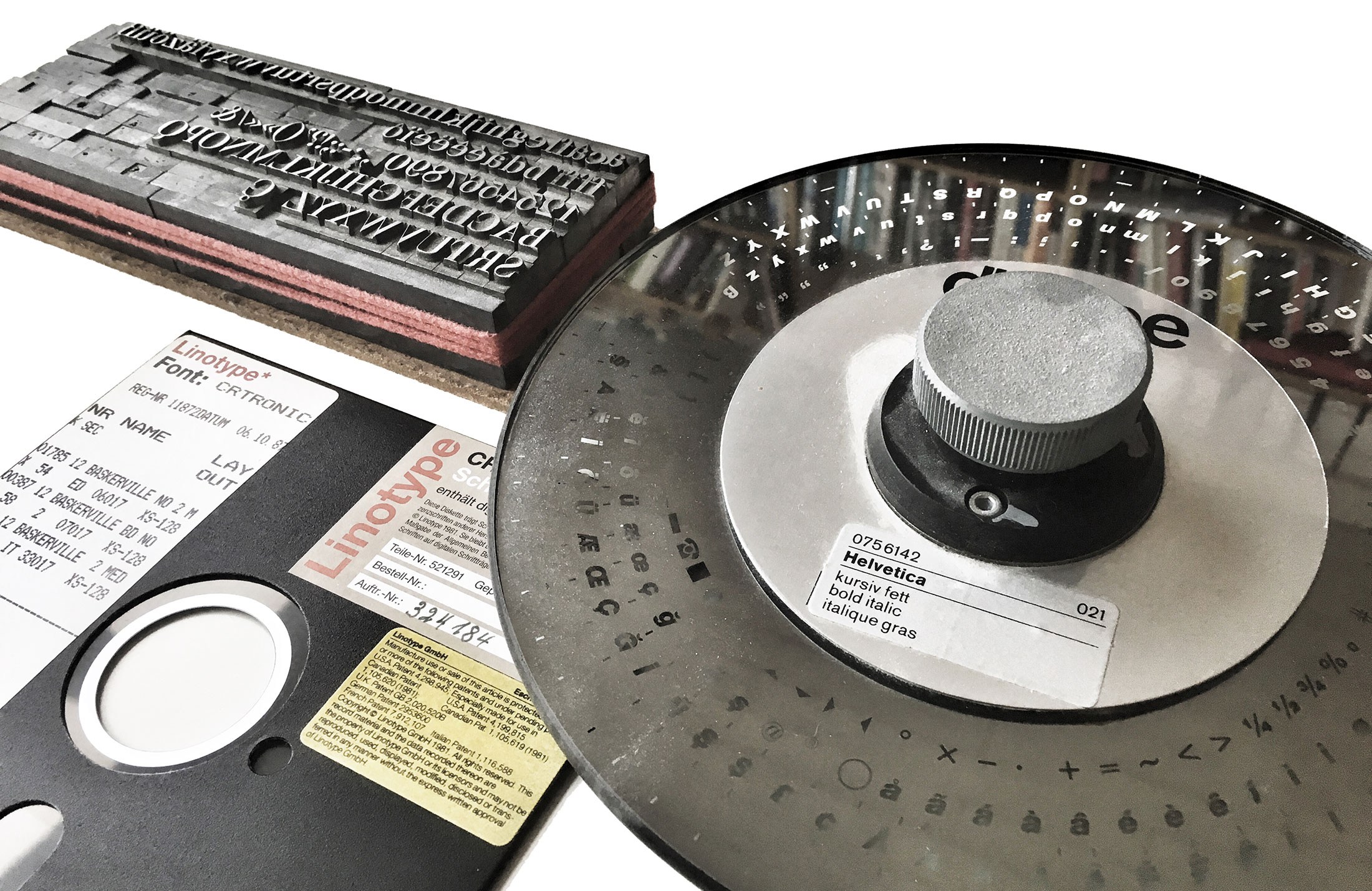
Defining the terms What do these terms mean anyway? The most simple explanation is: a typeface is what you see, a font is what you use. Both refer to a “set of letters (or symbols to put it more broadly) with a specific style”, but the term typeface puts the focus on the artistic work, whereas font points to the actual tool to arrrange and print or display text using a design with a specific style. Considering the most common techniques, this tool can be … the letters (made from materials such as metal or wood) in a single letterpress type case a phototypesetting disc or strip containing letters as photographic negatives a digital font file containing letters as digital outlines Fonts used for different typesetting techniques In contrast to what one might expect, most dictionaries aren’t of much help either and they demonstrate that the problems around the distinction between the two terms isn’t a new phenomenon caused by computer users with a lack of knowledge about letterpress printing. Most English dictionaries I checked use something like a “set of letters in a particular design” as the key element for the definition—but for both terms! The additional characteristics usually vary. Some limit the terms to printing, others have updated this to include today’s digital use as well. Some mention a specific size for fonts, some make that optional or omit it altogether. But most experts in our field probably agree that at its core, it’s about the visual design on the one hand (☞ typeface), and the useable manifestation or instance of this design (☞ font) on the other hand. And this broad definition works for all typesetting techniques. The debate It can’t be denied: The term font is used all the time in our field today. We go to sites like myfonts.com, fonts.com, fontshop.com and download digital font files to put them in a font folder and later use them in our application by opening the font menu. And other designers who see our work might later ask for a “font identification”. Still, there are people who reject this use of the word font, because it is not a perfect match with how they might have learned to define it decades ago when they started out with letterpress printing. Yes, fonts for letterpress printing happened to be size-specific. It’s just a physical requirement of this technique. And in a letterpress cabinet, each size of a typeface would be referred to as individual font. But as shown before, this is not necessarily a key element nor a requirement to define the term font for all eternity. Just as with the material by the way. Font (or “fount”) probably comes from the “melting” or “casting” of the metal alloy in order to make the moveable type. Yet, the same term was used when wood type became common, even though nothing is actually melted or casted in this case. Despite the conflict with the “original” meaning of the term font, it made sense to adopt it for wood type as well, because the purpose was the same. And the same thing happened with the shift to scalable fonts with phototypesetting and later digital typesetting. A phototypesetting disc was neither casted from metal nor was it restricted to a specific type size. Yet, just as a letterpress font it was used to typeset a specific type design and that’s why the term font was used as well. Sure, we could also use completely different terms for different typesetting techniques, but using a shared definition for letterpress fonts, phototypesetting fonts and digital fonts is just a normal effective use of language. The interchangeable use of font and typeface Now that we have clarified what the terms mean and why they exist the way they do, let’s move on to the actual question of this article. A typical complaint about today’s use of font and typeface is that the interchangeable use removes the distinction between the terms and so this is something that must be avoided. But in my opinion, that is a flawed logic, which often seems to be based on the assumption that only one term could be correct in any situation. The other extreme—which is also quite common today—is to say we should just give up and accept that these terms are essentially synonyms today. I disagree with both positions. They only propose two possible options: the use of these terms must be exclusive or identical. But that is a false dilemma. There are more options and I want to argue, that the interchangeable use of font and typeface is mostly the result of the fact, that both terms usually apply at the same time and so it just doesn’t matter much which one we pick. Let me explain that with an analogy. Take the words “song” and “recording” for example. They aren’t synonyms of course. I can whistle a melody and someone standing next to me might recognize the “song”. The person is standing next to me, listening to me. No recording was involved. But I could also give a talk and someone makes an audio recording of it. There is now a “recording”, but since it was just talking, the word song wouldn’t make sense. Both words have different meanings and in these two examples only one was valid in each case. But if we talk about music albums for example, both terms apply at the same time. There are songs—the musical composition (and optionally lyrics)—and there is a specific recording of that song on a certain album. If we talk about a specific album, it doesn’t matter if we refer to the songs or the recordings on that album. We could mean exactly the same thing. The recordings are the manifestations of the songs and both are bound together. This relationship can be shown in a very simple Venn diagram: There can be exclusive and overlapping uses of the terms. It doesn’t have to be “exclusive” or “identical”. Usually we just refer to a song or a recording by the same name written on the album cover and there are hardly any confusions. The linguistic symbols are pointing to the same thing. But as shown in the diagram, there are exclusive uses as well. A song might appear on different albums of the same artist or even different artists. In this case song and recording clearly point to different things and we need to make sure to use the correct words. And I would argue, that typeface and font share the same relationship as song and recording. When a new typeface or family with different styles is released, there will be fonts available to actually use the design or the different designs within the family. It goes without saying. And that’s the overlapping use that explains the interchangeable use. Helvetica Bold Italic is both a typeface and an available font. But that does not mean that typeface and font are synonyms. The exclusive uses remain as well. A type designer sketching letters in a notebook isn’t drawing a font. The designer is working on the visual artwork—the typeface! If the designer ships that typeface in various font formats I might have a folder on my computer with one typeface, but two or more fonts. In such cases an interchangeable use of font and typeface would make little sense and might cause unnecessary confusion. Conclusion Words don’t have intrinsic meanings—words have usages. Therefore it makes little sense to cling to a very narrow metal type definition of the word font, just because that happens to be the first or literal meaning of that word. It’s almost ridiculous to deny the reality of the usage of the word that became common with phototypesetting and digital type. Nothing is lost anyway. It is always possible to apply a broader or more narrow meaning depending on what the specific context requires, as we do it with many other words as well. If necessary, we can use a broader meaning for the word font which covers all typesetting techniques. And at the same time we can create categories and sub-categories to be highly specific about certain types of fonts. The specifics of a letterpress font can still be described by referring to it as “letterpress font” or “wood type font” to be even more specific. And in my opinion the interchangeable use of font and typeface is fine, as long as we stay in that overlapping area of the Venn diagram. There can be a fine line between words being used interchangeably in certain contexts and words being synonyms. In this case, it is a difference that matters and one that we should be aware of. -
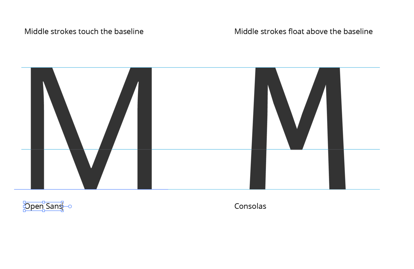
In some faces, the center strokes of the capital M touch down to the baseline, while others float above, either at the X height or some other position. Is there a term for this?
- 1 reply
-
- 1
-

-
- terms
- terminology
-
(and 1 more)
Tagged with:


