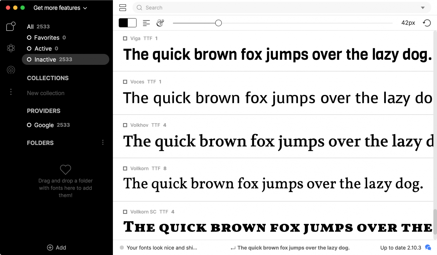
If you are beginner, you might simply open your font menu, start from the top, and just scroll through the list to see which font looks good to you. But if you frequently choose fonts for projects, this isn’t a very efficient or professional approach and chances are, you are not finding the best fonts for your projects, since you can’t have all fonts installed on your system. And even if you would try—it would take forever to go through them all. In the same sense, you don’t want to browse online sources like MyFonts or Pinterest for hours to find a font you like but might not have yet. We need a more efficient approach, don’t we?
You might also consider to ask other experienced designers for help, e.g. in our community forums. Beginners often expect that a certain use points to specific typefaces. They might say they need to choose a font for a “software company”, a “yoga studio”, a “hotel” and so on. And they might add some vague characteristics like “it should have a modern appeal”. But there are only very few cases where a font use points to just a few specific fonts. For the vast majority of projects, there are thousands of potential candidates and asking for font suggestions based on just the use alone is almost impossible to answer—or the answers would simply be arbitrary and a matter of personal taste.
Choosing a font, like many other design decisions, is about considering many aspects at once, weighing options, and choosing priorities.
In the following lessons, we will go through all the typical considerations to make when choosing a font. So let’s get started.
Previous lesson:
-Introduction-
Next lesson:
B1: The Font Appearance
-
 1
1


