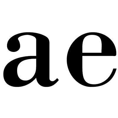
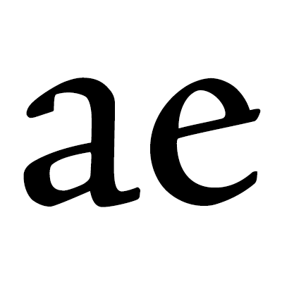
With tens of thousands of type families available today, professional font users need a way to structure this huge pool of choices. Unfortunately, typefaces are not that easy to classify in a hierarchical way since they combine so many different design options. Traditional classification system—like Vox-ATypI— are often taught in design schools as a foundation, but they are getting more a more criticized these days. They cover subtle differences of historic developments as individual categories, while many of the contemporary fonts do not even fit clearly in any of the historical categories and must be put in catch-all categories, which defeats the purpose of having a classification system to begin with. If you plan to work a lot with typefaces in the future, I would still recommend to learn at least one of the traditional classification systems, but for the purpose of this course, we will now use a different approach to classify fonts in the Latin script: we will not force all typefaces into a few boxes, but instead look at two typical features individually.
Serifs
A simple way to classify fonts is by looking at the serifs.
Roman fonts differentiated by their serifs
Serif fonts are the traditional book typefaces and they are still being used this way. Slab-serif fonts came into use in the 19th century when display typefaces for advertising purposes became common. Sans-serif fonts don’t have any serifs and became popular during the 20th century. The existence of the serifs influences the tonality of you design, but the existence or style of the serifs doesn’t point to a specific use.
Stress
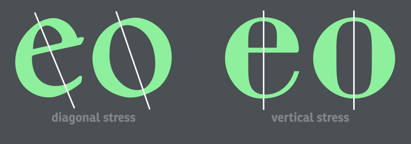
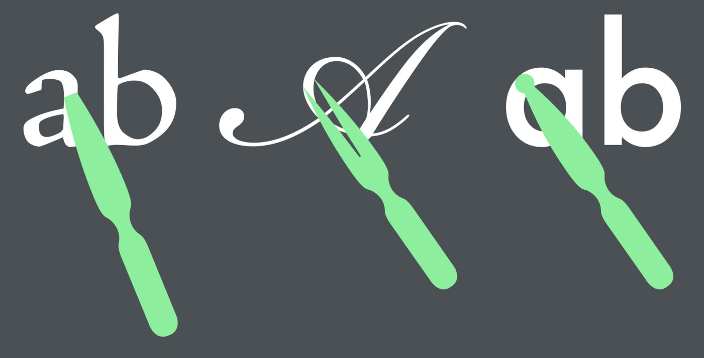
Another simple and useful way to classify fonts is by looking at their stress, i.e. the way the stroke width changes or doesn’t change throughout the letter. This was originally caused by the tools used for writing. A broad-nip pen held at a certain angle would create a completely different appearance than a pointed nip, which created fine and broad lines based on the pressure put on it. Even though today’s digitial fonts are often not directly based on written sources anymore, stress continues to be a design feature.
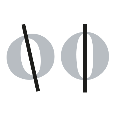
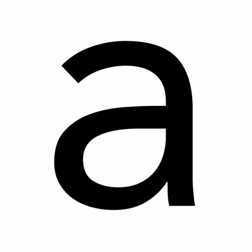
The stress influences the overall appearance of a typeface. A diagonal stress has a more organic and calligraphic appearance. This is sometimes called a “humanist” design. A strictly vertical stress has a more static and (especially with serif fonts) elegant appearance. A Font like Bodoni in the classification category “Modern” is a typical example. Geometric sans-serif fonts however might not have a distinct stress orientation, since they emulate writing with a pen that doesn’t create any changes in stroke width.
Stress as a result of different writing tools
The stress of typefaces is a useful tool to categorize fonts independent from and in addition to the existence of serifs and how they might look.
Related Terms in our Glossary:
Previous lesson:
B1: The Font Appearance
Next lesson:
D1: Relative type size and legibility


