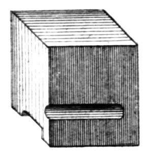
The visual letterforms of characters in a digital font always sit inside a container or so-called “bounding box”. This is important to understand, since those invisible boundaries control the placement of the letterforms and the space between them. Just select a letter in any application, for example from the text you are reading here! It’s the letter’s underlying bounding box that will become visible as a way to show the selection.
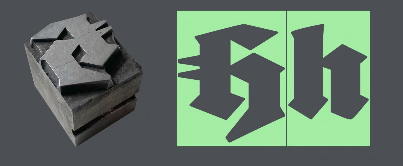
Both letterpress fonts and digital fonts have a body the visible letterform sits on
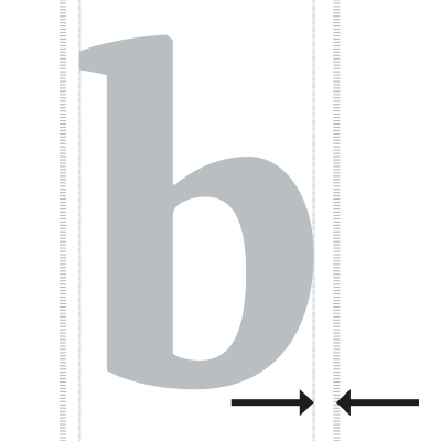
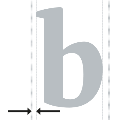
With letterpress fonts, the body will usually enclose the entire face of the letter. With digital fonts, some parts like diacritical marks and swashes might extend over the bounding box. The distances between the bounding box and the visible letterform on the right and the left side of a letter are called sidebearings. They can have positive and negative values. The value is positive if the letterform is inside the body (and so there is a positive distance between the edge of the body and the edge of the letterform) and negative if the letterform extends over the bounding box. Keep in mind that the width of a character is the width of the bounding box, not the width of the visible letterform.
The term tracking refers to spacing changes which affect multiple characters at once, e.g. within a word, phrase, or an entire paragraph or text. If the tracking is set to zero, then each letter’s bounding box is directly placed after the previous letter (see image below). If the tracking is positive, then the same amount of space is placed between the bounding boxes of consecutive letters. Or to be more precise and to put it in another way: The width of each letter is increased by the amount of tracking. And if the tracking is negative, the width of the letters is evenly reduced by the amount of tracking.
Note that tracking changes are not applied evenly on both sides of the letter. They are added to or subtracted from the end of the letter in relation to the reading direction. So, for Latin text, only the right side is influenced.
There are two typical reasons to change the tracking:
1. Tracking as optical compensation
The ideal tracking depends on the specific font and the relative type size. The larger the (relative) size, the less tracking is required. Lower (relative) type sizes require an increased tracking. This is because of the limits of our vision. The smaller a text gets, the more the letters will blur together. An increased tracking can counter this effect and that’s why for example road signs often have huge letter-spacing. They are supposed to be legible even at the furthest possible distance and therefore smallest size. A large magazine headline on the other hand doesn’t have this requirement. All letters are clearly visible and so the tracking can be reduced.
Increased tracking for very small type keeps letters legible
The amount of positive or negative tracking will depend on the specific font and its intended use. If you use a text font at 12 points, it will probably already have the ideal tracking for this use at a tracking value of zero. But if you use the same font in a very small size (like 6 Points) you probably want to increase the tracking. And if you use the same font for headlines, it might look better with negative tracking. So, as a rule of thumb:
- Smaller relative type size—more tracking.
- Larger relative type size—less tracking.
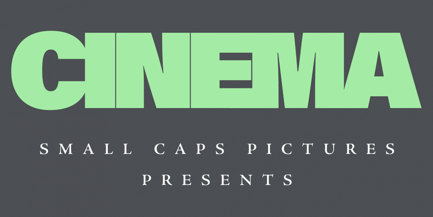
In addition, the letter case can also influence the need for tracking changes. When you switch Latin text from mixed-case to uppercase, increasing the tracking is usually recommended. Some fonts even increase the letter-spacing automatically when you activate the OpenType feature for all caps or small caps. But you can always add more space by increasing the tracking.
Small caps with additional tracking
Apps like those from Adobe set tracking and kerning based on an Em square with 1000 units. As a result, tracking changes are not an absolute measure, but relative to the type size. So, for example, if you would have a line of text in 12 points and a tracking value of 1000, it would mean that 12 points would be added between all letters.
But keep in mind that tracking changes as optical compensation can usually be subtle, for example between 5 and 15 units. The images above only use higher values to make the effect more obvious.
2. Tracking as stylistic choice
Especially for display use, tracking can also be used as a purely stylistic choice. Drastic tracking changes can be an eye-catching visual effect and influence the mood of the text display.
Decreased and increased tracking as stylistic choice
Related Terms in our Glossary:
Previous lesson:
-Introduction-
Next lesson:
B: How to kern type


