Search the Community
Showing results for tags 'calligraphy'.
Found 22 results
-
I thought this would be a good topic, as the font market is saturated with handwritten/calligraphy fonts that are associated with women's fashion and wedding invitations. As an example I would use Oriole Bird (which itself is tagged 'feminine headline'): Oriole Bird Font But what fonts would you use for a 'masculine' version?
-

Arabic Calligraphy Online Course: Learn Kufic Script
Ralf Herrmann posted a news entry in Typography Weekly #113
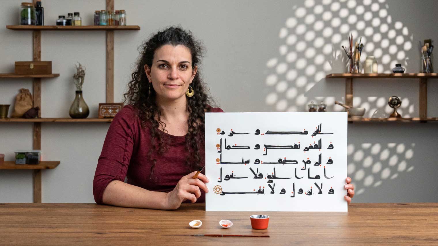 A course by Joumana Medlej. Explore the ancient Arabic script style of Kufic by learning to write a short text using traditional artistic practices
 -
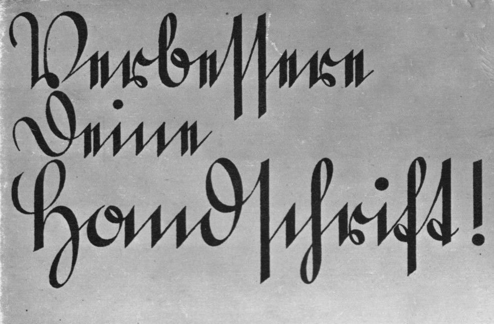 Just like blackletter, Kurrent is characterized by its abrupt changes of directions. In addition, the letters are almost always connected. Gaps are avoided and also writing over the same stroke again—whether it be on the paper itself or in the air. In cases, where this would happen in the Roman style of cursive writing, Kurrent just uses strokes beside each other. Standard Kurrent letters as they would appear around 1900 The development of the Kurrent style over more than 500 years A writing master’s Kurrent (Johann Gottfried Koeppel, 1781) Kurrent was also a style of the writing masters of the time and they embellished the type with decorative swashes for caps, ascenders and descenders. This gave the style it’s typical proportions with a rather small x-height. With these features fully developed over time, Kurrent became its own branch within the Latin script. The small x-height in connection with the zig-zag patterns and similar letter shapes made the type style more decorative than legible. Blackletter and Kurrent in a type specimen from the type foundry of Karl Tauchnitz, 1825 When learning to write German, people would have to learn the Roman block letters and cursive, as well as blackletter and Kurrent, which were the most-used styles for written and printed German. Therefore their colloquial name became “Deutsche Schrift” (German Script). This semantic differentiation between “Latin script” and “German Script” was later misused to support the growing nationalistic ideology at the end of the 19th century and in the first half of the 20th century. The so-called German script was glorified as unique and superior creation of the German people and used as nationalistic symbol. German postcards in Kurrent From the magazine Die zeitgemäße Schrift, which was published between 1928 and 1943 Books in Kurrent from the publisher Alexander Duncker Verlag, Weimar Sütterlin At the beginning of the 20th century the teaching of Kurrent was reformed. The proportions of Kurrent in connection with the influence of the steel pen were neither very legible nor a good foundation for a characteristic personal hand-writing style. The German graphic designer Ludwig Sütterlin developed a set of reformed alphabets for the ministry of culture of the state of Prussia. The Kurrent alphabet was introduced in 1915. In the 1930s it had become the dominant writing style for teaching to write German. Even though Ludwig Sütterlin had also created a Latin alphabet for schools, his name became a synonym for his the Kurrent style. Sütterlin writing in a children’s cook book Sütterlin did not try to invent new letters. Instead he modified the existing Kurrent style to make it easier to write and read. The general design of the letters remained basically unchanged. But the proportions were changed to a simple and more legible 1×1×1 ratio (ascender/x-height/descender). Beginners now wrote the letters upright and with a Redis pen without any pressure modulation while writing. Beginner’s Sütterlin alphabet The use of Sütterlin and blackletter typefaces was actively supported and even demanded, when the Nazis gained power in 1933. The publishers of school books had to use blackletter typefaces and had to focus on Kurrent writing—Jewish publishers on the other hand were not allowed to use any so-called “German typefaces”. So during the 1930s blackletter and Kurrent writing were on the rise again and the political connotations of this use became more and more prominent. Sütterlin store signage (“Edelmann”) A children’s book from 1945 Because of their connections, Kurrent and Sütterlin were not easy to be designed as metal typefaces, but they were offered and used nevertheless. Type foundries also reacted quickly to the ideological influence on the type use. Shortly after the Nazis gained power, a new style of modernized blackletter typefaces was offered from various foundries. It is now colloquially known as Schaftstiefelgrotesk (“combat boot sans serif”). This name also shows how strong the connotations between the type style and politics of the Nazi era still are. Two examples of the modernized blackletter typefaces of the 1930s. Left: Gotenburg, right: Element Offenbacher Script The famous German calligrapher and type designer Rudolf Koch also got in the game and developed his own style of Kurrent writing: It was published in 1927 and was called Offenbacher Schrift. Koch wanted a script that was not only easy to write, but it should also allow for some artistic quality and freedom. The design was much more lively than Sütterlin’s Kurrent alphabet and was introduced in schools in the state of Hesse. But despite it’s good reputation in the field of typography and calligraphy, the writing style of Rudolf Koch wasn’t widely adopted. In 1941, after years of promoting the typical German type styles, things changed from one day to the next. The Nazis had realized, that they couldn’t easily force their type styles onto the people in the conquered territories. And the German metal typefaces had to be shipped throughout Europe just to print them, which was rather expensive. So the Nazis took a pragmatic approach: they invented a Jewish connection to the development of blackletter typefaces and with that banned all “German typefaces”. Now the Roman block letters and cursive were proposed as Normalschrift (“standard script”). After that, blackletter and Kurrent quickly fell out of use and were removed from the school curriculum. And with that, hundreds of years of handwritten German became illegible to the general public.
- 5 comments
-
- 1
-

-
- sütterlin
- calligraphy
- (and 1 more)
-
In addition to the type specimen links collection topic, I start another one which deals with lettering. Feel free to add links you know of.
-
Hello fellow typophiles, I'm hoping you can help name these characters! (And do they have unicode support, I wonder!) The type is from Erhard Ratdolt's Psalterium puerorum (Venice: 1486 or earlier) In the first image, they are evidently (left-right) t u/v x y and z (or yogh?) - but what are the others? Is one a Tironian Ond, or something other? In the second image, there is superscript '9'. An apostrophe contraction, or something other again? I've attached another image (from Ratdolt's 1486 Index characterum diversarum) which shows some of the the letters in a written context.
-
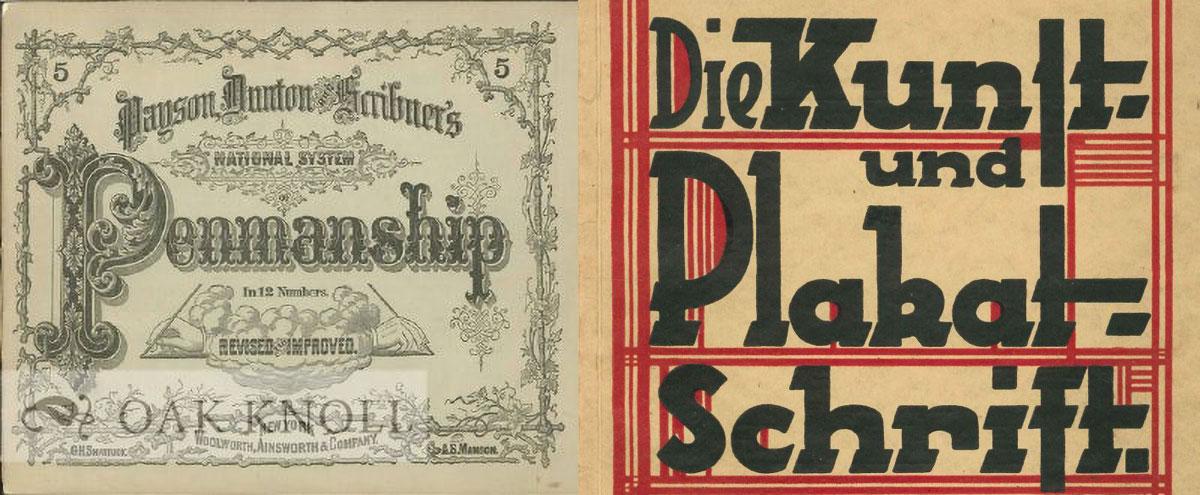 Oak Knoll Books, seller of rare and out-of print books, is having a sale for all calligraphy books.
 -
New online class with Martina Flor: Digital Lettering
Ralf Herrmann posted a news entry in Typography Weekly #94
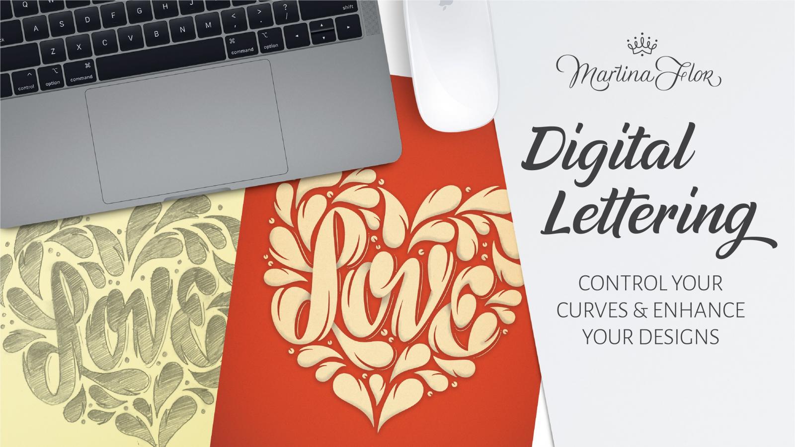 “In this class Martina Flor, lettering artist and designer, will share her secrets to successfully digitize a lettering piece to achieve expressive designs.”
 -
Behind the font: Jessica McCarty of Magpie Paper Works
Ralf Herrmann posted a news entry in Typography Weekly #94
 “This installment of Behind the Font features Jessica McCarty, an award-winning designer of handwritten and calligraphic fonts. McCarty founded Magpie Paper Works, a boutique typographic foundry specializing in hand-drawn fonts and custom lettering. She also co-founded Rare Bird Foundry in 2017, where she transforms select artists’ calligraphy into premium OpenType fonts.”
 -
Why there isn’t a font behind every letter you see
Ralf Herrmann posted a journal article in Journal
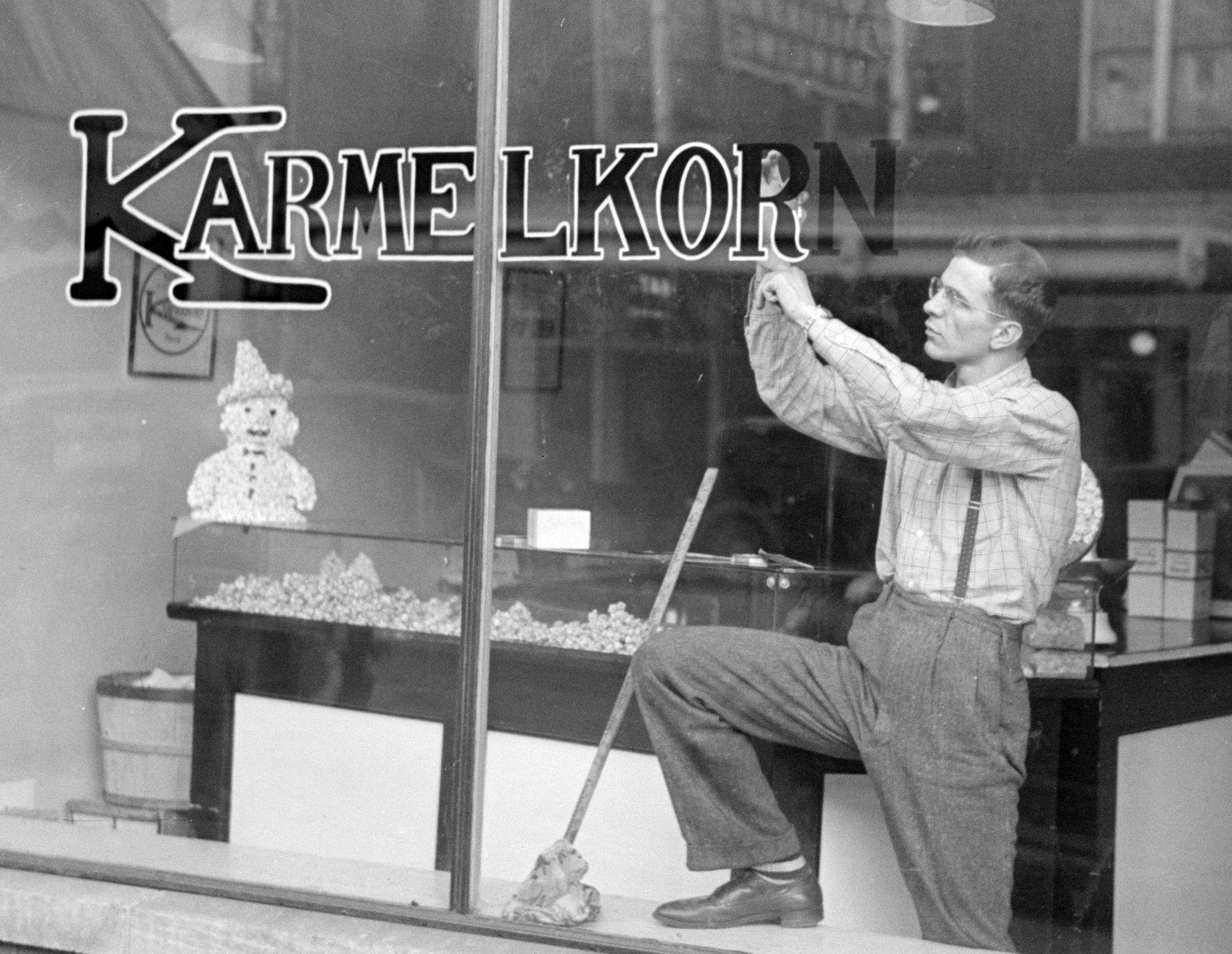 Today we take it for granted to use fonts for almost anything. Not just printed matter, but also logos, stamps, t-shirts, neon letters, and so on. Anything is possible—we just need to provide an image file. But this is a rather new development, considering how long movable type is in use. Over more than 500 years, fonts (made from metal or wood) were connected to letterpress printing, were each letter had to be made in the target print size, arranged by a typesetter, inked and finally printed on a surface like paper. That’s how things like the text block of books, flyers, letter heads, business cards, or posters were being made. But this technique was not suitable in many other areas. Think of a 50 inch sign on a train station building for example. It wouldn’t make sense to create a set of 50 inch letters just for this case and then press these huge letters against a sign or even the building wall itself. It was done differently and the following sections describe typical areas where letters were often not created using fonts. The Signpainter Signs over shops or on shop windows, political banners, train station signs, advertising boards and banners, large-scale ads on walls—those are all uses usually created by sign painters in the past. A sign painter could draw or write alphabets in many different styles, but his job had little to do with the letterpress letters used in print shops. The sign painter’s tool were brushes and pencils and every sign was usually a unique design, with letters specifically drawn for this one use. That’s what we call lettering. Sign painter training But it wasn’t just advertising. Even street signs, or the signage for busses or trains could have been lettering. If the same letters had to be repeated over and over again, there might have been stencils or technical drawings for each letter. But those were usually just for internal use, not sold publicly like letterpress fonts. And because of that, there was often not even a need to name the sets of letters just used internally. And so we also cannot identify a certain name in hindsight. The only chance is that the sign painter’s alphabets were interesting enough for someone to create a font later based on the original lettering design. A sign painter working on streetcar signs in the 1940s. Older logos, like the one from Coca-Cola in this case, were almost always drawn, not made from fonts Logos and mastheads Setting the logo of a brand or company in a certain typeface—or at least to base the design on a typeface—is very common today. But before the computer, logos were almost always created as individual drawings by a graphic designers. The same is true for mastheads of newspapers and magazines. They weren’t printed every time from moveable type. The were designed once and then turned into a printing block or “logotype”. In fact, this is were the term logo comes from originally. Combining several letters or full words to one unit was called a logotype (from Greek: logos → word). And since this was so common for the names of companies, logotype (or logo for short) became a synonym for visual trade marks of any kind, even the ones that don’t contain letters or words. Book covers The body copy of books is usually being printed from moveable type since Johannes Gutenberg. But the same was not necessarily true for book covers and dust jackets. They are designed by illustrators and graphic designers and before the computer, if there were letters, they were created as lettering—drawn in the original size just for this one use. And while it was less common, title pages or pages starting new chapters could also get such a lettering treatment. Product lettering Clock faces, food and cosmetics packaging, tube radios, vacuum cleaners, coffee makers and so—letterpress fonts weren’t suitable for putting letters on such products in the past. So even if the design of letters on such product looks similar to letterpress fonts, they were usually not made using fonts. Stonemasonry Just as the sign painters created the lettering on signs, stone cutters created the lettering on stones, may it be inscriptions on walls, tombstones, or on plaques mounted on buildings. And even while the letters might look as uniform as the ones in a typical font, before the computer, such stone cuttings were usually not made using fonts. The letters were designed and carved by the stone cutter for the specific application. Handwriting/calligraphy Most of the examples mentioned above fall into the category we call lettering. But letters can also be created with a another technique, that neither is lettering nor uses fonts: handwriting (or calligraphy, as we call it as an art form). Many requests in our font identification forum simply show handwriting, but people still ask for a “font identification”. Typing everything has become so common today, it might not even occur to people anymore, that things like logos, poster texts, or advertising claims might be handwritten. And modern script OpenType fonts might indeed even look a lot like lettering or calligraphy. But usually, if one takes a closer look, handwritten texts and fonts can still be distinguished very clearly.
- 2 comments
-
- 3
-
-
- lettering
- calligraphy
- (and 1 more)
-

Ruth Rowland Lettering Artist
Ruth Rowland Lettering posted a directory entry in Artisanal workshops & studios
 Ruth Rowland is a lettering artist and illustrator for over 25 years. Based in London, UK, she enjoys working with clients from all over the world from the music, advertising, editorial and publishing industries. She creates unique custom hand lettering, calligraphy and handwriting for books, magazines, albums and posters amongst many other projects. She also enjoys designing illustrative maps, hand lettered diagrams and word-heavy illustration, creating playful, informative infographics that engages audiences.
 -
 Mark Brooks is a freelance calligrapher, designer and artist who lives and works in Canterbury, Kent, UK.
 -
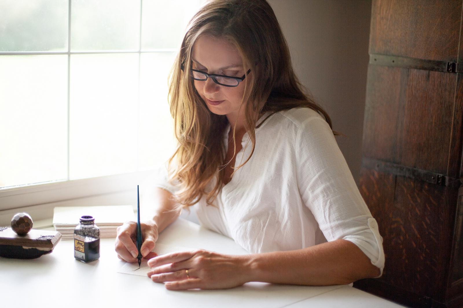
 Bespoke Strokes is a calligraphy studio by Chantelle Hoffmann. She took courses with Masters Penmen Michael Sull, Harvest Crittendon, and Jake Weidmann. She is also an active member of the International Association of Master Penmen, Engrossers and Teachers of Handwriting (IAMPETH).
 -
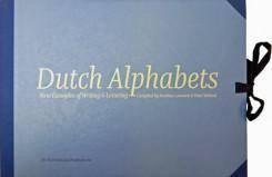 Dutch Alphabets is a portfolio containing 47 broadsides featuring new samples of lettering and writing by today’s most significant ‘Dutch’ lettering artists, type designers, calligraphers and sign painters. All the contributors are working and/or educated in the Netherlands. This collection of lettering has been compiled by Mathieu Lommen (University of Amsterdam) & Peter Verheul (Royal Academy of Art, The Hague), and was published in a limited edition. It showcases a wide variety of lettering and calligraphy, made especially for this project by: Amsterdam Signpainters / Yomar Augusto / Jacques le Bailly / Donald Beekman / Françoise Berserik / Barbara Bigosińska / Frank E. Blokland / Erik van Blokland / Maria Doreuli / James Edmondson / Ramiro Espinoza / Martina Flor / Dave Foster / Fritz Grögel / Janno Hahn / Hansje van Halem / Berton Hasebe / Henry van der Horst / Ondrej Jób / Max Kisman / René Knip / Holger Königsdörfer / Paul van der Laan / Lida Lopes Cardozo / Niels Shoe Meulman / Ross Milne / Gerrit Noordzij / Diana Ovezea / Krista Radoeva / Trine Rask / Arthur Reinders Folmer / Donald Roos / Pieter van Rosmalen / Just van Rossum / Kristyan Sarkis / Florian Schick / Elmo van Slingerland / Heidi Sørensen / Nina Stössinger / Joost Swarte / Teo Tuominen / Underware / Gerard Unger / Peter Verheul / Bernd Volmer / Job Wouters Offered in a collectors’ limited edition of only 175, with contributors’ copies separately reserved and numbered, Dutch Alphabets is printed offset on heavy acid-free paper in seven PMS colours and black. The broadsides and the introduction are housed in an attractive handmade cloth-covered portfolio with ties. The portfolio costs € 160,– and is available from the Publisher or Typotheque.
 -
 Calligraphy is the visual art of writing.
 -
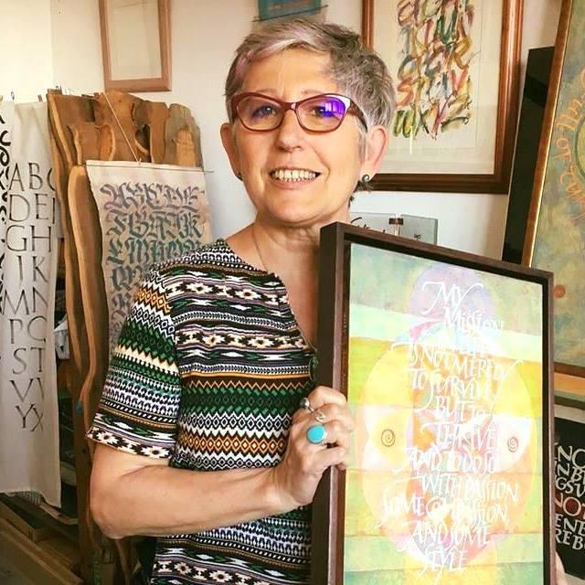 Rosella Garavaglia is an artist working on a wide range of calligraphy and lettering projects. Her main interest is to explore the expressive potential of the written word through various media and writing implements including the brush, fabric, wood, stone, glass and collage. Some of the provided services: logo design signs and advertisements wedding stationery corporate events poem and quotations lettering art
 -
The Typograph.Journal is written by designers for designers. The text is conversational, experimental, self-generated, personal expressions about design theory, practice and process. Each volume poses a question which sets the direction for ideas to develop and conversations to unravel. Unlike a traditional design theory publication the journal is a curated selection of short soundbites intended as creative propulsion for the readers own ideas and development. The thinking is expanded upon with in-depth interviews, demonstrated with visual research. The TypographJournals layout, visual devices and typographic treatment (form) expresses the content, thinking and curation (function). The intent is for the document to be self-reflective and symbiotic in its approach to design practice and theory.
-
 The dialogue between the calligrapher and the designer of type has been significant from the earliest days of print. Ewan looks at some of the issues raised through the lens of the life and work of Edward Johnston whose block letter type for the London Underground celebrates its centenary in 2016.
 -
 An ATypI talk by Oliver Linke (Germany) about the writing master Johann Neudörffer the Elder
 -
Scripts: Elegant Lettering from Design’s Golden Age
Ralf Herrmann posted a directory entry in Typography Books
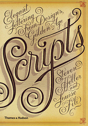 Seen in everything from wedding invitations and birth announcements to IOUs, menus, and diplomas, script typefaces impart elegance and sophistication to a broad variety of texts. Scripts never go out of style, and the hundreds of inventive examples here are sure to inspire today’s designers. Derived from handwriting, these are typefaces that are stylized to suggest, imply, or symbolize certain traits linked to writing. Their fundamental characteristic is that all the letters, more or less, touch those before and after. Drawn from the Golden Age of scripts, from the nineteenth to the mid-twentieth century, this is the first compilation of popular, rare, and forgotten scripts from the United States, Germany, France, England, and Italy. Featuring examples from a vast spectrum of sources—advertisements, street signs, type-specimen books, and personal letters—this book is a delightful and invaluable trove of longoverlooked material.
 -
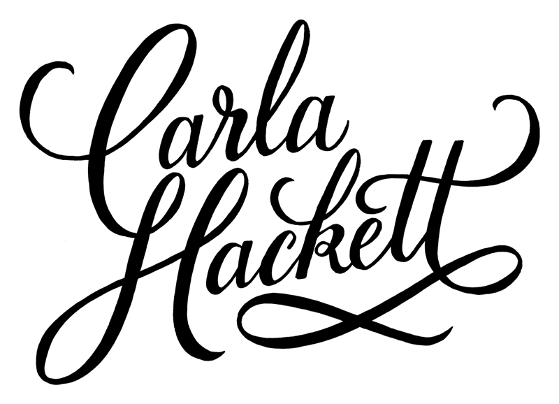 Carla Hackett is a Melbourne-based letterer who runs her studio from a sunny shared creative space Little Gold Studios in Brunswick. She hand-crafts lettering for a range of clients in creative industries, including fashion, music, food, branding, retail, hospitality, magazines, books, weddings and conferences.
 -
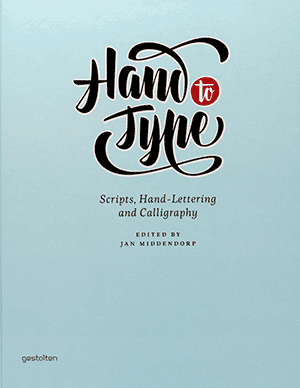 Although, or perhaps because, most of us write less and less by hand, our fascination for handwritten letterforms is growing. Typeface designers who specialize in traditional, charming, or spectacular lettering with a handmade look have become role models for today's young typographers and graphic design students. Script fonts--digital type families based on handwriting--are among the most sought on the typography market today. Scripts from the past, be it 18th-century formal calligraphy or advertising headlines from the 1960s, are being digitized and turned into OpenType programming. The love of the hand-written look is nothing new. Even the oldest printed books pretended to be something unique and not a machine-made mass product. Hand to Type is a collection of some of the best work by today's lettering artists in the fields of hand-made and digital script forms. The book includes texts about outstanding designers and contains a series of expert chapters outlining the principles of script forms that may be lesser known to most western typographers--from the German Sütterlin to Arabic and Asian scripts. Hand to Type also traces script fonts back to some of the earliest examples: hand-lettering as a sign of authenticity, or printing type made to look like formal writing.
 -
 A film on the purpose and techniques of calligraphy. Presented and produced by Hallmark. Filmed at Hallmark cards during a visit by Mr. Zapf.