Search the Community
Showing results for tags 'dutch'.
-
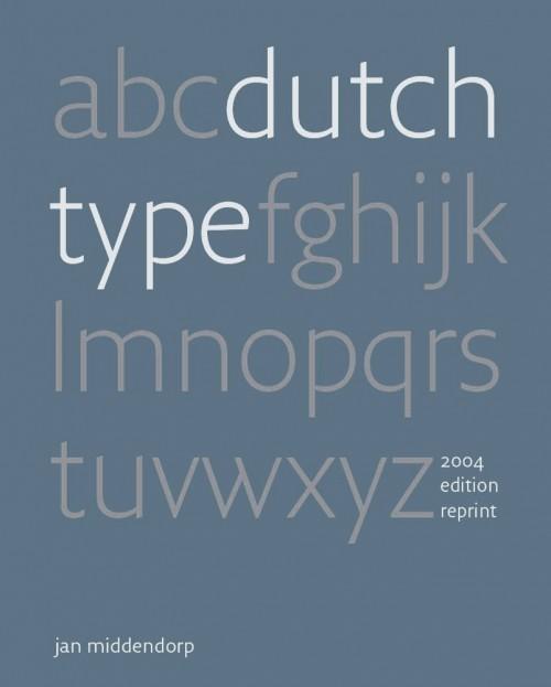
In ‘Dutch Type’, Jan Middendorp presents a comprehensive overview of type design and lettering in the Netherlands, tracing its origins through type designers and lettering artists from the 15th to the 20th centuries. Partly based on interviews, the book also offers insight into the motives and methods of the first generations of digital type designers, featuring published and unpublished typefaces as well as sketches, studies, and samples of lettering work. While the quest for quality and innovation has remained constant, it makes clear that the advent of desktop type has opened up the discipline to a more spontaneous, inventive, and democratic approach. Dutch Type was originally published in March 2004 and was received with huge enthusiasm. Its 3,500 copies sold out in 3 years. The book soon became hard to find and ended up being offered at embarrassingly high prices on Amazon, eBay and by antiquarians — between €400 and $800 for a copy. In 2018 author Jan Middendorp decided to self-publish a near-identical reprint, and successfully financed the production with crowdfunding.
- 1 review
-
- 1
-

-
- middendorp
- book
-
(and 1 more)
Tagged with:
-
-
- letterpress
- printing
-
(and 3 more)
Tagged with:
-
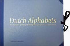
Dutch Alphabets is a portfolio containing 47 broadsides featuring new samples of lettering and writing by today’s most significant ‘Dutch’ lettering artists, type designers, calligraphers and sign painters. All the contributors are working and/or educated in the Netherlands. This collection of lettering has been compiled by Mathieu Lommen (University of Amsterdam) & Peter Verheul (Royal Academy of Art, The Hague), and was published in a limited edition. It showcases a wide variety of lettering and calligraphy, made especially for this project by: Amsterdam Signpainters / Yomar Augusto / Jacques le Bailly / Donald Beekman / Françoise Berserik / Barbara Bigosińska / Frank E. Blokland / Erik van Blokland / Maria Doreuli / James Edmondson / Ramiro Espinoza / Martina Flor / Dave Foster / Fritz Grögel / Janno Hahn / Hansje van Halem / Berton Hasebe / Henry van der Horst / Ondrej Jób / Max Kisman / René Knip / Holger Königsdörfer / Paul van der Laan / Lida Lopes Cardozo / Niels Shoe Meulman / Ross Milne / Gerrit Noordzij / Diana Ovezea / Krista Radoeva / Trine Rask / Arthur Reinders Folmer / Donald Roos / Pieter van Rosmalen / Just van Rossum / Kristyan Sarkis / Florian Schick / Elmo van Slingerland / Heidi Sørensen / Nina Stössinger / Joost Swarte / Teo Tuominen / Underware / Gerard Unger / Peter Verheul / Bernd Volmer / Job Wouters Offered in a collectors’ limited edition of only 175, with contributors’ copies separately reserved and numbered, Dutch Alphabets is printed offset on heavy acid-free paper in seven PMS colours and black. The broadsides and the introduction are housed in an attractive handmade cloth-covered portfolio with ties. The portfolio costs € 160,– and is available from the Publisher or Typotheque.
-
-
- museum
- netherlands
-
(and 1 more)
Tagged with:
-
-
- netherlands
- dutch
-
(and 1 more)
Tagged with:
-
Hey there, I’m quite stucked at the moment with the letter/ligature IJ and ij. It seems there are plenty of different kinds how to draw it. The most of the classic sans-serif fonts like Helvetica, Univers and Meta for example just uses ordinary glyphs of I and J, put them together and abracadabra here is your ligature. This seems are little bit to easy in my opinion. So I started a little research and what you see down here are my actual results. But now I’m a little bit confused right now. What is THE definitely form of IJ and ij. Is it better to ad points to the glyphs? Or without? Is the form of the ij correct in overall? It looks like a school form of the y. Looking forward for your answers on this. :) Kind regards Florian
- 5 replies
-
- type design
- ligature
-
(and 4 more)
Tagged with:


