

Typography feed (default)
Showing topics, journal articles, directory entries, news entries, quotes, videos, font lists, terms, font releases, exclusive entries and events posted in for the last 14 days.
- Today
-
I really think that's it. This is great. Thanks.
-
Best option would be to install a font manager app to handle activations/deactivations independent from what is done manually in the font folders.
-

Looking for the font used in the Touchstone 3rd edition of Viktor Frankl's Man's Search for Meaning
Member Kev… replied to Member Ell… 's topic in Font Identification
Sorts Mill Goudy vs. the sample: In 1984 this would have been a phototypesetting font, and while I've yet to find a digital version of Baskerville that is a close match, the Q, a, and g point in that general direction. You have to take into account the low quality of the sample and the effect of ink spread on the paper, but the tail on Goudy's Q (plus it's poor match on other letters) rule it out.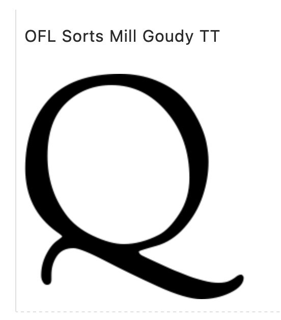
- Yesterday
-
I am looking to identify the font used in this decal, specifically the 400EX portion of it (I already have the Honda font). Thanks in advance for your assistance. https://www.ebay.ca/itm/334804487905?chn=ps&norover=1&mkevt=1&mkrid=706-89093-2056-0&mkcid=2&mkscid=101&itemid=334804487905&targetid=1656417413430&device=m&mktype=pla&googleloc=9047918&poi=&campaignid=17297476241&mkgroupid=135489415143&rlsatarget=pla-1656417413430&abcId=9300870&merchantid=591716756&gad_source=1&gbraid=0AAAAAD00iICRYn9d1gkoUMbBl2UtGsTKj

- Last week
-
Yes, that’s it. I just did a qualified guess based on what I saw in my Norwegian version of Safari.
-

Looking for some help in identifying this lovely 70s serif font (Alice Mushrooms)
Member Nei… replied to Member Nei… 's topic in Font Identification
Amazing. thank you all so much!! 'Clifton' is a beautful font! Nice one @Kevin Thompson🙂 -
Fontstand—a new way of font licensing
Member Bjø… commented on Ralf Herrmann's journal article in Journal
I am basically sympathetic to the concept, but boy do they need some high impact headliners on their poster. One true flagship per category (Questa, Graphik, Bree Serif, Drone and Nitti) is not enough. We need to see true heavy hitters like real Garamonds, Frutigers, Futuras, Bodonis, Baskervilles, Caslons, Goudys, , Universes, Gills, Helveticas, DINs and so forth. As it is, this looks very much like a collection of replacement fonts. Imagine having House Industries on board and not getting Neutraface or Eames. That just makes no sense. -
1 upvote for Typeface 3 from me.
-
North Yorkshire Council to phase out apostrophe use on street signs
Member Bjø… commented on Ralf Herrmann's news entry in Typography Weekly #133
Madness. -

Trying to identify the typeface used in the 2016 ATypI conference in Warsaw Poland.
Member Cou… replied to Member Cou… 's topic in Font Identification
Awesome! Thank you all! 🙂 -

IDing generic Cyrillic font used for government approval stamps
Ralf Herrmann replied to Member Gor… 's topic in Font Identification
Do you have more samples? With the resolution of this image it’s impossible to identify the font. Or to put it another way: any common sans-serif design will match that if it’s typeset so small or in such a low resolution. You could just use a system font like Helvetica or something like DIN or Bahnschrift for a more geometric feel.- 1 reply
-
- 1
-

-
Fantastic! Many, many thanks. This will save me a TON of work!
- Earlier
-
Font from LE REX in Nogent-le-Rotrou (France)'s logo.
Member Bjø… replied to Member mth… 's topic in Font Identification
What’s strange though, is that in your first sample, the E in CINÉMA isn’t rounded like in REX and the text below it. The rounded E looks more like it belongs in Exo 2.0 or thereabouts. -
Looking for the name of a rounded serif font from mark circa 2005.
Member Kev… replied to Member mon… 's topic in Font Identification
Sorry, but so little detail is visible in your sample as to make it pretty much useless to font matching software programs. It's a semi-slab typeface, at least, but that's not a lot to go on. Do you know the name of the restaurant? Better images may be available elsewhere on the 'net.- 1 reply
-
- 1
-
-
.thumb.png.51dfb6cc71a655bbb607ec7a044b60c4.png)
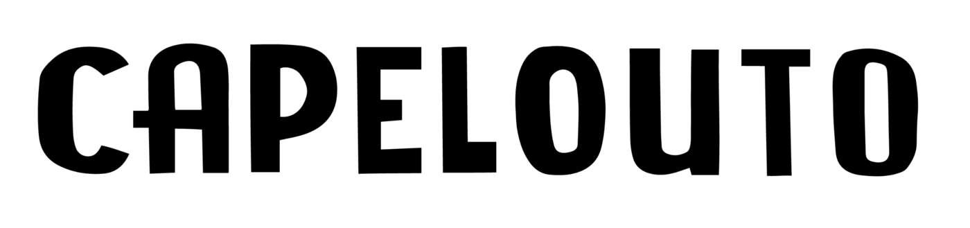
Looking for font used in Capelouto pest control logo please
Member Mis… replied to Member kur… 's topic in Font Identification
I agree with Kevin, I've unwrapped the perspective, and it looks wrong (inverse perspective than it should be): Even if you correct for the scaling: So somebody created it already as-is, with false perspective. That would suggest lettering rather than type..thumb.png.cf460d7914b5625bfb40ba71a0c60754.png)
-

Font found on a wedding shot glass in an online shop.
Member Ice… replied to Member Ice… 's topic in Font Identification
FYI, I have identified the script font which I determined to be "Edwardian Script." Thanks for the help! -

Looking for this font used in Looka
Member Pow… replied to Member Pow… 's topic in Font Identification
Thanks a lot MissNobody !! -

Font used for a clothing designer's logo around 2006-2007
Member Mad… replied to Member Mad… 's topic in Font Identification
You're absolutely right, @Kevin Thompson! Only, she must have messed around with it somehow to give it that bubbly/wavy look. Thank you so much for your expert support! -

Looking for the font used by Ficheraz on a instagram post
Member Jua… replied to Member Jua… 's topic in Font Identification
Thank you very much, that's exactly it ! -

UK DBT 'Great Britain & Northern Ireland' typeface
Member Ed… replied to Member Ed… 's topic in Font Identification
Hi Thank you so much for your help. As you say, I think it's Euclid Flex, but with Euclid Circular B for the G and the ampersand. Thank you so much for looking into this. -
Wondering what these 2 different font names are. The larger lettering and the smaller lettering (AHW Georgia Ezra)
Member Kev… replied to Member Tra… 's topic in Font Identification
GEORGIA EZRA appears to be set in Apollo Regular. -
ID font from circa 1910 British book. Distinctive Rs and Ms.
Member Kev… replied to Member sam… 's topic in Font Identification
Watchman is a digital revival of Vogue (Farmer, c. 1896). Called Hogarth by Stephenson Blake. See sample here (Vogue) and here (Hogarth). -
Looking for fonts shown on my school’s poster
Member Bjø… replied to Member aud… 's topic in Font Identification
I normally use a MacBook Pro M1 with a 15” retina screen, but when I’m away from it, an iPhone 13 Pro. I use glasses/contacts too, since I was 8. 😉👍 -

Looking for font on this Etsy wedding sign
Member Kpm… replied to Member Kpm… 's topic in Font Identification
THANK YOU!!! -
Can't find anything. I would try what Kevin suggested. Unless Marcos Buccini is already the author you've contacted. I've tried a different approach, searching for a Brazilian type designer, that has a similar style. I only found Eduardo Recife. Seems like he enjoys similar "Misprinted Type" style. If it's not Marcos Buccini or Eduardo Recife, it might be a good idea to post any information, from the book, you have. Like original author you've contacted, year when the font was created, or basically any information that is not shown on the picture you posted.


.png.3e5db2d9c4dc60bb3b23402ef9bb49b1.png)


-
Newsletter
Sign UpSubscribe to our monthly newsletter, which highlights recent and noteworthy content from the community.
-
New in Typography Weekly
-
Tell a friend
-
Article | See more …
-
Latest Videos | see more…
-
Latest Lists | see more…
-
Random Quote
Of all the achievements of the human mind, the birth of the alphabet is the most momentous.


