Jump to content
Check out our exclusive articles, videos and font downloads on Patreon!

Search the Community

Showing results for tags 'diacritics'.

  • Search By Tags

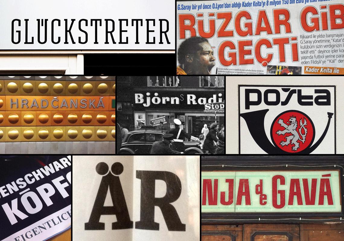
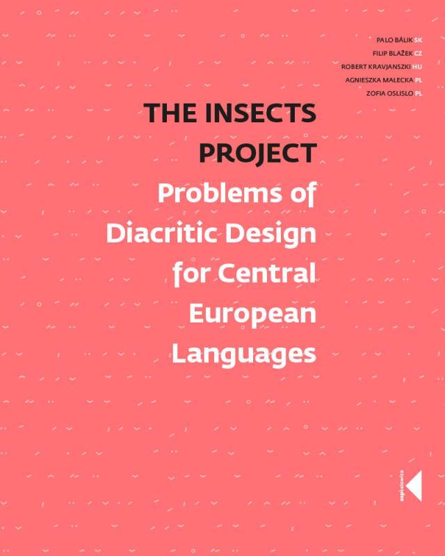
    Type tags separated by commas.
  • Search By Author

Content Type


The Typography.Guru Forums

  • Public Typography Forums
    • Talk
    • Font Identification
    • Font Downloads
  • Exclusive to Members
    • Type Design Forum
    • Letterpress Forum
    • Calligraphy/Lettering Forum
    • Show
    • Internal
    • Coffee Shop

Categories

  • Artisanal workshops & studios
  • Museums & Libraries
  • Apps
  • Education
  • Organizations
  • Online Typography Resources
  • Educational Video Channels
  • Typography Books
  • Magazines
  • Publishers

Categories

  • Link suggestions
  • Newsletter Archive (1-99)
    • Typography Weekly #1
    • Typography Weekly #2
    • Typography Weekly #3
    • Typography Weekly #4
    • Typography Weekly #5
    • Typography Weekly #6
    • Typography Weekly #7
    • Typography Weekly #8
    • Typography Weekly #9
    • Typography Weekly #10
    • Typography Weekly #11
    • Typography Weekly #12
    • Typography Weekly #13
    • Typography Weekly #14
    • Typography Weekly #15
    • Typography Weekly #16
    • Typography Weekly #17
    • Typography Weekly #18
    • Typography Weekly #19
    • Typography Weekly #20
    • Typography Weekly #21
    • Typography Weekly #22
    • Typography Weekly #23
    • Typography Weekly #24
    • Typography Weekly #25
    • Typography Weekly #26
    • Typography Weekly #27
    • Typography Weekly #28
    • Typography Weekly #29
    • Typography Weekly #30
    • Typography Weekly #31
    • Typography Weekly #32
    • Typography Weekly #33
    • Typography Weekly #34
    • Typography Weekly #35
    • Typography Weekly #36
    • Typography Weekly #37
    • Typography Weekly #38
    • Typography Weekly #39
    • Typography Weekly #40
    • Typography Weekly #41
    • Typography Weekly #42
    • Typography Weekly #43
    • Typography Weekly #44
    • Typography Weekly #45
    • Typography Weekly #46
    • Typography Weekly #47
    • Typography Weekly #48
    • Typography Weekly #49
    • Typography Weekly #50
    • Typography Weekly #51
    • Typography Weekly #52
    • Typography Weekly #53
    • Typography Weekly #54
    • Typography Weekly #55
    • Typography Weekly #56
    • Typography Weekly #57
    • Typography Weekly #58
    • Typography Weekly #59
    • Typography Weekly #60
    • Typography Weekly #61
    • Typography Weekly #62
    • Typography Weekly #63
    • Typography Weekly #64
    • Typography Weekly #65
    • Typography Weekly #66
    • Typography Weekly #67
    • Typography Weekly #68
    • Typography Weekly #69
    • Typography Weekly #70
    • Typography Weekly #71
    • Typography Weekly #72
    • Typography Weekly #73
    • Typography Weekly #74
    • Typography Weekly #75
    • Typography Weekly #76
    • Typography Weekly #77
    • Typography Weekly #78
    • Typography Weekly #79
    • Typography Weekly #80
    • Typography Weekly #81
    • Typography Weekly #82
    • Typography Weekly #83
    • Typography Weekly #84
    • Typography Weekly #85
    • Typography Weekly #86
    • Typography Weekly #87
    • Typography Weekly #88
    • Typography Weekly #89
    • Typography Weekly #90
    • Typography Weekly #91
    • Typography Weekly #92
    • Typography Weekly #93
    • Typography Weekly #94
    • Typography Weekly #95
    • Typography Weekly #96
    • Typography Weekly #97
    • Typography Weekly #98
    • Typography Weekly #99
  • Newsletter Archive (100-199)
    • Typography Weekly #100
    • Typography Weekly #101
    • Typography Weekly #102
    • Typography Weekly #103
    • Typography Weekly #104
    • Typography Weekly #105
    • Typography Weekly #106
    • Typography Weekly #107
    • Typography Weekly #108
    • Typography Weekly #109
    • Typography Weekly #110
    • Typography Weekly #111
    • Typography Weekly #112
    • Typography Weekly #113
    • Typography Weekly #114
    • Typography Weekly #115
    • Typography Weekly #116
    • Typography Weekly #117
    • Typography Weekly #118
    • Typography Weekly #119
    • Typography Weekly #120
    • Typography Weekly #121
    • Typography Weekly #122
    • Typography Weekly #123
    • Typography Weekly #124
    • Typography Weekly #125
    • Typography Weekly #126
    • Typography Weekly #127
    • Typography Weekly #128
    • Typography Weekly #129
    • Typography Weekly #130
    • Typography Weekly #131
    • Typography Weekly #132
    • Typography Weekly #133
    • Typography Weekly #134
    • Typography Weekly #135

Categories

  • Free Font Lists
  • Font alternatives
  • Fonts by topic/style
  • Fonts by region
  • Signage Fonts
  • Fonts by User

Categories

  • How to choose and pair fonts
  • Understanding Kerning & Tracking
  • How to use OpenType in InDesign
  • Font Licensing 101
  • How to use color fonts
  • Variable fonts for graphic and web designers
  • Typography on Apple devices

Categories

  • Hall of Fame
    • 2023
    • 2022
    • 2021
    • 2020
    • 2019

Find results in...

Find results that contain...


Date Created

  • Start

    End


Last Updated

  • Start

    End


Filter by number of...

Joined

  • Start

    End


Group


Job


Location

Found 7 results

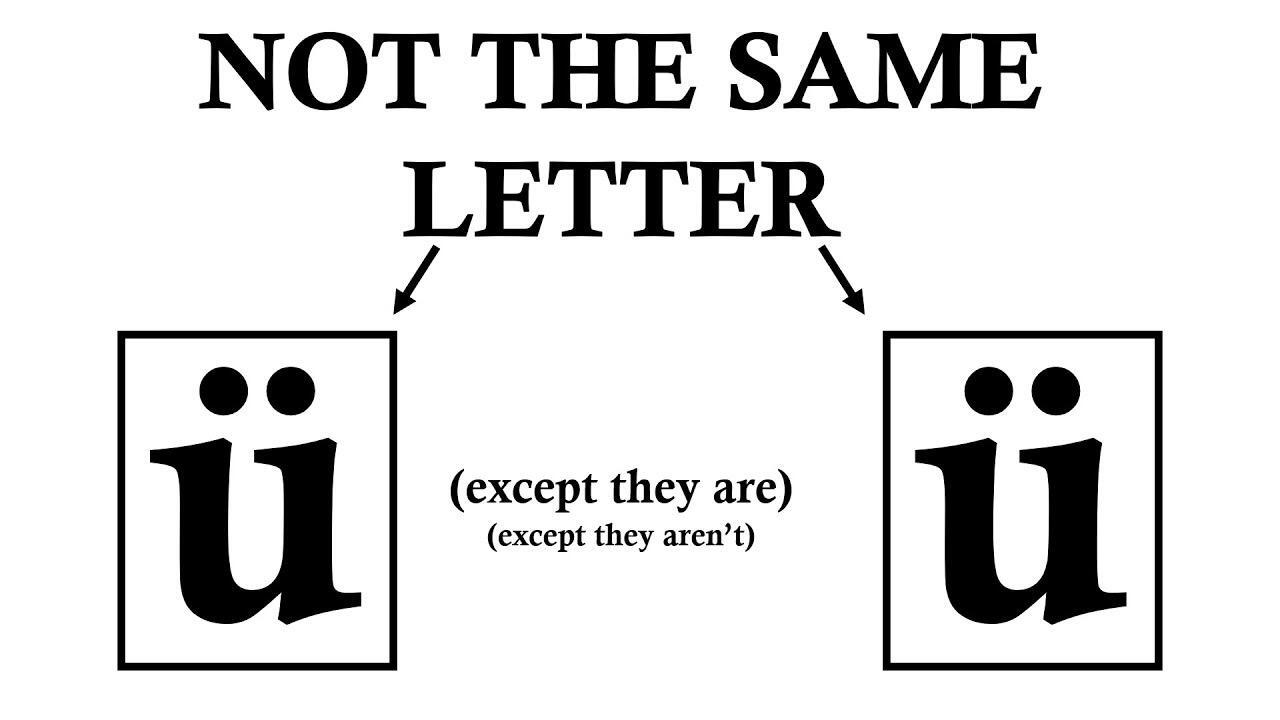
  1. A vowel with two dots above it can have two completely independent meanings. This video explains why.
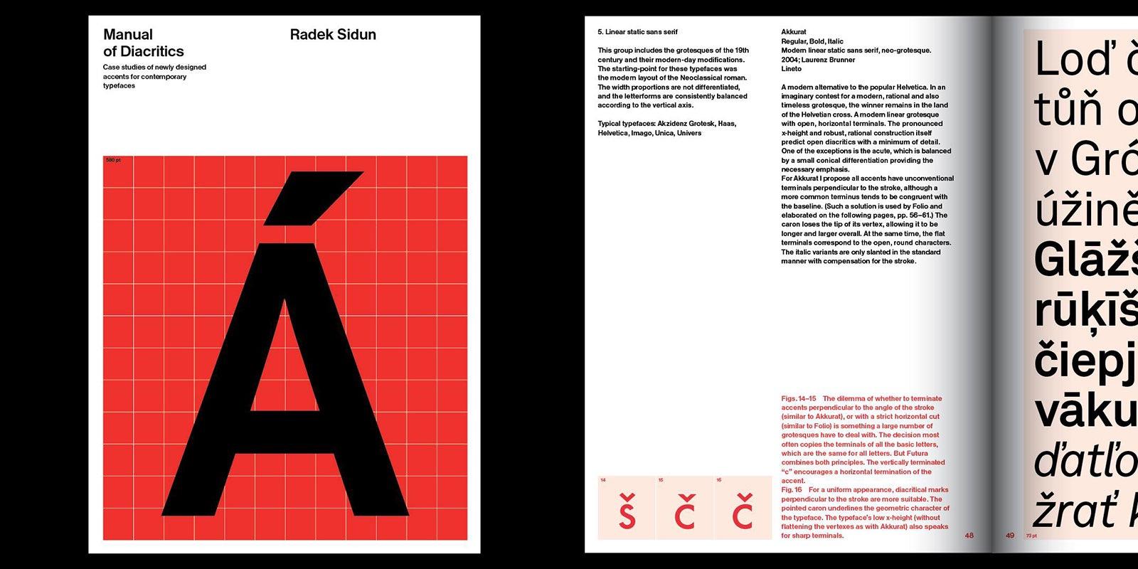
  2. Case studies of newly designed accents for contemporary typefaces
  3. “TypeTogether cofounder Veronika Burian discusses the major Latin-based information you should know about diacritics: those accented characters we include in all our font families.”
  4. Aleksandra Samulenkova ATypI 2016 • Warsaw, Poland
  5. The Insects Project is a product of a collaborative research aimed at sharing knowledge about Central European typography and promoting design that is sensitive to the needs of all those who are unlucky enough to be native users of Czech, Hungarian, Polish and Slovak. Perhaps few users of “diacriticless” languages (such as e.g. English) realise how lucky they are to be able to choose from literally thousands of typefaces. Central Europeans, on the other hand, are nowhere near as spoiled for choice, because many fonts available on the market still seem to overlook the specific needs of their knotty languages. This book contains four articles by invited experts. Each of them presents a historical overview and a guide to good diacritic design practices in particular languages including examples of the most common design problems that were prepared using font samples from young Czech, Polish and Slovak typedesigners. The book can be downloaded for free at: http://theinsectsproject.eu
  6. Context of Diacritics is an analysis of diacritics made to help type designers with refining the character sets of their fonts. It was made by Ondrej Jób, who runs his type foundry Urtd in Slovakia. The main goal of this project is to list diacritical combinations that exist in real life. Because of the methods used, all other data (absolute and relative frequency, position within words) is not and cannot be 100% accurate. Two main operations were performed during the analysis: The first operation was to find and count occurrences of each diacritical letter and combination. The results of this operation should be highly accurate. The second operation was to detect possible positions of each combination within words. For now, the results of this are far from perfect, because for it to be exact, finding every existing word in all of its forms is necessary. Therefore, if a certain combination isn't marked as Is a word, Can start words or Can end words, it doesn't mean that it actually cannot, it just did not occur in the respective position in the analyzed text.
  7. The Diacritics Project is a website which helps type designers to understand and design diacritics. The project was set up by Filip Blažek, but anyone can add content to it.
Tierra Nueva: 4 fonts based on a map of America
×
×
  • Create New...

Important Information

We are placing functional cookies on your device to help make this website better.