Search the Community
Showing results for tags 'graphic design'.
-

Design Regression, a journalette by Rosetta
Riccardo Sartori posted a news entry in Typography Weekly #112
-
- journal
- legibility
-
(and 4 more)
Tagged with:
-
“Sarah Hyndman shares with us a story of type and invites us to consider our emotional response to the printed word. Each font/typeface has a personality that influences our interpretation of the words we read by evoking our emotions and setting the scene. We all understand this instinctively but it happens on a subconscious level. Sarah shows us that conscious awareness of the emotional life of fonts can be entertaining and ultimately give us more control over the decisions we make.”
-
- 1
-

-
- psychology
- graphic design
-
(and 1 more)
Tagged with:
-
-
- advertising
- typewriter
-
(and 1 more)
Tagged with:
-
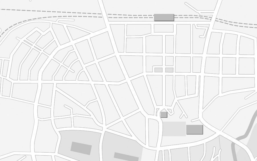
Drawing maps is a typical job of graphic designers and pretty much every designers knows how to do it. But not every map looks equally convincing. I always liked this special effect of online mapping services like Google Maps or OpenStreetMap, where roads are outlined but still reveal their connections. But this effect is not as often used for vector maps drawn in vector illustration apps like Illustrator. Maybe that is because there is no direct option which would allow the user to “outline an outline”. I checked a lot of online mapping tutorials, but the ones which mentioned this effect recommended rather cumbersome methods to achieve it. Mostly they required an additional step, like combining all paths to one object or copying all paths to another layer and style those paths individually. But that would make later changes to the maps much harder or even impossible. More creative solutions used layer transparency settings so the overlaying outlines would knock each other out or simply cover the unwanted overlaps with even more outlines laid on top with layer styles … But all these methods are work-arounds and have their flaws. What we really want is that Illustrator would take all our streets (usually drawn as outlines) and squares (usually drawn as fills), merge them together dynamically and draw an outline around it. And guess what, that’s actually possible and pretty easy to achieve — all we need to to is to combine two layer effects. An here is how you do it: First, draw your streets and put them on a layer. If you have different kinds of roads, I would recommend to put each category on one separate layer. This makes styling, editing and selecting much easier. In every layer where you used outlines (e.g. all street layers), open the Appearance panel and add an effect: Path → Outline Stroke. Now assign all these layers to a parent layer. This new layer will be used to create the outline around all objects in the child layers. Click on the circle beside the name of our parent layer in the Layer panel. Now you can add a new outline as layer style in the Appearance panel which will be applied to the outlines of all objects on our child layers. In this case, this even works for strokes, since we have applied the “Outline Stroke effect” before, which basically turns all outlines dynamically to filled objects. Your map should look something like this … All objects have the outlines we want, but they are not merged yet. So still in the Appearance settings of our container layer, we add another effect: Pathfinder → Merge. And that’s it! All overlapping objects from all child layers will dynamically be merged together and outlined with an additional stroke. And all objects remain fully editable and you can continue to work in a true WYSIWYG mode.
- 1 comment
-
- 2
-

-
- graphic design
- maps
-
(and 1 more)
Tagged with:
-
101 Editions and Carolina de Bartolo released the “second edition” of the type/graphic design book Explorations in Typography in November. THE BOOK • http://www.explorationsintypography.com Have you obtained this book? What do you think of the first edition by comparison? Have you tried the Do It Yourself in the website? DO IT YOURSELF • http://explorationsintypography.com/diy/
-
- 1
-

-
- book
- typography book
- (and 6 more)
-

From signs to minds—Can cartographic signs be superior to regular direction signs?
Ralf Herrmann posted a journal article in Journal
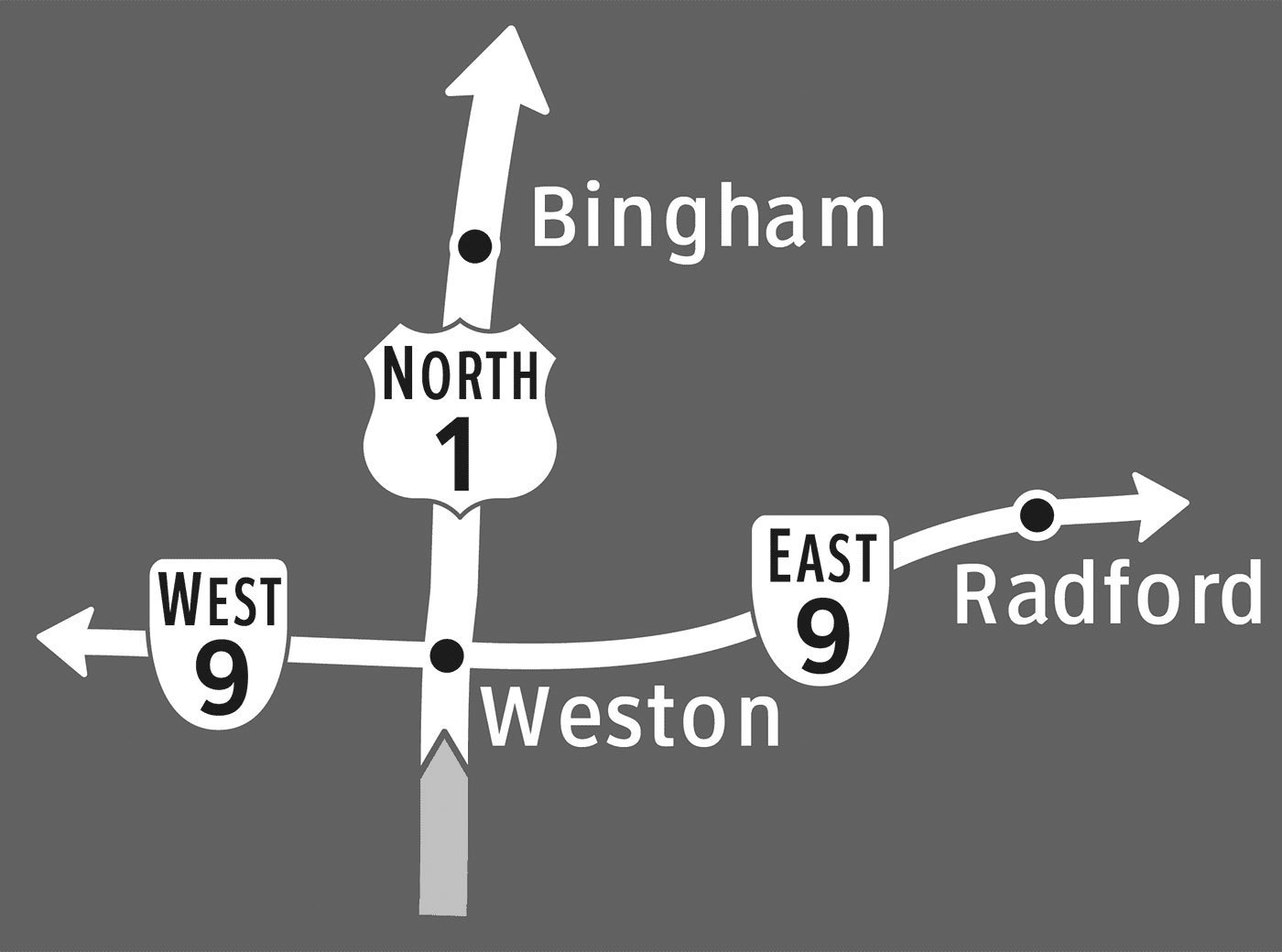
Finding your way through a new city has never been easier than it is today. There is a wide array of gadgets available to help you locate yourself and your destination, plan out a route to get there, and take the right turns along the way. But as you follow along to the voice of your navigation system, how much are you actually learning about the environment around you? Could you retrace that same route the next day? Could you draw your path on a map? There is a growing body of both anecdotal and experimental evidence suggesting that turn-by-turn navigational guidance hinders learning. Once you’ve punched in your destination, your mind goes on cruise control. Typical directional signs, like in-car navigation systems, simply point you in the right direction at each turn along your route. Following a series of these signs, you might arrive at your destination without understanding exactly how you got there – or how to get back home. In a previous post, Ralf Herrmann explained this downside of directional signs: Directional signage is purely egocentric. The signs will tell us to go left, right or straight at a decision point, without providing us information of how we move thru the environment in connection to cardinal directions or landmarks along the way. We will reach our target only if the signs work at every decision point. If one part of the way is blocked or we missed a sign, we cannot reach our target, because we have no idea where it actually is. And it will be hard to trace back our route to the starting point, because we just followed endless signs and did not built a large-scale cognitive map of the surrounding. In a recent study, I aimed to identify how directional signs could be designed to not only get people to their destination, but also help them construct a mental map of the area along the way. Drawing from research in cognitive science, I predicted that road signs featuring highly simplified maps would encourage this spatial learning by showing travelers an image of the layout of the area. Using the guidelines for U.S. highway signage as a foundation, I developed three types of signs to evaluate, shown below. The ‘separate’ type, which is the standard highway directional sign, uses arrows to indicate which way to turn to reach various destinations. Roads and towns are shown on two separate signs in order to not overload travelers with too much information at once. The ‘combined’ type shows route and town information all on one sign, and merges the simple arrows to form a schematic diagram of the intersection. This type of sign is much more common in Europe than in the U.S., and a similar sign is often used for roundabouts. The ‘cartographic’ signs display this same information in the form of a simple map, with route and town labels placed on lines that represent the roads. Perspective and mental effort in wayfinding These sign types connect to the different perspectives used to communicate or remember spatial information. The ‘separate’ and ‘combined’ types use the route perspective, while the ‘cartographic’ signs use the survey perspective. Route information, which is from a perspective within an environment, is a sequence of turns at decision-making points along a route. In contrast, survey information is from an imagined perspective above an environment, and can convey an interconnected and hierarchical network. With this more complex understanding of an area, it’s easier to identify shortcuts and alternate routes. In other words, you can communicate more complex information about the layout of an area by offering a map (survey perspective), than by providing a series of simple directional signs (route perspective). These two perspectives also differ in terms of the amount of mental effort they require for navigation. To find your way using a paper map, for example, you must locate and orient yourself, identify your destination, plan a route to get there, and translate that route into a series of turn actions. A well-designed you-are-here map would help you with self-location and orientation, but you’re still on your own to plan out your route and the turns it would require. Following signs to your destination, in contrast, may not require any understanding of the broader layout of the area, because you’re provided with turn-by-turn guidance along the way. In general, we prefer to do things the easy way when it comes to wayfinding. Most people with smartphones or in-car GPS would be unlikely to ditch them in favor of a paper map or gazetteer. But if you distilled a map down to only the absolutely essential information, could you give travelers a mental image of the layout of the area in only a few seconds? The aim of the ‘cartographic’ sign type, shown above, is to present the directional guidance offered at an intersection in the form of a simple map that can be read while driving past. By needing to interpret a map in order to make a turn decision, perhaps people will incidentally piece together a better ‘cognitive collage’ of their environment. (See: Tversky, B. (1993). ‘Cognitive maps, cognitive collages, and spatial mental models’, in Spatial Information Theory, Springer-Verlag). How much can you learn from signs? I’ll spare you the details of the experiment I developed to evaluate how well the three sign types support spatial learning, but if you have any questions or want to learn more, don’t hesitate to contact me. Basically, participants viewed a slideshow of signs as if driving through a fictional environment, and then were given an unexpected mapping task to demonstrate what they had learned from the signs. I then had the participants repeat the same sign viewing and mapping tasks, in order to see how much they could learn from the signs when they knew that they would be tested afterwards. In the first mapping task, people viewing the ‘cartographic’ signs constructed significantly more accurate maps than those viewing the other two sign types. This suggests that signs with maps do help people incidentally develop a mental map of their environment. What’s particularly interesting is that there was no significant difference between the map accuracy scores of the ‘separate’ and ‘combined’ sign groups. In other words, combining route and town information on a single sign didn’t really help people learn unless the information was presented in the form of a map (as was the case with the ‘cartographic’ signs) The second mapping task, which gauged how much people could learn intentionally, showed no significant differences between any of the sign type groups. Basically, when people knew that they would be tested on their knowledge of the area, the type of sign didn’t have a notable impact on how much they learned. In practice, however, intentional learning from directional signs is much less common than incidental learning. Would you focus on constructing a mental map of an airport as you follow signs to the baggage claim? Probably not. So while the results of the second mapping task are interesting to note, they’re less relevant to the practice of designing wayfinding signage. Beyond the lab While it may seem narrow and unrealistic to test changes to the carefully regulated signage of the U.S. highway system, it was in fact essential to start with such a restrictive wayfinding scenario. On the highway, you only have a few seconds to interpret each sign you pass by, so an overly complicated sign could be life threatening. For pedestrians, however, viewing time is much more flexible, which would allow you to include a greater complexity and quantity of information on a sign. In other contexts, the possibilities are endless. Imagine pedestrian signs with simple maps that orient you relative to a river, coastline, or another key geographic landmark that’s not always in view. Or as you enter a grocery store you’ve never been to, imagine seeing a simple map of the different departments. (I swear I thought of that before I saw the sign below, at a Fred Meyer store in Oregon!) Imagine if the typical subway directional signs, which only show the name of the last station on a line, were supplemented with a simple map of which direction the line would take you in the city. Whether you’re designing wayfinding guidance for drivers, bicyclists, pedestrians, or transit riders, the basic principle is the same: simple maps on signs can help people learn the layout of the area. The full paper was published in the Cartographic Journal, Volume 49, Number 4, November 2012 and is also available online.-
- graphic design
- signs
-
(and 3 more)
Tagged with:
-

Wayfinding observations: Landmarks and cardinal directions
Ralf Herrmann posted a journal article in Journal
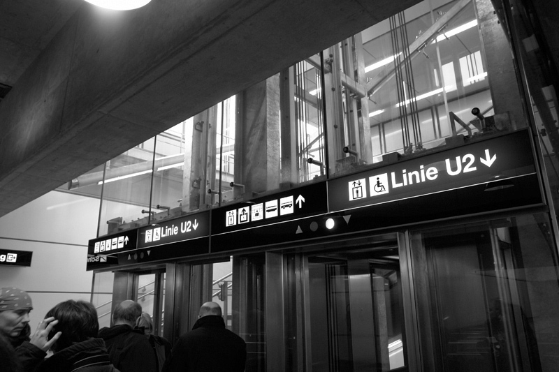
When we come to a new city we build a cognitve map to represent this city in our minds. Unless you have photographic memory such cognitve maps work differently from topographic maps. They don’t consist of exact representations and distances, but are driven by landmarks and the paths that connect them. A landmark can be anything that clearly stands out from its environment, like a tower or a church. But one of the most important landmarks are rivers that divide a city. London is divided by the Thames, Paris by the Seine and Vienna by the Danube. Last week I visited Vienna for the first time and experienced a typical wayfinding problem that always annoys me. From my hotel I wanted to make a sightseeing trip to the city center. I went to the closest subway station, paid my ticket and looked for a map to find out where I have to go. As you can see on the map, Vienna is divided by the river Danube. Since my hotel was close to the river I had no problem finding my position on the map, even though there was no You are Here mark. Source: openstreetmap, Creative Commons, by-sa The city center was also easy to find and I can easily place it on my cognive map. It’s across the river and Southwest of my hotel. A subway line is directly connecting my position with the city center, so the only question left is which platform I need to take on this line. I know I want to go across the river, Southwest and to the city center—but none of these information is given to me. Instead I get: Do I want to go Reumannplatz or Leopoldau? Well, neither! I want to go across the river, Southwest and to the city center… So I need to check this huge and very detailed map again to find those terminal stops. From a cognitive perspective this is really a problem. Especially tourist will never visit those terminal stops, so to them they are meaningless, hard to remember and hard to place on a cognitve map. But cardinal directions and landmarks are basic tools of navigating thru the environment and would make it much easier to travel around an unknown city. What about an additional information which of those platforms leads to the Northeast and which to the Southwest? Even a simple circled SW and NW would probably suffice. But getting on the right platform is not the only problem—it continues when we want to exit the subway. I got off at my stop in the city center. It’s a large subway station and after walking thru the subway catacombs I will usually have lost my sense for the cardinal directions again. From the topographic map I looked at in the other subway station I know I want to go Northeast from the station and stroll thru the city there, but what I get is: Do you want to exit to Kärntner Straße or Graben? Well, I don’t know! I want to go to the Northeast! How should I know all these street names as a tourist? And even if I would know the right street name, without cardinal directions I wouln’t even know which direction I should take on that street. So I need to consult a topographic map again to check random street junctions which might help me determine in which direction I am currently standing. A simple compass rose on the ground would have made it much easier… It’s not a secret how cognitve maps work and how tourist move thru a city. But it seems that the signage of most public transport systems don’t really reflect that. They seem to be more driven by a strict and logic engineer’s approach, rather than how people actually use these systems. What are your experiences? Am I the only one who wants to rely on landmarks and cardinal directions when navigating thru a city? Do you know cities with a signage system that accommodates our cognitve maps in a better way? In which cities do you got lost and why?


