Search the Community
Showing results for tags 'typeface'.
Found 11 results
-
A new corporate and interface typeface for Braun to replace Neue Helvetica. Made by Iconwerk with Ludwig Übele, Nina Sagra, and the Braun design studio.
-
- 1
-

-
- custom font
- bespoke
- (and 3 more)
-
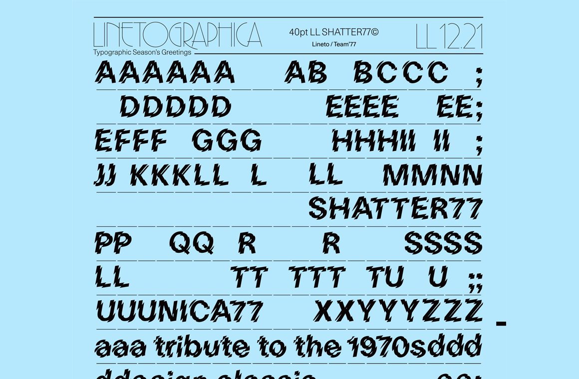 For a limited time, Swiss foundry Lineto is offering a free download of Shatter77, a design that applies the Shatter treatment to their Unica77.
 -

Variable font experiment: Your Typeface
RasmusTypeDesigner posted a news entry in Typography Weekly #100
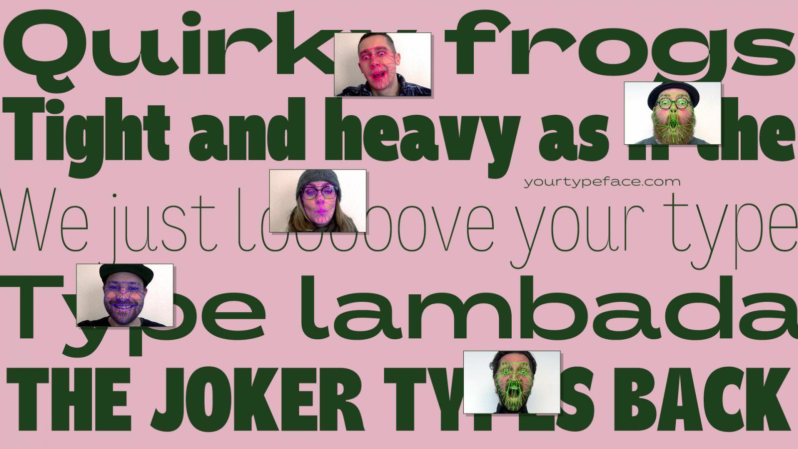 yourtypeface.com is a variable typeface experiment that enables you to design a typeface from the proportions and forced emotion of your face. Look surprised or uptight, yawn or smile, and let your face design your own typeface. Download it and use it freely for any project you’d like.
- 2 comments
-
- 1
-

-
- typeface
- typeface design
- (and 6 more)
-
What in your opinion is the typeface (or font) which corresponds / represents / symbolizes the year 2019? (I’m a student of Graphic Communication Design researching this for a project! Any help would be appreciated)
-
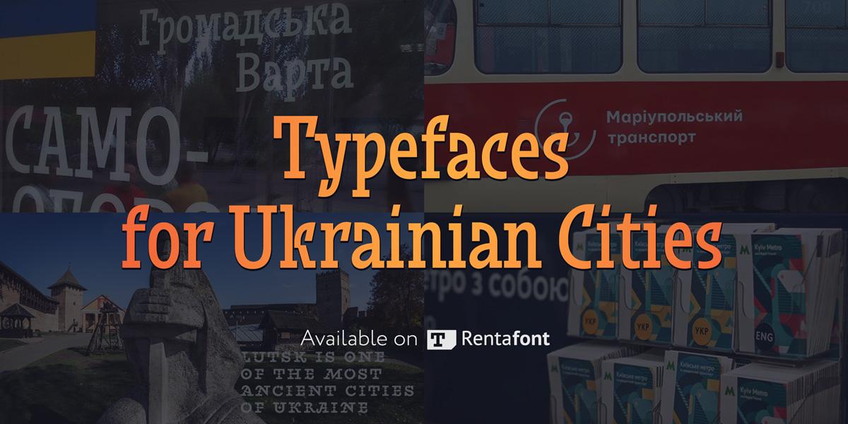 The Ukrainian font market could hardly be called large, but we have quite a few talented and original type designers. They design both commercial and free fonts, including freely available fonts for Ukrainian cities. Meanwhile, Rentafont, being a font service originating in Ukraine, supports development of the local typographic culture and promotes such fonts. At the close of 2017, our service was the first to start disseminating a new typeface for Lutsk. It was a pleasant surprise that not only designers but also common citizens took interest in the new typeface. Therefore, to support the Ukrainians’ interest in typography, we have decided to build a full collection of Ukrainian local fonts. The stories behind the creation of city typefaces are quite diverse. In some cases these are works submitted for competition, in others, it is purely their authors’ initiative. These include the “workhorses” for city way-finding and display fonts for tourism brands. There are also way-finding font for Lviv (Petro Nahirnyi), touristic typeface for Sumy (Dmytro Rastvortsev), original city typeface for Dnipro (Kyrylo Tkachov, Andrii Shevchenko), typefaces for Dnipro and Kyiv (Viktor Kharyk), and way-finding typeface for Kharkiv (Andrii Shevchenko). Some fonts are still work in progress, while some are almost completed and will soon join the Rentafont collection. Our ambition for 2018 is to bring together at Rentafont all the modern typefaces for tourism brands and way-finding of Ukrainian cities.
 -

Should the terms font and typeface be used interchangeably?
Ralf Herrmann posted a journal article in Journal
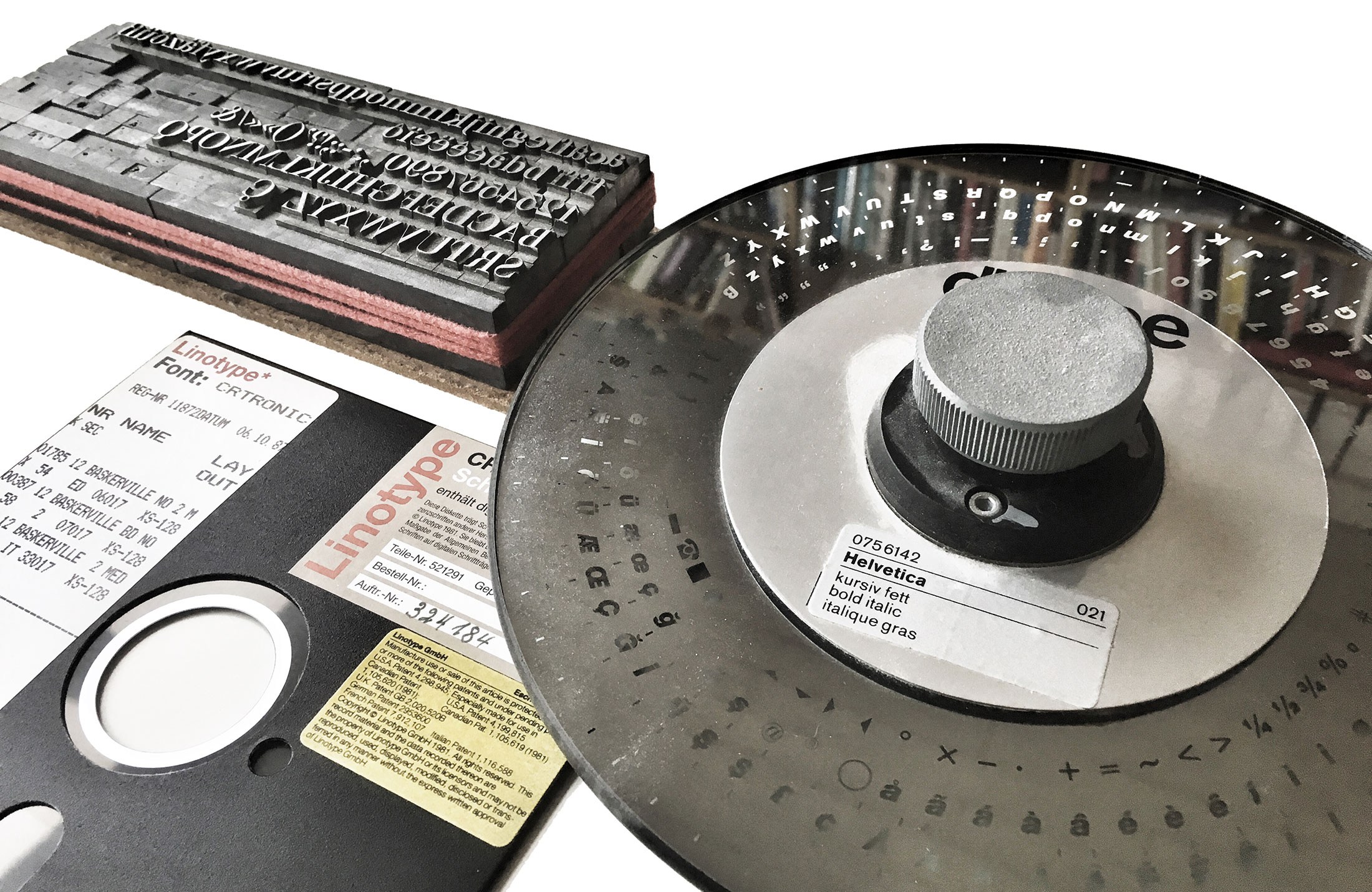 Defining the terms What do these terms mean anyway? The most simple explanation is: a typeface is what you see, a font is what you use. Both refer to a “set of letters (or symbols to put it more broadly) with a specific style”, but the term typeface puts the focus on the artistic work, whereas font points to the actual tool to arrrange and print or display text using a design with a specific style. Considering the most common techniques, this tool can be … the letters (made from materials such as metal or wood) in a single letterpress type case a phototypesetting disc or strip containing letters as photographic negatives a digital font file containing letters as digital outlines Fonts used for different typesetting techniques In contrast to what one might expect, most dictionaries aren’t of much help either and they demonstrate that the problems around the distinction between the two terms isn’t a new phenomenon caused by computer users with a lack of knowledge about letterpress printing. Most English dictionaries I checked use something like a “set of letters in a particular design” as the key element for the definition—but for both terms! The additional characteristics usually vary. Some limit the terms to printing, others have updated this to include today’s digital use as well. Some mention a specific size for fonts, some make that optional or omit it altogether. But most experts in our field probably agree that at its core, it’s about the visual design on the one hand (☞ typeface), and the useable manifestation or instance of this design (☞ font) on the other hand. And this broad definition works for all typesetting techniques. The debate It can’t be denied: The term font is used all the time in our field today. We go to sites like myfonts.com, fonts.com, fontshop.com and download digital font files to put them in a font folder and later use them in our application by opening the font menu. And other designers who see our work might later ask for a “font identification”. Still, there are people who reject this use of the word font, because it is not a perfect match with how they might have learned to define it decades ago when they started out with letterpress printing. Yes, fonts for letterpress printing happened to be size-specific. It’s just a physical requirement of this technique. And in a letterpress cabinet, each size of a typeface would be referred to as individual font. But as shown before, this is not necessarily a key element nor a requirement to define the term font for all eternity. Just as with the material by the way. Font (or “fount”) probably comes from the “melting” or “casting” of the metal alloy in order to make the moveable type. Yet, the same term was used when wood type became common, even though nothing is actually melted or casted in this case. Despite the conflict with the “original” meaning of the term font, it made sense to adopt it for wood type as well, because the purpose was the same. And the same thing happened with the shift to scalable fonts with phototypesetting and later digital typesetting. A phototypesetting disc was neither casted from metal nor was it restricted to a specific type size. Yet, just as a letterpress font it was used to typeset a specific type design and that’s why the term font was used as well. Sure, we could also use completely different terms for different typesetting techniques, but using a shared definition for letterpress fonts, phototypesetting fonts and digital fonts is just a normal effective use of language. The interchangeable use of font and typeface Now that we have clarified what the terms mean and why they exist the way they do, let’s move on to the actual question of this article. A typical complaint about today’s use of font and typeface is that the interchangeable use removes the distinction between the terms and so this is something that must be avoided. But in my opinion, that is a flawed logic, which often seems to be based on the assumption that only one term could be correct in any situation. The other extreme—which is also quite common today—is to say we should just give up and accept that these terms are essentially synonyms today. I disagree with both positions. They only propose two possible options: the use of these terms must be exclusive or identical. But that is a false dilemma. There are more options and I want to argue, that the interchangeable use of font and typeface is mostly the result of the fact, that both terms usually apply at the same time and so it just doesn’t matter much which one we pick. Let me explain that with an analogy. Take the words “song” and “recording” for example. They aren’t synonyms of course. I can whistle a melody and someone standing next to me might recognize the “song”. The person is standing next to me, listening to me. No recording was involved. But I could also give a talk and someone makes an audio recording of it. There is now a “recording”, but since it was just talking, the word song wouldn’t make sense. Both words have different meanings and in these two examples only one was valid in each case. But if we talk about music albums for example, both terms apply at the same time. There are songs—the musical composition (and optionally lyrics)—and there is a specific recording of that song on a certain album. If we talk about a specific album, it doesn’t matter if we refer to the songs or the recordings on that album. We could mean exactly the same thing. The recordings are the manifestations of the songs and both are bound together. This relationship can be shown in a very simple Venn diagram: There can be exclusive and overlapping uses of the terms. It doesn’t have to be “exclusive” or “identical”. Usually we just refer to a song or a recording by the same name written on the album cover and there are hardly any confusions. The linguistic symbols are pointing to the same thing. But as shown in the diagram, there are exclusive uses as well. A song might appear on different albums of the same artist or even different artists. In this case song and recording clearly point to different things and we need to make sure to use the correct words. And I would argue, that typeface and font share the same relationship as song and recording. When a new typeface or family with different styles is released, there will be fonts available to actually use the design or the different designs within the family. It goes without saying. And that’s the overlapping use that explains the interchangeable use. Helvetica Bold Italic is both a typeface and an available font. But that does not mean that typeface and font are synonyms. The exclusive uses remain as well. A type designer sketching letters in a notebook isn’t drawing a font. The designer is working on the visual artwork—the typeface! If the designer ships that typeface in various font formats I might have a folder on my computer with one typeface, but two or more fonts. In such cases an interchangeable use of font and typeface would make little sense and might cause unnecessary confusion. Conclusion Words don’t have intrinsic meanings—words have usages. Therefore it makes little sense to cling to a very narrow metal type definition of the word font, just because that happens to be the first or literal meaning of that word. It’s almost ridiculous to deny the reality of the usage of the word that became common with phototypesetting and digital type. Nothing is lost anyway. It is always possible to apply a broader or more narrow meaning depending on what the specific context requires, as we do it with many other words as well. If necessary, we can use a broader meaning for the word font which covers all typesetting techniques. And at the same time we can create categories and sub-categories to be highly specific about certain types of fonts. The specifics of a letterpress font can still be described by referring to it as “letterpress font” or “wood type font” to be even more specific. And in my opinion the interchangeable use of font and typeface is fine, as long as we stay in that overlapping area of the Venn diagram. There can be a fine line between words being used interchangeably in certain contexts and words being synonyms. In this case, it is a difference that matters and one that we should be aware of.
 -
I usually use the terms font and typeface as it is summarized nicely in this FontFeed article. http://fontfeed.com/archives/font-or-typeface/ As a result, there can be cases, where the term typeface is applicable, but font is not. I wonder if there are cases for the other way around? In German and according to my use that is the case. The German word for typeface is “Schriftart”, which has the meaning of “the written word” in it and as a result, I would avoid the term for the design of a dingbat font for example, since there aren’t any letters in it. But I am unsure whether this is similar in English. What do you think?
-
¶ I'd like to start a thread about a topic that remains rather unclear. How do you define the typeface from the Victorian era? ¶ I always find four designers related to that kind: the German-born Carl Schraubstadter Jr, Gustave F. Schroeder and Hermann Ihlenburg the American John F. Cumming Oddly enough, not a single British designer is highlit. I watched some catalogues from French foundries of the late XIX th century with this kind of typeface. ¶ Can you help me with this riddle?
-
¶ Many reknown typefaces, especially sans serifs, were renewed and enhanced with additional weights and widths. The first typeface I recalled that featured the 'new' marketing attribute was Helvetica Neue back in 1983. Were there any other typefaces with the 'new' attribute before that particular date? I wonder what is the genealogy of these attributes? When did they launch these Neue, Next and Nova? ¶ Linotype has many Neue, Next, Nova types in their catalogue. Why the differences in the names? What does it mean? Apart from this trio, are there any other names for 'new' in the typeface industry? Any thoughts? Thanks for your insights.
-
Hi everybody! I have recently started helping a professor at my uni with the design of his book, which is a 500+ pages study on the architecture of high-rise buildings. I really want to make things look very neat, and here's a list of typefaces I might or might not use for the body text: Minion Pro Garamond Premier Pro Warnock Pro ITC New Veljovic Pro Times Ten LT Std FF Meta Serif Pro FF Meta Pro Whitney Probably some of them are a big no-no when it comes to body text, but I'm not very sure. My options are limited to fonts that have cyrillic characters. I have attached a PDF file (and here's a jpg also) with a sample paragraph (the language is Bulgarian), set with each typeface, and I need your advice on what will work best. Any help will be greatly appreciated! Thank you.
-
Guia — a wayfinding typeface for pedestrian signage
Ralf Herrmann posted a journal article in Journal
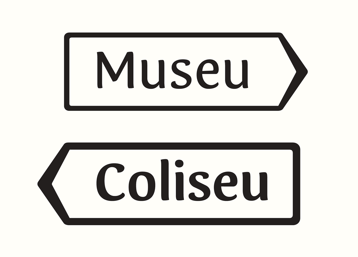 As a designer, I am interested in how certain solutions connect to the user. It is amazing to see how different solutions can change feelings, resulting in different ways of interaction. In consequence, in the type]media master I knew I wanted to design a typeface that would bring a new experience to the user in a specific area. As I am coming from Portugal, the creation of Guia was very much influenced by my personal visual memory: It is very common to find diverse guidance systems in different Portuguese cities. They differ in material, technique and lettering. Those differences are connected with the individual cities. For example, if a city has a granite tradition, it is most probable to find street name signs made out of granite, with the letters carved into the stone. There are also signs in marble or metal, but most commonly, painted tiles can be seen, as all of Portugal has a great tile tradition. Even though, different executions can be found yet again within the technique of painted tiles. Those street plaques appear to be there since forever, and they have become part of the history of the city. I know the portuguese sign tradition from my own experience, and I was visually supported by many images on Flickr. As I did not have the possibility to make a deeper research in person, online archives of photos were of great help. Street sign made of stone in Aveiro, Portugal. Photo by Filipa Cruz, http://www.flickr.com/photos/sufragista/3230191056/ Enamel street sign in Tondela, Portugal. Photo by Filipa Cruz http://www.flickr.com/photos/sufragista/4570775315 Street sign of painted tiles in Évora, Portugal Inspiration sources for getting the feeling right were also found studying books on signage and lettering, such as Nicolete Gray’s “Lettering on Buildings” and Jock Kinner’s “Words and buildings: The art and practice of public lettering”. Their research images showed many manually-produced signs, which all had a strong appeal to me. The signs’ purpose was mostly illustrating and matching a place, rather than providing a coherent appearance, or offering greatest readability. All those impressions helped me to get into an overall mood to create a typeface which would be personal, but at the same time useful and usable. In Portugal, almost no standardizations for signage systems exist, except for the use of the typeface “Transport” for transit guidance. Today, when new pedestrian sign systems are being created, they are mostly designed using rational sans serifs, being totally out of context within the sign lettering tradition. There are no ties with the surrounding architecture or connections to the city history. I felt there was a gap between the charming lettering of old street name plaques and current signage systems for pedestrian guidance. This area I decided to work on. I do understand that the complexity of the cities nowadays is not the same as it was 100 years ago; not even 20 years ago. Hence, new solutions are required in order to guide persons around a city. What I wanted to experiment with, was to bring back some of the lettering-feel to an up-to-date wayfinding typeface. Ideally, new pedestrian signage systems could consequently transmit more of a humane feeling than they are doing right now. The different styles of Guia and their features. Guia shall provide multiple possibilities for the sign creator of today, yet retain a strong human touch, in order to make the user comfortable and welcome with the new place that he is about to discover. For this reason, Guia is based on the movement of the broad-nib pen. In my research I found out that this particular way of creating letters results in pleasant shapes and it has advantages in readability in comparison to other contrast models. Contrast-less typefaces mostly have the characteristic of being uniform; so they do not evoke a feeling of their own. Calligraphy sheet produced during the design process of Guia Many decisions were taken bearing a foreign reader in mind. If a foreigner arrives at a new place, he or she does not have the word-images of street names etc. in mind. In consequence, reading succeeds letter by letter. Therefore, the spacing of Guia is relatively wide. For the same reason, it does not have any ligatures. Persons which are not into type design or typography might just decipher a ligature as a strange character they do not know. Guia does not have ligatures. To make the typeface really fit for signage purposes, various OpenType features and additions were implemented. For instance, any word can be converted into a pointing sign, just by selecting a stylistic set. Also, different kinds of arrows exist; to work in a mixed or all-cap setting. Circled arrows provide the possibility of stand-alone usage. In many languages such as Portuguese, Spanish and French, long words are abbreviated using superscript letters. For the purpose, Guia provides the whole alphabet in a superscript feature. The arrows of Guia correspond to the cap-height, x-height and ascender/descender height. With the help of OpenType, any word can be transformed into a sign Guia contains the whole alphabet also in superior letters. In all those details, I was also focusing on the broad-nib contrast. Even the arrows are based on the construction model, just as the circles around them. Those details might be negligible for an outsider, but I think they make the whole typeface more coherent in itself. Another area I focused on concerns the recognition of the individual letters. Therefore, cap- and ascender-heights are significantly different, in order to make their distinction easier. Stem joints have been adjusted, to make the whole letter shape sharper, avoiding visual clogging. All those corrections lead to a better legibility, which I find to be essential for a signage typeface. Different height of caps and ascenders. Adjusted stem joints avoid visual clogging. Guia is composed by a Regular, Bold, Condensed, Bold Condensed and Extra Condensed style — yet this selection might not be absolute. It is still an ongoing project. I have learned a lot during its creation, and I am sure that many things will change before the typeface is ready to be released. A next step will be designing a set of pictograms and symbols; and I am curious how to get the broad nib feeling into them. I am very glad I had the space and time to do this experiment, and I thank all the type]media teachers for being open to my ideas and for all their advice and support. Tânia Raposo http://www.taniaraposo.com
-
- 1
-
-
- signage
- wayfinding
- (and 1 more)