Search the Community
Showing results for tags 'free'.
-
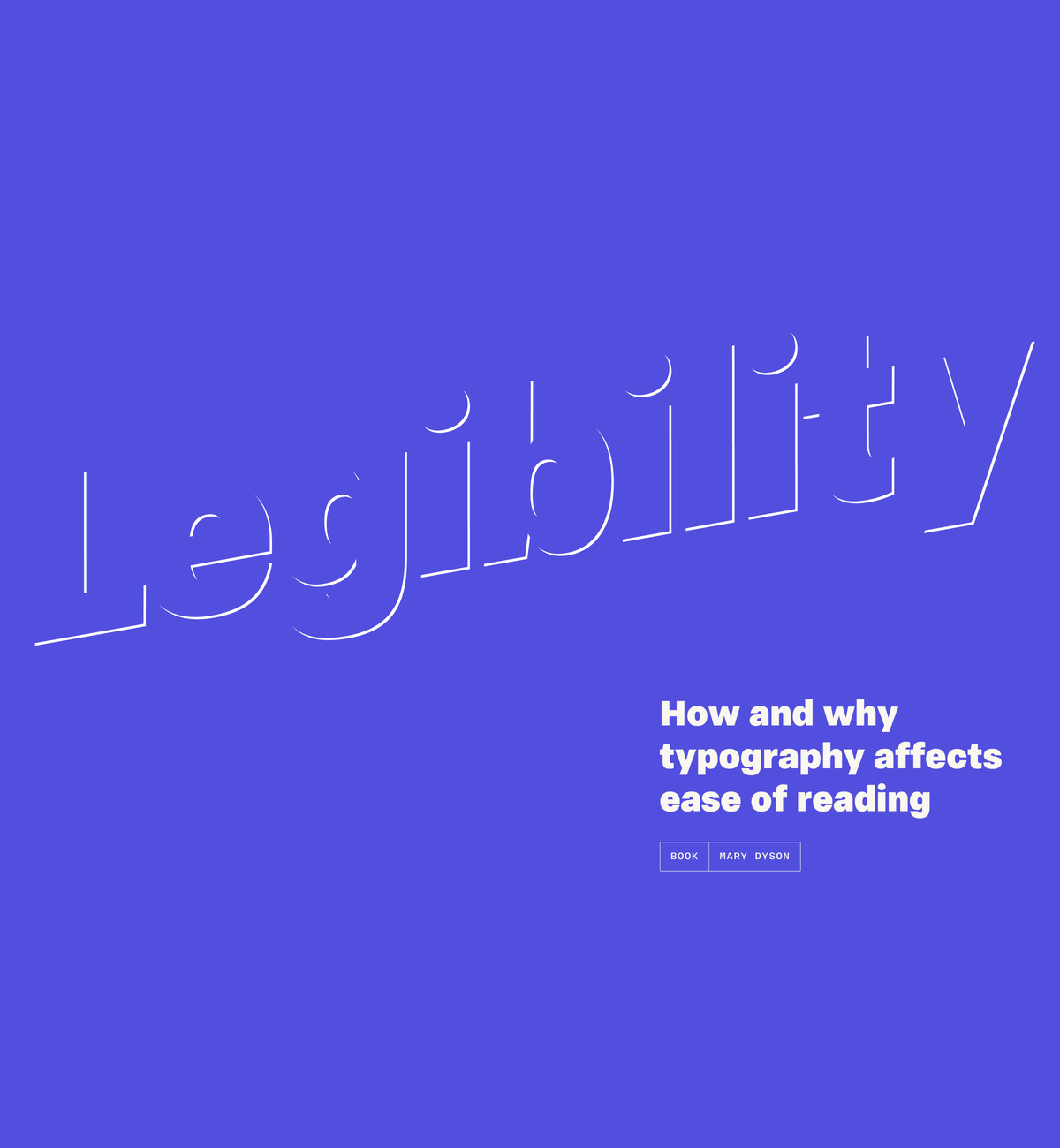
Legibility: how and why typography affects ease of reading
Riccardo Sartori posted a news entry in Typography Weekly #126
-
- book
- legibility
-
(and 1 more)
Tagged with:
-
-
-
- 1
-

-
- typedesign
- onlinecourse
-
(and 1 more)
Tagged with:
-
- 7 comments
-
- 2
-

-
- download
- opensource
-
(and 2 more)
Tagged with:
-
-
- conference
- online
-
(and 1 more)
Tagged with:
-
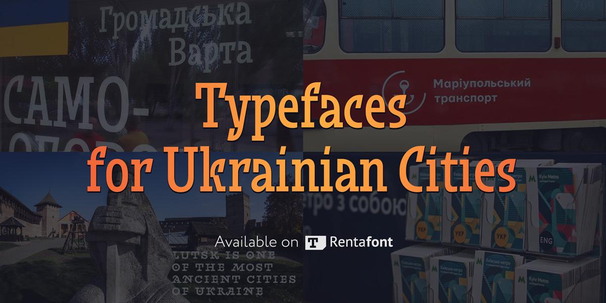
The Ukrainian font market could hardly be called large, but we have quite a few talented and original type designers. They design both commercial and free fonts, including freely available fonts for Ukrainian cities. Meanwhile, Rentafont, being a font service originating in Ukraine, supports development of the local typographic culture and promotes such fonts. At the close of 2017, our service was the first to start disseminating a new typeface for Lutsk. It was a pleasant surprise that not only designers but also common citizens took interest in the new typeface. Therefore, to support the Ukrainians’ interest in typography, we have decided to build a full collection of Ukrainian local fonts. The stories behind the creation of city typefaces are quite diverse. In some cases these are works submitted for competition, in others, it is purely their authors’ initiative. These include the “workhorses” for city way-finding and display fonts for tourism brands. There are also way-finding font for Lviv (Petro Nahirnyi), touristic typeface for Sumy (Dmytro Rastvortsev), original city typeface for Dnipro (Kyrylo Tkachov, Andrii Shevchenko), typefaces for Dnipro and Kyiv (Viktor Kharyk), and way-finding typeface for Kharkiv (Andrii Shevchenko). Some fonts are still work in progress, while some are almost completed and will soon join the Rentafont collection. Our ambition for 2018 is to bring together at Rentafont all the modern typefaces for tourism brands and way-finding of Ukrainian cities.
-
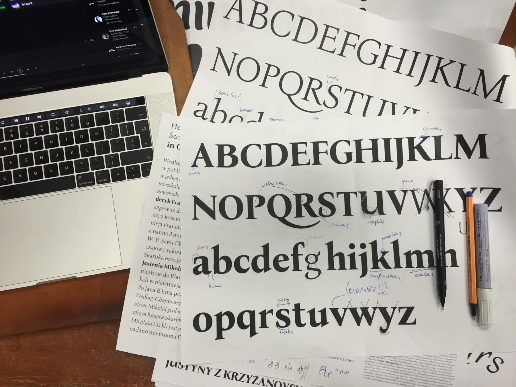
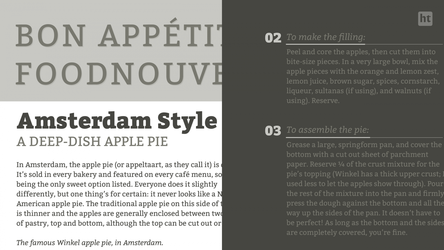
Letterpress version and type specimen of Bona Mateusz Machalski started the project in 2011, when he was in his second year at the Academy of Fine Arts in Warsaw. The font had only existed in metal type and it was available in the typesetting room of the academy. When Machalski became interested in the font, his professor arranged a meeting with its designer Heidrich. “I was surprised that he did not laugh at my projects. It made me more confident and I told him about my idea. He reacted with real enthusiasm” Machalski remembers. Digitization started quickly after that meeting, but the work remained unfinished for a few years. In 2016, together with Leszek Bielski, the project was revived again. More meetings with Heidrich took place and an extended type family (regular, italic, bold) was planned. Bona was Heidrich’s only full type design. But as graphic designer in those days, lettering for book jackets for example was a typical job. But there was little choice for body copy texts. “We always worked with 12 pt Times or Garamond—to the point of boredom. Each book looked the same inside. There was a deep need for new typefaces. For each cover or other design the lettering was custom made. It had to be drawn or painted, as there was not enough time to create and cast new letters.” Original sketches and matrices Heidrich worked on Bona as a side project—for the “pure pleasure” of it as he remembers. There was no specific brief or job for the design. The typeface was cast and a full set ended up in the typesetting studio of the Academy of Fine Arts in Warsaw, where it was used occasionally. For the digitization Heidrich provided all the original sketches of the italic and the matrices could be inspected as well. But there were still so many design decisions to be made for the digital version. “With Bona Nova, the most interesting things happened during the design work. I published images and details about the progress on the internet and the Bona Nova fanpage became a stage for a typographic debate on many levels” says Machalski. Among other details, the design for the Capital Sharp s was heavily discussed on Facebook And of course a roman design had to be developed from the italic, which is rather unusual. Letters on stamps and banknotes by Heidrich helped to work out certain characteristics. The final designs got an extended Latin character set with over 1000 glyphs, including small caps, lots of ligatures, multiple figure sets and ornaments. But the family still continued to grow. Three inline versions were added and three title versions with a very high contrast. These are available as commercials offers. And there might be more in the future. “There are some plans—perhaps Cyrillic? Maybe a sans serif version … Only time will tell.” Specimen images from Bona Nova The free styles of Bona Nova The commercial styles of Bona Nova The free and the commercial styles are available on the Capitalics website. More information about the project in Polish and English here: http://bonanova.wtf
-
-
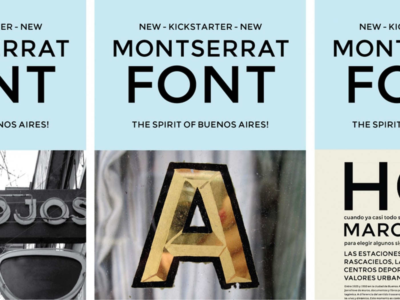
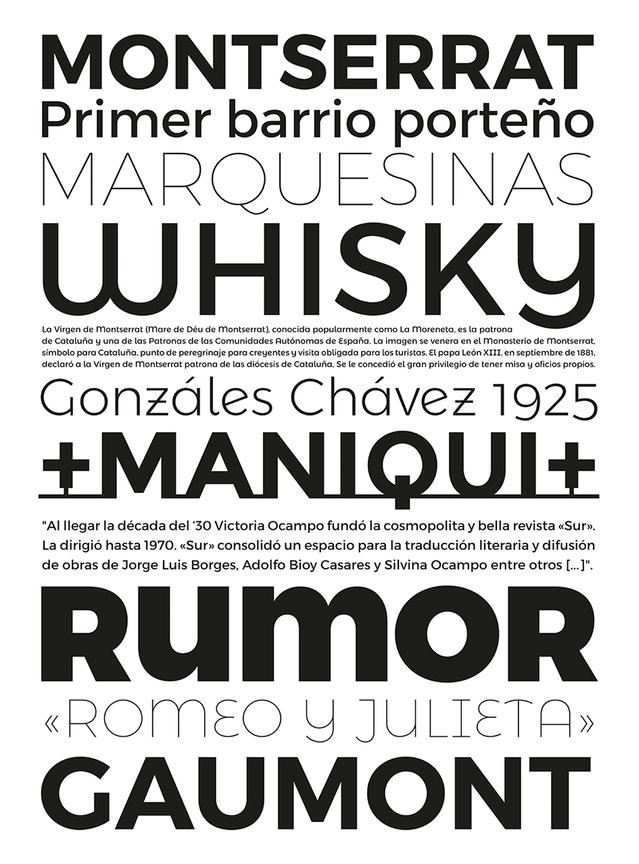
Montserrat is a “libre sans text typeface for the web, inspired by the signage found in a historical neighborhood of Buenos Aires” designed by Julieta Ulanovsky in 2011 thanks to a successful Kickstarter campaign. Montserrat enjoyed a certain success as a Google webfont (due, in part, to the superficial resemblance to Gotham of its uppercase) and, while the original design was limited in scope, in time it grew fairly extensive in styles and weights. For this last reason, and as suggested by @Ralf Herrmann, I wanted to add it to my list of good free display type families. However, when it came to insert a link that could offer an overview of all the different options, I was unable to find anything suitable. The official website hasn’t proved very helpful in this regard either, so I will list here all the styles and weights of Montserrat available to download and/or as webfonts. On Google Fonts: Montserrat Normal 400 and Bold 700 Montserrat Alternates Normal 400 and Bold 700 Montserrat Subrayada Normal 400 and Bold 700 (an architectural “underlined” caps only variant) On Fontsquirrell: Montserrat, eight weights, from Hairline to Black (the Ultralight, Semi Bold, and Extra Bold contain the Alternates as proper OpenType feature, none of the weights include the Subrayada variant) On Brick (webfonts only): Montserrat, nine weights, from 100 to 900 (it’s sometimes difficult to see a difference between the closest weights) Furthermore, there are some non-free styles and weights, featuring an extended Latin coverage, available directly from the designer upon request.
-
FontArk is a browser-based font editor with a real-time multiple glyph editing system. FontArk’s Skeleton based design doesn’t require you to draw the actual character outlines. In order to draw a letter all that is needed is to draw the center-line of the letter and the outline is generated automatically in real-time. Currently, FontArk can only run on Chrome and Safari browsers.
-
FontStruct is a free browser-based font-building tool. FontStruct lets you quickly and easily create fonts constructed out of geometrical shapes, which are arranged in a grid pattern, like tiles or bricks. Once you're done building, FontStruct generates high-quality TrueType fonts, ready to use in any Mac or Windows application. You can keep your creations to yourself, but the makers encourage users to share their “FontStructions”, so other users can download them or even copy them and make your own variations.
-
- font editor
- bitmap
-
(and 1 more)
Tagged with:
-
Glyphr Studio is a free, web based font editor. Features: Editing Tools: Create complex vector shapes, copy & paste, flip them around or lock them down, drag & resize to your heart's content. Lots of the normal stuff you’d expect, like a pen tool, guidelines, keyboard shortcuts, and Undo history. Linked Shapes: Define a shape once, like an o, and re-use it across many characters, like bdgpq. Make changes to the Linked Shape, and it updates all the characters linked to it. Test Drive: Try out your font as you type. Pack my box with five dozen liquor jugs! Ligatures: Combine a sequence of characters into one new supercharacter, like Æ or ¼. POW. Kerning: Standard character spacing feeling awkward like a gradeschool slowdance? Kerning gets characters together and feelin’ good. Import SVG Fonts or outlines: Use your favorite vector editing program to create vector outlines, then import them to characters via SVG. Or open a whole SVG Font at once. All the Chars: Easily select some common Unicode character ranges to design, or input arbitrary ranges - up to U+FFFF. That’s 65k characters of excitement. Two Screen Mode: spread out and use your big beautiful second monitor. Tools on one screen, editing on the other.
-
BirdFont is a free font editor that can export TTF, EOT & SVG fonts. BirdFont is developed by Johan Mattsson with a good number of people contributing translations and patches. The editor is written in Vala. Installers and source code packages are available for Windows, Linux, Mac OS X and BSD.


